Comet · Full Page
Comet
Perplexity'nin AI browser ürün sayfası — cinematic dark canvas, dramatic display typography, scroll-orchestrated reveals, single product surface as protagonist. Film trailer marketing.

Editorial disclaimer
Editorial noteThis entry documents observable design-language patterns for educational transfer and AI-agent briefing. Screenshots and trademarks are property of their respective owners. AI2 Design is not affiliated with or endorsed by the featured brand. Inspiration here is about language and rhythm — do not reproduce brand identity, logo, product copy, or proprietary features.
Curator verdict
Why we catalogued it?
Comet is Perplexity's AI browser — and the marketing page treats it like a product announcement worthy of the iPhone launch playbook. We catalogued it because in 2026 every AI tool is shouting capabilities; Comet's page commits to a different thesis: that an AI browser should feel like a film trailer, not a feature comparison. Dark cinematic canvas, dramatic typography reveals, scroll-triggered orchestration — together they signal a product whose ambition is to redefine the browser category, not just compete in the AI-assistant niche. If you are launching a category-defining product and want the marketing surface to carry the category-creation weight, this is the lodestar.
Design decisions observed
- Dark cinematic ground — pure black canvas with dramatic spotlight zones, treating the page as a sequence of film frames rather than a marketing brochure.
- Hero typography commits to large dramatic display moments — the kind that signals 'we believe this is important' rather than 'here are our features'.
- Single product surface anchors the page — Comet browser screenshot/animation is the protagonist, not surrounded by feature grids.
- Restrained accent palette — Perplexity-adjacent brand language (deep blue + warm cream highlight tones) without garish neon.
- Scroll-orchestrated reveals — each section enters with cinematic timing rather than instant fade-in.
- Minimal navigation chrome — the page is designed to be experienced, not browsed.
What to study
- How to launch a category-redefining product without resorting to feature checkboxes — Comet's page treats the browser like a film, not a tool. Steal the discipline of trusting the product surface to do the marketing.
- Dark cinematic canvas for AI products — most AI-tool marketing reaches for light-cream Anthropic-style warmth or purple-gradient generic. Comet's dark dramatic cinema is rare and earned.
- Restrained accent palette inside a chromatic-heavy category — Comet uses Perplexity's brand colours sparingly, letting the typography and motion carry the narrative weight.
What to avoid
- Don't lift the cinematic motion vocabulary without committing to choreography — half-baked scroll-trigger reveals feel cheap. Either commit fully or stay still.
- Don't use dark dramatic display for a product without ambition — Comet earns the cinema by being a browser-category redefinition. A note-taking app doesn't earn it.
- Don't add feature comparison grids — Comet's page deliberately refuses the table-comparison playbook. Adding it collapses the cinema into commerce.
Taste notes
The page feels like the trailer for a film about computing's next decade — every transition has deliberate weight, every accent is scarce, every product moment is treated as a hero shot. Comet understood that AI browsers are a category that doesn't exist yet, and the brand needs to carry the category-creation weight through visual ambition. The restraint reads as confidence, not coyness.
Lineage & references
- Direct heir to the Apple keynote film aesthetic — same conviction that product marketing can be cinematic without being commercial.
- Standing shoulder-to-shoulder with category-redefinition product launches (Arc Browser, Humane Ai Pin, Rabbit R1) — but Comet has more typographic discipline than most.
- Part of the Perplexity brand extension family — sister property to perplexity.ai search, but with cinematic display ambition the parent property doesn't attempt.
Design language brief
Paste-ready for your agent.
A typed design system transfer brief — philosophy, tokens, rules, techniques, and fitness checks. Your agent reads the whole language, not just the pixels.
Philosophy
Comet's design language is cinematic AI-browser ambition. Dark dramatic canvas; large display typography for hero moments; restrained accent palette; scroll-orchestrated motion reveals; single product surface anchors the page. The marketing surface treats the launch as a film trailer, not a feature comparison.
Main prompt
Use this capture as a design language transfer brief for my project. Adopt the palette (pure black ground dominant, near-white text for primary content, restrained Perplexity-adjacent accent palette — deep blue + warm cream highlight tones, no garish neon), dramatic display typography for hero moments (48-96px), scroll-orchestrated motion (Framer Motion or GSAP for section reveals with cinematic timing 600-1200ms), single product surface as page anchor (no feature comparison grids), Tailwind-standard breakpoints, dark cinematic atmospheric depth via gradients. Treat the page as a film trailer — every transition carries narrative weight, every accent is scarce. Apply the language, not the source brand's copy.
Overview
- Layout
- Single-column cinematic flow with scroll-triggered section reveals; product surface as protagonist.
- Content width
- Wide cinematic canvas — 1280-1440px hero, narrower 720-960 reading zones.
- Framing
- Film trailer for a product — dark canvas, dramatic display, single hero surface.
- Grid strength
- Implicit — motion timing carries rhythm, not column grid.
Color philosophy
Dark dramatic canvas with restrained Perplexity-adjacent accents; near-white text; scarce chromatic.
- Pure #000000 or near-black dominant ground
- #ffffff near-white primary text and surfaces
- Deep blue accent (Perplexity brand-adjacent) scarce usage
- Warm cream highlight tones for body emphasis
- Restrained chromatic — no garish neon or saturated gradients
Gradients (paste-ready)
Atmospheric cinematic depth zones — radial dark-warm spots, no decorative chromatic
Typography rules
- Premium grotesque or display serif for hero (48-96px)
- Body 14-16px with generous line-height 1.6
- Weight ladder restrained — 400 body, 500-600 emphasis
- Letter-spacing -0.02em for display, 0 for body
- Generous tracking for kicker labels (0.18em uppercase)
Spacing rules
- Generous vertical rhythm — 160-240px between major sections
- Hero breathing room 120-160px above/below
- Card padding 32-48px
- Cinematic pacing requires large gaps
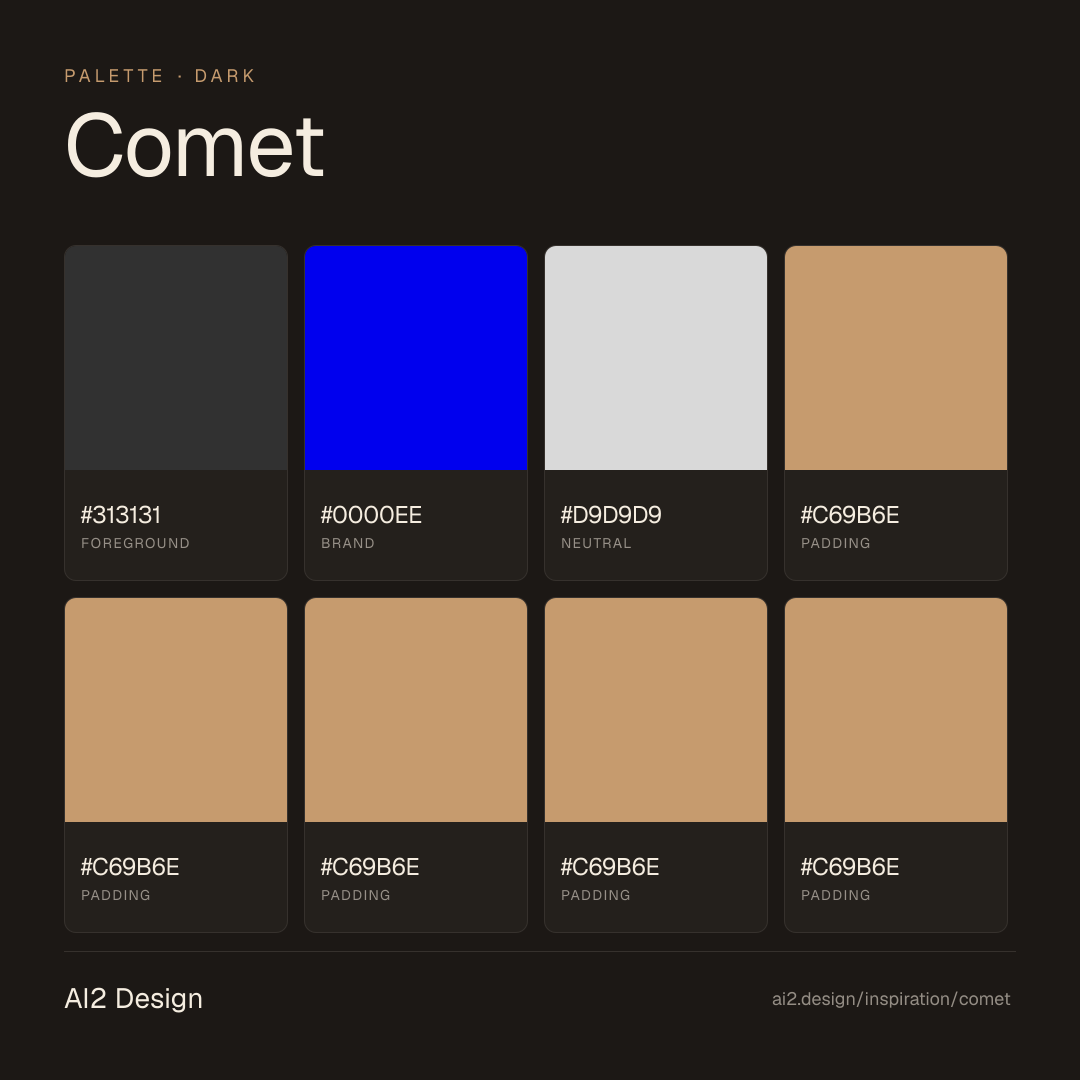
Design tokens
Palette, type, and space — all agent-readable.
3 colors · hex / rgb / hsl / oklch
- foreground86%
- HEX
#313131 - RGB
rgb(49, 49, 49) - HSL
hsl(0, 0%, 19%) - OKLCH
oklch(31.32% 0.0000 89.76)
- HEX
- brand10%
- HEX
#0000EE - RGB
rgb(0, 0, 238) - HSL
hsl(240, 100%, 47%) - OKLCH
oklch(42.90% 0.2973 264.05)
- HEX
- neutral5%
- HEX
#D9D9D9 - RGB
rgb(217, 217, 217) - HSL
hsl(0, 0%, 85%) - OKLCH
oklch(88.53% 0.0000 89.76)
- HEX
Inspector
Tab through the captured artifacts.
Six observable layers — page structure, fonts, breakpoints, z-index, gradients, motion — kept paste-ready alongside the tokens above.
Page structure
Semantic hierarchy at a glance.
Depth-first walk of meaningful sections — header, navigation, main regions, articles, footer. 2 nodes captured; depth capped at 6 for readability.
- body
- └─ div (×2)main
Accessibility
WCAG contrast matrix.
4 combinations · 4 pass AA · 2 pass AAA · APCA Lc shown alongside WCAG 2.1 ratio for draft WCAG 3 awareness.
| Preview | fg | bg | Ratio | Normal | Large | APCA Lc | Context |
|---|---|---|---|---|---|---|---|
Aa | #313131 | #D9D9D9 | 9.22 | AAA | AAA | +77 | foreground on neutral |
Aa | #D9D9D9 | #313131 | 9.22 | AAA | AAA | -78 | neutral on foreground |
Aa | #0000EE | #D9D9D9 | 6.66 | AA | AAA | +66 | brand on neutral |
Aa | #D9D9D9 | #0000EE | 6.66 | AA | AAA | -68 | neutral on brand |
- Full Page
- ai
- dark
- 2026-05-17
Editorial credit
Featured Sponsor slot — your brand here
Dedicated logo placement — no rotation, on every export.
COMPARE THIS WITH
Side-by-side reads sharing this design signal.
See also