Contra · Full Page
Contra
The creator-marketplace landing that reads like a well-designed magazine wrapped around a billboard. Contra pulls off the rare tension of slate-ink enterprise discipline with a vivid spot palette that only appears when the page actually wants you to feel something. Two variable fonts carry the entire personality — GT Standard Variable for product UI, Source Serif 4 Variable for editorial moments — sharing the page without a single decorative flourish. Asymmetric double-layer shadows and ambient glow callouts give the layout two elevation registers for two emotional tones.

Editorial disclaimer
Editorial noteThis entry documents observable design-language patterns for educational transfer and AI-agent briefing. Screenshots and trademarks are property of their respective owners. AI2 Design is not affiliated with or endorsed by the featured brand. Inspiration here is about language and rhythm — do not reproduce brand identity, logo, product copy, or proprietary features.
Curator verdict
Why we catalogued it?
Contra is the creator-marketplace landing that most teams should quietly study before they design their own. It holds a tension almost nobody pulls off — a disciplined, slate-ink reading layer that could pass for enterprise software, carrying a vivid spot palette of teal, violet, pink and orange that only appears when the page actually wants you to feel something. The typography does the real heavy lifting: two variable fonts, a serif that behaves like a display voice and a grotesque that behaves like product UI, trading the page between editorial and application modes without ever breaking rhythm. If you are shipping for a creative audience that still has to feel credible on a procurement call, this is the reference to keep open.
Design decisions observed
- Dual-voice typography as the entire personality — a variable grotesque for product UI, a variable serif for editorial moments, sharing the page without a single decorative flourish.
- Restraint on the canvas, permission on the spots — pure white background, slate ink reading layer, and then vivid spot colors that only show up where the page wants your eye and nowhere else.
- Shadow vocabulary that speaks two registers — an asymmetric soft double-layer for elevated cards and a diffuse ambient glow for feature callouts, letting the same layout carry different emotional weights.
- Narrow content rails inside a wide hero — 464px reading column, 1848px hero canvas. The page reads like a well-designed magazine wrapped around a billboard.
- Motion calibrated to the interaction, not to the brand — width and border changes get 0.35s so the eye can track them, opacity and transform get 0.2s so the page never stutters. Discipline disguised as craft.
What to study
- How Contra uses two variable fonts as the entire visual identity — learn how a grotesque/serif duet earns both product credibility and editorial warmth on a single page.
- Restraint-then-pop spot palette strategy — vivid greens, violets and pinks that carry almost no surface area but own every moment the page needs to feel alive.
- The asymmetric double-layer shadow — one of the most distinctive elevation grammars on the web, and transferable to any product that wants soft authority without drop-shadow fatigue.
- Narrow-rail-inside-wide-hero container pairing — 464px for reading, 1848px for hero moments. A template for marketing pages that still respect reading ergonomics.
What to avoid
- Do not copy the full spot-color inventory onto a B2B or enterprise page — Contra's permission to go vivid is earned by a creator-economy brand. Use one or two accents, not four.
- Do not replicate the dual-typeface pairing if you do not have a system for when serif appears — Contra's switches are editorial, not decorative. Misused, a second font reads like indecision.
- Do not paste the asymmetric shadow onto every card — its impact comes from reserving it for elevated moments. Flatten defaults and escalate with intent.
Taste notes
The page feels like a confident independent magazine that happens to sell a marketplace — warm where it wants to invite, tight where it wants to be trusted, colorful where it wants to remind you that the audience here is creative. Slate ink carries almost everything, and the spots behave like pull-quotes rather than paint. You are being welcomed into a community, not upsold.
Lineage & references
- Stands with the creator-economy landing class that rebuilt marketplace marketing around taste (Gumroad, Mirror, Ghost pre-2023, Substack in its more editorial moments) — pages that read like a publication first and a product second.
- Cousin to the variable-font-forward generation (Stripe's Sohne, Figma's plural stack) — brands that treat type as brand, not as a container for brand.
- Part of the 2024+ warm-but-credible cohort — light-first canvases that earn enterprise trust with slate-discipline while keeping the emotional permission a creative audience expects.
Design language brief
Paste-ready for your agent.
A typed design system transfer brief — philosophy, tokens, rules, techniques, and fitness checks. Your agent reads the whole language, not just the pixels.
Philosophy
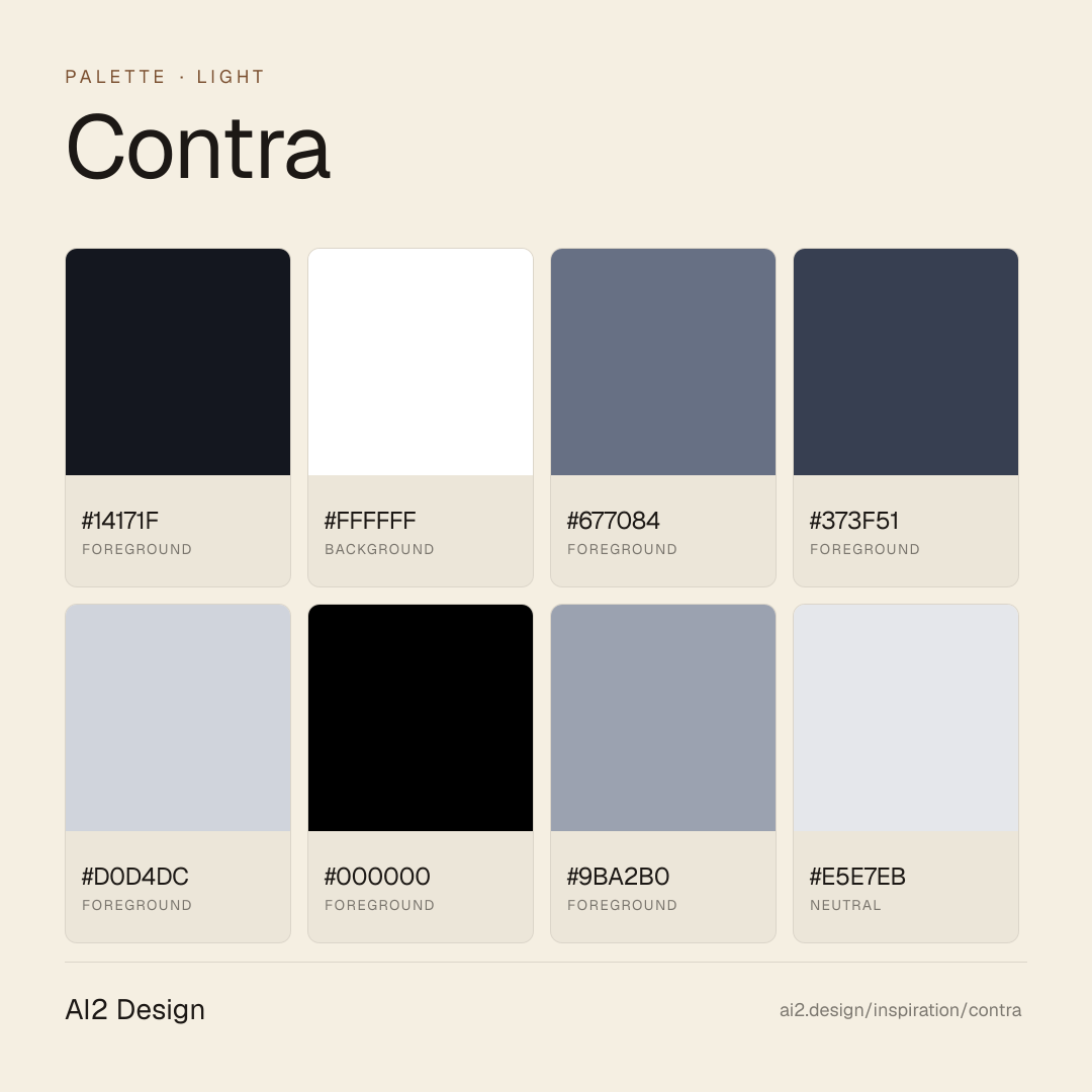
Light-first creator-marketplace canvas. Pure white #ffffff primary background, near-black #14171f primary text, slate descender scale #677084 / #4a5264 / #222834 for de-emphasized reading layers. Typography carries the entire personality: GT Standard Variable (L + M + Mono) handles product UI, Source Serif 4 Variable handles editorial moments. Vivid spot palette — teal #3ab266, violet #6a57e3, pink #cd74dd — used only where emphasis earns its own spotlight, never as fill. Elevation is an asymmetric double-layer soft shadow plus an ambient glow, rotated by context. Motion is expressive but calibrated: 0.35s for dimensional change (width/height/border), 0.2s for surface micro-interactions (opacity/transform/fill).
Main prompt
Use this capture as a design language transfer brief for my project. Adopt the palette (light-first #ffffff canvas + #14171f primary text + slate descender scale + homeopathic vivid spot palette of teal/violet/pink/orange), typographic duet (GT Standard Variable grotesque for product UI paired with Source Serif 4 Variable for editorial moments, both preloaded as woff2), 4px-base spacing scale with heavy use at 4/8/12/16, narrow 464px content rail inside wide 1848px hero canvas, double-peak border-radius grammar (10px for interactive elements, 16px for cards), asymmetric double-layer soft shadow for elevated cards + ambient glow for feature callouts, 640/768/1024/1280/1536 Tailwind-standard breakpoints, and expressive motion calibrated by property (0.35s ease for dimensional change, 0.2s ease-out for transform/opacity). Treat this as my project's constitution — every new component I author should pass as if crafted in the same studio. Apply the language, not the source brand's copy or identity. When I ask you to build a page or component, enforce these rules by default, and call out any decision that deviates.
Overview
- Layout
- Grid
- Content width
- Bounded
- Framing
- Flat
- Grid strength
- Moderate
Color philosophy
Light-first canvas — #ffffff primary background paired with #14171f near-black primary text doing the reading-layer work. Secondary text descends through a cool slate ladder: #677084 → #4a5264 → #9ba2b0 → #d0d4dc for progressive de-emphasis, plus deep #222834 for dark-mode panels. The vivid spot palette — teal #3ab266, violet #6a57e3, pink #cd74dd — is reserved for emphasis: feature highlights, call-to-action states, editorial spot illustrations. Surface area of spot colors stays below 3% of the viewport.
- Primary reading pair: #14171f text on #ffffff background (measured 1864 + 1845 occurrences — dominant surface)
- Slate descender ladder: #677084 (captions, metadata) → #4a5264 (muted UI) → #9ba2b0 (placeholder) → #d0d4dc (disabled state)
- Dark-mode panel base #222834 paired with #ffffff foreground for contrast regions
- Spot teal #3ab266 for success states and creator badges (never decorative)
- Spot violet #6a57e3 and pink #cd74dd for feature highlights and editorial emphasis
- Cool blue #8bb2d1 and warm browns (#45192f / #2e1104 / #c8b9a7) appear as one-off swatches in editorial illustrations and category chips
Gradients (paste-ready)
linear-gradient(360deg, rgba(20, 23, 31, 0.8) 12%, rgba(255, 255, 255, 0) 50%)
linear-gradient(90deg, rgb(205, 243, 253), rgb(157, 222, 249) 42.88%, rgb(151, 157, 241) 94.62%)
linear-gradient(rgb(3, 5, 49) 52.16%, rgb(4, 5, 39) 66.55%)
Typography rules
- Primary grotesque: GT Standard Variable (L + M), self-hosted and preloaded from https://builds.contra.com/static/fonts/GT-Standard-L-VF.woff2 and GT-Standard-M-VF.woff2. Monospace: GT Standard Mono (Standard-Regular.woff2). Secondary serif: Source Serif 4 Variable (SourceSerif4-Variable.woff2) for editorial moments.
- Dual-voice system — GT Standard handles product UI, labels, buttons, data-dense layouts; Source Serif 4 handles long-form reading, quotes and editorial feature moments. Do not substitute either — the duet is the brand.
- Observed size ladder: 8 / 12 / 14 / 15 / 16 / 23 px — micro-legend sizes exist at 8px with tight line-height 10px; body reading at 14-16px with line-height 20-24px; display-adjacent at 23px with 32px line-height.
- Line-height: tight 1.0-1.15 on display (23/32), relaxed 1.43-1.71 on reading (14/20, 16/24, 15/24). No unitless values outside these ratios.
- Monospace: GT Standard Mono for tabular data, code, kbd, IDs and timestamps. Do not use a mono substitute.
- Italic is reserved for Source Serif — GT Standard stays upright. Emphasis in GT Standard is carried through weight, not slant.
- Paragraph max width ~46-52 ch at 14-16px to echo the 464px narrow content rail.
Spacing rules
- 4px base unit. Observed scale: 2 / 4 / 6 / 8 / 10 / 12 / 16 / 20 / 24 / 26 / 28 / 32 — with dominant use at 4 (freq 405) / 8 (296) / 12 (202) / 16 (202).
- Flex gaps: 4px (freq 121), 8px (82), 12px (74) dominate component-level gutters. Keep default spacing in multiples of 4.
- Container widths: narrow reading column 464px (dominant content rail, 27 freq), wide hero 1848px, plus 320 / 544 / 580 / 904 for intermediary layouts. No 1280 default — adopt the narrow rail intentionally.
- Padding scale mirrors the spacing scale — prefer 16px / 20px / 24px on card surfaces, 12px / 16px on inline buttons.
- Respect the 464px reading column even inside the 1848px hero — long-form content stays bounded, visual-forward content breaks the rail for dramatic width.
Design tokens
Palette, type, and space — all agent-readable.
20 colors · hex / rgb / hsl / oklch
- foreground44%
- HEX
#14171F - RGB
rgb(20, 23, 31) - HSL
hsl(224, 22%, 10%) - OKLCH
oklch(20.52% 0.0167 268.83)
- HEX
- background44%
- HEX
#FFFFFF - RGB
rgb(255, 255, 255) - HSL
hsl(0, 0%, 100%) - OKLCH
oklch(100.00% 0.0000 89.76)
- HEX
- foreground4%
- HEX
#677084 - RGB
rgb(103, 112, 132) - HSL
hsl(221, 12%, 46%) - OKLCH
oklch(54.48% 0.0331 266.14)
- HEX
- foreground2%
- HEX
#373F51 - RGB
rgb(55, 63, 81) - HSL
hsl(222, 19%, 27%) - OKLCH
oklch(36.79% 0.0329 266.08)
- HEX
- foreground2%
- HEX
#D0D4DC - RGB
rgb(208, 212, 220) - HSL
hsl(220, 15%, 84%) - OKLCH
oklch(86.92% 0.0118 264.50)
- HEX
- foreground1%
- HEX
#000000 - RGB
rgb(0, 0, 0) - HSL
hsl(0, 0%, 0%) - OKLCH
oklch(0.00% 0.0000 0.00)
- HEX
- foreground1%
- HEX
#9BA2B0 - RGB
rgb(155, 162, 176) - HSL
hsl(220, 12%, 65%) - OKLCH
oklch(71.11% 0.0219 264.43)
- HEX
- neutral1%
- HEX
#E5E7EB - RGB
rgb(229, 231, 235) - HSL
hsl(220, 13%, 91%) - OKLCH
oklch(92.76% 0.0058 264.53)
- HEX
- background1%
- HEX
#222834 - RGB
rgb(34, 40, 52) - HSL
hsl(220, 21%, 17%) - OKLCH
oklch(27.64% 0.0239 264.07)
- HEX
Inspector
Tab through the captured artifacts.
Six observable layers — page structure, fonts, breakpoints, z-index, gradients, motion — kept paste-ready alongside the tokens above.
Page structure
Semantic hierarchy at a glance.
Depth-first walk of meaningful sections — header, navigation, main regions, articles, footer. 6 nodes captured; depth capped at 6 for readability.
- body
- └─ div
- └─ div
- ├─ Nav
- └─ Section
- └─ Footer
Accessibility
WCAG contrast matrix.
302 combinations · 136 pass AA · 84 pass AAA · APCA Lc shown alongside WCAG 2.1 ratio for draft WCAG 3 awareness.
| Preview | fg | bg | Ratio | Normal | Large | APCA Lc | Context |
|---|---|---|---|---|---|---|---|
Aa | #FFFFFF | #000000 | 21.00 | AAA | AAA | -108 | background on foreground |
Aa | #000000 | #FFFFFF | 21.00 | AAA | AAA | +106 | foreground on background |
Aa | #14171F | #FFFFFF | 17.92 | AAA | AAA | +105 | foreground on background |
Aa | #FFFFFF | #14171F | 17.92 | AAA | AAA | -107 | background on foreground |
Aa | #FFFFFF | #2E1104 | 17.53 | AAA | AAA | -106 | background on accent |
Aa | #2E1104 | #FFFFFF | 17.53 | AAA | AAA | +104 | accent on background |
Aa | #000000 | #E5E7EB | 16.96 | AAA | AAA | +92 | foreground on neutral |
Aa | #E5E7EB | #000000 | 16.96 | AAA | AAA | -92 | neutral on foreground |
Aa | #FFFFFF | #022710 | 16.15 | AAA | AAA | -105 | background on accent |
Aa | #022710 | #FFFFFF | 16.15 | AAA | AAA | +103 | accent on background |
Image strategy
Asset loading & format policy.
Observable image posture — total count, lazy-loading ratio, and format mix. Hero image is measured above the fold.
Hero image
https://builds.contra.com/3abb361e/assets/static/hero-background-left.BcTgHeV1.webp- Format
- WEBP
- Dimensions
- 1984×1962
- Loading
- auto
- srcset
- no
- Full Page
- productivity
- content
- saas
- light
- 2026-04-23
Frequently asked
Questions people ask about Contra
Answers are pulled from the curator verdict and design brief — the same text your AI agent sees when it paste-reads this page.
What makes Contra's landing read like a magazine?
Contra wraps a marketplace product in editorial discipline. GT Standard and Source Serif share a typographic duet — sans for utility, serif for voice — and an asymmetric shadow system gives cards a hand-placed feel. The light-first canvas plus creator-centric imagery reads as curated publication, not transactional flow.
What fonts and palette does Contra use?
A duet: GT Standard (a contemporary sans) for body and UI, Source Serif Pro for editorial headlines and pull-quotes. The palette is warm light with a narrow accent band, and the signature move is asymmetric shadow — shadows that fall to one side as if catching a studio light rather than a generic gradient.
How can I transfer Contra's editorial feel to my product?
Pick a sans + serif duet (one voice each), adopt asymmetric shadows over symmetric elevation, and treat the canvas like paper rather than glass. The agent brief captures the shadow offsets, the serif size ladder, and the spacing rhythm — paste-ready so your agent can scaffold magazine-feeling surfaces without guessing.
Editorial credit
Featured Sponsor slot — your brand here
Dedicated logo placement — no rotation, on every export.
COMPARE THIS WITH
Side-by-side reads sharing this design signal.
See also