Semrush · Full Page
Semrush
Light-first enterprise-marketing canvas for the SEO platform — wide 1440px hero confidence, custom Lazzer display family for marketing voice, Inter for dense data tables, corporate blue and lavender as a two-accent system. Pastel surface variants zone sections without committing to colour-fills. Confident enterprise that refuses startup minimalism.

Editorial disclaimer
Editorial noteThis entry documents observable design-language patterns for educational transfer and AI-agent briefing. Screenshots and trademarks are property of their respective owners. AI2 Design is not affiliated with or endorsed by the featured brand. Inspiration here is about language and rhythm — do not reproduce brand identity, logo, product copy, or proprietary features.
Curator verdict
Why we catalogued it?
Semrush is the rare enterprise-marketing landing that decided not to apologise for being enterprise — it ships a wide, confident page with a custom display family and a corporate-blue accent system that would have looked dated five years ago and now reads as quietly competent. We catalogued it because most SEO-and-marketing tools either chase startup minimalism (Ahrefs) or lean into B2B chrome (Moz); Semrush threads the needle with an editorial reading layer that still looks at home next to a Fortune 500 procurement deck. If you are shipping for a buying committee that needs to see the page on a 27-inch monitor, this is the reference to keep open.
Design decisions observed
- Wide 1440px hero canvas — Semrush refuses the narrow startup-marketing trend and uses the full desktop width with confidence.
- Lazzer as custom display + Inter as workhorse — a duet that lets the brand voice live in the marketing copy and the data-density tables breathe in a system font.
- Corporate blue #0071bc as anchor accent + lavender #c190ff as moments-of-delight — two-accent system rather than the usual monochrome restraint.
- Dark ink #181e15 on warm white — a softer reading layer than pure #000-on-#fff, calibrated for hours-long product browsing.
- Pastel surface variants — #dceeeb mint, #c190ff lavender, used for category section dividers without committing to a 'fun startup' vibe.
What to study
- How to wear enterprise confidence in 2026 — Semrush proves you can ship a wide page with a custom display family without looking like a 2018 redesign refugee.
- Two-accent system without chaos — corporate blue handles trust, lavender handles delight, the discipline lives in never letting them appear in the same component.
- Custom display family as brand voice carrier — Lazzer at 24-60px owns the marketing moments; Inter at 12-16px handles the dense data.
What to avoid
- Don't lift the wide 1440 canvas without solving for tablet — Semrush has gone through years of responsive iteration here.
- Don't paint sections in mint or lavender at 100% — Semrush uses them at 15-25% alpha as ambient backgrounds, never as solid fills.
Taste notes
The whole landing feels like a quarterly Bloomberg terminal — wide reading layer, dense data tables breathing on warm white, marketing copy carried by a custom display family that earns its weight by appearing only when the page actually has something to say. There is nothing trendy here, and that's the trick: by refusing fashion, Semrush dodges the 'redesign every 18 months' treadmill.
Lineage & references
- Heir to the Bloomberg / FactSet / S&P Global enterprise reading-layer school — wide canvas, dense data, soft warm-white ground.
- Standing shoulder-to-shoulder with the new wave of enterprise B2B SaaS that refuses startup minimalism (Snowflake's marketing era, Databricks 2024+).
- Part of the corporate-confidence revival cohort — Stripe Press, Tableau marketing, Notion Enterprise — where the design says 'we have nothing to prove'.
Design language brief
Paste-ready for your agent.
A typed design system transfer brief — philosophy, tokens, rules, techniques, and fitness checks. Your agent reads the whole language, not just the pixels.
Philosophy
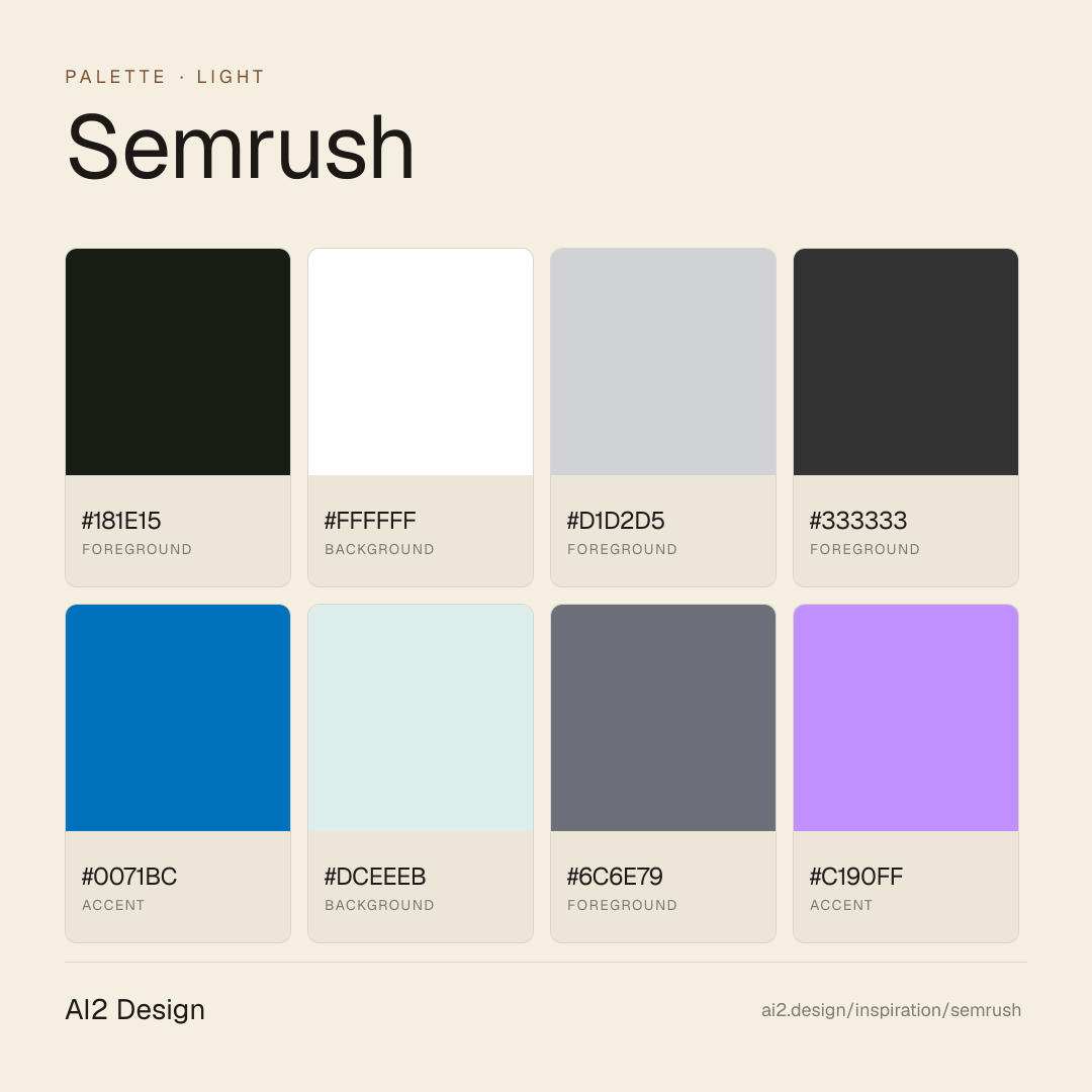
Light-first enterprise-marketing canvas. Warm #ffffff ground, dark olive ink #181e15 for primary text, slate #333333 for secondary, #6c6e79 for metadata. Lazzer Variable as the display voice (24-60px marketing moments), Inter as the workhorse (12-16px UI and data density). Corporate blue #0071bc is the trust accent, lavender #c190ff is the delight accent — two-accent system, never combined. Pastel surface variants (#dceeeb mint, #c190ff lavender at 15-25% alpha) divide sections without committing to colour-fill territory. Wide 1440 hero canvas + 720 reading rail — confident enterprise breathing room.
Main prompt
Use this capture as a design language transfer brief for my project. Adopt the palette (light-first #ffffff canvas + #181e15 primary olive ink + #333333 secondary + slate descender scale + two-accent corporate blue #0071bc and lavender #c190ff, pastel surface variants at 15-25% alpha), typographic duet (Lazzer Variable for display 24-60px + Inter for UI and data 12-16px), 4px-base spacing scale heavy at 1/4/6/8/12/14, wide 1440 hero canvas + 720 reading rail, restrained 2-variant shadow system, expressive but disciplined motion (10 transitions), 640/768/1024/1280/1440 breakpoint ladder. Treat this as my project's constitution. Apply the language, not the source brand. When I ask you to build a page or component, enforce these rules by default and call out any deviation.
Overview
- Layout
- Multi-column wide canvas with editorial reading rail nested inside; section dividers use pastel surface variants for ambient colour zoning.
- Content width
- 720px primary reading rail centred inside 1440px hero canvas; section bands break out to full 1440.
- Framing
- Enterprise reading room — wide, warm-white, confident.
- Grid strength
- Strong 12-column grid at desktop, collapses to 4-column at tablet; reading rhythm follows column count.
Color philosophy
Warm #ffffff ground + olive #181e15 ink + slate descender scale carry reading; two-accent system (corporate blue + lavender) handles attention without combining.
- #ffffff for primary background, never #f5f5f5 or off-white
- #181e15 olive ink for body — softer than pure #000, easier on long reading
- #333333 secondary, #6c6e79 metadata, #d1d2d5 hairlines
- #0071bc corporate blue: CTAs, primary links, focus rings (trust signal)
- #c190ff lavender: success states, hero moments, delight (never combined with blue in the same component)
- #dceeeb mint at 15-25% alpha: section background bands
Gradients (paste-ready)
4 gradients catalogued — soft pastel atmosphere on section dividers, never as button fill or hero backdrop
Typography rules
- Lazzer Variable for all display moments (24-60px) — marketing headlines, section titles, brand voice
- Inter for all UI, body, data tables, captions (12-16px range)
- Weights: Lazzer 500/600 for display, Inter 400/500/600 for UI
- Line-height 1.4-1.5 for body, 1.1-1.2 for Lazzer display
- Letter-spacing: 0 for Inter body, -0.01em for Lazzer display headlines
Spacing rules
- 4px base unit, heaviest use at 1/4/6/8/12/14px increments
- Section vertical rhythm: 80-160px between major content blocks
- Card internal padding: 24-32px standard; CTA padding: 12-14px vertical / 24-32px horizontal
- Data table cell padding: 8-12px (Inter sized to match)
Design tokens
Palette, type, and space — all agent-readable.
9 colors · hex / rgb / hsl / oklch
- foregroundmp-off-black80%
- HEX
#181E15 - RGB
rgb(24, 30, 21) - HSL
hsl(100, 18%, 10%) - OKLCH
oklch(22.57% 0.0192 135.28)
- HEX
- backgroundmp-focus-color-invert6%
- HEX
#FFFFFF - RGB
rgb(255, 255, 255) - HSL
hsl(0, 0%, 100%) - OKLCH
oklch(100.00% 0.0000 89.76)
- HEX
- foregroundmp-medium-grey5%
- HEX
#D1D2D5 - RGB
rgb(209, 210, 213) - HSL
hsl(225, 5%, 83%) - OKLCH
oklch(86.39% 0.0043 271.36)
- HEX
- foreground4%
- HEX
#333333 - RGB
rgb(51, 51, 51) - HSL
hsl(0, 0%, 20%) - OKLCH
oklch(32.11% 0.0000 89.76)
- HEX
- accent2%
- HEX
#0071BC - RGB
rgb(0, 113, 188) - HSL
hsl(204, 100%, 37%) - OKLCH
oklch(53.58% 0.1444 248.04)
- HEX
- backgroundmp-mint1%
- HEX
#DCEEEB - RGB
rgb(220, 238, 235) - HSL
hsl(170, 35%, 90%) - OKLCH
oklch(93.49% 0.0194 184.90)
- HEX
- foregroundmp-dark-grey1%
- HEX
#6C6E79 - RGB
rgb(108, 110, 121) - HSL
hsl(231, 6%, 45%) - OKLCH
oklch(54.03% 0.0172 277.60)
- HEX
- accentmp-lavendar1%
- HEX
#C190FF - RGB
rgb(193, 144, 255) - HSL
hsl(266, 100%, 78%) - OKLCH
oklch(74.37% 0.1617 303.05)
- HEX
- foregroundmp-shadow-glass0%
- HEX
#000000 - RGB
rgb(0, 0, 0) - HSL
hsl(0, 0%, 0%) - OKLCH
oklch(0.00% 0.0000 0.00)
- HEX
Inspector
Tab through the captured artifacts.
Six observable layers — page structure, fonts, breakpoints, z-index, gradients, motion — kept paste-ready alongside the tokens above.
Page structure
Semantic hierarchy at a glance.
Depth-first walk of meaningful sections — header, navigation, main regions, articles, footer. 12 nodes captured; depth capped at 6 for readability.
- body
- └─ div (×9)
- └─ div
- ├─ Main
- │ └─ div
- │ ├─ Section
- │ │ └─ Section
- │ ├─ div
- │ │ └─ Section (×2)
- │ └─ Section (×5)
- └─ div
- └─ Footer
Accessibility
WCAG contrast matrix.
62 combinations · 28 pass AA · 22 pass AAA · APCA Lc shown alongside WCAG 2.1 ratio for draft WCAG 3 awareness.
| Preview | fg | bg | Ratio | Normal | Large | APCA Lc | Context |
|---|---|---|---|---|---|---|---|
Aa | #FFFFFF | #000000 | 21.00 | AAA | AAA | -108 | background on foreground |
Aa | #000000 | #FFFFFF | 21.00 | AAA | AAA | +106 | foreground on background |
Aa | #DCEEEB | #000000 | 17.47 | AAA | AAA | -94 | background on foreground |
Aa | #000000 | #DCEEEB | 17.47 | AAA | AAA | +94 | foreground on background |
Aa | #181E15 | #FFFFFF | 17.00 | AAA | AAA | +104 | foreground on background |
Aa | #FFFFFF | #181E15 | 17.00 | AAA | AAA | -106 | background on foreground |
Aa | #181E15 | #DCEEEB | 14.14 | AAA | AAA | +92 | foreground on background |
Aa | #DCEEEB | #181E15 | 14.14 | AAA | AAA | -93 | background on foreground |
Aa | #D1D2D5 | #000000 | 13.89 | AAA | AAA | -79 | foreground on foreground |
Aa | #000000 | #D1D2D5 | 13.89 | AAA | AAA | +80 | foreground on foreground |
Image strategy
Asset loading & format policy.
Observable image posture — total count, lazy-loading ratio, and format mix. Hero image is measured above the fold.
- Full Page
- saas
- productivity
- content
- light
- 2026-05-15
Editorial credit
Featured Sponsor slot — your brand here
Dedicated logo placement — no rotation, on every export.
COMPARE THIS WITH
Side-by-side reads sharing this design signal.
See also