Cursor · Full Page
Cursor
AI IDE marketing page'in dramatic restraint çalışması — near-empty hero canvas, monospace-influenced typography, tek hero screenshot. AI gold rush'ın gradient-and-particle çağında confidence-by-absence playbook'unun lodestar'ı.

Editorial disclaimer
Editorial noteThis entry documents observable design-language patterns for educational transfer and AI-agent briefing. Screenshots and trademarks are property of their respective owners. AI2 Design is not affiliated with or endorsed by the featured brand. Inspiration here is about language and rhythm — do not reproduce brand identity, logo, product copy, or proprietary features.
Curator verdict
Why we catalogued it?
Cursor is the marketing page that turned a developer fork of VS Code into a generational AI category — and it did so by trusting a single, almost defiantly minimal canvas. We catalogued it because in 2026 every AI tool is shouting in gradients and chrome, and Cursor decided to do the opposite: a near-empty stage, one giant headline, one product surface, and the IDE itself doing the talking. If you are shipping an AI-native product that wants to be taken seriously by engineers rather than founders, this is the reference. The page assumes you already know what an editor is — its job is just to stand out of the way of the demo.
Design decisions observed
- Near-empty hero canvas — one massive headline, one IDE screenshot, no marketing chrome. Trust the product.
- Monospace-adjacent typography ladder — the page reads like a terminal that learned how to whisper, not how to perform.
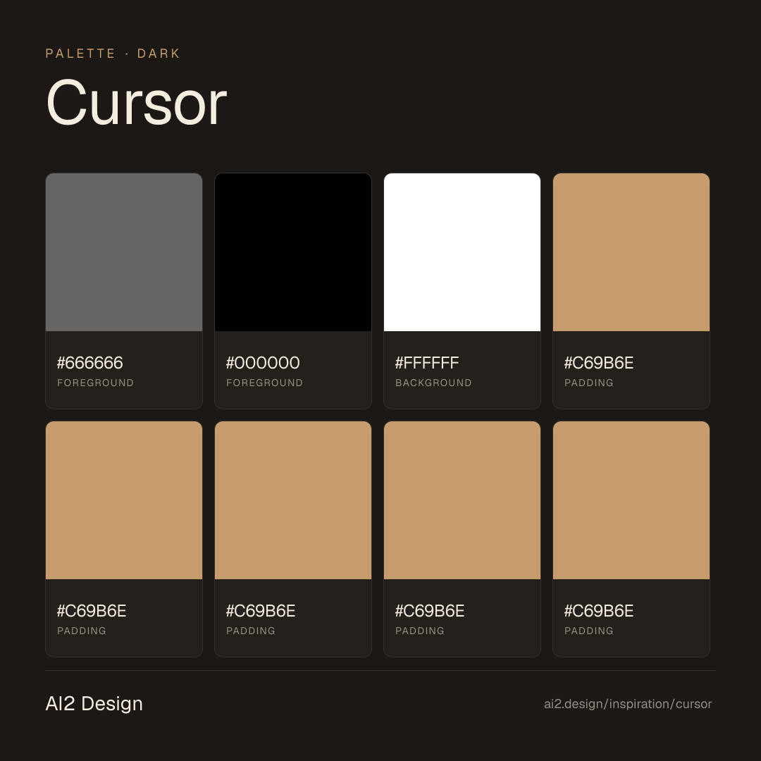
- Cool grey ground (#FFFFFF dominant with #666666 text in our capture) keeps the IDE screenshot as the only chromatic anchor.
- No carousels, no testimonial walls, no comparison tables — every section is a single statement with maximum air around it.
- The marketing motion is restrained to subtle scroll-reveals; the dramatic motion lives inside the embedded IDE preview where it earns the spectacle.
What to study
- How to launch an AI product without falling into the gradient-and-particle trap — Cursor's confidence is in absence, not addition. Steal the discipline of trusting your product surface to do the marketing.
- Monospace as marketing typography — usually a developer-only signal, but Cursor uses it as positioning. The page reads as if the editor is writing its own pitch.
- Single-screenshot hero — most AI tools cram a five-frame loop with annotations. Cursor uses one still and lets the headline finish the sentence.
What to avoid
- Don't copy the emptiness if your product isn't already iconic — Cursor earned the right to whitespace through ubiquity. A pre-launch startup needs to show more.
- Don't lift the monospace headline lockup without owning a developer audience — it reads as costume play in a non-engineering context.
Taste notes
The page feels like the IDE itself learned restraint — every interaction has the same weight as a thoughtful pull request comment. Nothing is loud, nothing is decorative, and yet the page is unmistakably premium because everything that exists is essential. This is what mature developer-tool marketing looks like in the AI era: the confidence to delete more than you add.
Lineage & references
- Direct heir to the Linear / Vercel restraint school — same conviction that engineers will read a single beautifully-typeset sentence over five animated bullet points.
- Stands alongside the AI-native generation that earned credibility through usage rather than promise (Bolt.new, Lovable, v0) — but Cursor pre-dates the AI-app-builder gold rush and has the visual confidence to match.
- Belongs to the post-VS-Code editor lineage (Zed, Warp, Cursor) — fast, dark-when-it-matters, with marketing pages that look more like documentation than landing pages.
Design language brief
Paste-ready for your agent.
A typed design system transfer brief — philosophy, tokens, rules, techniques, and fitness checks. Your agent reads the whole language, not just the pixels.
Philosophy
Cursor's design language is confidence through deletion. A near-empty light canvas, monospace-influenced typography, and a single hero screenshot that does the entire pitch. The marketing page does not perform — it presents. Motion is reserved for the IDE preview itself; the surrounding chrome stays still. Every element on the page earns its pixel cost by carrying load the headline alone cannot.
Main prompt
Use this capture as a design language transfer brief for my project. Adopt the palette (off-white #ffffff ground + #666666 secondary text + #000000 primary text; no decorative accents on the marketing surface — accent colour lives inside the product IDE preview), monospace-adjacent UI typography (ui-monospace + system fallback at 12-16px body, dramatic serif or grotesque display at 56-96px headlines), generous editorial spacing (4px base, but section gaps 160-240px), single-column reading flow with one product screenshot as the sole visual anchor, and Tailwind-standard 640/768/1024/1280 breakpoints. Treat absence as a design tool — every element must justify its existence. Apply the language, not the source brand's copy. When I ask you to build a page or component, enforce these rules by default.
Overview
- Layout
- Single-column reading flow with one hero screenshot anchoring the page; each section is a statement, not a feature list.
- Content width
- 768-896px editorial rail; the hero screenshot breaks out to ~1280px maximum.
- Framing
- Empty stage — the page is a frame for the IDE, not a presentation of features.
- Grid strength
- Implicit — 4px base unit governs spacing, but the page's rhythm comes from typography size jumps and white space, not column lines.
Color philosophy
Off-white ground (#ffffff) with restrained greyscale type (#666666 secondary, #000000 primary). The marketing canvas has no decorative accent — chromatic life is inside the product preview.
- #ffffff dominant ground — the page floats
- #666666 for secondary text and metadata
- #000000 reserved for primary text and the wordmark
- Brand accents (neon green, gradient) appear only inside the IDE screenshot, never on marketing chrome
Gradients (paste-ready)
No gradients on the marketing surface; product preview internals may carry them
Typography rules
- ui-monospace + system fallback as the entire UI stack — terminal-adjacent without being affected
- Display headlines large and quiet (56-96px), letter-spaced tight (-0.02em)
- Body 14-16px with generous 1.6 line-height
- Weight ladder is binary — 400 body, 500-600 emphasis; no decorative weight middle ground
- All-caps tracking 0.18em for the few kicker labels that exist
Spacing rules
- 4px base unit
- Section vertical rhythm: 160-240px between major sections (extreme breathing)
- Card internal padding rare — most surfaces are flat
- Hero-to-content transition: 120px minimum
Design tokens
Palette, type, and space — all agent-readable.
3 colors · hex / rgb / hsl / oklch
- foreground86%
- HEX
#666666 - RGB
rgb(102, 102, 102) - HSL
hsl(0, 0%, 40%) - OKLCH
oklch(51.03% 0.0000 89.76)
- HEX
- foreground10%
- HEX
#000000 - RGB
rgb(0, 0, 0) - HSL
hsl(0, 0%, 0%) - OKLCH
oklch(0.00% 0.0000 0.00)
- HEX
- background5%
- HEX
#FFFFFF - RGB
rgb(255, 255, 255) - HSL
hsl(0, 0%, 100%) - OKLCH
oklch(100.00% 0.0000 89.76)
- HEX
Inspector
Tab through the captured artifacts.
Six observable layers — page structure, fonts, breakpoints, z-index, gradients, motion — kept paste-ready alongside the tokens above.
Page structure
Semantic hierarchy at a glance.
Depth-first walk of meaningful sections — header, navigation, main regions, articles, footer. 4 nodes captured; depth capped at 6 for readability.
- body
- └─ div
- ├─ Main
- └─ Footer
Accessibility
WCAG contrast matrix.
6 combinations · 4 pass AA · 2 pass AAA · APCA Lc shown alongside WCAG 2.1 ratio for draft WCAG 3 awareness.
| Preview | fg | bg | Ratio | Normal | Large | APCA Lc | Context |
|---|---|---|---|---|---|---|---|
Aa | #000000 | #FFFFFF | 21.00 | AAA | AAA | +106 | foreground on background |
Aa | #FFFFFF | #000000 | 21.00 | AAA | AAA | -108 | background on foreground |
Aa | #666666 | #FFFFFF | 5.74 | AA | AAA | +79 | foreground on background |
Aa | #FFFFFF | #666666 | 5.74 | AA | AAA | -84 | background on foreground |
Aa | #666666 | #000000 | 3.66 | — | AA | -23 | foreground on foreground |
Aa | #000000 | #666666 | 3.66 | — | AA | +25 | foreground on foreground |
- Full Page
- ai
- developer-tools
- dark
- 2026-05-16
Editorial credit
Featured Sponsor slot — your brand here
Dedicated logo placement — no rotation, on every export.
COMPARE THIS WITH
Side-by-side reads sharing this design signal.
See also