GitBook · Full Page
GitBook
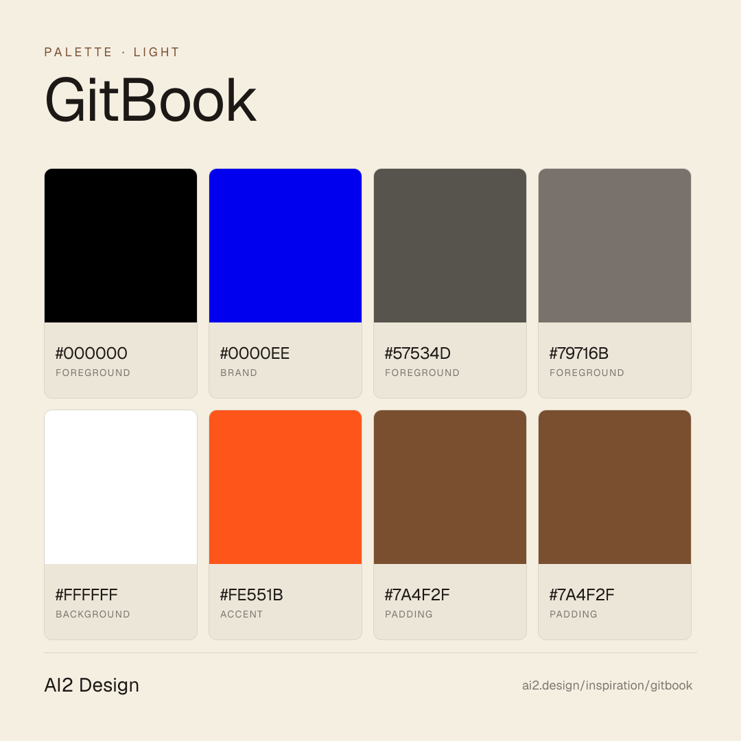
The docs-platform landing that reads like a published field manual — warm stone palette, pure black ink, zero gradients, and a single sharp orange accent used like a highlighter margin note. GitBook demonstrates a rare 2026 discipline: three typographic voices from three different foundries (General Sans Variable for display, Inter for body, Geist Mono for code), each holding a strict register, paired with a radically minimal elevation grammar — only three drop shadows, all soft. Preserved native #0000ee hyperlink blue signals editorial credibility from the OSS docs-tooling cohort.

Editorial disclaimer
Editorial noteThis entry documents observable design-language patterns for educational transfer and AI-agent briefing. Screenshots and trademarks are property of their respective owners. AI2 Design is not affiliated with or endorsed by the featured brand. Inspiration here is about language and rhythm — do not reproduce brand identity, logo, product copy, or proprietary features.
Curator verdict
Why we catalogued it?
GitBook is the docs-platform landing that reads like a published field manual — warm stone palette, pure black ink, zero gradients, and a single sharp orange accent used like a highlighter margin note. We catalogued it because it demonstrates a rare 2026 discipline: three typographic voices from three different foundries (General Sans Variable for display, Inter for body, Geist Mono for code), each holding a strict register, paired with a radically minimal elevation grammar — only three drop shadows, all soft. If you are shipping a documentation or content-authoring product that needs to signal editorial seriousness to both engineers and writers, this is the reference to keep open.
Design decisions observed
- Pure black ink on light canvas — the decisive contrast choice that signals editorial gravitas. No near-black consensus here; commitment to actual #000000 gives the page the weight of a printed manual.
- Warm stone palette instead of cool slate — every neutral leans toward the warm side (#000000 charcoal, #57534d stone, #ffffff cream). The page reads as 'library paper' rather than 'cold metal', even while staying monochrome.
- A single accent orange, used like a highlighter pen — #fe551b appears on less than 1% of the surface but becomes the visual signature. Three quarters of brands over-spend their accent budget; GitBook under-spends and wins.
- Three-foundry typographic trinity — General Sans Variable carries voice, Inter carries body, Geist Mono carries code. Strict register separation; mixing breaks the identity instantly.
- Preserved native #0000ee hyperlink blue — the classic web link colour survives unmodified. This is the OSS editorial signal shared with Lightdash and the docs-tooling cohort: credibility by restraint.
- Minimal shadow vocabulary (3 drops only) — shadow-xs, sm, md and nothing else. Depth is delivered through typography weight and spacing, not through elevation choreography.
- Zero gradients — an almost impossible commitment in a 2026 SaaS landing. GitBook lets colour and typography do all the persuasion, and the page feels remarkably unpressured as a result.
What to study
- How to split a typographic identity across three foundries without drift — GitBook's General Sans / Inter / Geist Mono trinity is the masterclass for docs-product registers (display / body / code).
- Warm-stone neutrals as an editorial decision — reach for the warm-stone descender (#57534d / #79716b) instead of a cool-slate gray when the brand should feel paper-adjacent rather than software-adjacent. The subtlety moves the page's whole emotional register.
- Single-hue accent at minimum surface — orange #fe551b below 1% of the viewport is more memorable than any rainbow palette above 5%. Learn where to withhold colour to make the colour you use land.
- The 10px spacing peak — GitBook's spatial rhythm centres on 10 rather than 8 or 12. Counter-intuitive, slightly softer than 8-grid, slightly tighter than 12-grid. A small distinctive choice that shapes the whole feel.
- Zero-gradient commitment on a SaaS landing — if you can make your page work without gradient rescue, you learn what your content is actually doing visually. A design-audit exercise disguised as a restriction.
What to avoid
- Do not buy General Sans Variable Trial for production without proper licensing — GitBook ships it through Framer's CDN and licensing is the user's responsibility in the source context. Use a commercially licensed grotesque (Inter, Söhne, Geist) if you need the same tone without the exposure.
- Do not adopt pure #000 text on pure #ffffff without testing on real screens — the contrast is maximum (21:1 AAA) but can feel harsh in long-form reading. GitBook's warm cream #ffffff is likely used on block surfaces to reduce glare; replicate that pairing.
- Do not copy the zero-gradient rule if your brand lives on visual atmosphere — GitBook earns the restraint because docs platforms want 'printed manual' gravitas. Consumer landings lose warmth with the same rule.
Taste notes
The page reads like a well-typeset field manual that happens to be marketing — warm-stone neutrals, decisive black ink, a single orange highlight, and three families of type each doing one job. The absence of gradient, the restraint on accent, and the preserved hyperlink blue all conspire to suggest that this is software built by people who read more than they scroll. Editorial respectability without austerity.
Lineage & references
- Stands with the docs-platform editorial class (Notion pre-2024 marketing, Mintlify, ReadMe, Linear docs) — pages that commit to paper-and-ink gravitas while shipping web-grade product imagery.
- Part of the Framer-hosted small-foundry editorial cohort (shares architecture with Lightdash) — small teams that lean on Framer's font CDN to deploy Trial-licensed display faces alongside a licensed body family.
- Shares the preserved-native-hyperlink editorial move with Lightdash, dbt Labs and the OSS data tooling generation — restraint-as-credibility signal.
Design language brief
Paste-ready for your agent.
A typed design system transfer brief — philosophy, tokens, rules, techniques, and fitness checks. Your agent reads the whole language, not just the pixels.
Philosophy
Light-first editorial docs-platform canvas. Pure white #ffffff primary background with pure #000 primary ink (freq 3165) — the decisive rejection of near-black for maximum editorial contrast. Secondary text descends through a warm stone ladder: #57534d (muted) → #79716b (captions) — NOT cool slate, leans paper-adjacent. Dark regions use warm charcoal #000000 and light-on-dark surfaces use warm cream #ffffff. Typography is a strict three-foundry trinity: General Sans Variable (display voice), Inter (body reading), Geist Mono (code / tabular) — each foundry holds one register. Accent is a single signature orange #fe551b used below 1% surface area as a visual highlighter. Preserved native #0000ee hyperlink blue for inline anchors — editorial credibility signal. Elevation is minimal: three drop shadows only (shadow-xs / sm / md), no inner shadows, no rings. Zero gradients. Motion is moderate via Framer Motion.
Main prompt
Use this capture as a design language transfer brief for my project. Adopt the palette (light-first #ffffff canvas + pure #000 primary ink + warm stone descender ladder #57534d / #79716b + warm charcoal #000000 for dark regions + warm cream #ffffff for light surfaces + signature orange #fe551b used below 1% surface + preserved native #0000ee hyperlink blue), typographic trinity (General Sans Variable for display voice paired with Inter for body and Geist Mono for code / tabular, each foundry holding exactly one register), 2px-base spacing scale with unusual 10px dominant peak, two-tier container ladder 332px narrow reading rail inside 1160px main rail, minimal three-shadow grammar (xs 0 1 2 drop, sm 0 4 12 drop, md 0 1 5 soft drop — no rings, no inner shadows), ZERO gradients, border-radius peaks at 8px (interactive) / 16px (cards) with unusual 88px 'extra' tier for large blob frames, moderate Framer Motion with color transitions only, custom md=810 breakpoint and xl=1200 breakpoint. Treat this as my project's constitution — every new component should pass as if crafted in the same studio. Apply the language, not the source brand's copy or identity. When I ask you to build a page or component, enforce these rules by default, and call out any decision that deviates.
Overview
- Layout
- Grid
- Content width
- Bounded
- Framing
- Flat
- Grid strength
- Moderate
Color philosophy
Light-first canvas — pure white #ffffff (freq 94) primary surface paired with pure #000 primary ink (freq 3165 — the editorial signature). Warm stone descender ladder: #57534d (muted text) → #79716b (captions / tertiary). Dark region backgrounds use warm charcoal #000000 with warm cream #ffffff for light-on-dark contrast. Single signature accent is orange #fe551b (freq 26 — under 1% of surface). Preserved native hyperlink blue #0000ee (freq 898) for inline anchors — editorial credibility signal inherited from the OSS docs-tooling cohort.
- Primary reading pair: pure #000 text on #ffffff background (measured 3165 + 94 occurrences — dominant surface)
- Warm stone descender: #57534d for muted body text, #79716b for captions / tertiary labels / metadata
- Dark region surface: warm charcoal (cluster-merged into #000000 in current extract) for alternate-tone sections, paired with white foreground
- Light cream #ffffff used as alternate light surface (reduces glare vs pure white on long-form blocks)
- Signature accent orange #fe551b for single-moment emphasis (brand CTAs, highlight badges, marginal notes) — surface area stays below 1%
- Preserved link colour #0000ee for inline anchors — do not substitute a branded blue
Gradients (paste-ready)
No gradients observed — radical editorial austerity. Depth is delivered through typography weight, spacing and soft drop shadow only.
Typography rules
- Display family: General Sans Variable — Bold axis carries hero display (70/70 -1.4px letter-spacing), medium display (20/26 -0.4px), and compact headlines (16/16 -0.48px). A small-foundry variable grotesque with editorial weight; delivered via @font-face from framerusercontent.com.
- Body family: Inter — 16/19.2 for standard body, 11/12.99 for fine print and metadata. Always paired with General Sans, never substituted.
- Code / tabular family: Geist Mono — 14/18.2 with -0.28px letter-spacing. Reserved for code, kbd, inline snippets, version numbers, hashes. Do not substitute a generic monospace.
- Three-foundry rule: General Sans / Inter / Geist Mono. Each foundry holds exactly one register. Mixing (e.g. using General Sans for body) breaks the trinity identity.
- Observed size ladder: 11 / 12 / 14 / 16 / 18 / 20 / 70 px. Hero display jumps directly from sub-display (20px) to heroic (70px) — this gap is intentional editorial rhythm.
- Letter-spacing in px, not em: -1.4px at 70px display, -0.48px at 16px tight UI, -0.18px at 18px body-lead, -0.28px on Geist Mono for optical alignment.
- Paragraph max ~55-65 ch at body 16-18px to echo the 332px narrow reading rail.
Spacing rules
- 2px base unit. Observed scale: 2 / 4 / 6 / 8 / 10 / 12 / 14 / 16 / 20 / 24 / 32 / 40 px. DOMINANT usage at unusual 10px peak (freq 429 — counter-intuitive vs typical 8 or 12 grids), followed by 6 (165) / 8 (117) / 24 (75) / 14 (74).
- The 10px rhythm centres the spatial identity. Keep gaps and gutters in multiples of 2 but prefer 10 as the natural beat wherever possible (e.g. 10px between icon and label, 20px between related items, 40px between sections).
- Two-tier container ladder: 332px narrow reading rail (dominant content column for body copy and testimonials), 1160px main rail (product-forward feature sections, hero canvas).
- Card padding: 16 / 20 / 24 / 32 px, aligned to the scale.
- Section vertical rhythm: 40 / 64 / 96 px desktop, 24 / 40 / 64 mobile — multiples of 8 and 40 for major breaks.
Design tokens
Palette, type, and space — all agent-readable.
6 colors · hex / rgb / hsl / oklch
- foreground69%
- HEX
#000000 - RGB
rgb(0, 0, 0) - HSL
hsl(0, 0%, 0%) - OKLCH
oklch(0.00% 0.0000 0.00)
- HEX
- brand19%
- HEX
#0000EE - RGB
rgb(0, 0, 238) - HSL
hsl(240, 100%, 47%) - OKLCH
oklch(42.90% 0.2973 264.05)
- HEX
- foreground6%
- HEX
#57534D - RGB
rgb(87, 83, 77) - HSL
hsl(36, 6%, 32%) - OKLCH
oklch(44.41% 0.0110 78.21)
- HEX
- foreground3%
- HEX
#79716B - RGB
rgb(121, 113, 107) - HSL
hsl(26, 6%, 45%) - OKLCH
oklch(55.40% 0.0136 59.40)
- HEX
- background2%
- HEX
#FFFFFF - RGB
rgb(255, 255, 255) - HSL
hsl(0, 0%, 100%) - OKLCH
oklch(100.00% 0.0000 89.76)
- HEX
- accent1%
- HEX
#FE551B - RGB
rgb(254, 85, 27) - HSL
hsl(15, 99%, 55%) - OKLCH
oklch(67.50% 0.2143 36.97)
- HEX
Inspector
Tab through the captured artifacts.
Six observable layers — page structure, fonts, breakpoints, z-index, gradients, motion — kept paste-ready alongside the tokens above.
Page structure
Semantic hierarchy at a glance.
Depth-first walk of meaningful sections — header, navigation, main regions, articles, footer. 3 nodes captured; depth capped at 6 for readability.
- body
- ├─ div
- └─ button
Accessibility
WCAG contrast matrix.
26 combinations · 10 pass AA · 6 pass AAA · APCA Lc shown alongside WCAG 2.1 ratio for draft WCAG 3 awareness.
| Preview | fg | bg | Ratio | Normal | Large | APCA Lc | Context |
|---|---|---|---|---|---|---|---|
Aa | #000000 | #FFFFFF | 21.00 | AAA | AAA | +106 | foreground on background |
Aa | #FFFFFF | #000000 | 21.00 | AAA | AAA | -108 | background on foreground |
Aa | #0000EE | #FFFFFF | 9.40 | AAA | AAA | +88 | brand on background |
Aa | #FFFFFF | #0000EE | 9.40 | AAA | AAA | -93 | background on brand |
Aa | #57534D | #FFFFFF | 7.64 | AAA | AAA | +87 | foreground on background |
Aa | #FFFFFF | #57534D | 7.64 | AAA | AAA | -91 | background on foreground |
Aa | #000000 | #FE551B | 6.53 | AA | AAA | +46 | foreground on accent |
Aa | #FE551B | #000000 | 6.53 | AA | AAA | -44 | accent on foreground |
Aa | #79716B | #FFFFFF | 4.79 | AA | AAA | +73 | foreground on background |
Aa | #FFFFFF | #79716B | 4.79 | AA | AAA | -79 | background on foreground |
Image strategy
Asset loading & format policy.
Observable image posture — total count, lazy-loading ratio, and format mix. Hero image is measured above the fold.
Hero image
https://framerusercontent.com/images/UBZ9X5BHbNP7sRuU7qGfH2i38C8.png?width=2268&height=1004- Format
- PNG
- Dimensions
- 2126×941
- Loading
- auto
- srcset
- yes
- srcset descriptor
- https://framerusercontent.com/images/UBZ9X5BHbNP7sRuU7qGfH2i38C8.png?scale-down-to=512&width=2268&height=1004 512w,https://framerusercontent.com/images/UBZ9X5BHbNP7sRuU7qGfH2i38C8.png?scale-down-to=1024&width=2268&height=1004 1024w,https://framerusercontent.com/images/UBZ9X5BHbNP7sRuU7qGfH2i38C8.png?scale-down-to=2048&width=2268&height=1004 2048w,https://framerusercontent.com/images/UBZ9X5BHbNP7sRuU7qGfH2i38C8.png?width=2268&height=1004 2268w
- Full Page
- developer-tools
- saas
- content
- light
- 2026-04-23
Frequently asked
Questions people ask about GitBook
Answers are pulled from the curator verdict and design brief — the same text your AI agent sees when it paste-reads this page.
What makes GitBook's marketing page read like a published field manual?
GitBook commits to docs-platform identity with warm stone palette, pure black ink, zero gradients, and a three-foundry typographic trio — General Sans for display, Inter for body, Geist Mono for code. A single orange accent (#fe551b) punctuates like a highlighter margin note. It's editorial discipline from cover to colophon.
What fonts and palette does GitBook use?
A triple-foundry trinity: General Sans Variable (display), Inter (body), Geist Mono (code) — three families, three registers, zero overlap. The palette is warm stone base, pure #000 text, and a single sharp orange accent (#fe551b) used sparingly. Zero gradients anywhere on the page — a rare 2026 discipline.
Can I apply GitBook's editorial discipline to my docs site?
Pick three font families from three different foundries (display, body, mono), commit to one sharp accent color, and remove every gradient. Let orange mean something specific — a keyword highlight, a CTA, a margin note — and never atmosphere. The AI2 Design brief captures the ten-pixel spacing peak and the accent usage rules for paste-ready transfer.
Editorial credit
Featured Sponsor slot — your brand here
Dedicated logo placement — no rotation, on every export.
COMPARE THIS WITH
Side-by-side reads sharing this design signal.
See also