Lightdash · Full Page
Lightdash
The open-source BI landing that earns the attention of both engineering leads and design-minded PMs — a page that reads like well-typeset documentation wrapped around a dashboard. Lightdash commits to three unfashionable choices at once: pure black primary ink against an off-white canvas, a small-foundry display face (Britti Sans Variable) paired with Inter Variable as the only typographic voices, and the preserved native #0000ee hyperlink blue as an editorial credibility signal. Elevation runs on a multi-layer soft shadow grammar (up to four stacked layers) that makes cards feel printed rather than floated.

Editorial disclaimer
Editorial noteThis entry documents observable design-language patterns for educational transfer and AI-agent briefing. Screenshots and trademarks are property of their respective owners. AI2 Design is not affiliated with or endorsed by the featured brand. Inspiration here is about language and rhythm — do not reproduce brand identity, logo, product copy, or proprietary features.
Curator verdict
Why we catalogued it?
Lightdash is the rare open-source data landing that earns the attention of both engineering leads and design-minded PMs — a page that feels like well-typeset documentation wrapped around a dashboard. We catalogued it because it commits to three unfashionable choices at once: a pure-black primary ink against an off-white canvas, a display serif-adjacent wordmark from a small foundry deployed alongside a clean grotesque body, and the decision to preserve the classic #0000ee hyperlink blue as an editorial signal rather than replacing it with a branded hue. If you are shipping a product that needs to look credible to a data team and human to a curious reader at the same time, this is the page to keep open.
Design decisions observed
- Pure black text on an off-white canvas — one of the very few 2026 landings that refuses the softer near-black consensus most peers settle on. The commitment gives the page the weight of a printed technical journal.
- A two-foundry typographic duet — Britti Sans Variable carries display voice, Inter Variable carries body, and the handoff between them is the only stylistic gesture on the page.
- Integration-chip palette treated as first-class colour — the Slack / Google / Google Sheets tint swatches appear alongside the brand palette rather than being ghettoised as logo decorations.
- Classic hyperlink blue preserved — the #0000ee native link colour survives unmodified, signalling open-source editorial credibility in a sea of custom brand blues.
- Shadow used as material rather than as elevation — multi-layer soft stacks (up to four layers on the flagship shadow-2xl) make cards feel printed onto the surface rather than floating above it.
- Framer Motion tuned to moderate, not expressive — 0.5s colour transitions dominate. The page moves like reading a well-designed paper report, not a SaaS demo.
What to study
- How a small-foundry display face (Britti Sans) used with variable-weight discipline can carry a brand better than any safe choice. The wordmark does more brand work than any illustration would.
- Off-white canvas as a reading ergonomics decision — #eceff3 reduces eye strain on long-form data pages without sacrificing the brightness of content blocks which sit on pure white.
- Preserving native web defaults as a brand choice — the #0000ee hyperlink blue is a credibility signal that costs nothing and only the most confident teams keep.
- Multi-layer soft shadow as elevation grammar — four stacked shadows at different blur radii produce a depth cue that reads as physical paper rather than CSS drop-shadow.
- Integration chips as a palette commitment — when your product is a connector, the partner colours are part of the brand. Design for them rather than around them.
What to avoid
- Do not adopt Britti Sans Trial in production without licensing it — Lightdash ships the Trial variants via Framer's CDN, which is fine during early marketing but not a long-term solution. Use a licensed variable grotesque (Geist, Inter, Söhne) if you need the same tone without the licensing exposure.
- Do not assume pure-black text is universally safer than a softer near-black — on pure-white surfaces pure black can feel harsh. The off-white canvas here mutes the contrast in exactly the right register.
- Do not paste the integration chip palette onto a non-data product — the permission to use Slack orange and Google red comes from being an actual integration platform. On a generic landing it reads as theft.
Taste notes
The page reads like documentation that happens to market — off-white canvas, pure black ink, minimal motion, minimal colour, and a typographic handoff doing almost all of the storytelling work. You are being shown how a product thinks, not sold its features. The editorial restraint is the brand.
Lineage & references
- Stands with the technical-documentation landing class (dbt Labs, Supabase pre-2024, Cal.com) — pages that market to engineers by looking like the reference docs rather than the marketing page.
- Part of the Framer-hosted small-foundry cohort — sites that lean on Framer's font CDN to ship Trial-licensed display faces alongside a licensed body family.
- Shares the editorial commitment of the open-source data tooling movement (Airbyte, Prefect, Dagster) — brands that earn trust by showing their work rather than dressing it up.
Design language brief
Paste-ready for your agent.
A typed design system transfer brief — philosophy, tokens, rules, techniques, and fitness checks. Your agent reads the whole language, not just the pixels.
Philosophy
Light-first editorial data landing. Off-white #eceff3 primary canvas (freq 283) paired with pure #000 primary ink (freq 3368 — the decisive rejection of near-black). Secondary text descends through #272835 → #36394a → #666d80 for progressive de-emphasis. Typography carries the entire personality: Britti Sans Variable (Trial Regular / Trial Semibold / Medium) for display, Inter / Inter Variable for body — a two-foundry duet with 129 @font-face declarations delivered from Framer's CDN (zero preload). Accent is signature purple #625df5, plus the preserved native #0000ee hyperlink blue used unmodified as an editorial credibility signal. Integration chips (Slack / Google / Google Sheets hues) are first-class palette citizens. Elevation is a multi-layer soft shadow grammar (up to four stacked layers on the flagship) that makes cards feel printed rather than floated. Motion stays moderate — Framer Motion in use, colour 0.5s ease dominant, plus a single cubic-bezier(0.44, 0, 0.56, 1) for chroma micro-interaction.
Main prompt
Use this capture as a design language transfer brief for my project. Adopt the palette (light-first #eceff3 off-white canvas + pure #000 primary ink + near-black descender ladder + signature purple #625df5 + preserved #0000ee native-link blue + integration-chip palette where relevant), typographic duet (Britti Sans Variable for display paired with Inter Variable for body, delivered via @font-face without preload), 2px base spacing scale with peaks at 8 / 16 / 10, four-tier graduated container ladder 724 / 836 / 1080 / 1280, multi-layer soft shadow grammar (three-layer for cards, four-layer for flagship surfaces), three-only gradient system (1px rail separators + soft fade, no decorative colour gradients), border-radius peaks at 8 / 12 + full-pill 80px, moderate Framer Motion with color 0.5s ease dominant and cubic-bezier(0.44, 0, 0.56, 1) for chroma micro-interactions, and a custom md=810 breakpoint. Treat this as my project's constitution — every new component should pass as if crafted in the same studio. Apply the language, not the source brand's copy or identity. When I ask you to build a page or component, enforce these rules by default, and call out any decision that deviates.
Overview
- Layout
- Grid
- Content width
- Bounded
- Framing
- Flat
- Grid strength
- Moderate
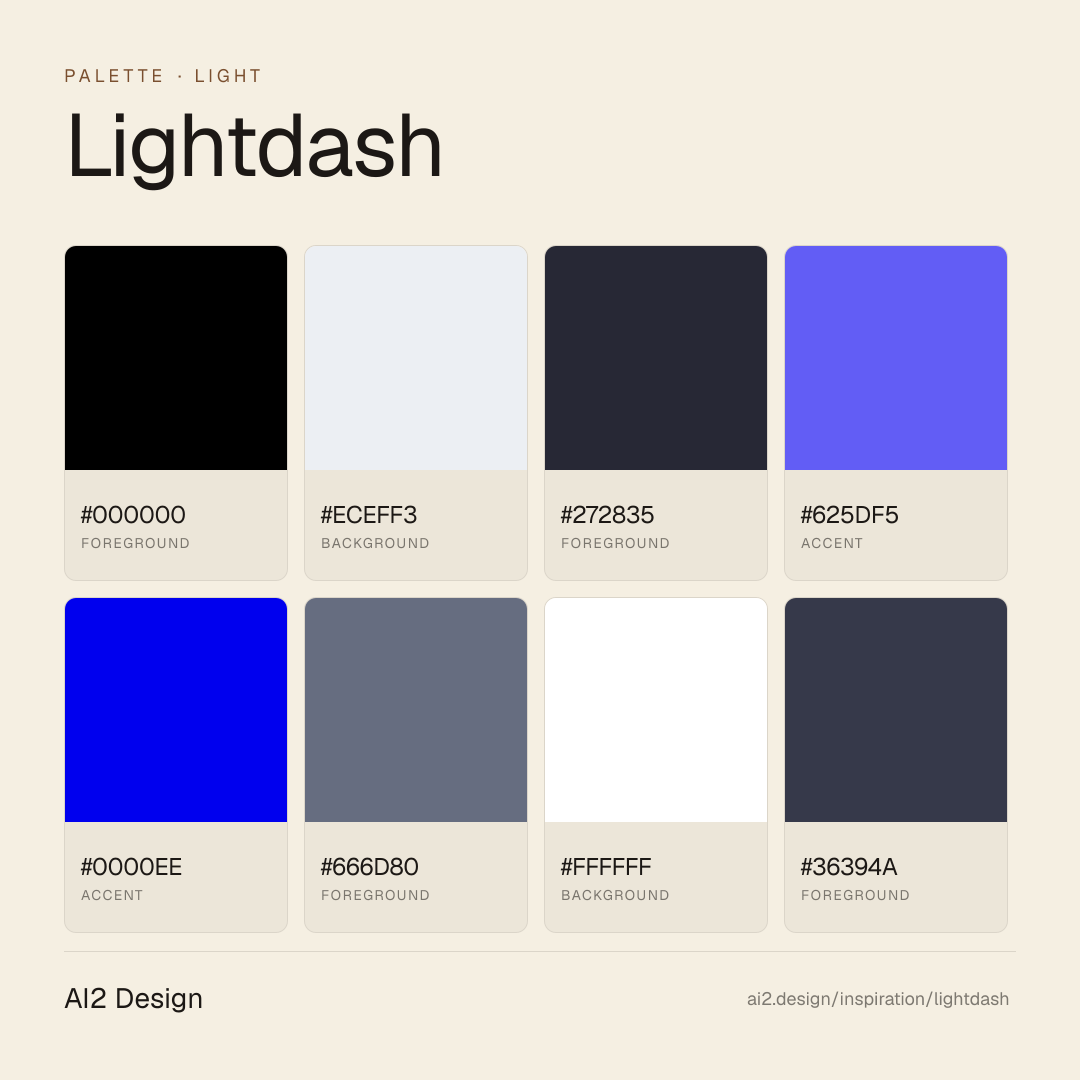
Color philosophy
Light-first canvas — cool off-white #eceff3 (freq 283) as primary background, with #ffffff (freq 97) reserved for elevated surfaces like cards and tables. Pure #000 text does the dominant reading (freq 3368 — the decisive choice). Secondary descender: #272835 → #36394a → #666d80 for progressive de-emphasis. Signature accent is purple #625df5 (freq 156); the native #0000ee hyperlink blue is preserved unmodified (freq 160) as an editorial credibility signal. Integration chip palette — #2eb67d, #ecb22e, #36c5f0, #ea4335, #4285f4, #e01e5a — used exclusively to identify partner products and third-party services, not as decorative brand colour.
- Primary reading pair: pure #000 text on #eceff3 off-white canvas (measured 3368 + 283 occurrences — dominant surface)
- Elevated surfaces: #ffffff for cards, table rows and modals against the off-white canvas
- Secondary descender: #272835 (muted body) → #36394a (cooler secondary) → #666d80 (captions / labels)
- Signature accent: #625df5 purple for primary CTAs, brand moments and product feature emphasis
- Preserved native link: #0000ee for inline anchor text — do not substitute a branded blue
- Integration chip palette (Slack / Google / Google Sheets / Figma brand hues) reserved for partner-product identification only
Gradients (paste-ready)
linear-gradient(rgba(0, 0, 0, 0) 1px, rgb(255, 255, 255) 0px)
linear-gradient(90deg, rgba(0, 0, 0, 0) 1px, rgb(255, 255, 255) 0px)
linear-gradient(rgb(248, 250, 251) 0%, rgba(248, 250, 251, 0) 100%)
Typography rules
- Display family: Britti Sans Variable (Trial Regular / Trial Semibold / Medium) — a small-foundry grotesque with editorial weight. Delivered via @font-face from framerusercontent.com; no preload observed. Licensing note: Trial variants are for evaluation — production use requires a commercial licence.
- Body family: Inter / Inter Variable — the default body companion. Do not swap to a second display family; the Britti + Inter duet is the identity.
- Size ladder observed: 12 / 15 / 16 / 18 / 20 / 24 / 48 / 76 px. Display hero at 48/48 with letter-spacing -0.96px (Britti Trial Regular or Semibold); XXL hero at 76/68.4 with normal tracking; sub-display at 24/31.2 with -0.48px (Britti Medium).
- Body at 16/24 with letter-spacing -0.16px (Inter) or 18/30.6 with -0.18px (Inter Variable) — the negative px tracking compensates at reading sizes.
- Britti Medium is used for UI labels at 16/32 (line-height 32 creates generous space), 20/24 for compact headers. Do not substitute the Medium weight — it is the secondary emphasis step.
- Do not use italic. Britti Sans has no observed italic cut; emphasis in body is carried via weight (Inter 500+).
- Paragraph max 55-70 ch at body 16-18px — echoes the 724 / 836 narrow container tiers.
Spacing rules
- 2px base unit. Observed scale: 2 / 4 / 6 / 8 / 10 / 12 / 14 / 16 / 18 / 20 / 22 / 24 px. Dominant usage: 8 (freq 227) / 16 (168) / 10 (118) / 20 (71) / 12 (69) / 24 (57).
- Four-tier graduated container ladder: 724 / 836 / 1080 / 1280 px. Use 724 for narrow reading-forward sections, 836 for medium editorial, 1080 for product-forward feature sections, 1280 as the full site rail (dominant, freq 8).
- Flex gap peaks at 8px and 16px — keep gutters on these steps wherever possible.
- Card padding scale: 16 / 20 / 24 / 32 px. Table cell padding typically 10-12 vertical, 16 horizontal.
- Section vertical rhythm: 48 / 64 / 96 px desktop, 32 / 48 / 64 mobile.
Design tokens
Palette, type, and space — all agent-readable.
20 colors · hex / rgb / hsl / oklch
- foreground70%
- HEX
#000000 - RGB
rgb(0, 0, 0) - HSL
hsl(0, 0%, 0%) - OKLCH
oklch(0.00% 0.0000 0.00)
- HEX
- background6%
- HEX
#ECEFF3 - RGB
rgb(236, 239, 243) - HSL
hsl(214, 23%, 94%) - OKLCH
oklch(95.10% 0.0063 255.48)
- HEX
- foreground4%
- HEX
#272835 - RGB
rgb(39, 40, 53) - HSL
hsl(236, 15%, 18%) - OKLCH
oklch(28.16% 0.0239 281.30)
- HEX
- accent4%
- HEX
#625DF5 - RGB
rgb(98, 93, 245) - HSL
hsl(242, 88%, 66%) - OKLCH
oklch(57.27% 0.2202 278.32)
- HEX
- accent3%
- HEX
#0000EE - RGB
rgb(0, 0, 238) - HSL
hsl(240, 100%, 47%) - OKLCH
oklch(42.90% 0.2973 264.05)
- HEX
- foreground2%
- HEX
#666D80 - RGB
rgb(102, 109, 128) - HSL
hsl(224, 11%, 45%) - OKLCH
oklch(53.57% 0.0310 269.36)
- HEX
- background2%
- HEX
#FFFFFF - RGB
rgb(255, 255, 255) - HSL
hsl(0, 0%, 100%) - OKLCH
oklch(100.00% 0.0000 89.76)
- HEX
- foreground1%
- HEX
#36394A - RGB
rgb(54, 57, 74) - HSL
hsl(231, 16%, 25%) - OKLCH
oklch(34.89% 0.0299 276.92)
- HEX
- foreground1%
- HEX
#CCCCCC - RGB
rgb(204, 204, 204) - HSL
hsl(0, 0%, 80%) - OKLCH
oklch(84.52% 0.0000 89.76)
- HEX
Inspector
Tab through the captured artifacts.
Six observable layers — page structure, fonts, breakpoints, z-index, gradients, motion — kept paste-ready alongside the tokens above.
Page structure
Semantic hierarchy at a glance.
Depth-first walk of meaningful sections — header, navigation, main regions, articles, footer. 7 nodes captured; depth capped at 6 for readability.
- body
- └─ div
- └─ div
- └─ div
- └─ div
- └─ div
- └─ Nav
Accessibility
WCAG contrast matrix.
286 combinations · 82 pass AA · 38 pass AAA · APCA Lc shown alongside WCAG 2.1 ratio for draft WCAG 3 awareness.
| Preview | fg | bg | Ratio | Normal | Large | APCA Lc | Context |
|---|---|---|---|---|---|---|---|
Aa | #000000 | #FFFFFF | 21.00 | AAA | AAA | +106 | foreground on background |
Aa | #FFFFFF | #000000 | 21.00 | AAA | AAA | -108 | background on foreground |
Aa | #000000 | #ECEFF3 | 18.21 | AAA | AAA | +96 | foreground on background |
Aa | #ECEFF3 | #000000 | 18.21 | AAA | AAA | -97 | background on foreground |
Aa | #272835 | #FFFFFF | 14.57 | AAA | AAA | +101 | foreground on background |
Aa | #FFFFFF | #272835 | 14.57 | AAA | AAA | -104 | background on foreground |
Aa | #000000 | #CCCCCC | 13.08 | AAA | AAA | +77 | foreground on foreground |
Aa | #CCCCCC | #000000 | 13.08 | AAA | AAA | -76 | foreground on foreground |
Aa | #ECEFF3 | #272835 | 12.63 | AAA | AAA | -94 | background on foreground |
Aa | #272835 | #ECEFF3 | 12.63 | AAA | AAA | +92 | foreground on background |
Image strategy
Asset loading & format policy.
Observable image posture — total count, lazy-loading ratio, and format mix. Hero image is measured above the fold.
Hero image
https://framerusercontent.com/images/P2NoiVxdHWdFiufYmridWJYiBtc.png?width=504&height=952- Format
- PNG
- Dimensions
- 543×1025
- Loading
- auto
- srcset
- yes
- srcset descriptor
- https://framerusercontent.com/images/P2NoiVxdHWdFiufYmridWJYiBtc.png?width=504&height=952 504w
- Full Page
- developer-tools
- saas
- content
- light
- 2026-04-23
Frequently asked
Questions people ask about Lightdash
Answers are pulled from the curator verdict and design brief — the same text your AI agent sees when it paste-reads this page.
What makes Lightdash's marketing page land with both engineers and analysts?
Lightdash treats the landing as an analyst document with a Rive animation tucked into the hero. Pure black ink on ivory, Britti Sans as the single voice, preserved #0000ee native hyperlink blue as trust signal, and a multi-layer soft shadow system. It reads as open-source BI with confidence, not apology.
What fonts and palette does Lightdash use?
Britti Sans is the entire hierarchy — one family, one decision. The palette is pure #000 ink on warm ivory, with preserved #0000ee for links (the 1994-era default treated as a credibility move), and a multi-layer soft shadow stack for card elevation that avoids the harsh drop-shadow of dashboard templates.
How can I apply Lightdash's trust-building aesthetic?
Keep links native-blue, adopt a single sans family, layer soft shadows rather than stacking a single hard one, and let a Rive animation do the explaining where screenshots would otherwise sit. The AI2 Design brief packages the shadow stack and spacing rhythm for paste-ready use in your Claude or Cursor session.
Editorial credit
Featured Sponsor slot — your brand here
Dedicated logo placement — no rotation, on every export.
COMPARE THIS WITH
Side-by-side reads sharing this design signal.
See also