Dub · Full Page
Dub
Open-source link-management'ın Linear-school editorial discipline'i — Inter throughout, hairline-bordered plates, semantic blue/purple/green accents per feature category. Premium dev-tool marketing.

Editorial disclaimer
Editorial noteThis entry documents observable design-language patterns for educational transfer and AI-agent briefing. Screenshots and trademarks are property of their respective owners. AI2 Design is not affiliated with or endorsed by the featured brand. Inspiration here is about language and rhythm — do not reproduce brand identity, logo, product copy, or proprietary features.
Curator verdict
Why we catalogued it?
Dub is the rare link-management landing that decided open-source dev-tool marketing should look like premium SaaS without losing its developer credibility. We catalogued it because most link-shortener marketing reaches for either Bitly-corporate stock photography or generic dev-tool dark mode. Dub picked a third path — bright white canvas, Inter throughout, restrained multi-accent palette (blue + purple + green) used as semantic feature signals, and Vercel-tier typographic discipline. The result is a brand that signals 'we ship as fast as PlanetScale and care about typography as much as Linear'. If you are shipping a B2B dev tool that needs to feel both indie-credible and enterprise-ready, this is the lodestar.
Design decisions observed
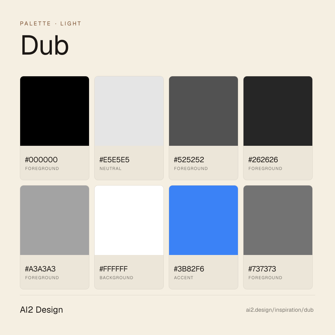
- Pure white canvas (#ffffff) with #000000 primary text (~3,055 surface refs) — extreme contrast as the spine, no off-white tinting.
- #e5e5e5 hairline border (~2,013 refs) — structural device threading every plate, Linear-school discipline.
- Inter (custom-loaded) as sole typeface 11-18px — premium grotesque commitment, no system fallback shown.
- Multi-accent semantic palette: blue #3b82f6 (links/active), purple #a855f7 (premium), green #16a34a (success) — each accent paired with specific feature category.
- Container ladder 512/532/576/672/800/1080 — multiple nested editorial widths.
- Custom breakpoint sm=360 (lowered from 640) — Dub optimises for mobile reading early.
- Framer Motion + 7 catalogued gradients — restrained, atmospheric depth.
- Tight 4px spacing scale (2/4/6/8/10/12/14/16) — Vercel-adjacent terminal-tight rhythm.
What to study
- Inter at editorial body 14-18px with system fallback — proven choice for dev-tool brands that want platform respect without licensing premium grotesques.
- Multi-accent semantic palette — Dub uses blue/purple/green as feature category signals rather than chromatic decoration. Each colour has meaning.
- Hairline border as primary structural device — #e5e5e5 frequency 2,013 means the page is fundamentally a grid of plates. Steal the discipline of treating borders as layout.
What to avoid
- Don't paint surfaces in any accent — blue/purple/green are semantic signals. Filling button backgrounds in #a855f7 collapses the meaning.
- Don't widen the editorial container ladder — Dub's 512-672 range is calibrated for tight reading rhythm.
- Don't substitute system fonts for Inter — Dub's typographic discipline depends on Inter's optical sidebearings.
Taste notes
The page feels like a beautifully designed product changelog that happens to ship a marketing surface — every paragraph at the correct body size, every accent earning its semantic frame, every hairline border deliberately placed. Dub understood that B2B dev tools live or die by perceived seriousness, and seriousness comes from typographic discipline + scarce accent usage. The brand carries Linear/Vercel DNA without copying their visual signatures.
Lineage & references
- Direct heir to the Linear/Vercel/PlanetScale editorial dev-tool school — Inter discipline + hairline grid + scarce accent usage.
- Standing shoulder-to-shoulder with the modern link-infra peer cohort (Bitly, Rebrandly, Short.io) — but Dub is the only one with editorial typographic discipline.
- Part of the Vercel-adjacent dev-tool wave (Resend, Liveblocks, Convex) that ships premium grotesque on white canvas — Dub belongs in that family.
Design language brief
Paste-ready for your agent.
A typed design system transfer brief — philosophy, tokens, rules, techniques, and fitness checks. Your agent reads the whole language, not just the pixels.
Philosophy
Dub's design language is editorial white with semantic multi-accent + hairline structural grid. Pure #ffffff canvas; #000000 text at extreme contrast; Inter throughout; semantic blue/purple/green accents per feature category; #e5e5e5 hairlines thread every layout cell. Vercel-tier discipline applied to link infrastructure.
Main prompt
Use this capture as a design language transfer brief for my project. Adopt the palette (pure #ffffff ground, #000000 primary text dominant, #e5e5e5 hairline borders primary structural, #525252 secondary text, #262626 deep text emphasis, #a3a3a3 tertiary text, #ffffff secondary surface, #3b82f6 blue accent for links/active, #737373 muted tertiary, #a855f7 purple accent for premium signals, #16a34a green accent for success/confirm), Inter as sole typeface (sizes 8/11/14/16/18px catalogued, weights 400/500), tight 4px spacing 2/4/6/8/10/12/14/16, container ladder 512/532/576/672/800/1080, custom breakpoints sm=360 md=768 lg=1024 xl=1280 (sm=360 lowered), Framer Motion + 7 catalogued gradients (atmospheric depth zones). Treat blue/purple/green as semantic state colours not chromatic decoration. Apply the language, not the source brand's copy.
Overview
- Layout
- Hairline-bordered editorial plates on white canvas; nested container ladder for sidebar-and-body layouts.
- Content width
- Container ladder 512/532/576/672/800/1080.
- Framing
- Premium dev-tool marketing — Inter + hairlines + semantic accents.
- Grid strength
- Explicit hairline grid — #e5e5e5 borders structure every cell.
Color philosophy
Pure white canvas with #000 text at extreme contrast; #e5e5e5 hairlines thread layout; semantic accents blue/purple/green.
- #ffffff dominant ground
- #000000 primary text (~3,055 refs)
- #e5e5e5 hairline border primary structural
- #525252 secondary text
- #262626 deep emphasis text
- #a3a3a3 tertiary text
- #3b82f6 blue accent (links, active)
- #a855f7 purple accent (premium)
- #16a34a green accent (success)
- #737373 muted tertiary border
Gradients (paste-ready)
7 catalogued — atmospheric depth zones around hero, never decorative
Typography rules
- Inter as sole typeface (custom-loaded)
- Body 14-16px, secondary 11-13px, display 18-32px
- Weight 400 body, 500 emphasis
- Letter-spacing 0
- Line-height 1.5 body, 1.05 display
Spacing rules
- 4px base unit, scale 2/4/6/8/10/12/14/16
- Section vertical rhythm 80-120px
- Card padding 20-28px
Design tokens
Palette, type, and space — all agent-readable.
20 colors · hex / rgb / hsl / oklch
- foreground46%
- HEX
#000000 - RGB
rgb(0, 0, 0) - HSL
hsl(0, 0%, 0%) - OKLCH
oklch(0.00% 0.0000 0.00)
- HEX
- neutral30%
- HEX
#E5E5E5 - RGB
rgb(229, 229, 229) - HSL
hsl(0, 0%, 90%) - OKLCH
oklch(92.19% 0.0000 89.76)
- HEX
- foreground7%
- HEX
#525252 - RGB
rgb(82, 82, 82) - HSL
hsl(0, 0%, 32%) - OKLCH
oklch(43.86% 0.0000 89.76)
- HEX
- foreground6%
- HEX
#262626 - RGB
rgb(38, 38, 38) - HSL
hsl(0, 0%, 15%) - OKLCH
oklch(26.86% 0.0000 89.76)
- HEX
- foreground3%
- HEX
#A3A3A3 - RGB
rgb(163, 163, 163) - HSL
hsl(0, 0%, 64%) - OKLCH
oklch(71.55% 0.0000 89.76)
- HEX
- background2%
- HEX
#FFFFFF - RGB
rgb(255, 255, 255) - HSL
hsl(0, 0%, 100%) - OKLCH
oklch(100.00% 0.0000 89.76)
- HEX
- accent2%
- HEX
#3B82F6 - RGB
rgb(59, 130, 246) - HSL
hsl(217, 91%, 60%) - OKLCH
oklch(62.31% 0.1880 259.81)
- HEX
- foreground1%
- HEX
#737373 - RGB
rgb(115, 115, 115) - HSL
hsl(0, 0%, 45%) - OKLCH
oklch(55.55% 0.0000 89.76)
- HEX
- accent1%
- HEX
#A855F7 - RGB
rgb(168, 85, 247) - HSL
hsl(271, 91%, 65%) - OKLCH
oklch(62.68% 0.2325 303.90)
- HEX
Inspector
Tab through the captured artifacts.
Six observable layers — page structure, fonts, breakpoints, z-index, gradients, motion — kept paste-ready alongside the tokens above.
Page structure
Semantic hierarchy at a glance.
Depth-first walk of meaningful sections — header, navigation, main regions, articles, footer. 6 nodes captured; depth capped at 6 for readability.
- body
- └─ div (×2)
- └─ div (×2)
- └─ div
- └─ div
- └─ Nav
Accessibility
WCAG contrast matrix.
296 combinations · 118 pass AA · 82 pass AAA · APCA Lc shown alongside WCAG 2.1 ratio for draft WCAG 3 awareness.
| Preview | fg | bg | Ratio | Normal | Large | APCA Lc | Context |
|---|---|---|---|---|---|---|---|
Aa | #000000 | #FFFFFF | 21.00 | AAA | AAA | +106 | foreground on background |
Aa | #FFFFFF | #000000 | 21.00 | AAA | AAA | -108 | background on foreground |
Aa | #000000 | #DCFCE7 | 19.12 | AAA | AAA | +100 | foreground on background |
Aa | #DCFCE7 | #000000 | 19.12 | AAA | AAA | -101 | background on foreground |
Aa | #FFFFFF | #111827 | 17.74 | AAA | AAA | -107 | background on foreground |
Aa | #111827 | #FFFFFF | 17.74 | AAA | AAA | +105 | foreground on background |
Aa | #000000 | #FEE2E2 | 17.19 | AAA | AAA | +93 | foreground on background |
Aa | #FEE2E2 | #000000 | 17.19 | AAA | AAA | -93 | background on foreground |
Aa | #000000 | #E5E7EB | 16.96 | AAA | AAA | +92 | foreground on neutral |
Aa | #E5E7EB | #000000 | 16.96 | AAA | AAA | -92 | neutral on foreground |
Image strategy
Asset loading & format policy.
Observable image posture — total count, lazy-loading ratio, and format mix. Hero image is measured above the fold.
- Full Page
- developer-tools
- saas
- light
- 2026-05-17
Editorial credit
Featured Sponsor slot — your brand here
Dedicated logo placement — no rotation, on every export.
COMPARE THIS WITH
Side-by-side reads sharing this design signal.
See also