Antimetal · Full Page
Antimetal
Dark-marketing AWS cost optimization — single gradient hero, big metric-as-typography for savings figures, near-monochrome feature scroll, product screenshot proof over testimonial quotes. Antimetal breaks the beige B2B convention of its category and lets calm clarity carry the page.

Editorial disclaimer
Editorial noteThis entry documents observable design-language patterns for educational transfer and AI-agent briefing. Screenshots and trademarks are property of their respective owners. AI2 Design is not affiliated with or endorsed by the featured brand. Inspiration here is about language and rhythm — do not reproduce brand identity, logo, product copy, or proprietary features.
Curator verdict
Why we catalogued it?
Antimetal is what AWS-cost marketing should look like when you've finally stopped pretending the category is interesting on its own — a dark-marketing page with confident metric displays, focused gradient moments, and copy that translates cloud-finance into outcomes a CTO actually cares about. We catalogued it because it's the cleanest cost-optimization marketing in a vertical drowning in pie charts and beige B2B.
Design decisions observed
- Big metric numerics as visual heroes — savings figures get display-type treatment, not chart treatment.
- Gradient hero with restraint downstream — single splash of color, then near-monochrome features.
- Dark-marketing rhythm with code-and-product moments — proof comes from product screenshots, not testimonial quotes.
- Editorial scroll cadence — each section is a confident claim with a single piece of supporting evidence.
What to study
- Metric-as-hero typography pattern — a way to make boring savings figures land emotionally.
- Dark-marketing for cost-optimization category — Antimetal breaks the beige B2B convention and the page is stronger for it.
- Single-gradient discipline — hero owns it, features are calm. The discipline carries the whole page.
What to avoid
- Don't lift Antimetal's metric-typography pattern without verifying your figures actually move emotionally — at smaller savings numbers it reads as desperate.
- Don't sustain the gradient density into feature sections — the calm after the hero is the magic.
Taste notes
The page reads like a confident SaaS marketing team's third design iteration — restrained, opinionated, with the right amount of motion to suggest the team cares about craft but isn't showing off.
Lineage & references
- Sits with Cast.ai, Vantage, and CloudZero in the AWS-cost-optimization marketing space — Antimetal is the most visually disciplined of the cohort.
- Inherits the dark-marketing pattern from Linear, Vercel, and Notion circa 2022-24 — restrained palette with metric display moments.
- Part of the 2024+ developer-finance SaaS wave — cost-tooling products that finally invested in real design teams.
Design language brief
Paste-ready for your agent.
A typed design system transfer brief — philosophy, tokens, rules, techniques, and fitness checks. Your agent reads the whole language, not just the pixels.
Philosophy
Dark-marketing cost-optimization system — single gradient hero, big metric typography for savings figures, restrained downstream feature sections, product screenshots as proof. Motion is for state and reveal only. The brand promise is calm clarity in a noisy category.
Main prompt
Use this capture as a design-language brief for B2B cost-optimization or developer-finance marketing. Adopt the dark canvas, single gradient hero, big metric-as-typography for outcome figures, near-monochrome feature scroll, and product-screenshot proof. Avoid pie charts in marketing surfaces — display-scale numerics carry savings better.
Overview
- Layout
- Stacked
- Content width
- Bounded
- Framing
- Layered
- Grid strength
- Strong
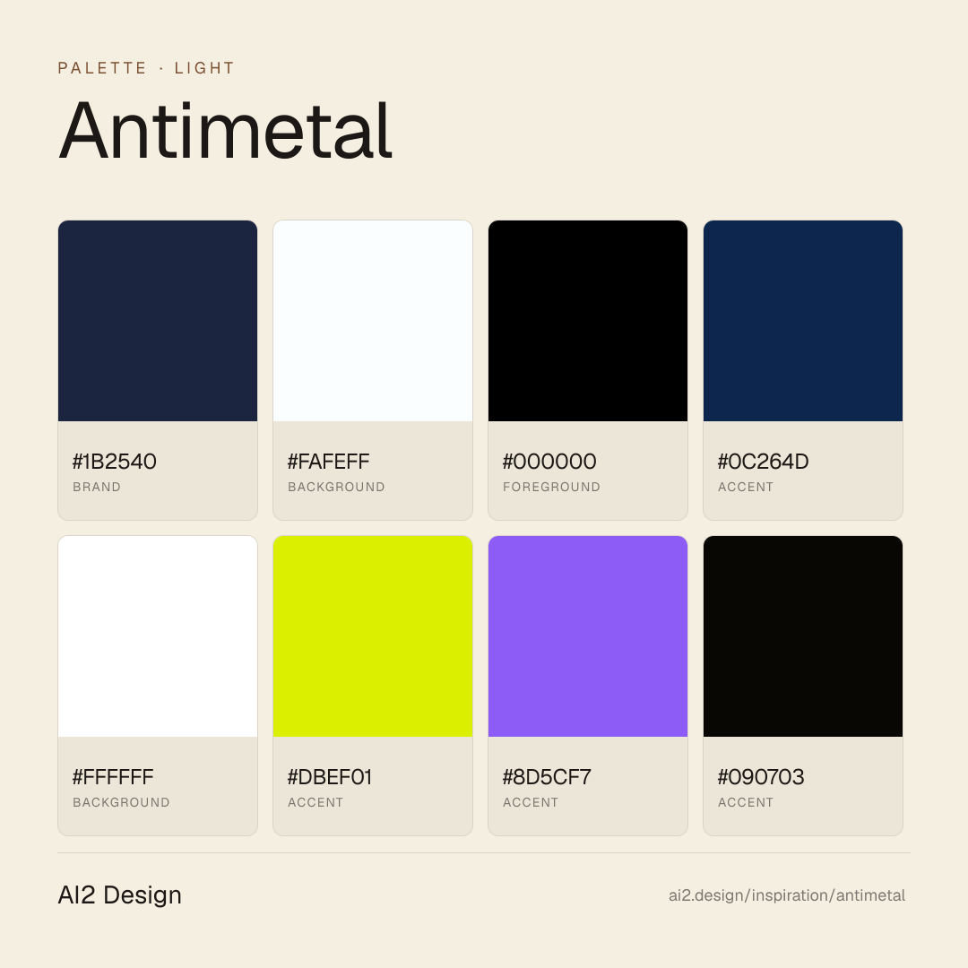
Color philosophy
Dark-first canvas — primary surface #1b2540 paired with foreground #fafeff doing the bulk of reading-layer work. Accent moments use #000000 + #0c264d sparingly. Near-black backdrop with restrained warm or cool accents.
- #1b2540 — primary surface / dominant background
- #fafeff — primary foreground / reading layer
- #000000 — first accent — used for CTAs and highlights
- #0c264d — secondary accent / hover states
- #ffffff — tertiary surface / panels
Gradients (paste-ready)
// No gradient extracted — use solid surfaces
Typography rules
- Primary family: abcdFont. Mono fallback: JetBrains Mono for code and tabular numerics.
- Weight ladder: 400 / 450 / 480. Keep substitutions tight — the captured ladder is the typographic signature.
- Display tracking uses negative px (not em) for optical correction at large sizes — typically -0.5 to -1.5px at 48-64px hero scale.
- Heading line-height tightens at display sizes (1.0-1.2); body sits at 1.4-1.6. Captions and small UI labels at 1.3.
- Tabular numerals mandatory on aligned columns: font-variant-numeric: tabular-nums.
- Italic reserved for editorial quotes and emphasis where weight cannot carry — never for product UI labels.
- Paragraph max 45-55ch at body size; dense data tables may extend to 65ch with line-height 1.5.
Spacing rules
- Scale (observed): 2 / 4 / 6 / 8 / 10 / 12 / 14 / 16 px. Stay on the scale — no magic numbers.
- Container max-width: 976px. Secondary bounded rails for narrow content clusters at ~480-640px.
- Section vertical rhythm: 64-128px on desktop, 40-80px on mobile, scaled by page depth.
- Card padding: 16-24px on desktop, 12-16px on mobile.
- Gutter values draw from the smaller half of the scale (4 / 8 / 12 / 16 / 24).
Design tokens
Palette, type, and space — all agent-readable.
13 colors · hex / rgb / hsl / oklch
- brand78%
- HEX
#1B2540 - RGB
rgb(27, 37, 64) - HSL
hsl(224, 41%, 18%) - OKLCH
oklch(26.97% 0.0524 267.46)
- HEX
- background9%
- HEX
#FAFEFF - RGB
rgb(250, 254, 255) - HSL
hsl(192, 100%, 99%) - OKLCH
oklch(99.43% 0.0044 214.33)
- HEX
- foreground7%
- HEX
#000000 - RGB
rgb(0, 0, 0) - HSL
hsl(0, 0%, 0%) - OKLCH
oklch(0.00% 0.0000 0.00)
- HEX
- accent4%
- HEX
#0C264D - RGB
rgb(12, 38, 77) - HSL
hsl(216, 73%, 17%) - OKLCH
oklch(27.34% 0.0788 258.61)
- HEX
- background1%
- HEX
#FFFFFF - RGB
rgb(255, 255, 255) - HSL
hsl(0, 0%, 100%) - OKLCH
oklch(100.00% 0.0000 89.76)
- HEX
- accent1%
- HEX
#DBEF01 - RGB
rgb(219, 239, 1) - HSL
hsl(65, 99%, 47%) - OKLCH
oklch(90.60% 0.2065 115.75)
- HEX
- accent0%
- HEX
#8D5CF7 - RGB
rgb(141, 92, 247) - HSL
hsl(259, 91%, 66%) - OKLCH
oklch(60.82% 0.2202 293.30)
- HEX
- accent0%
- HEX
#090703 - RGB
rgb(9, 7, 3) - HSL
hsl(40, 50%, 2%) - OKLCH
oklch(12.94% 0.0133 89.97)
- HEX
- background0%
- HEX
#F8F9FC - RGB
rgb(248, 249, 252) - HSL
hsl(225, 40%, 98%) - OKLCH
oklch(98.22% 0.0041 271.37)
- HEX
Inspector
Tab through the captured artifacts.
Six observable layers — page structure, fonts, breakpoints, z-index, gradients, motion — kept paste-ready alongside the tokens above.
Page structure
Semantic hierarchy at a glance.
Depth-first walk of meaningful sections — header, navigation, main regions, articles, footer. 3 nodes captured; depth capped at 6 for readability.
- body
- └─ Main
- └─ Footer
Accessibility
WCAG contrast matrix.
122 combinations · 70 pass AA · 58 pass AAA · APCA Lc shown alongside WCAG 2.1 ratio for draft WCAG 3 awareness.
| Preview | fg | bg | Ratio | Normal | Large | APCA Lc | Context |
|---|---|---|---|---|---|---|---|
Aa | #000000 | #FFFFFF | 21.00 | AAA | AAA | +106 | foreground on background |
Aa | #FFFFFF | #000000 | 21.00 | AAA | AAA | -108 | background on foreground |
Aa | #FAFEFF | #000000 | 20.69 | AAA | AAA | -107 | background on foreground |
Aa | #000000 | #FAFEFF | 20.69 | AAA | AAA | +105 | foreground on background |
Aa | #FFFFFF | #090703 | 20.13 | AAA | AAA | -108 | background on accent |
Aa | #090703 | #FFFFFF | 20.13 | AAA | AAA | +106 | accent on background |
Aa | #000000 | #F8F9FC | 19.95 | AAA | AAA | +102 | foreground on background |
Aa | #F8F9FC | #000000 | 19.95 | AAA | AAA | -104 | background on foreground |
Aa | #FAFEFF | #090703 | 19.83 | AAA | AAA | -107 | background on accent |
Aa | #090703 | #FAFEFF | 19.83 | AAA | AAA | +105 | accent on background |
Image strategy
Asset loading & format policy.
Observable image posture — total count, lazy-loading ratio, and format mix. Hero image is measured above the fold.
Hero image
https://antimetal.com/assets/footer/background-transition.avif- Format
- AVIF
- Dimensions
- 1884×1124
- Loading
- lazy
- srcset
- no
- Full Page
- developer-tools
- saas
- fintech
- light
- 2026-05-11
Frequently asked
Questions people ask about Antimetal
Answers are pulled from the curator verdict and design brief — the same text your AI agent sees when it paste-reads this page.
What makes Antimetal's cost-optimization marketing land?
Antimetal breaks the beige B2B convention of its category — dark-marketing canvas, single gradient hero, big metric typography for savings figures, and product screenshots as proof instead of pie charts or testimonial quotes. The result is the cleanest cost-optimization marketing we've seen in a vertical drowning in dashboards.
What fonts and palette does Antimetal use?
A geometric sans carries the entire hierarchy with display-scale numerics doing the heaviest emotional lift for savings figures. The palette is dark-marketing with a single gradient splash in hero, then disciplines down to near-monochrome for feature sections. Product screenshots land as authoritative inserts; gradients never decorate middle sections.
Can I adopt Antimetal's metric-led marketing approach?
Yes, if your savings figures genuinely move emotionally. Adopt the dark canvas, big metric-as-typography for outcome figures, single gradient hero with calm downstream, and product-screenshot proof over testimonial quotes. Avoid pie charts in marketing — display-scale numerics carry savings better. Our growing gallery captures the AI2 Design brief as paste-ready scaffolding.
Editorial credit
Featured Sponsor slot — your brand here
Dedicated logo placement — no rotation, on every export.
COMPARE THIS WITH
Side-by-side reads sharing this design signal.
See also