ReadMe · Full Page
ReadMe
Warm-purple developer-marketing for API documentation — humanist sans with monospace accents, bespoke illustrated character moments, story-led comic-strip scroll pacing, and the light-canvas + dark-code-inset pattern that proves the product mode without committing the page to dark mode.

Editorial disclaimer
Editorial noteThis entry documents observable design-language patterns for educational transfer and AI-agent briefing. Screenshots and trademarks are property of their respective owners. AI2 Design is not affiliated with or endorsed by the featured brand. Inspiration here is about language and rhythm — do not reproduce brand identity, logo, product copy, or proprietary features.
Curator verdict
Why we catalogued it?
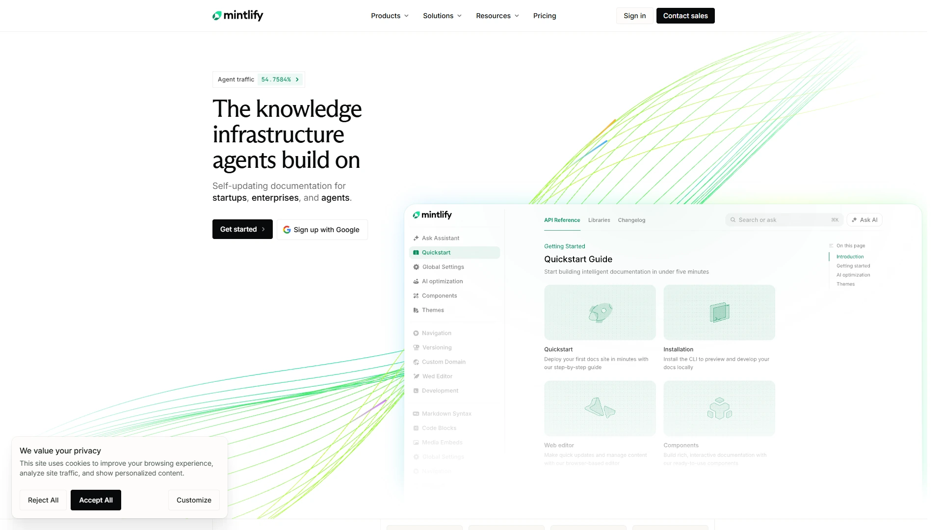
ReadMe's landing is the warmest developer-marketing page we've audited — purple-tinted, illustrated, deliberately approachable in a category that defaults to monochrome severity. We catalogued it because it solves the API-docs marketing problem with personality. The page makes you want to read docs, which is a marketing miracle.
Design decisions observed
- Warm purple as primary brand — softens the developer-tool palette without abandoning category cues.
- Hand-drawn illustration moments — bespoke characters and diagrams humanize what's usually a sterile vertical.
- Long-form scroll with comic-strip pacing — the page is a story, not a feature grid.
- Light canvas with dark code embeds — the docs preview lands as a dark inset, mimicking the actual product.
What to study
- How a developer tool earns warmth without losing technical credibility — ReadMe's illustration is on-brand without being childish.
- Story-led scroll architecture for SaaS — each section is a panel in a comic, not a competing feature.
- Light-canvas + dark-code-inset pattern — visually proves the product's mode without committing the whole page to dark mode.
What to avoid
- Don't lift ReadMe's illustration style without commissioning real illustrators — generic vector characters miss the warmth and read as kitsch.
- Don't apply ReadMe's pacing to a dev-platform marketing page where every minute of attention is precious — it's deliberately slow.
Taste notes
The page feels like a children's book about software — earnest, illustrated, with a quiet confidence that ReadMe knows it's solving an unsexy problem and choosing to make it cheerful anyway.
Lineage & references
- Sits with Stripe Docs, Algolia, and Postman as API-tooling brands — but ReadMe is the only one that leans into warmth as a category-differentiation move.
- Inherits the friendly-developer-marketing playbook from Heroku circa 2014-16 — illustration-led, story-paced, never sterile.
- Part of the 2022+ approachable-enterprise wave (ReadMe, Linear, Vercel pre-2024) — tools that earn trust with personality rather than corporate cues.
Design language brief
Paste-ready for your agent.
A typed design system transfer brief — philosophy, tokens, rules, techniques, and fitness checks. Your agent reads the whole language, not just the pixels.
Philosophy
Warm-purple developer-marketing system — illustrated story-led scroll, light canvas with dark code embeds, humanist sans with monospace accents. Motion is gentle and intentional (300-500ms ease-out reveals). The page is designed to make a dry product (API docs) feel like something you'd want to spend Saturday with.
Main prompt
Use this capture as a design-language brief for developer-tool marketing with personality. Adopt the warm-purple palette, illustrated character moments, story-led scroll pacing, and the light-canvas + dark-code-inset pattern. Commission real illustration; never use generic vectors. Let the product feel warm without abandoning technical credibility.
Overview
- Layout
- Stacked
- Content width
- Bounded
- Framing
- Layered
- Grid strength
- Moderate
Color philosophy
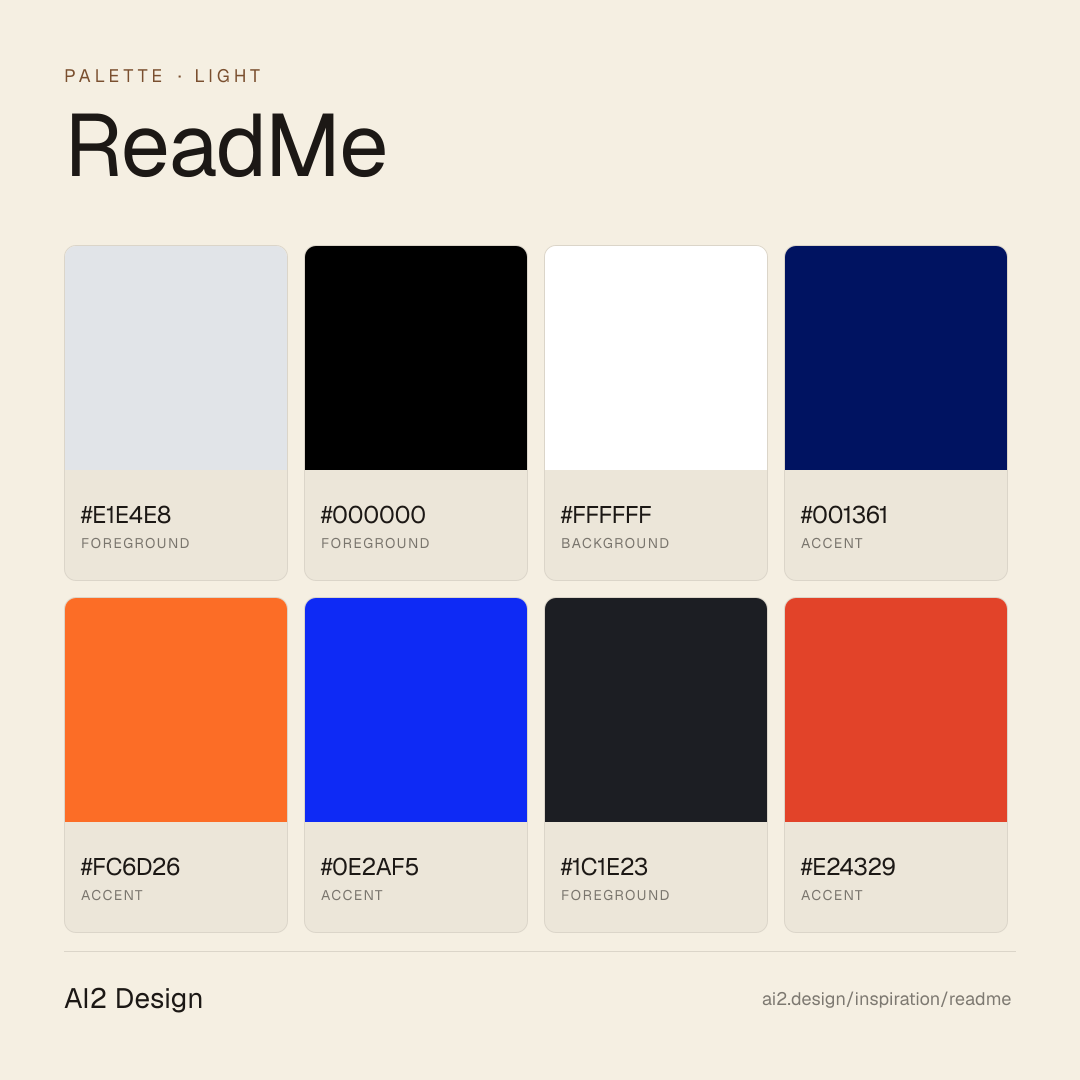
Light-first canvas — primary surface #e1e4e8 paired with foreground #ffffff doing the bulk of reading-layer work. Accent moments use #ffffff + #001361 sparingly. Cream and warm-neutral surfaces with small accent flags.
- #e1e4e8 — primary surface / dominant background
- #000000 — primary foreground / reading layer
- #ffffff — first accent — used for CTAs and highlights
- #001361 — secondary accent / hover states
- #fc6d26 — tertiary surface / panels
Gradients (paste-ready)
// No gradient extracted — use solid surfaces
Typography rules
- Primary family: ui-sans-serif. Mono fallback: Geist Mono for code and tabular numerics.
- Weight ladder: 300 / 400 / 450 / 500. Keep substitutions tight — the captured ladder is the typographic signature.
- Display tracking uses negative px (not em) for optical correction at large sizes — typically -0.5 to -1.5px at 48-64px hero scale.
- Heading line-height tightens at display sizes (1.0-1.2); body sits at 1.4-1.6. Captions and small UI labels at 1.3.
- Tabular numerals mandatory on aligned columns: font-variant-numeric: tabular-nums.
- Italic reserved for editorial quotes and emphasis where weight cannot carry — never for product UI labels.
- Paragraph max 45-55ch at body size; dense data tables may extend to 65ch with line-height 1.5.
Spacing rules
- Scale (observed): 2 / 4 / 6 / 8 / 10 / 12 / 14 / 16 px. Stay on the scale — no magic numbers.
- Container max-width: 1120px. Secondary bounded rails for narrow content clusters at ~480-640px.
- Section vertical rhythm: 64-128px on desktop, 40-80px on mobile, scaled by page depth.
- Card padding: 16-24px on desktop, 12-16px on mobile.
- Gutter values draw from the smaller half of the scale (4 / 8 / 12 / 16 / 24).
Design tokens
Palette, type, and space — all agent-readable.
8 colors · hex / rgb / hsl / oklch
- foreground50%
- HEX
#E1E4E8 - RGB
rgb(225, 228, 232) - HSL
hsl(214, 13%, 90%) - OKLCH
oklch(91.77% 0.0063 255.48)
- HEX
- foreground42%
- HEX
#000000 - RGB
rgb(0, 0, 0) - HSL
hsl(0, 0%, 0%) - OKLCH
oklch(0.00% 0.0000 0.00)
- HEX
- background3%
- HEX
#FFFFFF - RGB
rgb(255, 255, 255) - HSL
hsl(0, 0%, 100%) - OKLCH
oklch(100.00% 0.0000 89.76)
- HEX
- accent3%
- HEX
#001361 - RGB
rgb(0, 19, 97) - HSL
hsl(228, 100%, 19%) - OKLCH
oklch(24.82% 0.1372 263.75)
- HEX
- accent0%
- HEX
#FC6D26 - RGB
rgb(252, 109, 38) - HSL
hsl(20, 97%, 57%) - OKLCH
oklch(70.17% 0.1913 42.95)
- HEX
- accent0%
- HEX
#0E2AF5 - RGB
rgb(14, 42, 245) - HSL
hsl(233, 92%, 51%) - OKLCH
oklch(46.52% 0.2857 265.09)
- HEX
- foreground0%
- HEX
#1C1E23 - RGB
rgb(28, 30, 35) - HSL
hsl(223, 11%, 12%) - OKLCH
oklch(23.51% 0.0101 268.25)
- HEX
- accent0%
- HEX
#E24329 - RGB
rgb(226, 67, 41) - HSL
hsl(8, 76%, 52%) - OKLCH
oklch(61.12% 0.1999 31.96)
- HEX
Inspector
Tab through the captured artifacts.
Six observable layers — page structure, fonts, breakpoints, z-index, gradients, motion — kept paste-ready alongside the tokens above.
Page structure
Semantic hierarchy at a glance.
Depth-first walk of meaningful sections — header, navigation, main regions, articles, footer. 2 nodes captured; depth capped at 6 for readability.
- body
- └─ div
Accessibility
WCAG contrast matrix.
46 combinations · 24 pass AA · 16 pass AAA · APCA Lc shown alongside WCAG 2.1 ratio for draft WCAG 3 awareness.
| Preview | fg | bg | Ratio | Normal | Large | APCA Lc | Context |
|---|---|---|---|---|---|---|---|
Aa | #000000 | #FFFFFF | 21.00 | AAA | AAA | +106 | foreground on background |
Aa | #FFFFFF | #000000 | 21.00 | AAA | AAA | -108 | background on foreground |
Aa | #FFFFFF | #1C1E23 | 16.68 | AAA | AAA | -106 | background on foreground |
Aa | #1C1E23 | #FFFFFF | 16.68 | AAA | AAA | +104 | foreground on background |
Aa | #FFFFFF | #001361 | 16.59 | AAA | AAA | -105 | background on accent |
Aa | #001361 | #FFFFFF | 16.59 | AAA | AAA | +103 | accent on background |
Aa | #E1E4E8 | #000000 | 16.46 | AAA | AAA | -90 | foreground on foreground |
Aa | #000000 | #E1E4E8 | 16.46 | AAA | AAA | +90 | foreground on foreground |
Aa | #E1E4E8 | #1C1E23 | 13.07 | AAA | AAA | -88 | foreground on foreground |
Aa | #1C1E23 | #E1E4E8 | 13.07 | AAA | AAA | +88 | foreground on foreground |
Image strategy
Asset loading & format policy.
Observable image posture — total count, lazy-loading ratio, and format mix. Hero image is measured above the fold.
Hero image
https://readme.com/_next/static/media/corners.13o7u~ifms12k.svg?dpl=dpl_AwhYnA8uX7VUf3deaEYPJ5xmwDB9- Format
- SVG
- Dimensions
- 169×809
- Loading
- eager
- srcset
- no
- Full Page
- developer-tools
- saas
- light
- 2026-05-11
Frequently asked
Questions people ask about ReadMe
Answers are pulled from the curator verdict and design brief — the same text your AI agent sees when it paste-reads this page.
What makes ReadMe's developer-marketing page so warm?
ReadMe solves the API-docs marketing problem with personality. Warm purple branding, bespoke illustrated character moments, story-led comic-strip scroll pacing, and a light canvas with dark code-inset embeds that prove the product mode without committing the page to dark mode. The result is marketing that makes you want to read docs — a small miracle.
What fonts and palette does ReadMe use?
A humanist sans handles headlines and body with monospace accents for code samples. The palette centres warm purple as primary brand, softening the developer-tool category without abandoning its cues. Light canvas keeps the page approachable; dark code embeds prove the product's mode. Illustration is bespoke and on-brand, never childish.
Can I apply ReadMe's warm-developer-marketing to my product?
Yes, if your audience can afford slow contemplative pacing. Adopt the warm-purple palette, commission real illustration (generic vectors read as kitsch), structure the page as a story with comic-strip pacing, and use the light-canvas + dark-code-inset pattern to prove product mode. Our growing gallery captures the AI2 Design brief as paste-ready scaffolding.
Editorial credit
Featured Sponsor slot — your brand here
Dedicated logo placement — no rotation, on every export.
COMPARE THIS WITH
Side-by-side reads sharing this design signal.
See also