Clerk · Full Page
Clerk
Authentication-infrastructure'ın hairline-grid structural confidence'ı — #d9d9de soft border lattice primary structural element, Geist Variable + Suisse Intl premium typography, Sōehne Mono code-grade, custom 450ms cubic-bezier signature easings. Beautifully constructed legal-document precision.

Editorial disclaimer
Editorial noteThis entry documents observable design-language patterns for educational transfer and AI-agent briefing. Screenshots and trademarks are property of their respective owners. AI2 Design is not affiliated with or endorsed by the featured brand. Inspiration here is about language and rhythm — do not reproduce brand identity, logo, product copy, or proprietary features.
Curator verdict
Why we catalogued it?
Clerk is the rare authentication-infrastructure landing that decided being approachable was a strategic moat, not a brand compromise — a clean ground anchored by Geist's numerals and a custom Suisse Intl ladder, soft hairline borders threaded everywhere, and a single saturated cyan accent (#5de3ff) deployed like a punctuation mark. We catalogued it because the auth-and-user-management category is a graveyard of generic blue logos and shield illustrations; Clerk hit a third path — premium grotesque restraint, hairline-driven layout, and a chromatic identity that signals 'we know taste' without ever showing off.
Design decisions observed
- Hairline border #d9d9de used as the primary structural element (~1,956 surface references) — Clerk's brand is not its colour, it's the borders. The page reads as printed plate.
- Geist Variable as the typographic identity (especially for numerals like rate cards and stats) — the Vercel-adjacent font family signals developer-tool craftsmanship.
- Suisse Intl alongside Geist — premium grotesque pairing that gives the page editorial weight beyond default sans options.
- Sōehne Mono for inline code — Sōehne is one of the most carefully drawn modern monospaces; using it for inline code signals serious typography culture.
- Single saturated cyan accent #5de3ff (~14 refs) — used as a scarce signal, not a paint. The contrast against the warm grey hairline grid is dramatic but restrained.
- Custom long-duration motion easings: cubic-bezier(0.33, 1, 0.68, 1) at 450ms + cubic-bezier(0.4, 0.36, 0, 1) at 300ms — Clerk has its own choreography signature, not Tailwind defaults.
- Framer Motion + 12 gradients catalogued — gradient used as atmospheric depth around hero and key callouts, never as decoration.
- Spacing scale 1/4/6/8/10/12/14/16/20/24 — incremental 4px rhythm typical of premium grotesque-anchored layouts.
What to study
- Hairline borders as the primary structural device — Clerk uses 1,956 surface references to its border colour, which means the page is fundamentally a grid of plates rather than a flowing composition. Steal the discipline of treating borders as content, not chrome.
- Geist numerals as a positioning signal — the typeface (and especially its tabular figures) is associated with Vercel, which means using Geist on an auth product signals peer-cohort membership with the Linear/Vercel/Stripe quality bar.
- Custom long-duration easings — Clerk's 450ms with cubic-bezier(0.33, 1, 0.68, 1) is dramatically slower than typical button hovers; this gives interactions a deliberate weight that reads as expensive software.
What to avoid
- Don't lift the hairline-grid layout without committing to the typographic discipline — without Geist/Suisse holding the type at exactly the right size, the borders read as wireframe rather than finished design.
- Don't paint surfaces in #5de3ff — the cyan accent is signal-grade. The moment you fill a button with it, you've collapsed the brand into 'generic cyan SaaS'.
- Don't shorten the 450ms motion durations — Clerk's signature ease takes time. Compressing it to 200ms makes the page feel cheaper.
Taste notes
The page feels like the inside of a beautifully constructed legal contract — every cell is bordered, every number is tabular, every transition takes exactly the right amount of time. Clerk's brand is not chromatic; it is structural. The hairline grid is the brand. Take it away and the typographic stack is still strong but the identity dissolves. This is the rare auth product that looks like it was made by people who would care about the spacing of a footnote.
Lineage & references
- Direct heir to the Stripe / Vercel / Linear editorial-developer-tool school — Clerk uses the same Geist/Suisse Intl typographic DNA as that family, applied to authentication.
- Standing shoulder-to-shoulder with the modern identity-platform peer cohort (Auth0 reimagined, WorkOS, Stytch) — but Clerk's hairline-grid layout discipline is unique in the category.
- Part of the long-duration motion lineage that Apple's recent marketing pages and Mercury's banking app touch on — Clerk's 450ms ease signature places it in that cohort of deliberately slow, premium-feeling software interactions.
Design language brief
Paste-ready for your agent.
A typed design system transfer brief — philosophy, tokens, rules, techniques, and fitness checks. Your agent reads the whole language, not just the pixels.
Philosophy
Clerk's design language is hairline-grid structural confidence. Soft hairline borders (#d9d9de) thread the entire page as the primary layout device; Geist Variable and Suisse Intl carry the typography; Sōehne Mono handles code; and a single saturated cyan accent (#5de3ff) provides scarce chromatic punctuation. The page reads like a beautifully constructed legal document — every cell is framed, every number is tabular, every transition is deliberately long.
Main prompt
Use this capture as a design language transfer brief for my project. Adopt the palette (#ffffff ground for primary surface, #131316 dark surface for inversion zones, #d9d9de hairline border as primary structural element, #000000 primary text, #ffffff text on inversion, #747686 muted grey for secondary text, #5e5f6e tertiary text, #2f3037 elevated dark surface, #9394a1 metadata grey, #42434d background for dark cards, single saturated #5de3ff cyan accent), typography stack (Geist Variable for numerals and emphasis at sizes 10/13/16px, Suisse Intl for body and display, Sōehne Mono at 12-14px for inline code, with letter-spacing -0.12px on tight UI labels), incremental 4px spacing scale 1/4/6/8/10/12/14/16/20/24, container ladder 672/1280 (one tight reading + one wide hero), Tailwind-standard 640/768/1024/1280/1536 breakpoints, Framer Motion with custom signature easings cubic-bezier(0.33, 1, 0.68, 1) at 450ms + cubic-bezier(0.4, 0.36, 0, 1) at 300ms, 12 catalogued gradients used as atmospheric depth. Treat hairline borders as the primary brand asset — every section, card, and table cell uses them. Apply the language, not the source brand's copy.
Overview
- Layout
- Hairline-grid plate layout — every section bordered, every card framed; tight 672px reading width with 1280px hero canvas breakouts.
- Content width
- 672px reading rail, 1280px hero/wide canvas.
- Framing
- Legal-document precision — hairline plates organise content; chromatic restraint; long-duration motion gives weight.
- Grid strength
- Explicit hairline grid — borders are not decoration, they are layout.
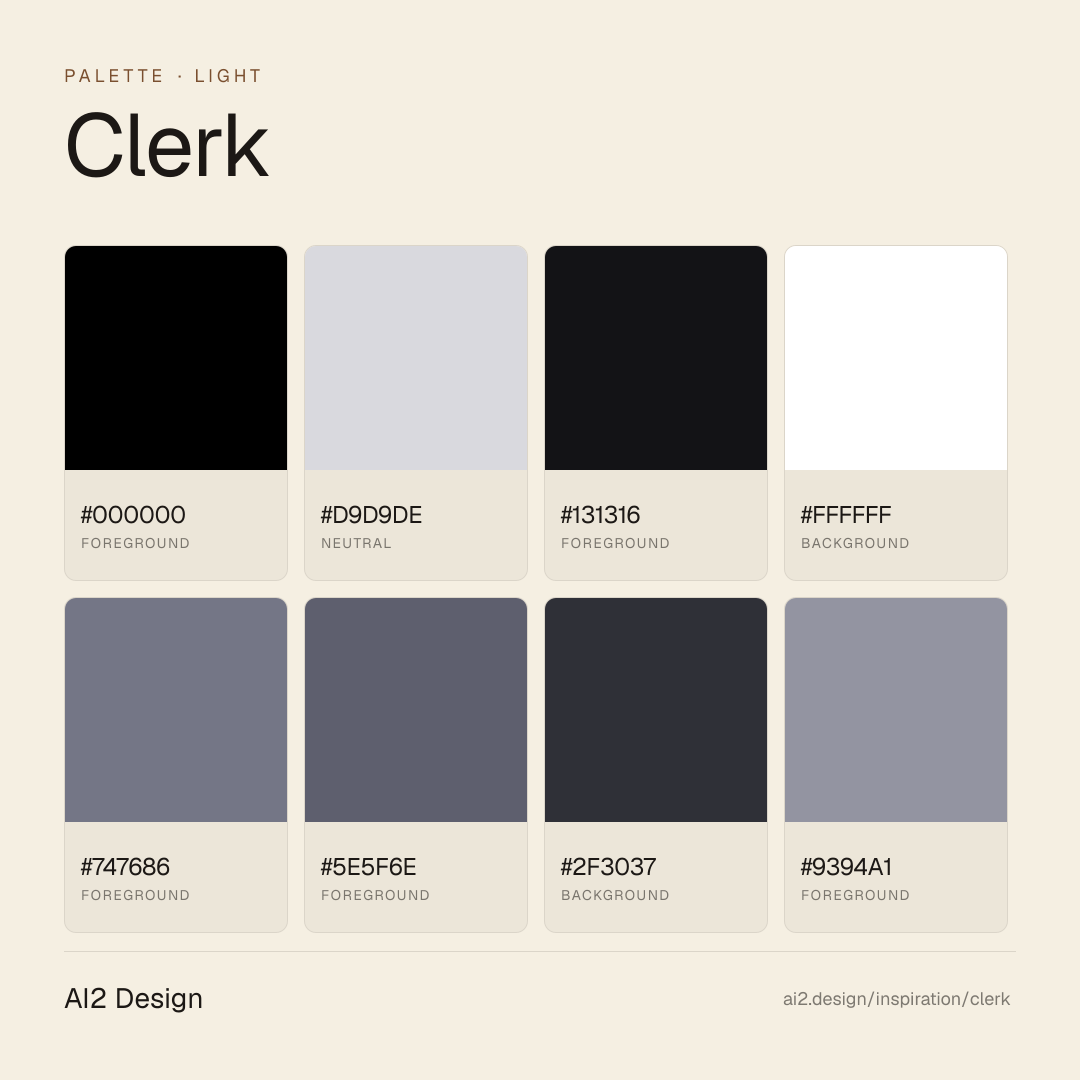
Color philosophy
Light primary canvas with #d9d9de hairline borders threading the entire layout; dark inversion zones for inverted plates; single cyan accent #5de3ff as scarce signal.
- #ffffff primary canvas — clean and bright
- #d9d9de hairline border colour — primary structural brand element
- #000000 primary ink text (~2,361 refs — high text density)
- #131316 dark inversion zone background
- #747686 muted grey for secondary text
- #5e5f6e tertiary text
- #2f3037 elevated dark surface for inverted cards
- #9394a1 metadata grey for tabular figures and timestamps
- #42434d background for dark cards on dark surfaces
- #5de3ff cyan accent — scarce signal, scarce paint
Gradients (paste-ready)
12 gradients catalogued — atmospheric depth around hero, subtle cyan-tinted glow around key callouts, never decorative chromatic surfaces
Typography rules
- Geist Variable for numerals, tabular figures, and emphasis — especially on rate cards and stats
- Suisse Intl for body and display moments
- Sōehne Mono at 12-14px for inline code and metadata
- Display 32-72px in Suisse Intl 500-600; body 13-16px
- Letter-spacing -0.12px on tight UI labels (small caps and metadata)
- Weight ladder: 400 body, 500 emphasis, 600 display
- Line-height 1.5 body, 1.05-1.15 display
Spacing rules
- 4px base unit, incremental scale 1/4/6/8/10/12/14/16/20/24
- Section vertical rhythm: 80-120px between major sections
- Card padding: 24-32px
- CTA padding: 12-14px vertical, 16-24px horizontal
- Hairline border padding: borders sit at 0 from container edges — no inset
Design tokens
Palette, type, and space — all agent-readable.
16 colors · hex / rgb / hsl / oklch
- foreground42%
- HEX
#000000 - RGB
rgb(0, 0, 0) - HSL
hsl(0, 0%, 0%) - OKLCH
oklch(0.00% 0.0000 0.00)
- HEX
- neutral35%
- HEX
#D9D9DE - RGB
rgb(217, 217, 222) - HSL
hsl(240, 7%, 86%) - OKLCH
oklch(88.68% 0.0068 286.26)
- HEX
- foreground9%
- HEX
#131316 - RGB
rgb(19, 19, 22) - HSL
hsl(240, 7%, 8%) - OKLCH
oklch(18.81% 0.0060 285.81)
- HEX
- background5%
- HEX
#FFFFFF - RGB
rgb(255, 255, 255) - HSL
hsl(0, 0%, 100%) - OKLCH
oklch(100.00% 0.0000 89.76)
- HEX
- foreground4%
- HEX
#747686 - RGB
rgb(116, 118, 134) - HSL
hsl(233, 7%, 49%) - OKLCH
oklch(56.97% 0.0246 279.94)
- HEX
- foreground2%
- HEX
#5E5F6E - RGB
rgb(94, 95, 110) - HSL
hsl(236, 8%, 40%) - OKLCH
oklch(49.00% 0.0239 282.46)
- HEX
- background1%
- HEX
#2F3037 - RGB
rgb(47, 48, 55) - HSL
hsl(233, 8%, 20%) - OKLCH
oklch(31.10% 0.0125 279.19)
- HEX
- foreground1%
- HEX
#9394A1 - RGB
rgb(147, 148, 161) - HSL
hsl(236, 7%, 60%) - OKLCH
oklch(66.99% 0.0191 282.36)
- HEX
- accent0%
- HEX
#5DE3FF - RGB
rgb(93, 227, 255) - HSL
hsl(190, 100%, 68%) - OKLCH
oklch(85.28% 0.1215 213.96)
- HEX
Inspector
Tab through the captured artifacts.
Six observable layers — page structure, fonts, breakpoints, z-index, gradients, motion — kept paste-ready alongside the tokens above.
Page structure
Semantic hierarchy at a glance.
Depth-first walk of meaningful sections — header, navigation, main regions, articles, footer. 9 nodes captured; depth capped at 6 for readability.
- body
- └─ div (×2)
- ├─ Header
- │ └─ div
- │ └─ div
- │ └─ div
- │ └─ Nav
- ├─ Main
- └─ Footer
Accessibility
WCAG contrast matrix.
192 combinations · 64 pass AA · 32 pass AAA · APCA Lc shown alongside WCAG 2.1 ratio for draft WCAG 3 awareness.
| Preview | fg | bg | Ratio | Normal | Large | APCA Lc | Context |
|---|---|---|---|---|---|---|---|
Aa | #000000 | #FFFFFF | 21.00 | AAA | AAA | +106 | foreground on background |
Aa | #FFFFFF | #000000 | 21.00 | AAA | AAA | -108 | background on foreground |
Aa | #131316 | #FFFFFF | 18.54 | AAA | AAA | +105 | foreground on background |
Aa | #FFFFFF | #131316 | 18.54 | AAA | AAA | -107 | background on foreground |
Aa | #000000 | #D9D9DE | 14.93 | AAA | AAA | +84 | foreground on neutral |
Aa | #D9D9DE | #000000 | 14.93 | AAA | AAA | -84 | neutral on foreground |
Aa | #000000 | #5DE3FF | 13.90 | AAA | AAA | +80 | foreground on accent |
Aa | #5DE3FF | #000000 | 13.90 | AAA | AAA | -80 | accent on foreground |
Aa | #D9D9DE | #131316 | 13.18 | AAA | AAA | -83 | neutral on foreground |
Aa | #131316 | #D9D9DE | 13.18 | AAA | AAA | +83 | foreground on neutral |
Image strategy
Asset loading & format policy.
Observable image posture — total count, lazy-loading ratio, and format mix. Hero image is measured above the fold.
Hero image
https://clerk.com/_next/static/media/circuit-lines@2xl.0~0tt7bohu08~.webp?dpl=dpl_FVH57DgvDYyCACPQozPWRkBrYvyY- Format
- WEBP
- Dimensions
- 1938×1774
- Loading
- auto
- srcset
- no
- Full Page
- developer-tools
- saas
- light
- 2026-05-16
Editorial credit
Featured Sponsor slot — your brand here
Dedicated logo placement — no rotation, on every export.
COMPARE THIS WITH
Side-by-side reads sharing this design signal.
See also