Panxo · Full Page
Panxo
Dark-first modern-fintech landing that inherits from the post-Vercel cohort rather than from the Stripe/Klarna lineage. Inter + Mona Sans duet, four-accent system anchored by classic web blue #0000ee as deliberate cultural reference, twelve Framer Motion atmospheric gradients holding depth. Sharper than Plasticity's calm subtlety, less choreographed than Chronicle's keynote.

Editorial disclaimer
Editorial noteThis entry documents observable design-language patterns for educational transfer and AI-agent briefing. Screenshots and trademarks are property of their respective owners. AI2 Design is not affiliated with or endorsed by the featured brand. Inspiration here is about language and rhythm — do not reproduce brand identity, logo, product copy, or proprietary features.
Curator verdict
Why we catalogued it?
Panxo is the rare fintech-adjacent landing that decided to inherit from the post-Vercel cohort rather than from the Stripe/Lemon Squeezy classical style — clean white canvas with dark-zoned section breaks, Inter as the workhorse, Mona Sans for display, and a four-accent system that uses classic web blue #0000ee like punk hypertext over polished corporate gradients. We catalogued it because most fintech sites either go full Klarna-pastel or full Wise-grayscale; Panxo threads a sharper needle by treating its accent as a deliberate cultural reference. If you are shipping for a buying audience that recognises the difference between Cabin Tailwind and shadcn Tailwind, this is a reference worth keeping open.
Design decisions observed
- White hero ground + classic web blue accent — a deliberate punk-fintech inheritance, recontextualising the early-web hyperlink as premium fintech signal.
- Inter Variable as workhorse + Mona Sans for display — a duet that keeps reading dense at 12-16px and brand voice clear at 32px+.
- Four-accent system — classic blue #0000ee primary, mint #10b981 success, lavender #777eff secondary, orange #ff6020 alerts — each one earns one register.
- Twelve atmospheric gradients — Framer Motion-animated light leaks at hero edges, never as fills.
- Moderate motion level (4 transitions) — sharper than Plasticity's calm subtlety but less choreographed than Chronicle's keynote.
What to study
- How a modern fintech inherits from the design-tool cohort instead of corporate finance — Panxo's discipline reads like Vercel-Cabin lineage, not Bloomberg-Wise.
- Classic web blue as fintech signal — most teams reach for indigo or violet; Panxo's #0000ee feels like a deliberate cultural decision.
- Atmospheric gradients as ambient depth — twelve gradients used at low alpha as light leaks, never as decorative fills.
What to avoid
- Don't paint primary CTAs in classic blue without owning the hyperlink reference — out of context it reads as broken default link colour.
- Don't import Framer Motion just for the gradient animations — the whole motion vocabulary needs the same library or the page feels stitched together.
Taste notes
The whole landing feels like a well-engineered fintech terminal designed by someone who reads HackerNews and follows Pieter Levels — sharp typography, four colour pots within reach but used sparingly, ambient gradients holding depth without committing to fills. The page is dark enough to feel serious and accent-rich enough to feel modern; the four-stop system pulls it out of the gray Wise-clone trap.
Lineage & references
- Heir to the post-Vercel fintech cohort — Mercury's 2024 redesign, Wise's modern era, Brex's developer-marketing moments.
- Standing shoulder-to-shoulder with the new wave of fintech tools that refuse corporate grayscale (Tella, Crunchyroll's fintech-adjacent product marketing).
- Part of the classic-blue revival cohort — Cabin, Are.na, Chronicle — where #0000ee is treated as a deliberate cultural reference rather than browser default.
Design language brief
Paste-ready for your agent.
A typed design system transfer brief — philosophy, tokens, rules, techniques, and fitness checks. Your agent reads the whole language, not just the pixels.
Philosophy
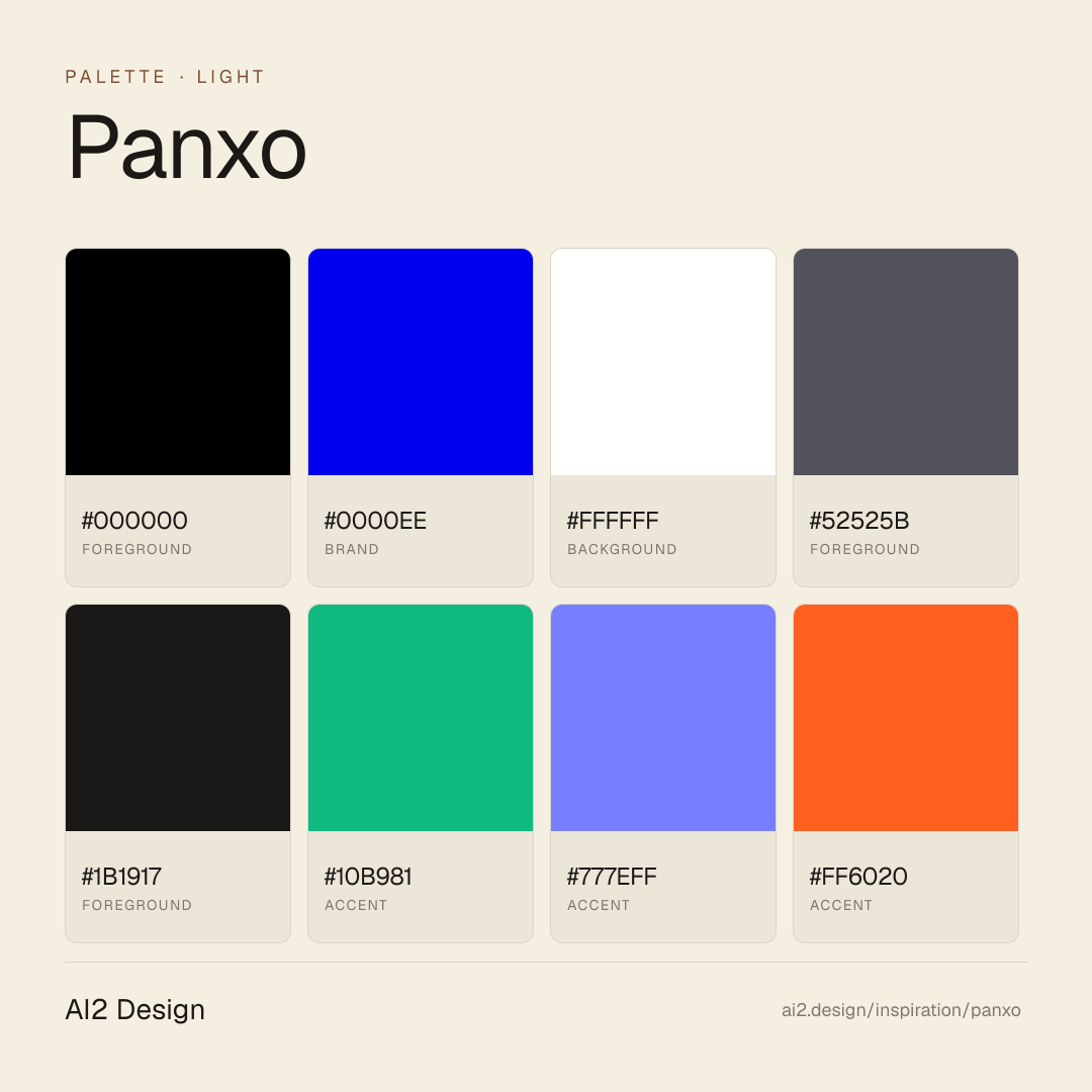
Light-first modern-fintech canvas with dark-zoned section breaks. Pure #ffffff ground, #000000 primary ink, #52525b secondary slate, #1b1917 used as alternate dark section ground for contrast moments. Inter Variable as workhorse (12-16px UI/body) + Mona Sans as display family (32px+ headlines). Four-accent system: classic blue #0000ee primary, mint #10b981 success, lavender #777eff secondary, orange #ff6020 alert — each used at <3% surface, never combined. Twelve atmospheric gradients exist as Framer Motion-animated light leaks. Moderate motion level (4 transitions).
Main prompt
Use this capture as a design language transfer brief for my project. Adopt the palette (light-first #ffffff canvas + #000000 primary ink + #52525b secondary slate + #1b1917 alternate dark section ground for contrast moments + four-accent system classic blue/mint/lavender/orange each at <3% surface, never combined), typographic duet (Inter Variable for UI/body 12-16px + Mona Sans for display 32px+), 4px-base spacing scale, atmospheric gradient system (12 gradients as Framer Motion light leaks only, never as fills), moderate motion level (4 transitions, primary state changes only), 640/768/1024/1280/1536 breakpoint ladder. Treat this as my project's constitution. Apply the language, not the source brand. When I ask you to build a page or component, enforce these rules by default and call out any deviation.
Overview
- Layout
- Single-column reading flow with atmospheric gradients holding depth between sections.
- Content width
- 640-768px reading rail; product UI sections may break to wider canvas.
- Framing
- Modern fintech terminal — dark, sharp, accent-rich without being noisy.
- Grid strength
- Implicit 4px grid; reading rhythm comes from typography size jumps and the four-stop accent placements.
Color philosophy
Pure #000 ground + #ffffff text hold the page; four-accent system (classic blue + mint + lavender + orange) handles attention with deliberate cultural references.
- #000000 ground; #1b1917 elevated surface for rare card moments
- #ffffff primary text, #52525b secondary, slate descender for metadata
- #0000ee classic blue: primary CTAs, links, focus rings (punk-fintech signal)
- #10b981 mint: success states, positive trend indicators
- #777eff lavender: secondary actions, neutral info
- #ff6020 orange: alerts, error states, attention chips
- Each accent ≤3% surface; never two in one component
Gradients (paste-ready)
12 atmospheric gradients — Framer Motion-animated light leaks at hero and section edges, never as button or card fills
Typography rules
- Inter Variable for all UI, body, captions (12-16px range)
- Mona Sans for display headlines (32px+) only — never below 24px
- Weights: Inter 400/500/600, Mona Sans 500/600
- Line-height 1.4-1.5 body, 1.1-1.2 display
- Letter-spacing 0 for body, -0.01em for Mona Sans display
Spacing rules
- 4px base unit
- Section vertical rhythm: 80-128px between major content blocks
- Card internal padding: 20-28px
- CTA padding: 12-14px vertical / 22-28px horizontal
Design tokens
Palette, type, and space — all agent-readable.
11 colors · hex / rgb / hsl / oklch
- foreground74%
- HEX
#000000 - RGB
rgb(0, 0, 0) - HSL
hsl(0, 0%, 0%) - OKLCH
oklch(0.00% 0.0000 0.00)
- HEX
- brand15%
- HEX
#0000EE - RGB
rgb(0, 0, 238) - HSL
hsl(240, 100%, 47%) - OKLCH
oklch(42.90% 0.2973 264.05)
- HEX
- background9%
- HEX
#FFFFFF - RGB
rgb(255, 255, 255) - HSL
hsl(0, 0%, 100%) - OKLCH
oklch(100.00% 0.0000 89.76)
- HEX
- foreground1%
- HEX
#52525B - RGB
rgb(82, 82, 91) - HSL
hsl(240, 5%, 34%) - OKLCH
oklch(44.19% 0.0146 285.79)
- HEX
- foreground0%
- HEX
#1B1917 - RGB
rgb(27, 25, 23) - HSL
hsl(30, 8%, 10%) - OKLCH
oklch(21.49% 0.0050 67.56)
- HEX
- accent0%
- HEX
#10B981 - RGB
rgb(16, 185, 129) - HSL
hsl(160, 84%, 39%) - OKLCH
oklch(69.59% 0.1491 162.48)
- HEX
- accent0%
- HEX
#777EFF - RGB
rgb(119, 126, 255) - HSL
hsl(237, 100%, 73%) - OKLCH
oklch(65.15% 0.1880 277.48)
- HEX
- accent0%
- HEX
#FF6020 - RGB
rgb(255, 96, 32) - HSL
hsl(17, 100%, 56%) - OKLCH
oklch(68.94% 0.2058 39.23)
- HEX
- background0%
- HEX
#F4F5F7 - RGB
rgb(244, 245, 247) - HSL
hsl(220, 16%, 96%) - OKLCH
oklch(97.00% 0.0029 264.54)
- HEX
Inspector
Tab through the captured artifacts.
Six observable layers — page structure, fonts, breakpoints, z-index, gradients, motion — kept paste-ready alongside the tokens above.
Page structure
Semantic hierarchy at a glance.
Depth-first walk of meaningful sections — header, navigation, main regions, articles, footer. 3 nodes captured; depth capped at 6 for readability.
- body
- ├─ div
- └─ Asidedialog
Accessibility
WCAG contrast matrix.
88 combinations · 44 pass AA · 30 pass AAA · APCA Lc shown alongside WCAG 2.1 ratio for draft WCAG 3 awareness.
| Preview | fg | bg | Ratio | Normal | Large | APCA Lc | Context |
|---|---|---|---|---|---|---|---|
Aa | #000000 | #FFFFFF | 21.00 | AAA | AAA | +106 | foreground on background |
Aa | #FFFFFF | #000000 | 21.00 | AAA | AAA | -108 | background on foreground |
Aa | #000000 | #F4F5F7 | 19.25 | AAA | AAA | +100 | foreground on background |
Aa | #F4F5F7 | #000000 | 19.25 | AAA | AAA | -101 | background on foreground |
Aa | #000000 | #F7F3EB | 18.97 | AAA | AAA | +99 | foreground on background |
Aa | #F7F3EB | #000000 | 18.97 | AAA | AAA | -100 | background on foreground |
Aa | #000000 | #EEF5ED | 18.92 | AAA | AAA | +99 | foreground on background |
Aa | #EEF5ED | #000000 | 18.92 | AAA | AAA | -100 | background on foreground |
Aa | #FFFFFF | #1B1917 | 17.53 | AAA | AAA | -107 | background on foreground |
Aa | #1B1917 | #FFFFFF | 17.53 | AAA | AAA | +104 | foreground on background |
Image strategy
Asset loading & format policy.
Observable image posture — total count, lazy-loading ratio, and format mix. Hero image is measured above the fold.
Hero image
https://framerusercontent.com/images/tY9fRCoNTgNp2kGIdSeVpxxWf3g.svg?width=102&height=21- Format
- SVG
- Dimensions
- 102×21
- Loading
- auto
- srcset
- no
- Full Page
- fintech
- saas
- developer-tools
- light
- 2026-05-15
Editorial credit
Featured Sponsor slot — your brand here
Dedicated logo placement — no rotation, on every export.
COMPARE THIS WITH
Side-by-side reads sharing this design signal.
See also