Interfere · Full Page
Interfere
Dark-first editorial-typography canvas for the AI experimentation platform. Six-font museum — Inter + Berkeley Mono + Heldane Text + Redaction + Departure Mono — each one assigned exactly one register. Six-accent spectrum (yellow, green, blue, pink, purple, royal blue) breaks up the dark like a tasting menu. Twelve atmospheric Framer Motion gradients hold ambient depth without ever becoming fills.

Editorial disclaimer
Editorial noteThis entry documents observable design-language patterns for educational transfer and AI-agent briefing. Screenshots and trademarks are property of their respective owners. AI2 Design is not affiliated with or endorsed by the featured brand. Inspiration here is about language and rhythm — do not reproduce brand identity, logo, product copy, or proprietary features.
Curator verdict
Why we catalogued it?
Interfere is the rare AI-experiment landing that decided to ship a typographic museum instead of a chatbot demo — six display families, thirteen preloaded woff2 weights, an editorial reading layer on a warm-white canvas with a serif/mono/sans triple that feels like it was designed by a New York indie magazine rather than a Y Combinator cohort. We catalogued it because most AI startups treat their landing as a temporary placeholder until the product reveals itself; Interfere's page is the product reveal. If you are shipping for a creative audience that smells generic AI sites from three scrolls away, this is the lodestar.
Design decisions observed
- Six-font typographic museum — Inter Variable as workhorse, Berkeley Mono as data voice, Heldane Text as editorial serif, Redaction as display, Departure Mono as accent — each one earns its register with surgical precision.
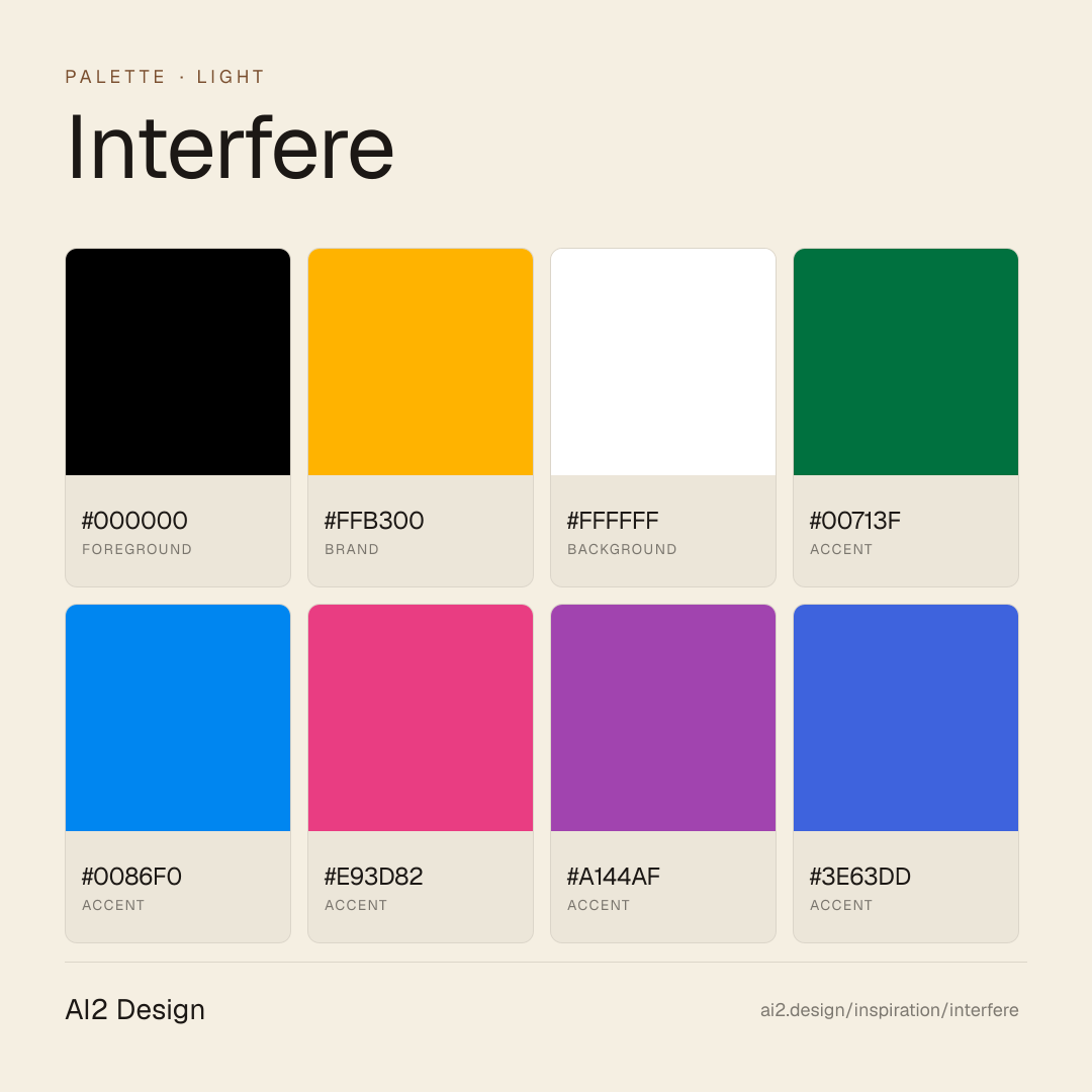
- Multi-accent spectrum — yellow #ffb300, green #00713f, blue #0086f0, pink #e93d82, purple #a144af, royal blue #3e63dd — six accents distributed across the page like flavour notes on a tasting menu.
- Warm-white canvas with full editorial freedom — light ground but the page reads alive thanks to the gold/pink/blue/green accent constellation breaking up the page.
- Twelve atmospheric gradients — Framer Motion-driven, used as ambient light leaks rather than as fills.
- Wide reading rail (1244px) — the typographic museum needs room to breathe.
What to study
- How to ship a typographic museum without it becoming a typeface zoo — Interfere assigns each of its six families a specific register and never lets them cross.
- Multi-accent spectrum as identity — most teams pick one or two accents; Interfere uses six as a tasting menu, each one appearing in a context where it's the unique right answer.
- Editorial light canvas without losing depth — the constellation of saturated accents on white keeps the page from feeling like a generic SaaS marketing template.
What to avoid
- Don't import six font families without assigning six registers — the entire system collapses without that discipline.
- Don't paint anything in the multi-accent palette — they are emphasis colours, never fills.
Taste notes
The whole landing feels like reading a beautifully typeset broadsheet on a quiet Sunday morning — warm white canvas, but the text is alive with subtle colour notes, each headline using a different display family without ever feeling chaotic. There is a kind of typographic confidence here that you only see when designers know they can take a hand off the wheel and trust their type stack to navigate.
Lineage & references
- Heir to the post-Are.na typographic-museum school — Cabin, Read.cv, Folk magazine — where multiple display families coexist with editorial discipline.
- Standing shoulder-to-shoulder with the new wave of AI tools that refuse the generic SaaS aesthetic (Krea AI 2024+, Runway's marketing era, Captions).
- Part of the dark-editorial revival cohort — Resend's brand renaissance, Linear's 2024 redesign, Vercel's render-on-scroll era — where dark canvas is treated as editorial space not technical chrome.
Design language brief
Paste-ready for your agent.
A typed design system transfer brief — philosophy, tokens, rules, techniques, and fitness checks. Your agent reads the whole language, not just the pixels.
Philosophy
Light-first editorial-typography canvas. Warm #ffffff ground, #000000 primary ink, slate descender scale for de-emphasis. Six-font typographic museum: Inter Variable as workhorse (UI/body 13-15px), Berkeley Mono as data voice (12-13px tables/code), Heldane Text as editorial serif (28px+ display), Redaction as display headlines (44px+), Departure Mono as accent (12px metadata). Six-accent spectrum: yellow #ffb300, green #00713f, blue #0086f0, pink #e93d82, purple #a144af, royal blue #3e63dd — each one used at <2% surface as emphasis colour, never as fill. Twelve atmospheric gradients exist as ambient light leaks. Wide 1244px reading rail.
Main prompt
Use this capture as a design language transfer brief for my project. Adopt the palette (light-first #ffffff canvas + #000000 primary ink + six-accent spectrum yellow/green/blue/pink/purple/royal-blue each at <2% surface as emphasis only — never as fill, never combined in one component), six-font typographic museum (Inter Variable for UI/body, Berkeley Mono for data, Heldane Text as editorial serif for display, Redaction for headlines, Departure Mono for accent metadata — each family owns exactly one register), 4px-base spacing scale heavy at 2/4/6/8/10/12, wide 1244px reading rail, Framer Motion for atmospheric gradient animations (12 gradients as ambient light leaks only), expressive motion vocabulary, 640/768/1024/1280/1536 breakpoint ladder. Treat this as my project's constitution. Apply the language, not the source brand. When I ask you to build a page or component, enforce these rules by default and call out any deviation.
Overview
- Layout
- Editorial single-column with break-out moments to wider canvas for display headlines and ambient gradient backdrops.
- Content width
- 640-768px reading rail centred inside 1244px hero canvas; display headlines may break out to 1244 full width.
- Framing
- Midnight broadsheet — dark canvas alive with typography and saturated accent constellation.
- Grid strength
- Editorial baseline grid governs vertical rhythm; horizontal grid loose because of the multi-family typography ladder.
Color philosophy
Pure #000 ground + #ffffff text hold the page; six-accent spectrum (yellow/green/blue/pink/purple/royal-blue) creates a constellation of emphasis without combining or fighting.
- #000000 only ground; no charcoal, no off-black
- #ffffff for primary text, slate descender for secondary copy
- #ffb300 yellow: hero accents, brand voice moments
- #00713f green: success states, code highlights
- #0086f0 blue: links, info badges
- #e93d82 pink: error states, attention chips
- #a144af purple: special-context tags
- #3e63dd royal blue: secondary links, technical labels
- Each accent ≤2% of surface; never two in one component; never as fill
Gradients (paste-ready)
12 atmospheric gradients catalogued — Framer Motion-animated light leaks at section edges, never as fills or button backgrounds
Typography rules
- Inter Variable for all UI, body, captions (13-15px range)
- Berkeley Mono for data tables, code blocks (12-13px)
- Heldane Text as editorial serif for display (28px+)
- Redaction as headline display (44px+) — never below 36px
- Departure Mono for accent metadata (12px) — used very sparingly
- Weights: Inter 400/500, Berkeley Mono 400, Heldane Text 400/500, Redaction 400, Departure Mono 400
- Line-height 1.4-1.5 body, 1.05-1.15 display
- Letter-spacing 0 for body; -0.01em for Redaction headlines
Spacing rules
- 4px base unit, heaviest use at 2/4/6/8/10/12px
- Section vertical rhythm: 96-144px between major content blocks (broadsheet pacing)
- Card internal padding: 20-28px standard
- CTA padding: 12-14px vertical / 22-26px horizontal
Design tokens
Palette, type, and space — all agent-readable.
8 colors · hex / rgb / hsl / oklch
- foreground91%
- HEX
#000000 - RGB
rgb(0, 0, 0) - HSL
hsl(0, 0%, 0%) - OKLCH
oklch(0.00% 0.0000 0.00)
- HEX
- brand2%
- HEX
#FFB300 - RGB
rgb(255, 179, 0) - HSL
hsl(42, 100%, 50%) - OKLCH
oklch(81.79% 0.1705 77.95)
- HEX
- background2%
- HEX
#FFFFFF - RGB
rgb(255, 255, 255) - HSL
hsl(0, 0%, 100%) - OKLCH
oklch(100.00% 0.0000 89.76)
- HEX
- accent2%
- HEX
#00713F - RGB
rgb(0, 113, 63) - HSL
hsl(153, 100%, 22%) - OKLCH
oklch(48.19% 0.1189 155.11)
- HEX
- accent1%
- HEX
#0086F0 - RGB
rgb(0, 134, 240) - HSL
hsl(207, 100%, 47%) - OKLCH
oklch(61.76% 0.1857 252.16)
- HEX
- accent1%
- HEX
#E93D82 - RGB
rgb(233, 61, 130) - HSL
hsl(336, 80%, 58%) - OKLCH
oklch(63.41% 0.2130 1.28)
- HEX
- accent1%
- HEX
#A144AF - RGB
rgb(161, 68, 175) - HSL
hsl(292, 44%, 48%) - OKLCH
oklch(55.19% 0.1812 322.24)
- HEX
- accent0%
- HEX
#3E63DD - RGB
rgb(62, 99, 221) - HSL
hsl(226, 70%, 55%) - OKLCH
oklch(54.38% 0.1910 267.01)
- HEX
Inspector
Tab through the captured artifacts.
Six observable layers — page structure, fonts, breakpoints, z-index, gradients, motion — kept paste-ready alongside the tokens above.
Page structure
Semantic hierarchy at a glance.
Depth-first walk of meaningful sections — header, navigation, main regions, articles, footer. 12 nodes captured; depth capped at 6 for readability.
- body
- ├─ Header
- │ └─ div
- │ └─ div
- │ └─ div
- │ └─ Nav
- ├─ Section (×5)
- ├─ div
- ├─ Section
- ├─ div
- ├─ Section
- └─ [+93 more]
Accessibility
WCAG contrast matrix.
40 combinations · 14 pass AA · 4 pass AAA · APCA Lc shown alongside WCAG 2.1 ratio for draft WCAG 3 awareness.
| Preview | fg | bg | Ratio | Normal | Large | APCA Lc | Context |
|---|---|---|---|---|---|---|---|
Aa | #000000 | #FFFFFF | 21.00 | AAA | AAA | +106 | foreground on background |
Aa | #FFFFFF | #000000 | 21.00 | AAA | AAA | -108 | background on foreground |
Aa | #000000 | #FFB300 | 11.70 | AAA | AAA | +71 | foreground on brand |
Aa | #FFB300 | #000000 | 11.70 | AAA | AAA | -70 | brand on foreground |
Aa | #FFFFFF | #00713F | 6.12 | AA | AAA | -85 | background on accent |
Aa | #00713F | #FFFFFF | 6.12 | AA | AAA | +80 | accent on background |
Aa | #000000 | #0086F0 | 5.67 | AA | AAA | +40 | foreground on accent |
Aa | #0086F0 | #000000 | 5.67 | AA | AAA | -38 | accent on foreground |
Aa | #000000 | #E93D82 | 5.45 | AA | AAA | +39 | foreground on accent |
Aa | #E93D82 | #000000 | 5.45 | AA | AAA | -37 | accent on foreground |
Image strategy
Asset loading & format policy.
Observable image posture — total count, lazy-loading ratio, and format mix. Hero image is measured above the fold.
Hero image
https://ojlajfkioceqxno6.public.blob.vercel-storage.com/marketing-site/homepage/luke.avif- Format
- AVIF
- Dimensions
- 512×512
- Loading
- auto
- srcset
- no
- Full Page
- ai
- design-tools
- saas
- light
- 2026-05-15
Editorial credit
Featured Sponsor slot — your brand here
Dedicated logo placement — no rotation, on every export.
COMPARE THIS WITH
Side-by-side reads sharing this design signal.
See also