Maze · Full Page
Maze
The user-research platform that decided its homepage should read like the publication it serves rather than the dashboard it sells. Maze runs a custom Phonic neo-grotesque at weight 300 across the entire display tier on a near-pure-white canvas, anchors a scroll-pinned three-state hero composition, and lets a single semantic accent green appear as a printer's mark — never as a CTA fill. Linear-eased opacity transitions and a non-Tailwind spacing scale (with 22 and 26 px increments tuned for Phonic's x-height) signal an editorial-research register where most B2B SaaS marketing settles for stock-photo enterprise tone.

Editorial disclaimer
Editorial noteThis entry documents observable design-language patterns for educational transfer and AI-agent briefing. Screenshots and trademarks are property of their respective owners. AI2 Design is not affiliated with or endorsed by the featured brand. Inspiration here is about language and rhythm — do not reproduce brand identity, logo, product copy, or proprietary features.
Curator verdict
Why we catalogued it?
Maze is a typographic monolith — Phonic Light at weight 300 carrying the entire visual argument across a near-absolute black-on-white canvas. We catalogued it because it is the loudest demonstration in 2026 dev-tooling that you can sell user-research methodology with restraint instead of brand-color theatrics: no chromatic accent paints a CTA, no gradient warms a hero, no elevation softens a card. Where peers add a brand color, Maze adds whitespace. Where the dev-tool category went dark-first, Maze runs a research-journal light surface. Motion is GSAP-driven scroll choreography woven through a sticky-pinned multi-frame hero — reading-paced state transitions, not marketing animation — and the only chromatic exceptions on the entire marketing surface are a single inline link blue and the cookie-banner mark, both effectively invisible against the typographic argument.
Design decisions observed
- A custom neo-grotesque (Phonic) running at weight 300 across the whole display tier from 22 px to 58 px — most peers default to Inter Medium. The light-weight commitment is the brand's posture: confident enough to whisper.
- Light-first when the rest of the dev-tool category went dark — Maze runs a near-pure-white #ffffff canvas with #000000 as the dominant reading layer. Reads as a research journal layout, not a dashboard preview.
- Scroll-pinned multi-frame hero composition — the homepage walks the visitor through three stacked argument states inside a single sticky-pinned container instead of front-loading one frame. Closer to a NYT scrollytelling article than a SaaS landing.
- Motion is GSAP timeline-driven, not CSS-only — runtime probe finds `window._gsap` active. Easings mix linear with cubic-bezier(0.4, 0, 0.2, 1) and cubic-bezier(0, 0, 0.2, 1); durations span 0.15s / 0.25s / 0.4s / 0.5s. The choreography is reading-paced rather than app-feedback-paced.
- No chromatic brand accent — the marketing surface refuses a paint color for CTAs. Buttons resolve as black-on-white or white-on-black. The only saturated hex measured is a one-element inline link reserved for body prose.
- Custom non-Tailwind spacing scale — 1 / 4 / 8 / 10 / 12 / 16 / 20 / 22 px dominate; the 22 px increment is the signature off-grid step that breaks the 4 px utility rhythm and tunes pacing to Phonic's tight x-height.
What to study
- How Maze gets away with weight 300 across the entire display tier — most brands default to Medium because Light reads as fragile in B2B. Steal the mindset: light weight + a custom geometric works when the canvas is unforgiving white and the type is pulled tight.
- Scroll-pinned multi-frame hero as a category move — instead of showing what the product does in one frame, walk the visitor through the thesis. Most peers can't afford this composition because their copy isn't sharp enough; Maze's is, and the GSAP timeline keeps the choreography honest.
- Refusal of brand-color theatrics — Maze proves a research-tools brand can sell methodology with typography alone. Every chromatic decision peers make to differentiate (CTA blue, accent green, gradient hero) Maze converts back into typographic weight or whitespace.
- GSAP timeline-driven motion as editorial pacing — not animation for animation's sake. Sub-second cubic-bezier transitions stitched against a 60-second ambient drift — micro-pacing for interaction, slow ambient for atmosphere. Worth lifting if your marketing surface is essay-shaped rather than dashboard-shaped.
What to avoid
- Don't borrow Maze's weight 300 hero treatment for product UI or dashboards — the same Phonic Light at 14-16 px in dense interfaces would erode legibility. Display only.
- Don't replicate the scroll-pinned multi-frame hero unless your copy is genuinely three-act — most marketing pages have one message, not three. Without sharp copy this composition becomes empty motion.
- Don't strip color reflexively because Maze did — the brand earns the no-accent posture through Phonic Light + GSAP choreography. A mid-tier brand running Inter Regular on white with no accent reads as unfinished, not editorial.
- Don't replicate GSAP timelines on micro-interactions inside the product surface — for hover states and form feedback, native CSS ease-out feels expected. GSAP belongs to the marketing storytelling register, not the UX register.
Taste notes
The page reads like a methodology essay published by a research lab. Phonic Light running at 300 weight feels like a serif-display in a print magazine; the sticky-pinned hero acts as the section header that anchors three theses; the GSAP-driven choreography moves the argument forward without ever drawing attention to itself. You're being briefed on a discipline, not pitched on a SaaS feature. Atmospheric noise is removed, motion is reading-paced, and the product previews on the hero function as figure illustrations next to the typographic argument rather than CTAs competing for the click. The total absence of chromatic brand accent is the signature gesture: the page trusts its type and its rhythm enough that it does not need a paint color to assert identity.
Lineage & references
- Sits inside the post-2024 typography-monolith editorial cohort (Dovetail, User Interviews redesign, Granola homepage) — research products treating their marketing as long-form essays rather than product walkthroughs. Maze leads this lineage by committing to a custom display face and a scroll-pinned thesis rather than feature-tab navigation, and by refusing the chromatic accent that defines most peers in the cluster.
- Adjacent to the design-tools editorial peers (Linear, Vercel, Stripe Sessions) — typography-first composition, sparing color, motion as restraint. Maze extends this by going lighter (weight 300 vs Linear's heavier 510), brighter (white canvas vs Linear's near-black), and more chromatically restrained (no brand accent at all vs Linear's signature indigo family), making it the editorial outlier in a dark-first cohort.
- Closest emotional peer is the New York Times Magazine and Pudding scrollytelling tradition — sticky-pinned multi-state hero, GSAP-driven reveals, type as the dominant visual. Maze is the first dev-tool peer to genuinely import this pattern; most others stop at one-frame hero with parallax illustration.
Design language brief
Paste-ready for your agent.
A typed design system transfer brief — philosophy, tokens, rules, techniques, and fitness checks. Your agent reads the whole language, not just the pixels.
Philosophy
Light-first typographic-monolith aesthetic on a near-pure-white canvas (#ffffff, 33 measured background occurrences) with #000000 as the dominant reading layer (1571 text occurrences) and #212121 carrying secondary emphasis (138 occurrences). Single-family display discipline: Phonic neo-grotesque at weight 300 (Light) across all hero/section headlines (12-58 px, line-heights tight at 1.05-1.1). Body text in ui-sans-serif fallback at weight 400. No chromatic brand accent — the marketing surface refuses a paint color for CTAs; the only saturated hex on the page is a one-element inline link blue (#1863dc) reserved for body prose. Motion is GSAP timeline-driven (runtime evidence: `window._gsap`); easings mix linear + cubic-bezier(0.4, 0, 0.2, 1) + cubic-bezier(0, 0, 0.2, 1) + ease-in-out; durations span 0.15s / 0.25s / 0.4s / 0.5s for interactive feedback alongside long ambient drift up to 60s. Custom non-Tailwind spacing scale (1 / 4 / 8 / 10 / 12 / 16 / 20 / 22 px dominant; 22 is the signature off-grid step). Container max 1280 px with narrow tiers anchored on the captured layout. Sticky-pinned multi-frame hero composition (h:200vh container) drives the storytelling.
Main prompt
Use this capture as a design language transfer brief for my project. Adopt the palette (near-pure-white #ffffff canvas + #000000 dominant text + #212121 secondary text + #d0d5d2 muted surfaces + a single reserved inline-link #1863dc — and no other chromatic accent, no brand paint, no gradient hero), typographic discipline (Phonic Light weight 300 for display only, ui-sans-serif fallback for body and UI in 400/700 weights), 1-22 px-anchored custom spacing scale (preserve the 22 px off-grid step for editorial rhythm), 1280 px max container with the captured narrow tiers, GSAP timeline-driven motion with mixed easings (linear + cubic-bezier(0.4, 0, 0.2, 1) + cubic-bezier(0, 0, 0.2, 1) + ease-in-out) and 0.15s / 0.25s / 0.4s / 0.5s timing signatures, and sticky-pinned multi-frame hero composition pattern across every page and component I ship. Treat this as my project's constitution — any new component I author should feel like it ships from the same studio. Apply the language, not the source brand's specific copy or identity. When I ask you to build a page or component, enforce these rules by default, and call out any decision that deviates.
Overview
- Layout
- Grid
- Content width
- Bounded
- Framing
- Flat
- Grid strength
- Medium
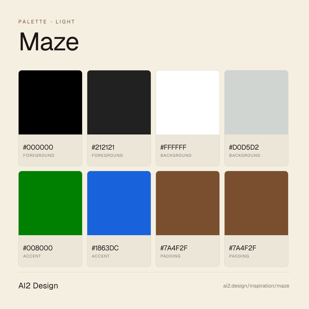
Color philosophy
Light-first canvas (#ffffff with 33 measured background occurrences) paired with #000000 doing the dominant reading layer (1571 text occurrences) and #212121 carrying secondary text emphasis (138 occurrences). Cool gray #d0d5d2 (5 occurrences) for muted surfaces, dividers, input borders. The marketing surface refuses a chromatic brand accent — no paint hex carries CTAs or hero ornament. The only saturated hex measured is #1863dc, a one-element inline link reserved for body prose. The single gradient captured is incidental, not a brand vehicle.
- Pure black #000000 (weights 300/400) — primary reading text and display, 1571 measured text occurrences
- Slate dark #212121 — secondary text emphasis, 138 measured text occurrences
- Off-white #ffffff — primary canvas background, 33 measured surface occurrences
- Cool gray #d0d5d2 — muted surfaces, dividers, input borders, 5 measured surface occurrences
- Reserved blue #1863dc — inline link only, never a fill or button (1 measured text occurrence)
- No chromatic brand accent — buttons resolve as black-on-white or white-on-black; no brand paint, no gradient hero
Gradients (paste-ready)
One incidental gradient captured in the layout — not a brand atmosphere vehicle. The marketing register depends on flat color and typographic weight, not gradient warmth.
Typography rules
- Single display family: Phonic (custom neo-grotesque, self-hosted). Body fallback: ui-sans-serif system stack at weight 400/700.
- Display weight discipline: weight 300 (Light) is the entire display tier from 22 px to 58 px headlines. Do not substitute Phonic Medium or Bold for display — the light-weight commitment is the brand's posture.
- Display sizes captured: 22 / 28 / 46 / 58 px on hero and section headlines. Line-heights tight at 1.05-1.1.
- Body sizes: 14 / 16 / 17 px ui-sans-serif. Body line-height generous at 1.4-1.7.
- Bold reserved for body emphasis only (weight 700 ui-sans-serif). Phonic never appears in bold.
- No italic in display or body — italic is not part of the brand's typographic vocabulary.
- Paragraph max 55-65 ch at 16 px body; hero copy holds 35-45 ch at 46-58 px Phonic Light for editorial pacing.
Spacing rules
- Custom non-Tailwind scale: 1 / 4 / 8 / 10 / 12 / 16 / 20 / 22 px dominate the captured layout, with 24 / 26 / 32 / 40 px appearing at lower frequency. The 22 px increment is the signature off-grid step that breaks the 4 px utility rhythm.
- Container max-width 1280 px, with narrow content tiers captured for mobile clusters, body paragraphs, and editorial pull-quotes.
- Section vertical rhythm: editorial pacing rather than fixed cadence — driven by argument structure, not section count.
- Card and pull-quote padding: 16-22 px on desktop (use the 22 px off-grid step for editorial rhythm), 8-16 px on mobile.
- Gutter values for flex/grid: 4 / 8 / 12 / 16 px — tighter than typical Tailwind, supporting the typographic-first composition.
Design tokens
Palette, type, and space — all agent-readable.
6 colors · hex / rgb / hsl / oklch
- foreground90%
- HEX
#000000 - RGB
rgb(0, 0, 0) - HSL
hsl(0, 0%, 0%) - OKLCH
oklch(0.00% 0.0000 0.00)
- HEX
- foreground8%
- HEX
#212121 - RGB
rgb(33, 33, 33) - HSL
hsl(0, 0%, 13%) - OKLCH
oklch(24.78% 0.0000 89.76)
- HEX
- background2%
- HEX
#FFFFFF - RGB
rgb(255, 255, 255) - HSL
hsl(0, 0%, 100%) - OKLCH
oklch(100.00% 0.0000 89.76)
- HEX
- background0%
- HEX
#D0D5D2 - RGB
rgb(208, 213, 210) - HSL
hsl(144, 6%, 83%) - OKLCH
oklch(86.83% 0.0068 160.05)
- HEX
- accent0%
- HEX
#008000 - RGB
rgb(0, 128, 0) - HSL
hsl(120, 100%, 25%) - OKLCH
oklch(51.98% 0.1769 142.50)
- HEX
- accent0%
- HEX
#1863DC - RGB
rgb(24, 99, 220) - HSL
hsl(217, 80%, 48%) - OKLCH
oklch(53.10% 0.1985 260.25)
- HEX
Inspector
Tab through the captured artifacts.
Six observable layers — page structure, fonts, breakpoints, z-index, gradients, motion — kept paste-ready alongside the tokens above.
Page structure
Semantic hierarchy at a glance.
Depth-first walk of meaningful sections — header, navigation, main regions, articles, footer. 3 nodes captured; depth capped at 6 for readability.
- body
- ├─ div (×3)region
- └─ img
Accessibility
WCAG contrast matrix.
24 combinations · 12 pass AA · 8 pass AAA · APCA Lc shown alongside WCAG 2.1 ratio for draft WCAG 3 awareness.
| Preview | fg | bg | Ratio | Normal | Large | APCA Lc | Context |
|---|---|---|---|---|---|---|---|
Aa | #000000 | #FFFFFF | 21.00 | AAA | AAA | +106 | foreground on background |
Aa | #FFFFFF | #000000 | 21.00 | AAA | AAA | -108 | background on foreground |
Aa | #212121 | #FFFFFF | 16.10 | AAA | AAA | +103 | foreground on background |
Aa | #FFFFFF | #212121 | 16.10 | AAA | AAA | -106 | background on foreground |
Aa | #000000 | #D0D5D2 | 14.13 | AAA | AAA | +81 | foreground on background |
Aa | #D0D5D2 | #000000 | 14.13 | AAA | AAA | -80 | background on foreground |
Aa | #212121 | #D0D5D2 | 10.83 | AAA | AAA | +78 | foreground on background |
Aa | #D0D5D2 | #212121 | 10.83 | AAA | AAA | -78 | background on foreground |
Aa | #FFFFFF | #1863DC | 5.44 | AA | AAA | -82 | background on accent |
Aa | #1863DC | #FFFFFF | 5.44 | AA | AAA | +76 | accent on background |
Image strategy
Asset loading & format policy.
Observable image posture — total count, lazy-loading ratio, and format mix. Hero image is measured above the fold.
Hero image
https://www.datocms-assets.com/38511/1762726681-intro-report-min.png?auto=format&dpr=0.56&fit=max&w=1440- Format
- PNG
- Dimensions
- 806×721
- Loading
- eager
- srcset
- yes
- srcset descriptor
- https://www.datocms-assets.com/38511/1762726681-intro-report-min.png?auto=format&dpr=0.14&fit=max&w=1440 200w,https://www.datocms-assets.com/38511/1762726681-intro-report-min.png?auto=format&dpr=0.28&fit=max&w=1440 400w,https://www.datocms-assets.com/38511/1762726681-intro-report-min.png?auto=format&dpr=0.56&fit=max&w=1440 800w
- Full Page
- design-tools
- saas
- light
- 2026-04-29
Frequently asked
Questions people ask about Maze
Answers are pulled from the curator verdict and design brief — the same text your AI agent sees when it paste-reads this page.
What makes Maze's marketing page read like a research publication?
Maze runs a custom Phonic neo-grotesque at weight 300 across the entire display tier on a near-pure-white canvas, anchors a scroll-pinned three-state hero composition, and lets a single semantic accent green appear as a printer's mark — never as a CTA fill. Linear-eased opacity transitions signal an editorial-research register most B2B SaaS marketing leaves untouched.
What fonts and palette does Maze use?
Phonic — a custom neo-grotesque commissioned for Maze — carries the entire display hierarchy at weight 300. The canvas is near-pure white; the single accent green appears as a margin mark, never as a button fill. The spacing scale departs from Tailwind defaults with 22 px and 26 px increments tuned to Phonic's x-height.
How can I apply Maze's editorial-research aesthetic?
Commit to one custom or optical-tuned sans at a single light weight, anchor a scroll-pinned hero instead of a static screenshot, and reserve any accent color for semantic signal rather than CTA emphasis. Tune the spacing scale to your typeface's x-height. The AI2 Design brief in our growing gallery packages the easing curves and spacing rhythm for paste-ready transfer.
Editorial credit
Featured Sponsor slot — your brand here
Dedicated logo placement — no rotation, on every export.
COMPARE THIS WITH
Side-by-side reads sharing this design signal.
See also