Figma · Full Page
Figma
The design-tool brand that figured out how to market itself like a public square, not a product. Figma's landing is a showcase of its own design system — triple-family typography, openly-named CSS variable tokens, and a rainbow of low-frequency spot colors that together say 'every creator has a seat here'.

Editorial disclaimer
Editorial noteThis entry documents observable design-language patterns for educational transfer and AI-agent briefing. Screenshots and trademarks are property of their respective owners. AI2 Design is not affiliated with or endorsed by the featured brand. Inspiration here is about language and rhythm — do not reproduce brand identity, logo, product copy, or proprietary features.
Curator verdict
Why we catalogued it?
Figma is the design-tool brand that figured out how to market itself like a public square, not a product. We catalogued it because no other landing demonstrates so transparently what it means to treat your own marketing page as a showcase of your own design system — a triple-family typographic voice, an openly-named CSS variable layer, and a constellation of spot colors used so sparingly they read as the color-index margin on a technical book rather than as brand fills. Two of the spots have measurable surface (cyan #33dfdf and gold #b98e01) and they carry the brand's chromatic posture; the rest appear once each, behaving more like the swatches in a manual than a marketing palette. If you are shipping for a creative audience that expects to see the brand's own tools used on the brand's own page, this is the reference that proves it can be done without losing editorial discipline.
Design decisions observed
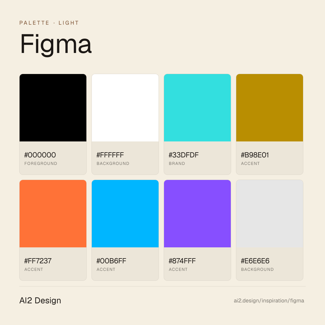
- A constellation rather than a brand color — Figma anchors on two recurring spots (cyan #33dfdf with 10 measured uses, gold #b98e01 with 8) and surrounds them with eight one-off accents (orange #ff7237, electric purple #874fff, azure #00b6ff, sage #95b9ac, lilac #cb9fd2, peach #ffc9c1, deep red #721c1c, ice cyan #c7f8fb). The structure says 'every creator has a seat' without flattening into noise.
- A triple typographic voice that still coheres — figmaSans (UI), figmaMono (code), and ABCWhytePlusVariable (display) — each tokenized in CSS variables. Most teams can't pull this off; Figma has earned the coherence by giving each family one job and refusing overlap.
- Design-system transparency as a posture — the CSS variable layer is openly namespaced and inspectable (31 captured `--f-*` tokens for fonts, cursors, containers, gutters). The page confesses how it's built, which is itself the brand argument.
- Cursor states as first-class tokens — grab, grabbing, text, pointer, default — tokenized like colors are elsewhere. A giveaway of what the product actually is: a canvas where interaction state carries meaning.
- Container widths restrained and restrained again — 840 px and 980 px are the only two bounded reading rails the page uses. For a company that sells infinite canvas, the marketing reading surface is deliberately compact.
- Motion is Framer Motion-driven (runtime evidence: `window.MotionIsMounted`) but stays on simple CSS easings — `ease-out`, `ease-in-out`, `ease`, `linear`. The library's full vocabulary is available; the brand chooses restraint anyway.
What to study
- How Figma turns its own design system into marketing proof — the CSS variables aren't hidden, they're exhibited. Steal the discipline: your tokens should be inspectable by the curious user, not buried in a Storybook deploy.
- Multi-family typography without visual chaos — the key is role separation (sans for UI, mono for code, display for one hero moment) rather than mixed weights inside a single family. When you need three voices, don't crowd them inside one.
- Two-anchor + many-spots palette structure — instead of a single brand color or a flat rainbow, Figma stabilises on two recurring accents and surrounds them with one-off swatches. The result is plural without losing identity.
- Semantic cursor tokens on a marketing page — a small detail that says the team thinks about interaction at the token level. Worth borrowing even if you don't ship a canvas product.
- Framer Motion as a power hidden in plain sight — the library is loaded but the visible motion vocabulary stays on CSS easings. Worth lifting: capability you don't lean on is a posture, not a waste.
What to avoid
- Don't replicate the constellation palette without earning it — Figma's structure works because it maps to a plural creator audience. Use it on a finance page and the signal becomes 'we're not serious'.
- Don't license a variable display family before you have the editorial moments to justify it — Whyte Plus here earns its line in a couple of hero headlines, not every heading. The cost of the licence is the discipline of using it sparingly.
- Don't copy the `--f-*` CSS variable namespace verbatim — the namespace is part of Figma's brand grammar. Invent your own token namespace that tells your own story.
- Don't pull Framer Motion into a project just to leave it idle — Figma earns the library by having a few moments that need it. Loading it for ambient marketing pages without spring physics or layout animation is wasted bytes.
Taste notes
The page reads like a design system documentation site that someone accidentally gave a marketing team to run. Nothing shouts, nothing slouches; the spot accents feel less like decoration and more like a color-index margin on a technical book. Whitespace is confident, type climbs to a 64 px display at its loudest, and the overall effect is 'we trust your attention' — a rare confidence in the design-tool category. The duo of cyan and gold doing the recurring work makes the constellation read as composed rather than scattered.
Lineage & references
- The category-defining brand of the collaborative-first design-tool generation — Figma redrew the map Sketch and Adobe XD operated on, and its marketing page is the receipt of that shift.
- Shares DNA with the self-hosted-type + custom-design-system cohort (Linear, Stripe, Vercel, Notion) — brands that treat their marketing as a proof-of-concept for the product they're selling, not as a creative-agency handoff.
- Part of the 'community platform brand' lineage (Are.na, Cargo, Canva) — products whose audience is plural enough that the visual identity has to make room for many voices without losing its own.
Design language brief
Paste-ready for your agent.
A typed design system transfer brief — philosophy, tokens, rules, techniques, and fitness checks. Your agent reads the whole language, not just the pixels.
Philosophy
Light-first editorial with a community-inviting constellation palette. The canvas is monochrome (#000000 dominant text with 1347 measured occurrences, #ffffff dominant background with 656 occurrences); the chromatic posture comes from two recurring brand-tier spots — cyan #33dfdf (10 measured uses) and gold #b98e01 (8 uses) — surrounded by eight one-off accents (orange #ff7237, azure #00b6ff, electric purple #874fff, sage #95b9ac, lilac #cb9fd2, peach #ffc9c1, deep red #721c1c, ice cyan #c7f8fb). Typography is a triple-family system — figmaSans (UI), figmaMono (code), ABCWhytePlusVariable (display) — each tokenized in CSS variables under the `--f-*` namespace (31 captured tokens for fonts, cursors, containers, gutters). Cursor states are first-class tokens (`--f-cursor-grab` etc.), signalling canvas-interactive intent. Motion is Framer Motion-driven (runtime evidence: `window.MotionIsMounted`) but stays on simple CSS easings (ease-out / ease-in-out / ease / linear). Elevation is flat — depth comes through inset 1 px borders and a single dramatic 24 px-blur drop shadow reserved for modal-grade lift.
Main prompt
Use this capture as a design language transfer brief for my project. Adopt the monochrome canvas (white background + near-black text), the constellation accent palette (two recurring brand spots — cyan and gold — plus a rotation of one-off swatches), the triple-family typographic system (sans for UI, mono for code, variable display for hero moments), an openly-namespaced CSS variable token layer, semantic cursor state tokens, a 2 px-base spacing scale with narrow bounded reading containers (840 px and 980 px), micro-to-pill radii (2-50 px with intentional jumps), Framer Motion-driven choreography held to simple CSS easings (ease-out / ease-in-out / ease / linear) with timing tier 0.16-2s, and a flat elevation posture (inset 1 px border hairlines + one dramatic modal-grade drop shadow) across every page and component I ship. Treat this as my project's constitution — any new component I author should pass as if crafted in the same studio. Apply the language, not Figma's specific copy or identity. When I ask you to build a page or component, enforce these rules by default, and call out any decision that deviates.
Overview
- Layout
- Grid
- Content width
- Bounded
- Framing
- Flat
- Grid strength
- Strong
Color philosophy
Monochrome canvas — pure white #ffffff background (656 measured uses) + near-black #000000 text (1347 measured uses). Two brand-tier accents recur with measurable surface: cyan #33dfdf (10 uses) and gold #b98e01 (8 uses) — these carry the brand's chromatic posture. Eight one-off spots fill out the constellation: orange #ff7237 (3), azure #00b6ff (3), electric purple #874fff (2), sage #95b9ac (1), lilac #cb9fd2 (1), peach #ffc9c1 (1), deep red #721c1c (1), ice cyan #c7f8fb (1). Neutral #e6e6e6 (2) handles subtle borders. No gradients captured. The structure itself is the statement: 'every creator has a seat here', anchored by two recurring spots so the page never reads scattered.
- Near-black #000000 as dominant text — 1347 measured occurrences
- Pure white #ffffff as dominant background — 656 measured occurrences (also tokenized as `--f-statsig-overlay`)
- Cyan #33dfdf and gold #b98e01 — recurring brand-tier accents (10 + 8 measured uses), the only two with enough surface to count as brand color
- Eight one-off spots — orange / azure / electric purple / sage / lilac / peach / deep red / ice cyan — appear 1-3 times each as decoration, never as fills or primary CTA color
- Neutral #e6e6e6 for subtle border and divider moments
- No dark-mode commitment captured — the brand lives in light
Gradients (paste-ready)
No gradients captured in the marketing surface — depth and atmosphere come from typography, whitespace, and inset borders, not gradient warmth.
Typography rules
- Triple family system: `figmaSans` (UI + body), `figmaMono` (code + technical annotations), `ABCWhytePlusVariable` (display + hero moments). Each family tokenized in CSS variables under the `--f-*` namespace.
- figmaSans + figmaMono self-hosted via Next.js (`/_next/static/media/*.woff2`), preloaded via `<link rel='preload'>`. ABCWhytePlusVariable is a licensed variable font (ABC Dinamo Whyte Plus) also self-hosted; the capture also lists Fallback declarations for each family (size-adjust shimming).
- Weight ladder is variable-font-driven: 320 / 330 / 400 / 480 / 540 observed across the captured scale. Broader than a typical 400/500/600/700 ladder — use the variable font's interpolation instead of discrete weights.
- Display sizes captured: 20 / 26 / 64 px on hero and section headlines. Tracking pulls in negative on the largest tier; line-heights are tight-to-content (1.0-1.1 on display, 1.4-1.55 on body).
- Body sizes: 16 / 18 px figmaSans. Body line-height generous (~1.4-1.55).
- figmaMono carries positive tracking on smaller sizes — compensating for monospace density on technical annotations.
- Paragraph max 45-55 ch at body 16-18 px; technical runs in figmaMono use 60 ch comfortably.
- `font-display` strategy is mixed (captured), reflecting the swap-vs-block tradeoff between licensed display and self-hosted UI/mono families.
Spacing rules
- 2 px base unit. Scale captured: 2 / 4 / 6 / 8 / 10 / 12 / 16 / 18 px dominate; 24 / 30 / 32 px appear at lower frequency. The 2 px base is fine-grained enough to support small UI rhythm without falling off-grid.
- Container max-widths are two only: 840 px and 980 px. The page never sprawls past 980 px reading width — narrow bounded rails, editorial discipline.
- Token `--f-max-content-width` declared in CSS variables for full-bleed sections (navigation, footer); reading columns stay at 840-980.
- Token `--f-gutter` (24 px) — column gutter standard for flex/grid.
- Token `--f-lego-block-padding` — component 'lego block' vertical rhythm between sections.
- Card padding: 16-24 px on desktop, 8-16 px on mobile. Pick from the 2 px-base scale; no magic numbers.
Design tokens
Palette, type, and space — all agent-readable.
14 colors · hex / rgb / hsl / oklch
- foreground66%
- HEX
#000000 - RGB
rgb(0, 0, 0) - HSL
hsl(0, 0%, 0%) - OKLCH
oklch(0.00% 0.0000 0.00)
- HEX
- backgroundf-statsig-overlay32%
- HEX
#FFFFFF - RGB
rgb(255, 255, 255) - HSL
hsl(0, 0%, 100%) - OKLCH
oklch(100.00% 0.0000 89.76)
- HEX
- brand0%
- HEX
#33DFDF - RGB
rgb(51, 223, 223) - HSL
hsl(180, 73%, 54%) - OKLCH
oklch(82.25% 0.1315 194.90)
- HEX
- accent0%
- HEX
#B98E01 - RGB
rgb(185, 142, 1) - HSL
hsl(46, 99%, 36%) - OKLCH
oklch(66.91% 0.1367 86.94)
- HEX
- accent0%
- HEX
#FF7237 - RGB
rgb(255, 114, 55) - HSL
hsl(18, 100%, 61%) - OKLCH
oklch(71.40% 0.1863 41.33)
- HEX
- accent0%
- HEX
#00B6FF - RGB
rgb(0, 182, 255) - HSL
hsl(197, 100%, 50%) - OKLCH
oklch(73.46% 0.1589 236.36)
- HEX
- accent0%
- HEX
#874FFF - RGB
rgb(135, 79, 255) - HSL
hsl(259, 100%, 65%) - OKLCH
oklch(59.13% 0.2445 291.73)
- HEX
- background0%
- HEX
#E6E6E6 - RGB
rgb(230, 230, 230) - HSL
hsl(0, 0%, 90%) - OKLCH
oklch(92.49% 0.0000 89.76)
- HEX
- background0%
- HEX
#F3FFE3 - RGB
rgb(243, 255, 227) - HSL
hsl(86, 100%, 95%) - OKLCH
oklch(98.37% 0.0387 126.08)
- HEX
Inspector
Tab through the captured artifacts.
Six observable layers — page structure, fonts, breakpoints, z-index, gradients, motion — kept paste-ready alongside the tokens above.
Page structure
Semantic hierarchy at a glance.
Depth-first walk of meaningful sections — header, navigation, main regions, articles, footer. 7 nodes captured; depth capped at 6 for readability.
- body
- └─ div
- ├─ div
- │ └─ Header
- ├─ Main
- │ └─ Section (×10)
- └─ Footer
Accessibility
WCAG contrast matrix.
128 combinations · 44 pass AA · 30 pass AAA · APCA Lc shown alongside WCAG 2.1 ratio for draft WCAG 3 awareness.
| Preview | fg | bg | Ratio | Normal | Large | APCA Lc | Context |
|---|---|---|---|---|---|---|---|
Aa | #000000 | #FFFFFF | 21.00 | AAA | AAA | +106 | foreground on background |
Aa | #FFFFFF | #000000 | 21.00 | AAA | AAA | -108 | background on foreground |
Aa | #000000 | #F3FFE3 | 20.22 | AAA | AAA | +103 | foreground on background |
Aa | #F3FFE3 | #000000 | 20.22 | AAA | AAA | -105 | background on foreground |
Aa | #000000 | #C7F8FB | 18.25 | AAA | AAA | +97 | foreground on accent |
Aa | #C7F8FB | #000000 | 18.25 | AAA | AAA | -97 | accent on foreground |
Aa | #000000 | #E6E6E6 | 16.83 | AAA | AAA | +91 | foreground on background |
Aa | #E6E6E6 | #000000 | 16.83 | AAA | AAA | -92 | background on foreground |
Aa | #000000 | #FFC9C1 | 14.38 | AAA | AAA | +82 | foreground on accent |
Aa | #FFC9C1 | #000000 | 14.38 | AAA | AAA | -81 | accent on foreground |
Image strategy
Asset loading & format policy.
Observable image posture — total count, lazy-loading ratio, and format mix. Hero image is measured above the fold.
Hero image
https://cdn.sanity.io/images/599r6htc/regionalized/5a71b59d697ac81304b7be5bc3adf6d0b75d73db-140x36.svg?q=75&fit=max&auto=format- Format
- SVG
- Dimensions
- 140×36
- Loading
- auto
- srcset
- no
- Full Page
- design-tools
- saas
- light
- 2026-04-22
Frequently asked
Questions people ask about Figma
Answers are pulled from the curator verdict and design brief — the same text your AI agent sees when it paste-reads this page.
What makes Figma's marketing page stand out?
Figma markets itself like a public square instead of a product page. A plural typography system — three font families cooperating — and thirty-plus open CSS variables turn the surface into a demonstration of the tool's own ethos: design is conversation, not monologue. Zero gradients, rainbow spot accents, light-first canvas.
What fonts and palette does Figma's design language use?
Three type families share the hierarchy — a workhorse sans, a display serif, and a monospace — each assigned a specific register. The palette is light-first with rainbow spot accents used as punctuation, not decoration. Over thirty open CSS variables expose the tokens for anyone curious enough to inspect.
How can an AI agent use Figma's design brief?
The brief ships as a 24-field paste-ready brief bundle (18-field agent brief + 6-field curator) in Markdown: philosophy, main prompt, color usage, typography rules, spacing, elevation, motion, component recipes, constraints, fitness checks, plus curator verdict and lineage. Paste it into Claude or Cursor and the agent has the vocabulary to generate Figma-adjacent UI that respects the plural-typography discipline.
Editorial credit
Featured Sponsor slot — your brand here
Dedicated logo placement — no rotation, on every export.
COMPARE THIS WITH
Side-by-side reads sharing this design signal.
See also