Plasticity · Full Page
Plasticity
Light-first 3D modelling tool landing that refuses the render-reel-above-fold cliché. Triple-font system — Matter + auxMono + fkGrotesk — assigns each family one register. Four-stop rainbow accent (lime, cyan, magenta, amber) appears only as solid emphasis, never as fill. Narrow 896px canvas, zero gradients, subtle motion — the page is the pause before opening the tool.

Editorial disclaimer
Editorial noteThis entry documents observable design-language patterns for educational transfer and AI-agent briefing. Screenshots and trademarks are property of their respective owners. AI2 Design is not affiliated with or endorsed by the featured brand. Inspiration here is about language and rhythm — do not reproduce brand identity, logo, product copy, or proprietary features.
Curator verdict
Why we catalogued it?
Plasticity is the rare 3D-tool landing that decided not to put a render reel above the fold — instead it ships a dark reading layer carrying a rainbow-spot palette that only earns its appearance where the page wants you to feel the difference between concept and ship-ready model. We catalogued it because most CAD-adjacent tools confuse 'creative' with 'cluttered'; Plasticity shows how to keep a 320-896 narrow canvas calm while still selling a tool whose superpower is the moment colour finally lands on geometry. If you are shipping a creative product that lives in the gap between sketch and final asset, this is the lodestar.
Design decisions observed
- Pure black ground + four-stop rainbow accent (lime / cyan / magenta / amber) — colour discipline that lets the spot palette feel earned each time it appears on the dark canvas.
- Triple-font system: Matter as workhorse + auxMono as data voice + fkGrotesk as display — each font owns one register, no overlap.
- Narrow 320-896 canvas — Plasticity rejects the desktop sprawl trend; the page reads like a sketchbook spread, not a marketing brochure.
- Subtle motion level (level: subtle, 2 transitions only) — calm intentionally, because the product itself is where the action lives.
- Zero gradient fills — the rainbow accent does its work as solid colour, never atmosphere.
What to study
- How to ship a creative tool without a render reel — Plasticity's hero is type + a single product UI screenshot, and you immediately trust the tool more than if a 4K render were spinning.
- Multi-font discipline without chaos — three families, three registers, zero overlap; each font knows exactly when to appear.
- Rainbow spot palette without becoming Crayola — lime/cyan/magenta/amber appear in small surface counts (<3% each), always as solid fill never gradient, never together on one component.
What to avoid
- Don't paint the page in lime — Plasticity uses #68ff21 at <3% of surface as exclamation; bleeds the trust when overused.
- Don't import three fonts unless you assign three distinct registers — otherwise the system becomes a typography zoo.
Taste notes
The whole landing feels like an open sketchbook on a clean desk — narrow page rail, calm typography, four colour pots within reach but used sparingly. The motion is barely there because the product itself is where movement happens; the page is the moment of pause before you open the tool. This is the rare creative-tool marketing page that respects the user's attention by refusing to compete with their own work.
Lineage & references
- Heir to the post-Figma creative-tool school — narrow rail, calm typography, brand voice carried by display moments.
- Standing shoulder-to-shoulder with the new generation of 3D and motion tools (Spline 2024+, Rive marketing, Cavalry app) — all betting that creators want a calm marketing surface, not a render reel.
- Part of the rainbow-spot palette cohort — Linear's spot accents, Vercel's chip system — but Plasticity pushes it further by using four colours instead of one.
Design language brief
Paste-ready for your agent.
A typed design system transfer brief — philosophy, tokens, rules, techniques, and fitness checks. Your agent reads the whole language, not just the pixels.
Philosophy
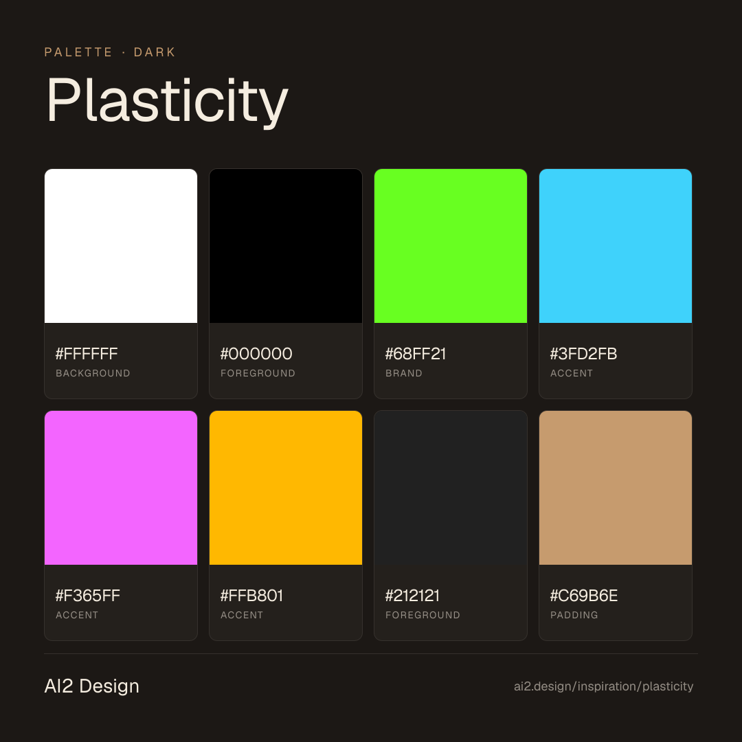
Dark-first creative-tool canvas. Pure #000000 ground, #ffffff primary ink, #212121 elevated surface for cards. Four-stop rainbow accent: lime #68ff21, cyan #3fd2fb, magenta #f365ff, amber #ffb801 — each used at <3% of surface, never gradient, never combined on one component. Triple-font system: Matter Variable as workhorse (12-16px UI/body), auxMono as data voice (12-13px tables and code), fkGrotesk as display only (24-48px headlines). Narrow 320-896 canvas — the page is a sketchbook, not a brochure. Motion level subtle: 2 transitions only, focused micro-interactions on hover. Zero gradient fills.
Main prompt
Use this capture as a design language transfer brief for my project. Adopt the palette (dark-first #000000 canvas + #ffffff ink + four-stop rainbow accent lime/cyan/magenta/amber each at <3% surface as solid fill only — never gradient, never combined), triple-font system (Matter Variable 12-16px UI/body, auxMono 12-13px data and code, fkGrotesk display-only 24-48px headlines), 4px-base spacing scale heavy at 2/4/6/8/10/12, narrow 320-896 canvas, zero gradients, subtle motion (2 transitions), 640/768/1024/1280/1536 breakpoint ladder. Treat this as my project's constitution. Apply the language, not the source brand. When I ask you to build a page or component, enforce these rules by default and call out any deviation.
Overview
- Layout
- Single-column narrow rail; product UI screenshots break out modestly but never to full desktop width.
- Content width
- 640-896px content rail; mobile collapses to 320-384px.
- Framing
- Sketchbook spread — narrow, calm, ready for the user to leave for the product.
- Grid strength
- Implicit 4px grid; reading rhythm comes from typography size jumps and the four-stop accent placements.
Color philosophy
Pure white + black ink hold the page; four-stop rainbow accent appears only where emphasis is earned, always as solid fill, never combined.
- #ffffff for primary background, #f8f8f8 acceptable for subtle section zoning
- #000000 for body ink, #212121 for elevated surfaces (rare dark moments)
- #68ff21 lime: success states, primary CTA when context demands optimism
- #3fd2fb cyan: secondary CTAs, link hover, info badges
- #f365ff magenta: hero accents, brand voice moments
- #ffb801 amber: highlight tags, attention chips
- Each accent ≤3% of total surface; never two accents in one component
Gradients (paste-ready)
Zero gradient fills — accent colours appear as solid only, never as backdrop atmosphere
Typography rules
- Matter Variable for all UI, body, captions, labels (12-16px range)
- auxMono for data tables, code blocks, technical metadata (12-13px)
- fkGrotesk display-only for headlines (24-48px) — never below 20px
- Weights: Matter 400/500, auxMono 400/500, fkGrotesk 400 only
- Line-height 1.4-1.5 body, 1.1-1.2 display
- Letter-spacing 0 across all three families — natural optical alignment
Spacing rules
- 4px base unit, heaviest use at 2/4/6/8/10/12px
- Section vertical rhythm: 64-96px between major blocks (narrow canvas demands tighter rhythm)
- Card internal padding: 16-20px standard
- CTA padding: 10-12px vertical / 18-22px horizontal
Design tokens
Palette, type, and space — all agent-readable.
7 colors · hex / rgb / hsl / oklch
- background59%
- HEX
#FFFFFF - RGB
rgb(255, 255, 255) - HSL
hsl(0, 0%, 100%) - OKLCH
oklch(100.00% 0.0000 89.76)
- HEX
- foreground18%
- HEX
#000000 - RGB
rgb(0, 0, 0) - HSL
hsl(0, 0%, 0%) - OKLCH
oklch(0.00% 0.0000 0.00)
- HEX
- brand12%
- HEX
#68FF21 - RGB
rgb(104, 255, 33) - HSL
hsl(101, 100%, 56%) - OKLCH
oklch(88.27% 0.2691 138.82)
- HEX
- accent6%
- HEX
#3FD2FB - RGB
rgb(63, 210, 251) - HSL
hsl(193, 96%, 62%) - OKLCH
oklch(80.46% 0.1323 221.09)
- HEX
- accent2%
- HEX
#F365FF - RGB
rgb(243, 101, 255) - HSL
hsl(295, 100%, 70%) - OKLCH
oklch(74.01% 0.2464 324.52)
- HEX
- accent2%
- HEX
#FFB801 - RGB
rgb(255, 184, 1) - HSL
hsl(43, 100%, 50%) - OKLCH
oklch(82.72% 0.1710 80.50)
- HEX
- foreground1%
- HEX
#212121 - RGB
rgb(33, 33, 33) - HSL
hsl(0, 0%, 13%) - OKLCH
oklch(24.78% 0.0000 89.76)
- HEX
Inspector
Tab through the captured artifacts.
Six observable layers — page structure, fonts, breakpoints, z-index, gradients, motion — kept paste-ready alongside the tokens above.
Page structure
Semantic hierarchy at a glance.
Depth-first walk of meaningful sections — header, navigation, main regions, articles, footer. 8 nodes captured; depth capped at 6 for readability.
- body
- ├─ div (×2)
- │ └─ Header
- │ └─ div
- │ └─ Nav
- └─ Main
- ├─ Section (×7)
- └─ Footer
Accessibility
WCAG contrast matrix.
28 combinations · 20 pass AA · 18 pass AAA · APCA Lc shown alongside WCAG 2.1 ratio for draft WCAG 3 awareness.
| Preview | fg | bg | Ratio | Normal | Large | APCA Lc | Context |
|---|---|---|---|---|---|---|---|
Aa | #FFFFFF | #000000 | 21.00 | AAA | AAA | -108 | background on foreground |
Aa | #000000 | #FFFFFF | 21.00 | AAA | AAA | +106 | foreground on background |
Aa | #FFFFFF | #212121 | 16.10 | AAA | AAA | -106 | background on foreground |
Aa | #212121 | #FFFFFF | 16.10 | AAA | AAA | +103 | foreground on background |
Aa | #000000 | #68FF21 | 15.91 | AAA | AAA | +88 | foreground on brand |
Aa | #68FF21 | #000000 | 15.91 | AAA | AAA | -88 | brand on foreground |
Aa | #68FF21 | #212121 | 12.20 | AAA | AAA | -86 | brand on foreground |
Aa | #212121 | #68FF21 | 12.20 | AAA | AAA | +85 | foreground on brand |
Aa | #000000 | #FFB801 | 12.11 | AAA | AAA | +73 | foreground on accent |
Aa | #FFB801 | #000000 | 12.11 | AAA | AAA | -72 | accent on foreground |
Image strategy
Asset loading & format policy.
Observable image posture — total count, lazy-loading ratio, and format mix. Hero image is measured above the fold.
- Full Page
- design-tools
- saas
- content
- dark
- 2026-05-15
Editorial credit
Featured Sponsor slot — your brand here
Dedicated logo placement — no rotation, on every export.
COMPARE THIS WITH
Side-by-side reads sharing this design signal.
See also