Spline · Full Page
Spline
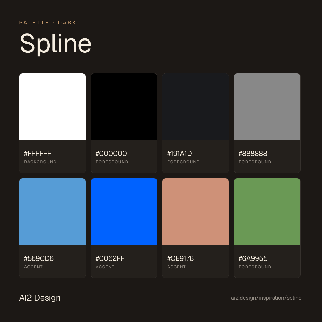
The 3D-tool landing that refuses to flatten itself into a screenshot — pure #000 canvas, a three-family Spline Sans / Brockmann / Spline Sans Mono trinity, and a semantic rainbow of accent CSS variables used one tone at a time. Spline demonstrates a rare creative-tool discipline: zero shadow, zero gradient, a single 1px hairline carrying every layer distinction, all motion compressed into a 0.2s CSS transition with no library overhead. The spacing scale starts at 2px so embedded canvases and video loops can breathe without feeling airy.

Editorial disclaimer
Editorial noteThis entry documents observable design-language patterns for educational transfer and AI-agent briefing. Screenshots and trademarks are property of their respective owners. AI2 Design is not affiliated with or endorsed by the featured brand. Inspiration here is about language and rhythm — do not reproduce brand identity, logo, product copy, or proprietary features.
Curator verdict
Why we catalogued it?
Spline is what happens when a 3D tool dares to behave like a proper marketing site — one that treats its own canvas as the hero instead of a screenshot of it. We catalogued it because it demonstrates the hardest trick in creative-tool design: carrying a dark, almost cinematic identity while keeping every supporting detail practically invisible. If you ship software where the output is more interesting than the interface, this is the reference to keep open while you wire your landing page.
Design decisions observed
- Canvas first, chrome never — the product's own scenes fill the stage and the surrounding UI steps back; no gradient atmosphere, no decorative hero blobs, just typography and spacing doing the actual work.
- A code-editor palette as brand fingerprint — the captured accent vocabulary is lifted directly from VS Code Dark+ syntax theme: `#569cd6` keyword cyan, `#0062ff` link/CTA blue, `#ce9178` string orange, `#6a9955` comment green, `#3ddc84` success green. The brand acknowledges its dev-creative cross-section by speaking the same color language its users see in their editors.
- Typography trinity over typography noise — one sans, one display, one mono cover the entire information hierarchy; every weight and size feels assigned a job, never decorative.
- Hairline-only elevation — the entire dark surface uses a single 1px solid border token to separate layers; drop shadows, glows, and softening gradients are absent by design.
- Fine-grained rhythm — the spacing scale starts at 2px and steps in twos and fours, which lets embedded canvases and video loops breathe without feeling airy around the edges.
What to study
- How Spline gets away with a pitch-black hero where most creative tools still feel compelled to add a warming gradient — steal the confidence: if your product speaks in color, let the canvas speak and keep the page muted.
- The code-editor color borrow — Spline's brand-tier accents (cyan #569cd6 + link blue #0062ff) plus the supporting cast (string orange #ce9178, comment green #6a9955) read straight out of VS Code Dark+. Adopt this when your audience lives half in editors and half in design tools; you'll meet them in a familiar color space.
- Shadow-free hierarchy on a dark canvas — border weight, spacing rhythm, and type weight do every job that drop shadow normally carries; this is how a dark site stays legible without tricks.
- Fonts preloaded as a statement — the first paint already wears the brand voice because the display, body, and mono weights are locally served and `rel=preload`'ed at the top of `<head>`.
What to avoid
- Don't borrow the code-editor palette if your audience doesn't live in editors — the cyan / orange / comment-green vocabulary works because Spline's users recognise it. Lift it onto a finance or B2B page and the colors will feel arbitrary.
- Don't ship 2px spacing steps without a custom sans — Spline Sans carries optical sizing that keeps tight rhythm readable; stock Inter at the same density will feel cramped.
- Don't attempt the shadow-free dark look without a disciplined border token — take away the 1px hairline and the whole system collapses into a flat void.
Taste notes
The page feels like opening a dark design file in fullscreen — the chrome calmly dissolves, your eye goes to the work, and when it returns to the UI everything is already exactly where a creative-tool user expects it. The sans carries most of the authority, the mono sneaks in precisely where a 3D artist expects it (coordinates, shortcuts, snippets), and the display typeface enters only to whisper a headline. It is the rare dark landing that reads as workspace rather than dramatic reveal.
Lineage & references
- Part of the post-Figma browser-native creative-tool cohort — Rive, ProtoPie, Play, tldraw — where the marketing surface and the editing surface deliberately share visual DNA.
- Adjacent to the 3D-in-browser generation (Vercel Geist showcase, Anthropic particle fields, GitHub Octoverse) but with production stakes; this is the actual product surface, not a set piece.
- A dark-first creative-tool descendant of Cinema 4D and After Effects marketing pages, translated from static renders into browser-native canvas primitives.
Design language brief
Paste-ready for your agent.
A typed design system transfer brief — philosophy, tokens, rules, techniques, and fitness checks. Your agent reads the whole language, not just the pixels.
Philosophy
Dark-first creative-tool identity where a single 2 px-base rhythm, a three-family type system, and a code-editor accent palette (lifted from VS Code Dark+) carry the entire load of hierarchy — no shadow, no gradient, no decorative chrome. The page exists to stage the product's own canvas; every surface detail is tuned to recede.
Main prompt
Design a dark-first landing for a browser-native creative tool where the product's own output (3D scenes, interactive canvases, embedded video loops) is the visual centerpiece. Use a trio of fonts only: Spline Sans (body + UI), Brockmann (display headings), Spline Sans Mono (code, coordinates, shortcuts). Page background is pure #000000 (tokenized as `--color-bg`) with white text at full opacity (#ffffff tokenized as `--color-white-090`) plus mid-gray #888888 for de-emphasized surfaces and #191a1d for panel backgrounds. The accent vocabulary is borrowed from VS Code Dark+ syntax theme — `#569cd6` keyword cyan and `#0062ff` link blue carry the brand-tier surface (10 + 6 measured uses); `#ce9178` string orange, `#6a9955` comment green, and `#3ddc84` success green provide the supporting cast (1-6 measured uses each), applied one tone per concept, never combined decoratively. Zero box-shadow, zero linear/radial gradient (extraction gradient count: 0). Corner-radius ladder is 8 / 12 / 16 / 24 / 50 / 99 px. Spacing scale anchored on 2 / 4 / 6 / 8 / 10 / 12 / 16 px dominant with 18 / 20 / 24 / 30 appearing at lower frequency. Container widths stay narrow: 340 / 460 / 480 / 500 / 552 / 652 px. Motion vocabulary captured: 0.2 s on ease / ease-out / ease-in-out / linear for interactive feedback plus a single 100 s linear ambient drift for atmospheric loops; no motion library captured (pure CSS transitions).
Overview
- Layout
- centered narrow column with full-width canvas and video bands bleeding to edge; sticky nav at z-10/11 is the only persistent chrome
- Content width
- 652px primary reading width, 460–552px for utility cards and callouts, full-viewport for embedded canvases and video
- Framing
- pure #000 canvas with content floating at narrow widths; canvases and video replace decorative hero art
- Grid strength
- implied — typography weight and spacing rhythm carry hierarchy; no visible column rails or divider grid
Color philosophy
Pure #000000 page (tokenized as `--color-bg`) with white text (#ffffff at `--color-white-090`) and a code-editor accent palette borrowed from VS Code Dark+. Two brand-tier accents — cyan #569cd6 (10 measured uses) and link blue #0062ff (6 uses, tokenized as `--color-blue`) — carry recurring surface; supporting cast #ce9178 string-orange, #6a9955 comment-green, #3ddc84 success-green, plus #191a1d panel and #888888 mid-gray fill out the system.
- bg #000000 (`--color-bg`) across the entire page — no alternate surface tone
- text #ffffff (tokenized as `--color-white-090`) for headlines and primary body — 2194 measured occurrences
- panel #191a1d for elevated surfaces (27 measured occurrences) and #888888 for mid-gray de-emphasized text (11 occurrences)
- brand-tier cyan #569cd6 for syntax-style highlights and code-editor surfaces (10 measured uses)
- brand-tier link blue #0062ff (`--color-blue`) for primary CTA, link, and active state (6 measured uses)
- supporting code-editor accents #ce9178 (string orange), #6a9955 (comment green), #3ddc84 (success green) applied semantically — one tone per concept
Typography rules
- One sans (Spline Sans), one display (Brockmann), one mono (Spline Sans Mono) — do not introduce a fourth family
- Preload the four hero weights locally as woff2: SplineSans-Regular, SplineSans-Medium, Brockmann-Regular, Brockmann-Medium
- Hero display maximum is 36px / 44 line-height at weight 500 — do not scale the heading type beyond this
- Body paragraph 18px / 28 line-height at weight 400 is the only comfortable reading size on dark
- Utility text 14px / 20 line-height at weight 400–500, captions 12px / 16–18 line-height
- Mono appears only in code blocks, coordinates, shortcuts, and API signatures — never in prose
- Letter-spacing stays 'normal' across the entire system — do not track-open for atmosphere
Spacing rules
- Base unit is 2px — scale is strictly 2 / 4 / 6 / 8 / 10 / 12 / 14 / 16 / 18 / 20 / 24 / 30
- No value above 30px in a single gap — larger vertical distance is implied by section height, not margin
- 24–30 for section padding, 12–16 for component internal rhythm, 2–6 for chip and pill micro-spacing
- Gap values inherit from the scale — no improvised 22px or 28px steps
Design tokens
Palette, type, and space — all agent-readable.
9 colors · hex / rgb / hsl / oklch
- backgroundcolor-white-09087%
- HEX
#FFFFFF - RGB
rgb(255, 255, 255) - HSL
hsl(0, 0%, 100%) - OKLCH
oklch(100.00% 0.0000 89.76)
- HEX
- foregroundcolor-bg11%
- HEX
#000000 - RGB
rgb(0, 0, 0) - HSL
hsl(0, 0%, 0%) - OKLCH
oklch(0.00% 0.0000 0.00)
- HEX
- foreground1%
- HEX
#191A1D - RGB
rgb(25, 26, 29) - HSL
hsl(225, 7%, 11%) - OKLCH
oklch(21.80% 0.0060 271.13)
- HEX
- foreground0%
- HEX
#888888 - RGB
rgb(136, 136, 136) - HSL
hsl(0, 0%, 53%) - OKLCH
oklch(62.68% 0.0000 89.76)
- HEX
- accent0%
- HEX
#569CD6 - RGB
rgb(86, 156, 214) - HSL
hsl(207, 61%, 59%) - OKLCH
oklch(67.13% 0.1118 245.54)
- HEX
- accentcolor-blue0%
- HEX
#0062FF - RGB
rgb(0, 98, 255) - HSL
hsl(217, 100%, 50%) - OKLCH
oklch(55.60% 0.2453 261.33)
- HEX
- accent0%
- HEX
#CE9178 - RGB
rgb(206, 145, 120) - HSL
hsl(17, 47%, 64%) - OKLCH
oklch(71.04% 0.0825 43.17)
- HEX
- foreground0%
- HEX
#6A9955 - RGB
rgb(106, 153, 85) - HSL
hsl(101, 29%, 47%) - OKLCH
oklch(63.23% 0.1092 136.61)
- HEX
- accent0%
- HEX
#3DDC84 - RGB
rgb(61, 220, 132) - HSL
hsl(147, 69%, 55%) - OKLCH
oklch(79.30% 0.1803 154.00)
- HEX
Inspector
Tab through the captured artifacts.
Six observable layers — page structure, fonts, breakpoints, z-index, gradients, motion — kept paste-ready alongside the tokens above.
Page structure
Semantic hierarchy at a glance.
Depth-first walk of meaningful sections — header, navigation, main regions, articles, footer. 15 nodes captured; depth capped at 6 for readability.
- body
- └─ div
- ├─ Header
- │ └─ Nav
- ├─ Main
- │ ├─ Section (×5)
- │ ├─ div
- │ │ └─ Section
- │ ├─ Section
- │ ├─ div
- │ │ └─ Section
- │ ├─ Section (×2)
- │ └─ [+3 more]
- └─ Footer
- └─ Section (×2)
Accessibility
WCAG contrast matrix.
54 combinations · 26 pass AA · 12 pass AAA · APCA Lc shown alongside WCAG 2.1 ratio for draft WCAG 3 awareness.
| Preview | fg | bg | Ratio | Normal | Large | APCA Lc | Context |
|---|---|---|---|---|---|---|---|
Aa | #FFFFFF | #000000 | 21.00 | AAA | AAA | -108 | background on foreground |
Aa | #000000 | #FFFFFF | 21.00 | AAA | AAA | +106 | foreground on background |
Aa | #FFFFFF | #191A1D | 17.40 | AAA | AAA | -107 | background on foreground |
Aa | #191A1D | #FFFFFF | 17.40 | AAA | AAA | +104 | foreground on background |
Aa | #000000 | #3DDC84 | 11.77 | AAA | AAA | +71 | foreground on accent |
Aa | #3DDC84 | #000000 | 11.77 | AAA | AAA | -70 | accent on foreground |
Aa | #191A1D | #3DDC84 | 9.75 | AAA | AAA | +70 | foreground on accent |
Aa | #3DDC84 | #191A1D | 9.75 | AAA | AAA | -69 | accent on foreground |
Aa | #000000 | #CE9178 | 7.95 | AAA | AAA | +53 | foreground on accent |
Aa | #CE9178 | #000000 | 7.95 | AAA | AAA | -51 | accent on foreground |
Image strategy
Asset loading & format policy.
Observable image posture — total count, lazy-loading ratio, and format mix. Hero image is measured above the fold.
Hero image
https://spline.design/_next/image?url=%2F_next%2Fstatic%2Fmedia%2Fspline_logo.54f4e584.png&w=64&q=75- Format
- UNKNOWN
- Dimensions
- 64×64
- Loading
- lazy
- srcset
- yes
- srcset descriptor
- /_next/image?url=%2F_next%2Fstatic%2Fmedia%2Fspline_logo.54f4e584.png&w=64&q=75 1x, /_next/image?url=%2F_next%2Fstatic%2Fmedia%2Fspline_logo.54f4e584.png&w=128&q=75 2x
- Full Page
- design-tools
- dark
- 2026-04-24
Frequently asked
Questions people ask about Spline
Answers are pulled from the curator verdict and design brief — the same text your AI agent sees when it paste-reads this page.
What makes Spline's marketing page stage the product itself?
Spline treats the 3D canvas as the hero instead of a screenshot of it. Pure #000 background, a Spline Sans + Brockmann + Spline Sans Mono trinity, rainbow semantic CSS-variable accents, zero shadow, zero gradient, and a fine 2px spacing base. The chrome steps back so embedded scenes and video loops lead.
What fonts and palette does Spline use?
Three families: Spline Sans (body), Brockmann (display), Spline Sans Mono (code, coordinates). The palette is pure #000 canvas with text at three white opacities, plus six semantic rainbow accents (#0062ff primary blue, and five tool-specific hues) used one concept at a time. No shadows, no gradients — the product's own output carries visual weight.
How can I apply Spline's creative-tool aesthetic to a non-3D product?
Let your product's output dominate visually, step the surrounding UI back, and treat accent colors as semantic vocabulary (one per concept, never for mood). Commit to a shadow-free, gradient-free dark canvas and a 2px spacing base. The AI2 Design brief captures the exact transition durations and the rainbow-as-semantic rules as paste-ready tokens.
Editorial credit
Featured Sponsor slot — your brand here
Dedicated logo placement — no rotation, on every export.
COMPARE THIS WITH
Side-by-side reads sharing this design signal.
See also