Frame · Full Page
Frame
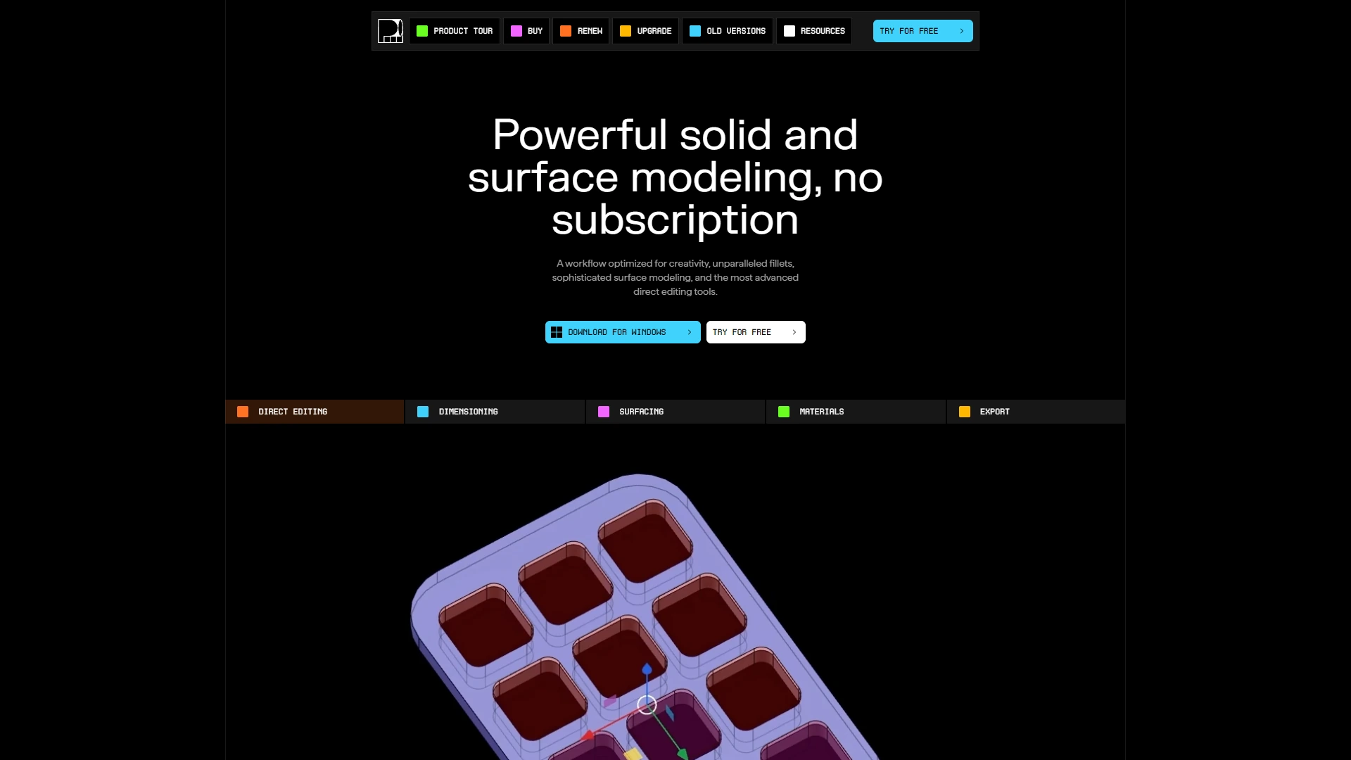
Dark-first cinema-tooling landing for the Adobe-acquired video collaboration platform. FrameGothic carries the entire brand voice in three weights; a single cobalt accent appears only where the page wants you to click. Restraint as identity — the product UI screenshots are the spectacle, the page is the calm before the cut.

Editorial disclaimer
Editorial noteThis entry documents observable design-language patterns for educational transfer and AI-agent briefing. Screenshots and trademarks are property of their respective owners. AI2 Design is not affiliated with or endorsed by the featured brand. Inspiration here is about language and rhythm — do not reproduce brand identity, logo, product copy, or proprietary features.
Curator verdict
Why we catalogued it?
Frame is the rare creative-tool landing that earns its prestige by behaving like the product itself — every panel reads like a timeline scrub, every transition holds the kind of weighted ease video editors recognise as professional craft. We catalogued it because few B2B SaaS landings inside the Adobe ecosystem have managed to keep the dark-first cinema room intact while still selling teams, plans and seat counts the way modern fintech does. If you are shipping for creators who decode tools through their hands first and their eyes second, this is the reference to keep open while you scope hero motion.
Design decisions observed
- Dark-first cinema room — true black background carries authority on its own; no decorative gradients fight the product UI screenshots for attention.
- FrameGothic as identity carrier — a single proprietary grotesque does almost all the work, in three weights, sized down to 12-15px in a way that demands sharper screens (and rewards them).
- Spot accent restraint — one cobalt blue accent appears only on CTAs and active states; the supporting #eaeaff alpha keeps the rest of the page in muted greys.
- Premium display moments — NeueMachinaInktrap shows up exactly where the page wants you to feel the brand voice; nowhere else. Reserve, don't overuse.
- Container disciplina — 1068px max content rail nested inside a 1440px hero canvas. The page breathes without sprawling.
What to study
- How a creative tool earns trust without leaning on cinematic rendering — Frame proves you can sell film tooling without a single 4K reel autoplaying. Steal the mindset: let the product UI screenshots be the spectacle.
- Single-family typography with disciplined weight ladder — FrameGothic at 400/500/600 only, but used so consistently it feels like five voices. Steal the mindset: a custom grotesque can replace a serif/sans duet entirely.
- How dark-mode B2B avoids the techno-startup trap — Frame's #000 reads editorial, not gamer, because the typography sets the tone first.
What to avoid
- Don't reach for a 4K hero video — Frame's restraint works because the product itself is the cinema. Adapt the discipline, not the budget assumption.
- Don't paint the page in blue — accent should appear in <2% of surface; over-use bleeds the prestige out of the cobalt.
Taste notes
The whole landing feels like a colour-corrected DI suite — neutral greys calibrated to look right on professional monitors, one accent calibrated to draw the eye exactly where the action lives, type small enough that it expects the viewer to lean in. There is no spectacle here, only the quiet confidence of a tool that knows its audience knows the difference.
Lineage & references
- Heir to the dark-pro creative-tool school — Figma's product-marketing era, Linear's cinematic shadows, Cinema 4D's neutral greys — all converging on the same dark-canvas reading layer.
- Standing shoulder-to-shoulder with Adobe's premium post-Frame.io family pages (Photoshop, Premiere Pro landing redesigns 2024+) — same restrained palette discipline, same custom-grotesque dominance.
- Part of the 2024+ B2B-creative renaissance (Runway, Captions, Descript) — selling editorial-quality tools with editorial-quality landing pages, not bro-y growth-marketing pages.
Design language brief
Paste-ready for your agent.
A typed design system transfer brief — philosophy, tokens, rules, techniques, and fitness checks. Your agent reads the whole language, not just the pixels.
Philosophy
Dark-first cinema-tooling canvas. Pure #000 ground for product UI screenshots, off-white #fcfcfc primary text, slate #eaeaff alpha for de-emphasised reading layers. Typography carries the entire personality: FrameGothic Variable (400/500/600) handles UI + body, NeueMachinaInktrap as a display-only voice for marketing headlines. Cobalt #6199f6 is the sole functional accent — CTAs, active states, focus rings — kept under 2% of surface. Elevation is restrained: 4 shadow variants total, mostly subtle inset/drop combos that feel like product chrome. Motion is expressive but never decorative — 10 transitions calibrated for product-feel scrub interactions.
Main prompt
Use this capture as a design language transfer brief for my project. Adopt the palette (dark-first #000 canvas + #fcfcfc primary text + #eaeaff alpha descender + single cobalt #6199f6 accent at <2% surface), single-family typography discipline (FrameGothic Variable in weights 400/500/600 for everything, NeueMachinaInktrap reserved for display moments only), 4px-base spacing scale with heavy use at 4/6/8/10/12/16, 1068px content rail inside 1440px hero canvas, restrained 4-variant shadow system, expressive but disciplined motion (10 transitions, weighted easings, no decorative animation), and 389/768/897/1158/1500 breakpoint ladder. Treat this as my project's constitution — every new component should pass as if engineered in the same studio. Apply the language, not the source brand's copy or identity. When I ask you to build a page or component, enforce these rules by default and call out any deviation.
Overview
- Layout
- Single-column reading flow on a dark canvas, with product UI screenshots breaking out of the content rail for cinematic full-bleed moments.
- Content width
- 1068px content rail centred inside 1440px hero canvas; screenshots may break out to 1440 for emphasis.
- Framing
- Dark-room cinema with restrained typography setting the tone before any UI screenshot loads.
- Grid strength
- Light grid — 4px base unit governs spacing but is invisible to the eye; reading rhythm comes from typography size jumps rather than grid lines.
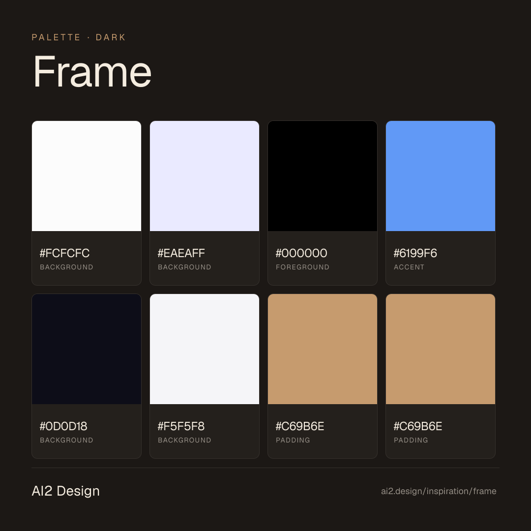
Color philosophy
Pure #000 ground holds the page; #fcfcfc primary text + #eaeaff alpha descender carry reading; single cobalt #6199f6 accent earns attention by scarcity.
- #000000 is the only background colour — no charcoal, no near-black, no off-shades
- #fcfcfc primary text 60% of the type surface, #eaeaff alpha for secondary copy and metadata
- #6199f6 cobalt accent exclusively on CTAs, focus rings and active nav states (under 2% total surface)
- #0d0d18 used sparingly for elevated surfaces (cards, hover states) — visible only by contrast
Gradients (paste-ready)
10 gradients catalogued, all atmospheric — soft cobalt light leaks at hero edges, never as fill
Typography rules
- FrameGothic Variable is the sole interface family — UI labels, body copy, navigation, captions, all 400/500/600 weights only
- NeueMachinaInktrap appears only in display headlines (32px+) and brand mark — never below 24px
- Reading copy sits at 13-15px, optical adjustments preserved at small sizes
- Line-height 1.4-1.5 for body, 1.05-1.15 for display — tight stack respects the small reading size
- Letter-spacing left at 0 for body; -0.01em to -0.02em for display headlines only
Spacing rules
- 4px base unit, heaviest use at 4/6/8/10/12/16px increments
- Section vertical rhythm: 80-120px between major content blocks
- Card internal padding: 16-24px standard; CTA padding: 14px vertical / 24px horizontal
- Avoid spacing values above 64px inside the content rail — keep the reading dense
Design tokens
Palette, type, and space — all agent-readable.
6 colors · hex / rgb / hsl / oklch
- backgroundmain-font-color74%
- HEX
#FCFCFC - RGB
rgb(252, 252, 252) - HSL
hsl(0, 0%, 99%) - OKLCH
oklch(99.11% 0.0000 89.76)
- HEX
- backgroundcolor-alpha-light-6012%
- HEX
#EAEAFF - RGB
rgb(234, 234, 255) - HSL
hsl(240, 100%, 96%) - OKLCH
oklch(94.33% 0.0282 285.85)
- HEX
- foregroundcolor-grey-008%
- HEX
#000000 - RGB
rgb(0, 0, 0) - HSL
hsl(0, 0%, 0%) - OKLCH
oklch(0.00% 0.0000 0.00)
- HEX
- accentcolor-turquoise-triumph2%
- HEX
#6199F6 - RGB
rgb(97, 153, 246) - HSL
hsl(217, 89%, 67%) - OKLCH
oklch(68.66% 0.1501 260.03)
- HEX
- backgroundcolor-grey-052%
- HEX
#0D0D18 - RGB
rgb(13, 13, 24) - HSL
hsl(240, 30%, 7%) - OKLCH
oklch(16.51% 0.0230 283.60)
- HEX
- backgroundcolor-accent2%
- HEX
#F5F5F8 - RGB
rgb(245, 245, 248) - HSL
hsl(240, 18%, 97%) - OKLCH
oklch(97.10% 0.0040 286.33)
- HEX
Inspector
Tab through the captured artifacts.
Six observable layers — page structure, fonts, breakpoints, z-index, gradients, motion — kept paste-ready alongside the tokens above.
Page structure
Semantic hierarchy at a glance.
Depth-first walk of meaningful sections — header, navigation, main regions, articles, footer. 11 nodes captured; depth capped at 6 for readability.
- body
- ├─ Header
- │ └─ div
- │ └─ Nav
- └─ div (×3)
- ├─ Main
- │ └─ div (×5)
- │ └─ Section
- │ └─ div
- │ └─ Article (×4)
- └─ Footer
Accessibility
WCAG contrast matrix.
22 combinations · 16 pass AA · 14 pass AAA · APCA Lc shown alongside WCAG 2.1 ratio for draft WCAG 3 awareness.
| Preview | fg | bg | Ratio | Normal | Large | APCA Lc | Context |
|---|---|---|---|---|---|---|---|
Aa | #FCFCFC | #000000 | 20.47 | AAA | AAA | -106 | background on foreground |
Aa | #000000 | #FCFCFC | 20.47 | AAA | AAA | +104 | foreground on background |
Aa | #000000 | #F5F5F8 | 19.30 | AAA | AAA | +100 | foreground on background |
Aa | #F5F5F8 | #000000 | 19.30 | AAA | AAA | -101 | background on foreground |
Aa | #FCFCFC | #0D0D18 | 18.82 | AAA | AAA | -106 | background on background |
Aa | #0D0D18 | #FCFCFC | 18.82 | AAA | AAA | +104 | background on background |
Aa | #0D0D18 | #F5F5F8 | 17.74 | AAA | AAA | +100 | background on background |
Aa | #F5F5F8 | #0D0D18 | 17.74 | AAA | AAA | -101 | background on background |
Aa | #EAEAFF | #000000 | 17.71 | AAA | AAA | -95 | background on foreground |
Aa | #000000 | #EAEAFF | 17.71 | AAA | AAA | +95 | foreground on background |
Image strategy
Asset loading & format policy.
Observable image posture — total count, lazy-loading ratio, and format mix. Hero image is measured above the fold.
Hero image
https://cdn.sanity.io/images/s6lu43cv/production-v4/7a478723f741b7c66f9f76ad116bc7d3fcfc05cd-3840x2160.jpg?w=1920&h=1080&q=30&auto=format&fit=max- Format
- JPG
- Dimensions
- 1920×1080
- Loading
- auto
- srcset
- yes
- srcset descriptor
- https://cdn.sanity.io/images/s6lu43cv/production-v4/7a478723f741b7c66f9f76ad116bc7d3fcfc05cd-3840x2160.jpg?w=256&h=144&q=30&auto=format&fit=max 256w, https://cdn.sanity.io/images/s6lu43cv/production-v4/7a478723f741b7c66f9f76ad116bc7d3fcfc05cd-3840x2160.jpg?w=750&h=422&q=30&auto=format&fit=max 750w, https://cdn.sanity.io/images/s6lu43cv/production-v4/7a478723f741b7c66f9f76ad116bc7d3fcfc05cd-3840x2160.jpg?w=1200&h=675&q=30&auto=format&fit=max 1200w, https://cdn.sanity.io/images/s6lu43cv/production-v4/7a478723f741b7c66f9f76ad116bc7d3fcfc05cd-3840x2160.jpg?w=1920&h=1080&q=30&auto=format&fit=max 1920w, https://cdn.sanity.io/images/s6lu43cv/production-v4/7a478723f741b7c66f9f76ad116bc7d3fcfc05cd-3840x2160.jpg?w=2400&h=1350&q=30&auto=format&fit=max 2400w
- Full Page
- design-tools
- saas
- content
- dark
- 2026-05-15
Editorial credit
Featured Sponsor slot — your brand here
Dedicated logo placement — no rotation, on every export.
COMPARE THIS WITH
Side-by-side reads sharing this design signal.
See also