Vercel · Full Page
Vercel
The platform landing that doubles as the reference implementation of its own stack — Vercel treats marketing as a living engineering brief. A Geist family trinity (sans, mono, and five decorative pixel cuts) carries the entire typographic personality. Accents come from a Radix-derived semantic palette used like confidence indicators rather than decoration. Elevation runs on a ring-plus-inset shadow grammar that makes every card feel printed. Gradients appear only as 50%-stop solid-colour dot-fill pattern backgrounds, and 96 CSS custom properties are exposed in the cascade as a public token surface.

Editorial disclaimer
Editorial noteThis entry documents observable design-language patterns for educational transfer and AI-agent briefing. Screenshots and trademarks are property of their respective owners. AI2 Design is not affiliated with or endorsed by the featured brand. Inspiration here is about language and rhythm — do not reproduce brand identity, logo, product copy, or proprietary features.
Curator verdict
Why we catalogued it?
Vercel is the rare marketing site that doubles as the reference implementation for its own stack — the page itself is the demo. We catalogued it because no other 2026 platform landing spends its token budget so deliberately: a Geist family trinity that runs from a single variable sans into a monospace companion and then into five decorative pixel cuts used like punctuation, a Radix-derived semantic palette that treats colour as confidence rather than decoration, and a ring-plus-inset shadow grammar that makes every card feel printed rather than floated. If you want to see what it looks like when a platform team uses their own marketing surface as a living engineering brief, this is where you look.
Design decisions observed
- The typographic family is the entire identity — Geist sans for voice, Geist Mono for proof, Geist Pixel for craft moments. One foundry, three registers, no outside guests.
- Colour behaves like confidence — grey descenders do 95% of the reading, and the Radix-derived accent set (cyan, magenta, red, teal, orange, green) shows up only to mark state or pattern recognition, never as surface paint.
- Shadow as hairline — every card is framed by a 1px border ring plus a 1px inset highlight, a 'printed on paper' elevation that never drifts into drop-shadow costume.
- Gradients used like dot-matrix ink — eleven 50%-stop solid-colour gradients act as flat pattern fills behind feature tiles. It is the most disciplined way to use gradient we have seen in a B2B landing.
- Motion calibrated to input type — 0.1s-0.15s snap on chroma so feedback lands immediately, a single custom cubic-bezier(0.33, 0.12, 0.15, 1) for opacity reveals, and 0.2s ease for transform. Three channels, three speeds, no spring.
- Open token system as a public signal — 96 CSS variables exposed in the cascade tells every engineer who inspects the page that this is a design system, not a landing decorator.
What to study
- How one type foundry — Geist — carries a whole brand without a second family in sight. Steal the discipline of limiting yourself to one foundry, many cuts.
- The ring-plus-inset shadow grammar — a 1px outer ring with a 1px inner highlight gives you the feel of a printed card and eliminates the drop-shadow fatigue most SaaS pages carry.
- Gradients as flat pattern fills — use a 50%-stop solid-colour gradient when you want a feature tile to feel categorised, not coloured. Contra glows, Linear shimmers, Vercel tiles.
- The snap chroma motion rule — hover feedback under 150ms feels like pressing a real button. Most landings set 300ms and lose that micro-credibility.
- Exposing CSS custom properties as a brand signal — ninety-six variables in the cascade is not an accident, it is a statement that the page and the product share the same token surface.
What to avoid
- Do not import Geist Pixel without a reason — the decorative cuts are used very sparingly on the source. Pasted onto every paragraph, they flip from craft to costume immediately.
- Do not adopt the Radix-derived accent palette wholesale without mapping each colour to a semantic role. Vercel earns the spectrum because each colour means something; decorated onto generic UI it reads as a toolbox.
- Do not replicate the 1080px single-container rail at larger widths — the tight constraint is deliberate editorial framing for a developer audience. A broad consumer landing needs more air, not less.
Taste notes
The page reads like well-engineered documentation that happens to be marketing — grey on white with precise weight steps, hairline cards, and colour applied like a state indicator rather than a paint job. Gradients are there but barely register as colour because they behave like swatches of pattern ink. You are being onboarded into a platform, not persuaded into a purchase.
Lineage & references
- The 2024+ platform-marketing benchmark — Vercel, Linear and Stripe are the triangle most dev-facing landings are measured against. Vercel is the variant that leans most into exposed tokens and engineering-as-aesthetic.
- Part of the 'home-grown typography as brand' cohort (Geist in Vercel, Sohne in Stripe, GT America in Figma pre-redesign) — foundries operated as product rather than as license.
- Shares grammar with the Radix Themes ecosystem — the semantic 10/11/12 colour stops speak directly to the same token discipline Radix and shadcn/ui publish.
Design language brief
Paste-ready for your agent.
A typed design system transfer brief — philosophy, tokens, rules, techniques, and fitness checks. Your agent reads the whole language, not just the pixels.
Philosophy
Light-first engineering-as-aesthetic platform landing. Pure white #ffffff canvas. Near-black #171717 primary text doing the dominant reading (measured 1908 occurrences), with a six-stop grey descender ladder (#4d4d4d / #666666 / #808080 / #a8a8a8 / #ebebeb) handling secondary, tertiary and border roles. Typography carries the entire identity: Geist Variable (sans) for voice, Geist Mono for code and tabular proof, Geist Pixel in five decorative cuts (Circle / Grid / Line / Square / Triangle) for craft punctuation. Accents come from a Radix-derived semantic palette (cyan / magenta / red / teal / orange / green) applied like state indicators, never as fills. Elevation is a ring-plus-inset grammar — 1px outer hairline with a 1px inset highlight — that makes every card feel printed rather than floated. Gradients are used only as 50%-stop solid-colour dot-fill pattern backgrounds. Motion splits into three channels: 0.1-0.15s snap chroma for input feedback, cubic-bezier(0.33, 0.12, 0.15, 1) opacity reveals, and 0.2s ease transforms.
Main prompt
Use this capture as a design language transfer brief for my project. Adopt the palette (light-first #ffffff canvas + #171717 primary text + six-stop grey descender ladder + Radix-derived semantic accents used as state indicators), typographic system (Geist Variable as primary sans, Geist Mono for code and tabular data, Geist Pixel reserved for sparse decorative punctuation), 2px base spacing scale with peaks at 2 / 6 / 8 / 12, single 1080px content rail, ring-plus-inset shadow grammar (1px outer hairline plus 1px inset highlight), 50%-stop solid-colour gradient as flat pattern fill, 96-variable open CSS token surface, border-radius double-peak at 4 / 6 px with 64px for large feature cards and 100px pill for indicators, and three-channel motion (0.1-0.15s snap chroma for input, cubic-bezier(0.33, 0.12, 0.15, 1) for opacity reveals, 0.2s ease for transform). Treat this as my project's constitution — every new component should pass as if crafted in the same studio. Apply the language, not the source brand's copy or identity. When I ask you to build a page or component, enforce these rules by default, and call out any decision that deviates.
Overview
- Layout
- Grid
- Content width
- Bounded
- Framing
- Flat
- Grid strength
- Strong
Color philosophy
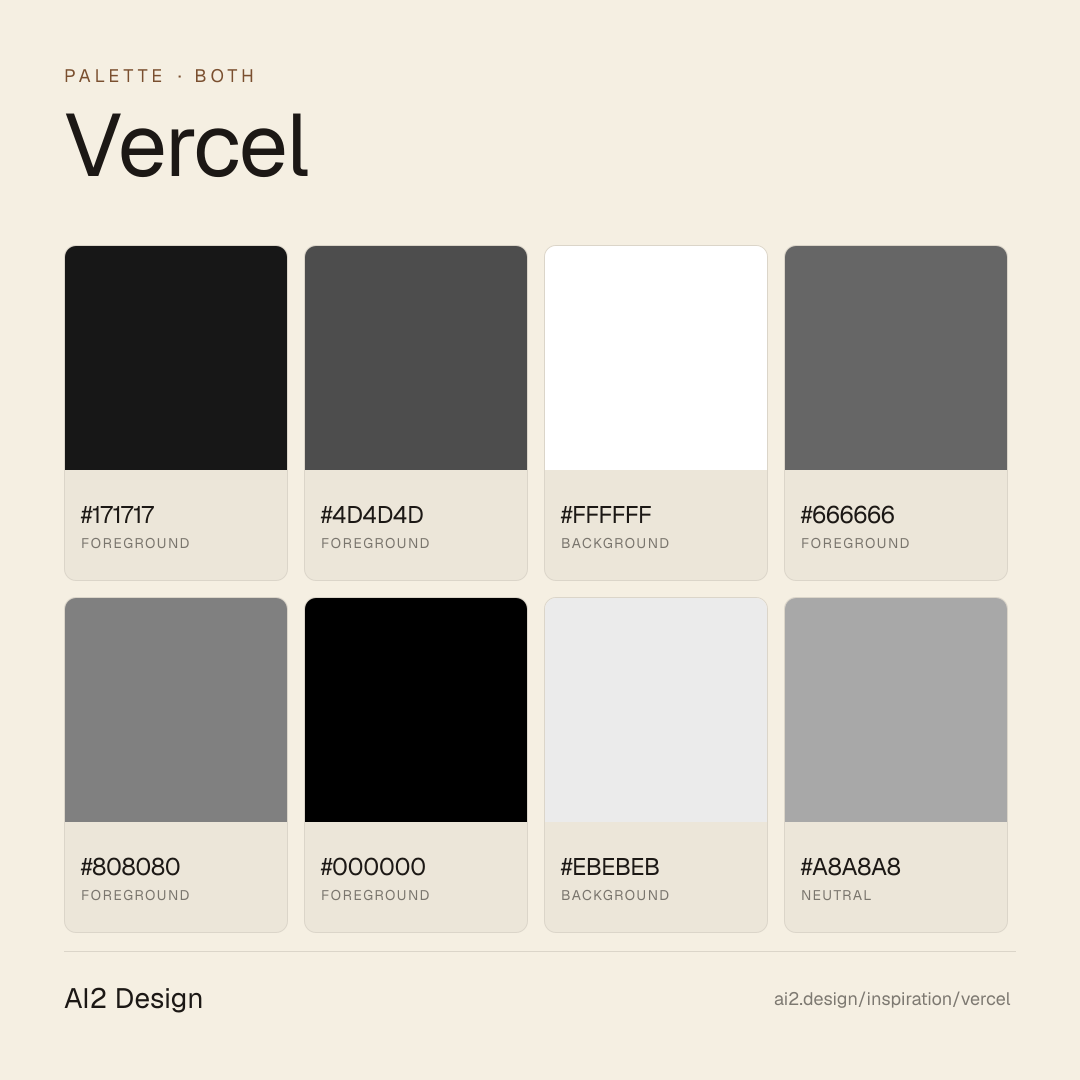
Light-first canvas — pure #ffffff background paired with #171717 near-black primary text doing the dominant reading layer (measured 1908 occurrences). Six-stop grey descender ladder: #4d4d4d (secondary body) → #666666 (muted text) → #808080 (placeholder) → #a8a8a8 (borders) → #ebebeb (light borders / strokes) → #000000 (accent border). Accent palette is Radix-derived semantic — cyan #52aeff, magenta #bd2864, red #e5484d, teal #45dec5, orange #ffb224, green #297a3a — each colour tied to a role (state, category, emphasis) rather than used as decoration. Surface area of accent colour stays below 3% of the viewport.
- Primary reading pair: #171717 near-black text on #ffffff background (measured 1888 + 138 occurrences — dominant surface)
- Secondary descender ladder: #4d4d4d (ready-to-read) → #666666 (muted) → #808080 (placeholder / disabled) — for progressive de-emphasis
- Border grey stops: #a8a8a8 (emphasised stroke), #ebebeb (default hairline) — the ring that does the elevation work
- Semantic accent cyan #52aeff for informational state, magenta #bd2864 for editorial emphasis
- Semantic accent red #e5484d for destructive state, teal #45dec5 for fresh state, orange #ffb224 for warning, green #297a3a for success
Gradients (paste-ready)
linear-gradient(rgb(235, 235, 235), rgb(235, 235, 235) 50%, rgba(0, 0, 0, 0) 0px, rgba(0, 0, 0, 0))
linear-gradient(rgb(212, 238, 247), rgb(212, 238, 247) 50%, rgba(0, 0, 0, 0) 0px, rgba(0, 0, 0, 0))
linear-gradient(rgb(255, 232, 224), rgb(255, 232, 224) 50%, rgba(0, 0, 0, 0) 0px, rgba(0, 0, 0, 0))
Typography rules
- Primary family: Geist Variable (self-hosted, preloaded from /vc-ap-vercel-marketing/_next/static/media/*.woff2). The family is deployed alongside Geist Mono for code and five Geist Pixel cuts (Circle, Grid, Line, Square, Triangle) for decorative punctuation.
- Do not introduce a second foundry. The Geist trinity carries every register — voice, proof, craft. Mixing in Inter, SF Pro or any display serif breaks the identity immediately.
- Observed size ladder: 12 / 13 / 14 / 16 / 18 / 24 / 48 px. Display hero at 48/48 with letter-spacing -2.4px. Display sub at 24/32 with letter-spacing -0.96px. Body at 14-16 with line-height 20-24.
- Letter-spacing is px, not em: negative at display (-2.4px at 48, -0.96px at 24) to produce optical tightness; normal at body. Never invent intermediate tracking values.
- Geist Mono reserved for code, kbd, tabular numerics, version strings, hashes, deploy IDs. Body 13-16px with line-height 20px. Never use Mono as a display substitute.
- Geist Pixel is decorative only — reserve each of the five cuts (Circle / Grid / Line / Square / Triangle) for specific craft moments (pattern tiles, feature dividers, visual emphasis). Pasted on running text it is costume.
- Paragraph max 55-65 ch at body 14-16px — echoes the 1080px rail when wrapped in the main container.
Spacing rules
- 2px base unit. Observed scale: 2 / 4 / 6 / 8 / 10 / 12 / 14 / 16 / 18 / 20 / 24 / 32 px, dominated by 2 (freq 361) / 12 (301) / 8 (277) / 6 (204).
- Flex gaps: 8px (freq 73), 6px (69), 12px (43), 4px (15), 16px (13). Keep gutters in multiples of 2.
- Container: single 1080px primary rail (maxWidthPx 1080, freq 6). Do not break the rail except for full-bleed feature strips or hero-scale assets.
- Card padding scale: 12 / 16 / 20 / 24 px, aligned to gutter steps.
- Section vertical rhythm: 32 / 48 / 64 px desktop; 24 / 32 / 48 px mobile.
Design tokens
Palette, type, and space — all agent-readable.
20 colors · hex / rgb / hsl / oklch
- foreground56%
- HEX
#171717 - RGB
rgb(23, 23, 23) - HSL
hsl(0, 0%, 9%) - OKLCH
oklch(20.46% 0.0000 89.76)
- HEX
- foreground28%
- HEX
#4D4D4D - RGB
rgb(77, 77, 77) - HSL
hsl(0, 0%, 30%) - OKLCH
oklch(42.02% 0.0000 89.76)
- HEX
- background4%
- HEX
#FFFFFF - RGB
rgb(255, 255, 255) - HSL
hsl(0, 0%, 100%) - OKLCH
oklch(100.00% 0.0000 89.76)
- HEX
- foreground4%
- HEX
#666666 - RGB
rgb(102, 102, 102) - HSL
hsl(0, 0%, 40%) - OKLCH
oklch(51.03% 0.0000 89.76)
- HEX
- foreground3%
- HEX
#808080 - RGB
rgb(128, 128, 128) - HSL
hsl(0, 0%, 50%) - OKLCH
oklch(59.99% 0.0000 89.76)
- HEX
- foreground2%
- HEX
#000000 - RGB
rgb(0, 0, 0) - HSL
hsl(0, 0%, 0%) - OKLCH
oklch(0.00% 0.0000 0.00)
- HEX
- background1%
- HEX
#EBEBEB - RGB
rgb(235, 235, 235) - HSL
hsl(0, 0%, 92%) - OKLCH
oklch(94.01% 0.0000 89.76)
- HEX
- neutral1%
- HEX
#A8A8A8 - RGB
rgb(168, 168, 168) - HSL
hsl(0, 0%, 66%) - OKLCH
oklch(73.16% 0.0000 89.76)
- HEX
- background0%
- HEX
#8F8F8F - RGB
rgb(143, 143, 143) - HSL
hsl(0, 0%, 56%) - OKLCH
oklch(65.00% 0.0000 89.76)
- HEX
Inspector
Tab through the captured artifacts.
Six observable layers — page structure, fonts, breakpoints, z-index, gradients, motion — kept paste-ready alongside the tokens above.
Page structure
Semantic hierarchy at a glance.
Depth-first walk of meaningful sections — header, navigation, main regions, articles, footer. 10 nodes captured; depth capped at 6 for readability.
- body
- ├─ a
- └─ div (×4)
- ├─ div
- │ ├─ div
- │ │ └─ Header
- │ ├─ Main
- │ └─ Footer
- │ └─ Nav
- └─ Aside
Accessibility
WCAG contrast matrix.
276 combinations · 78 pass AA · 34 pass AAA · APCA Lc shown alongside WCAG 2.1 ratio for draft WCAG 3 awareness.
| Preview | fg | bg | Ratio | Normal | Large | APCA Lc | Context |
|---|---|---|---|---|---|---|---|
Aa | #FFFFFF | #000000 | 21.00 | AAA | AAA | -108 | background on foreground |
Aa | #000000 | #FFFFFF | 21.00 | AAA | AAA | +106 | foreground on background |
Aa | #171717 | #FFFFFF | 17.93 | AAA | AAA | +105 | foreground on background |
Aa | #FFFFFF | #171717 | 17.93 | AAA | AAA | -107 | background on foreground |
Aa | #000000 | #EBEBEB | 17.62 | AAA | AAA | +94 | foreground on background |
Aa | #EBEBEB | #000000 | 17.62 | AAA | AAA | -95 | background on foreground |
Aa | #000000 | #CCE6FF | 16.33 | AAA | AAA | +89 | foreground on accent |
Aa | #CCE6FF | #000000 | 16.33 | AAA | AAA | -90 | accent on foreground |
Aa | #171717 | #EBEBEB | 15.04 | AAA | AAA | +93 | foreground on background |
Aa | #EBEBEB | #171717 | 15.04 | AAA | AAA | -94 | background on foreground |
Image strategy
Asset loading & format policy.
Observable image posture — total count, lazy-loading ratio, and format mix. Hero image is measured above the fold.
Hero image
https://vercel.com/vc-ap-vercel-marketing/_next/static/media/leonardo-ai-light.33rurcgq77tyi.svg?dpl=dpl_53dNajPAEgXXNCKBoLEtJvLR1AUh- Format
- SVG
- Dimensions
- 355×38
- Loading
- eager
- srcset
- no
- Full Page
- developer-tools
- saas
- ai
- both
- 2026-04-23
Frequently asked
Questions people ask about Vercel
Answers are pulled from the curator verdict and design brief — the same text your AI agent sees when it paste-reads this page.
What makes Vercel's marketing page the reference implementation of its own stack?
Vercel ships the page as proof of the stack underneath it. A Geist trinity (sans, mono, pixel display), Radix-derived semantic palette, ring-plus-inset shadow grammar, and ninety-six open CSS variables turn the surface into a walking tour of Next.js-native design primitives — marketing and product sharing one vocabulary.
What fonts and palette does Vercel use?
The Geist trinity: Geist Sans for body and UI, Geist Mono for code and coordinates, Geist Pixel for display moments. The palette is a Radix semantic system — foreground, muted, accent bands — with near-a-hundred open CSS variables exposing every surface and state to the developer tools inspector.
Can I adopt Vercel's design language in a Next.js project?
Easily — the Geist family is open and Radix is installable. The AI2 Design brief captures Vercel's ring-plus-inset shadow stack, the semantic token naming, and the sizing cadence — paste-ready so your agent can produce Vercel-adjacent UI on a fresh Next.js install without reverse-engineering the tokens.
Editorial credit
Featured Sponsor slot — your brand here
Dedicated logo placement — no rotation, on every export.
COMPARE THIS WITH
Side-by-side reads sharing this design signal.
See also