Neon · Full Page
Neon
Section-zoned developer-database landing that turns its brand colour into the design statement. Petrol-green #2c6d4c drenches entire sections as ground (not accent), Geist Mono carries code-voice authority, Inter handles marketing copy. Wide 1856px canvas, zero shadow system — depth lives in section colour contrast.

Editorial disclaimer
Editorial noteThis entry documents observable design-language patterns for educational transfer and AI-agent briefing. Screenshots and trademarks are property of their respective owners. AI2 Design is not affiliated with or endorsed by the featured brand. Inspiration here is about language and rhythm — do not reproduce brand identity, logo, product copy, or proprietary features.
Curator verdict
Why we catalogued it?
Neon is the rare developer-database landing that decided to make its brand colour the page itself — sections drenched in petrol-green #2c6d4c are the most recognisable design move in serverless Postgres, and the rest of the layout earns its calm by refusing to compete. We catalogued it because most database tools either default to AWS-grey enterprise chrome (Supabase early days, Aurora) or chase startup-coral gradients; Neon's confidence lives in committing to one brand colour at full saturation as section ground. If you are shipping for a developer audience that already knows what Postgres looks like, this is the lodestar for how to make the boring beautiful.
Design decisions observed
- Petrol-green #2c6d4c as section ground — not as accent, not as button fill, but as full section background — a brand colour applied with confidence most teams reserve for hero illustrations.
- Geist Mono + Inter duet — code-voice mono carries the technical credibility, Inter handles the marketing reading layer.
- Wide 1600-1856px canvas — Neon uses the full desktop width and earns it with dense content that breathes thanks to the brand-coloured section bands.
- Pure #ffffff text on green ground — high contrast, broadsheet legibility, no clever pastel overlay tricks.
- Expressive motion via Framer Motion — section transitions, hover micro-interactions, all calibrated for the developer-marketing audience that recognises the difference between staged and live demos.
What to study
- How to commit to a brand colour as section ground — Neon teaches that confidence is the design move, not restraint.
- Code-voice typography for developer marketing — Geist Mono carries technical credibility without becoming gimmicky.
- Wide canvas with brand-coloured section zoning — sections drenched in petrol-green create rhythm without needing illustration.
What to avoid
- Don't lift petrol-green as accent — it lives at the section-ground level here; using it as a button fill collapses the system.
- Don't widen the canvas to 1856 without solving for tablet — Neon has gone through years of responsive iteration.
Taste notes
The whole landing feels like a database admin tool that decided to dress for a designer conference — wide canvas, deep brand-coloured sections, code-voice typography carrying technical authority. There is no startup-coral on this page, no gradient sky overlays, no decorative illustration. Just one brand colour, one mono font, and the calm confidence of a tool whose value the developer already understands.
Lineage & references
- Heir to the post-Stripe developer-marketing school — wide canvas, brand colour as section ground, code-voice typography carrying authority.
- Standing shoulder-to-shoulder with the new wave of serverless infrastructure marketing (PlanetScale's 2024+ era, Turso, Cloudflare Workers landing).
- Part of the brand-colour-as-ground cohort — Vercel's black, Linear's dark, Resend's red — but Neon goes further by drenching whole sections instead of using the brand colour as background-secondary.
Design language brief
Paste-ready for your agent.
A typed design system transfer brief — philosophy, tokens, rules, techniques, and fitness checks. Your agent reads the whole language, not just the pixels.
Philosophy
Section-zoned developer-database canvas. White #ffffff text dominates because brand-green #2c6d4c is the primary section ground (not accent), with #000000 as the alternate section ground. Slate descender scale (#94979e / #797d86 / #c9cbcf) for de-emphasis. Geist Mono carries code-voice technical credibility (16px tables and code), Inter handles marketing reading layer (13-18px UI/body). Wide 1600-1856px canvas — section width is the design move. Expressive motion via Framer Motion. Single gradient catalogued — atmospheric only.
Main prompt
Use this capture as a design language transfer brief for my project. Adopt the palette (section-zoned with petrol-green #2c6d4c as primary section ground + #000000 as alternate section ground + #ffffff primary text + slate descender scale for de-emphasis — the brand colour is the ground, never an accent or button fill), typographic duet (Geist Mono for code-voice 16px tables and technical labels + Inter for marketing reading 13-18px UI/body), 4px-base spacing scale heavy at 4/6/8/10/12/14, wide 1600-1856px canvas with section zoning by brand colour, expressive Framer Motion vocabulary, custom breakpoint ladder. Treat this as my project's constitution. Apply the language, not the source brand. When I ask you to build a page or component, enforce these rules by default and call out any deviation.
Overview
- Layout
- Section-zoned wide canvas — petrol-green and #000 sections alternate as the design rhythm, each holding a full content block.
- Content width
- 960-1600px content rail inside 1856px hero canvas; sections break to full width.
- Framing
- Developer-database broadsheet — wide, brand-coloured, technically confident.
- Grid strength
- Strong 12-column grid at desktop, section-coloured backgrounds carry the rhythm.
Color philosophy
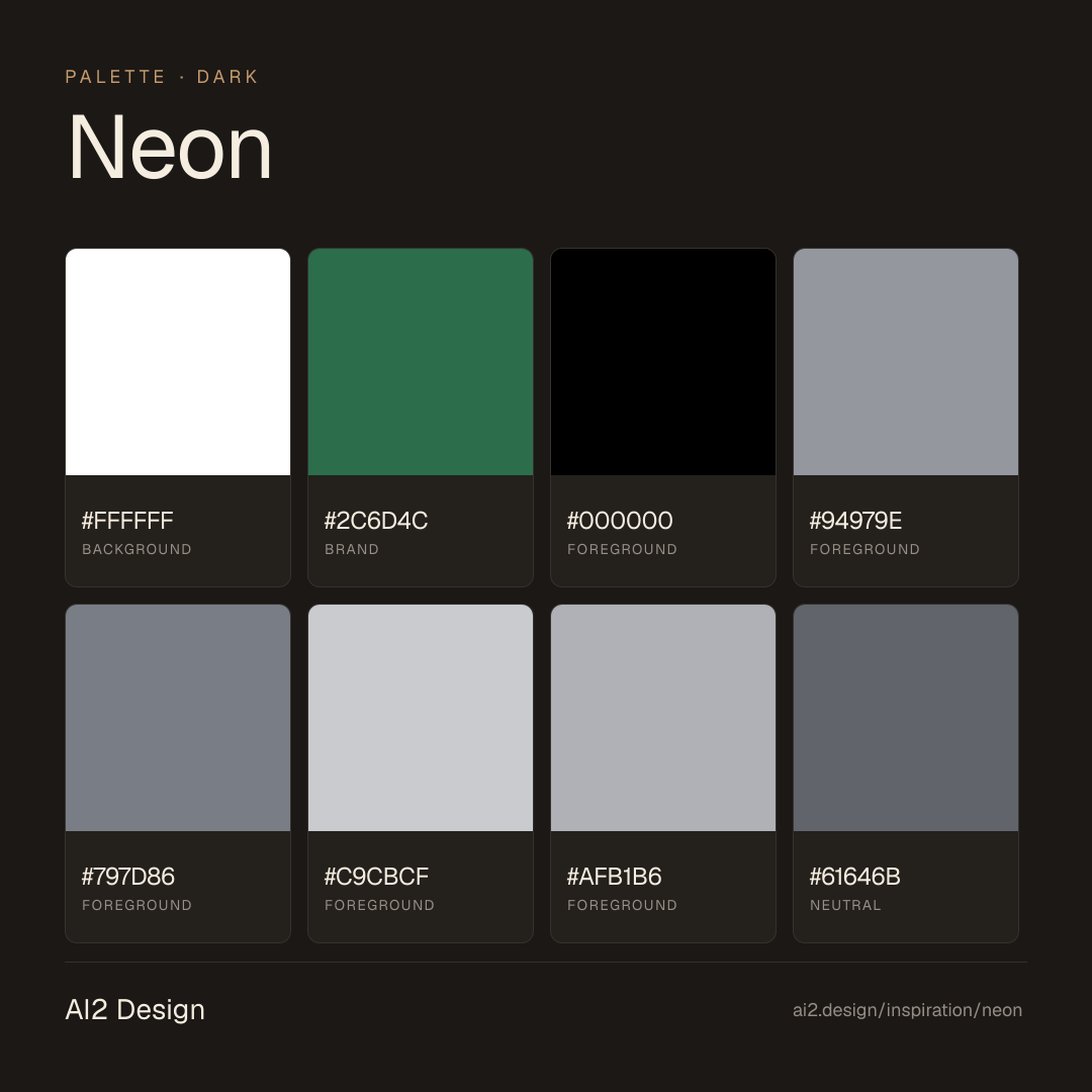
Petrol-green #2c6d4c + #000000 alternate as section grounds; #ffffff primary text + slate descender scale; brand colour is the ground, never an accent.
- #2c6d4c petrol-green: primary section ground (drenched, not accent)
- #000000: alternate section ground for contrast
- #ffffff for primary text on green/black sections
- #94979e secondary text, #797d86 metadata, #c9cbcf disabled
- #61646b border colour on cards
- Never use petrol-green as accent or button fill — it is ground only
Gradients (paste-ready)
1 gradient catalogued — atmospheric only, never as section background or button fill
Typography rules
- Geist Mono for technical labels, code blocks, data tables (16px)
- Inter for all UI, body, marketing copy (13-18px)
- Weights: Inter 400/500/600, Geist Mono 400
- Line-height 1.4-1.5 body, 1.1-1.2 display
- Letter-spacing 0
Spacing rules
- 4px base unit, heaviest use at 4/6/8/10/12/14px
- Section vertical rhythm: 80-160px between major sections
- Card internal padding: 24-32px
- CTA padding: 12-14px vertical / 22-28px horizontal
Design tokens
Palette, type, and space — all agent-readable.
16 colors · hex / rgb / hsl / oklch
- background75%
- HEX
#FFFFFF - RGB
rgb(255, 255, 255) - HSL
hsl(0, 0%, 100%) - OKLCH
oklch(100.00% 0.0000 89.76)
- HEX
- brand15%
- HEX
#2C6D4C - RGB
rgb(44, 109, 76) - HSL
hsl(150, 42%, 30%) - OKLCH
oklch(48.29% 0.0858 158.53)
- HEX
- foreground4%
- HEX
#000000 - RGB
rgb(0, 0, 0) - HSL
hsl(0, 0%, 0%) - OKLCH
oklch(0.00% 0.0000 0.00)
- HEX
- foreground2%
- HEX
#94979E - RGB
rgb(148, 151, 158) - HSL
hsl(222, 5%, 60%) - OKLCH
oklch(67.61% 0.0108 267.32)
- HEX
- foreground2%
- HEX
#797D86 - RGB
rgb(121, 125, 134) - HSL
hsl(222, 5%, 50%) - OKLCH
oklch(58.93% 0.0145 266.63)
- HEX
- foreground0%
- HEX
#C9CBCF - RGB
rgb(201, 203, 207) - HSL
hsl(220, 6%, 80%) - OKLCH
oklch(84.17% 0.0060 264.53)
- HEX
- foreground0%
- HEX
#AFB1B6 - RGB
rgb(175, 177, 182) - HSL
hsl(223, 5%, 70%) - OKLCH
oklch(76.03% 0.0074 268.53)
- HEX
- neutral0%
- HEX
#61646B - RGB
rgb(97, 100, 107) - HSL
hsl(222, 5%, 40%) - OKLCH
oklch(50.30% 0.0117 267.27)
- HEX
- foreground0%
- HEX
#18191B - RGB
rgb(24, 25, 27) - HSL
hsl(220, 6%, 10%) - OKLCH
oklch(21.32% 0.0042 264.48)
- HEX
Inspector
Tab through the captured artifacts.
Six observable layers — page structure, fonts, breakpoints, z-index, gradients, motion — kept paste-ready alongside the tokens above.
Page structure
Semantic hierarchy at a glance.
Depth-first walk of meaningful sections — header, navigation, main regions, articles, footer. 13 nodes captured; depth capped at 6 for readability.
- body
- ├─ a
- └─ div (×2)
- ├─ Header
- │ └─ div
- │ └─ div
- │ └─ Nav
- ├─ Main
- │ ├─ Section
- │ ├─ div
- │ │ └─ Section (×5)
- │ └─ Section (×3)
- └─ Footer
Accessibility
WCAG contrast matrix.
192 combinations · 76 pass AA · 44 pass AAA · APCA Lc shown alongside WCAG 2.1 ratio for draft WCAG 3 awareness.
| Preview | fg | bg | Ratio | Normal | Large | APCA Lc | Context |
|---|---|---|---|---|---|---|---|
Aa | #FFFFFF | #000000 | 21.00 | AAA | AAA | -108 | background on foreground |
Aa | #000000 | #FFFFFF | 21.00 | AAA | AAA | +106 | foreground on background |
Aa | #000000 | #E4F1EB | 18.08 | AAA | AAA | +96 | foreground on background |
Aa | #E4F1EB | #000000 | 18.08 | AAA | AAA | -97 | background on foreground |
Aa | #FFFFFF | #18191B | 17.59 | AAA | AAA | -107 | background on foreground |
Aa | #18191B | #FFFFFF | 17.59 | AAA | AAA | +104 | foreground on background |
Aa | #000000 | #E4E5E7 | 16.66 | AAA | AAA | +91 | foreground on foreground |
Aa | #E4E5E7 | #000000 | 16.66 | AAA | AAA | -91 | foreground on foreground |
Aa | #18191B | #E4F1EB | 15.15 | AAA | AAA | +94 | foreground on background |
Aa | #E4F1EB | #18191B | 15.15 | AAA | AAA | -95 | background on foreground |
Image strategy
Asset loading & format policy.
Observable image posture — total count, lazy-loading ratio, and format mix. Hero image is measured above the fold.
Hero image
https://neon.com/_next/image?url=https%3A%2F%2Fcdn.neonapi.io%2Fpublic%2Fpages%2Fhome%2Fhero%2Fposter.jpg&w=1920&q=100- Format
- UNKNOWN
- Dimensions
- 1920×832
- Loading
- lazy
- srcset
- yes
- srcset descriptor
- /_next/image?url=https%3A%2F%2Fcdn.neonapi.io%2Fpublic%2Fpages%2Fhome%2Fhero%2Fposter.jpg&w=32&q=100 32w, /_next/image?url=https%3A%2F%2Fcdn.neonapi.io%2Fpublic%2Fpages%2Fhome%2Fhero%2Fposter.jpg&w=48&q=100 48w, /_next/image?url=https%3A%2F%2Fcdn.neonapi.io%2Fpublic%2Fpages%2Fhome%2Fhero%2Fposter.jpg&w=64&q=100 64w, /_next/image?url=https%3A%2F%2Fcdn.neonapi.io%2Fpublic%2Fpages%2Fhome%2Fhero%2Fposter.jpg&w=96&q=100 96w, /_next/image?url=https%3A%2F%2Fcdn.neonapi.io%2Fpublic%2Fpages%2Fhome%2Fhero%2Fposter.jpg&w=128&q=100 128w, /_next/image?url=https%3A%2F%2Fcdn.neonapi.io%2Fpublic%2Fpages%2Fhome%2Fhero%2Fposter.jpg&w=256&q=100 256w, /_next/image?url=https%3A%2F%2Fcdn.neonapi.io%2Fpublic%2Fpages%2Fhome%2Fhero%2Fposter.jpg&w=384&q=100 384w, /_next/image?url=https%3A%2F%2Fcdn.neonapi.io%2Fpublic%2Fpages%2Fhome%2Fhero%2Fposter.jpg&w=640&q=100 640w, /_next/image?url=https%3A%2F%2Fcdn.neonapi.io%2Fpublic%2Fpages%2Fhome%2Fhero%2Fposter.jpg&w=750&q=100 750w, /_next/image?url=https%3A%2F%2Fcdn.neonapi.io%2Fpublic%2Fpages%2Fhome%2Fhero%2Fposter.jpg&w=828&q=100 828w, /_next/image?url=https%3A%2F%2Fcdn.neonapi.io%2Fpublic%2Fpages%2Fhome%2Fhero%2Fposter.jpg&w=1080&q=100 1080w, /_next/image?url=https%3A%2F%2Fcdn.neonapi.io%2Fpublic%2Fpages%2Fhome%2Fhero%2Fposter.jpg&w=1200&q=100 1200w, /_next/image?url=https%3A%2F%2Fcdn.neonapi.io%2Fpublic%2Fpages%2Fhome%2Fhero%2Fposter.jpg&w=1920&q=100 1920w, /_next/image?url=https%3A%2F%2Fcdn.neonapi.io%2Fpublic%2Fpages%2Fhome%2Fhero%2Fposter.jpg&w=2048&q=100 2048w, /_next/image?url=https%3A%2F%2Fcdn.neonapi.io%2Fpublic%2Fpages%2Fhome%2Fhero%2Fposter.jpg&w=3840&q=100 3840w
- Full Page
- developer-tools
- saas
- ai
- dark
- 2026-05-15
Editorial credit
Featured Sponsor slot — your brand here
Dedicated logo placement — no rotation, on every export.
COMPARE THIS WITH
Side-by-side reads sharing this design signal.
See also