Chronicle · Full Page
Chronicle
Dark-first motion-driven presentation tool landing — Diatype as the sole sans family across 12 typographic moments, classic web blue #0000ee as the only accent, GSAP-choreographed section reveals and Lottie product UI demos turning the page itself into a keynote build. Restraint plus motion as primary copy.

Editorial disclaimer
Editorial noteThis entry documents observable design-language patterns for educational transfer and AI-agent briefing. Screenshots and trademarks are property of their respective owners. AI2 Design is not affiliated with or endorsed by the featured brand. Inspiration here is about language and rhythm — do not reproduce brand identity, logo, product copy, or proprietary features.
Curator verdict
Why we catalogued it?
Chronicle is the rare productivity-tool landing that decided motion is its primary copy — every section reveal is choreographed, every micro-interaction times itself to the typography ladder, and every product UI demo unfolds with the deliberateness of an Apple keynote. We catalogued it because it solves the hardest problem in B2B SaaS: how do you sell a presentation tool without your landing page itself becoming a slide deck? Chronicle's answer is to make the page so confident in its motion vocabulary that it feels like the product is already running — and to ship both light and dark variants so the browser's system theme always feels native. If you are shipping a tool whose value lives in motion, this is the lodestar.
Design decisions observed
- Both light + dark variants via `prefers-color-scheme` — light is the default reading surface, dark variant kicks in for users with system dark mode.
- Diatype as the sole sans family — restraint that says 'we trust the typography to carry the brand'.
- Hand-picked motion stack — GSAP for choreographed reveals + Lottie for product UI demos. No compromise libraries.
- Classic web blue #0000ee preserved as accent — a deliberate nod to early-web hyperlinks, recontextualised as a premium signature.
- Narrow editorial container 800-828px nested inside 1212px hero canvas — the reading layer stays scannable while demos breathe.
- Custom Diatype variable font in 6 preloaded weights — every typographic moment has its own designated voice.
What to study
- How to use motion as primary copy without it becoming overwhelming — Chronicle reveals each section as if it were a slide, but the rhythm is so disciplined you absorb the message before noticing the choreography.
- Single-family typography with weight as the entire hierarchy — Diatype at 400/500 covers all 12 typographic moments. Steal the discipline.
- Classic-blue accent as anti-trend signature — most teams reach for purple or coral; Chronicle's #0000ee feels like punk hypertext, premium-coded.
What to avoid
- Don't import GSAP unless you commit to choreographing the entire page — half-baked GSAP looks worse than CSS transitions.
- Don't lift the #0000ee accent without owning the early-web reference — out of context it reads as broken default link colour.
Taste notes
The whole landing feels like a beautifully timed keynote — each panel arrives precisely when your eye is ready for it, never before. There is no decorative motion here; every animation pays for its frame budget by carrying a piece of the narrative. The page is also weirdly quiet — pure black, one font, one accent — which is the only way motion this dense can avoid becoming noise.
Lineage & references
- Heir to the post-Keynote presentation-tool school — Pitch's editorial confidence, Tome's narrative pacing, but with darker bones.
- Standing shoulder-to-shoulder with the new wave of motion-first product marketing (Linear's 2024 motion redesign, Vercel's render-on-scroll era).
- Part of the punk-web typography revival — Diatype + #0000ee belongs in the same cohort as Are.na, Cabin, and other tools that wear their early-web influences with pride.
Design language brief
Paste-ready for your agent.
A typed design system transfer brief — philosophy, tokens, rules, techniques, and fitness checks. Your agent reads the whole language, not just the pixels.
Philosophy
Light + dark variants via `prefers-color-scheme`. Light primary canvas (off-white/gray ground, #000 ink), dark variant mirrors the same hierarchy with #000 ground + #ffffff text. Diatype Variable (400/500) is the sole sans family — every typographic moment from 12px caption to 54px display headline uses one weight ladder. Classic web blue #0000ee is the only functional accent — hyperlinks, CTAs, focus rings. Motion is the primary copy: GSAP-choreographed section reveals + Lottie product UI demos, 10 transitions total, all calibrated to feel like a slow keynote build. Containers stay narrow (800-828 editorial, 1212 hero) — density beats sprawl.
Main prompt
Use this capture as a design language transfer brief for my project. Adopt the palette (light + dark variants via prefers-color-scheme — light: off-white ground + #000 ink + #e2e2e2 hairlines; dark mirror: #000 ground + #ffffff text + #151515 elevated surface — single classic-web blue #0000ee accent works on both), single-family typography (Diatype Variable in weights 400/500 only, used across 12+ sizes from 12px to 54px), 4px-base spacing scale heavy at 3/8/10/12/16/20, narrow 800-828px content rail inside 1212px hero canvas, motion-first interactions (GSAP for reveals, Lottie for product demos, 10 transitions), and 640/768/1025/1280/1536 Tailwind-standard breakpoints. Treat motion as primary copy — every section transition should carry narrative weight. Apply the language, not the source brand's copy. When I ask you to build a page or component, enforce these rules by default and call out any deviation.
Overview
- Layout
- Single-column reading flow with scroll-choreographed section reveals; product UI demos break out to wider 1212px canvas.
- Content width
- 800-828px editorial rail centred inside 1212px hero canvas.
- Framing
- Dark keynote room — typography sets pace, motion delivers each beat.
- Grid strength
- Implicit grid — 4px base unit governs spacing but reading rhythm comes from typography size jumps and motion timing.
Color philosophy
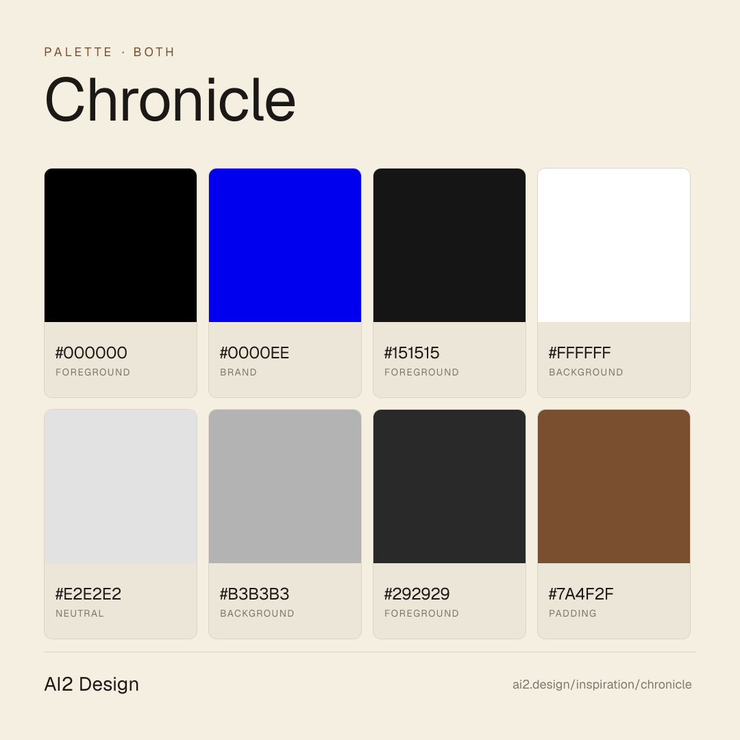
Pure #000 ground + #ffffff text holds the page; classic-web #0000ee accent earns attention through scarcity and unmistakable hyperlink heritage.
- #000000 is the only background colour — no dark grey, no off-black
- #ffffff for primary text, #151515 for elevated surfaces (cards on dark)
- #e2e2e2 hairline borders — visible only by contrast
- #0000ee classic web blue exclusively on links, CTAs, focus rings
Gradients (paste-ready)
1 gradient catalogued — subtle dark-to-darker atmospheric tone in the hero section, otherwise gradient-free
Typography rules
- Diatype Variable is the sole interface family — UI, body, captions, display headlines, all 400/500 only
- Display sizes 48-54px for hero headlines; body 16px; metadata 12px
- Line-height 1.4-1.5 for body, 1.05-1.1 for display
- Letter-spacing 0 across the board — Diatype's optical spacing is already correct
- Weight as hierarchy: 500 for emphasis, 400 for everything else
Spacing rules
- 4px base unit, heaviest use at 3/8/10/12/16/20px increments
- Section vertical rhythm: 120-200px between major sections (keynote pacing)
- Card internal padding: 24-32px; CTA padding: 14px vertical / 24px horizontal
- Hero-to-content transition: 80-120px breathing room
Design tokens
Palette, type, and space — all agent-readable.
7 colors · hex / rgb / hsl / oklch
- foregroundcolor-black-alpha-1291%
- HEX
#000000 - RGB
rgb(0, 0, 0) - HSL
hsl(0, 0%, 0%) - OKLCH
oklch(0.00% 0.0000 0.00)
- HEX
- brand3%
- HEX
#0000EE - RGB
rgb(0, 0, 238) - HSL
hsl(240, 100%, 47%) - OKLCH
oklch(42.90% 0.2973 264.05)
- HEX
- foregroundcolor-solid-112%
- HEX
#151515 - RGB
rgb(21, 21, 21) - HSL
hsl(0, 0%, 8%) - OKLCH
oklch(19.57% 0.0000 89.76)
- HEX
- backgroundcolor-white-alpha-122%
- HEX
#FFFFFF - RGB
rgb(255, 255, 255) - HSL
hsl(0, 0%, 100%) - OKLCH
oklch(100.00% 0.0000 89.76)
- HEX
- neutralcolor-border2%
- HEX
#E2E2E2 - RGB
rgb(226, 226, 226) - HSL
hsl(0, 0%, 89%) - OKLCH
oklch(91.28% 0.0000 89.76)
- HEX
- backgroundcolor-solid-20%
- HEX
#B3B3B3 - RGB
rgb(179, 179, 179) - HSL
hsl(0, 0%, 70%) - OKLCH
oklch(76.68% 0.0000 89.76)
- HEX
- foregroundcolor-solid-90%
- HEX
#292929 - RGB
rgb(41, 41, 41) - HSL
hsl(0, 0%, 16%) - OKLCH
oklch(28.09% 0.0000 89.76)
- HEX
Inspector
Tab through the captured artifacts.
Six observable layers — page structure, fonts, breakpoints, z-index, gradients, motion — kept paste-ready alongside the tokens above.
Page structure
Semantic hierarchy at a glance.
Depth-first walk of meaningful sections — header, navigation, main regions, articles, footer. 10 nodes captured; depth capped at 6 for readability.
- body
- ├─ Header
- │ └─ div
- │ └─ div
- │ └─ div
- │ └─ Nav
- └─ div (×2)
- ├─ Main
- │ └─ Section (×7)
- └─ Footer
Accessibility
WCAG contrast matrix.
34 combinations · 22 pass AA · 20 pass AAA · APCA Lc shown alongside WCAG 2.1 ratio for draft WCAG 3 awareness.
| Preview | fg | bg | Ratio | Normal | Large | APCA Lc | Context |
|---|---|---|---|---|---|---|---|
Aa | #000000 | #FFFFFF | 21.00 | AAA | AAA | +106 | foreground on background |
Aa | #FFFFFF | #000000 | 21.00 | AAA | AAA | -108 | background on foreground |
Aa | #151515 | #FFFFFF | 18.26 | AAA | AAA | +105 | foreground on background |
Aa | #FFFFFF | #151515 | 18.26 | AAA | AAA | -107 | background on foreground |
Aa | #000000 | #E2E2E2 | 16.21 | AAA | AAA | +89 | foreground on neutral |
Aa | #E2E2E2 | #000000 | 16.21 | AAA | AAA | -89 | neutral on foreground |
Aa | #FFFFFF | #292929 | 14.55 | AAA | AAA | -104 | background on foreground |
Aa | #292929 | #FFFFFF | 14.55 | AAA | AAA | +101 | foreground on background |
Aa | #151515 | #E2E2E2 | 14.10 | AAA | AAA | +88 | foreground on neutral |
Aa | #E2E2E2 | #151515 | 14.10 | AAA | AAA | -88 | neutral on foreground |
Image strategy
Asset loading & format policy.
Observable image posture — total count, lazy-loading ratio, and format mix. Hero image is measured above the fold.
Hero image
https://chroniclehq.com/_next/image?url=https%3A%2F%2Fcms.chroniclehq.com%2Fwp-content%2Fuploads%2F2026%2F02%2Fhero-ui-opt.png&w=1920&q=100- Format
- UNKNOWN
- Dimensions
- 1722×1045
- Loading
- eager
- srcset
- yes
- srcset descriptor
- /_next/image?url=https%3A%2F%2Fcms.chroniclehq.com%2Fwp-content%2Fuploads%2F2026%2F02%2Fhero-ui-opt.png&w=1920&q=100 1x, /_next/image?url=https%3A%2F%2Fcms.chroniclehq.com%2Fwp-content%2Fuploads%2F2026%2F02%2Fhero-ui-opt.png&w=3840&q=100 2x
- Full Page
- productivity
- saas
- design-tools
- both
- 2026-05-15
Editorial credit
Featured Sponsor slot — your brand here
Dedicated logo placement — no rotation, on every export.
COMPARE THIS WITH
Side-by-side reads sharing this design signal.
See also