Notion · Full Page
Notion
The productivity-tool landing that treats the interface itself as the product — every surface feels like a well-crafted page in a well-crafted notebook. Notion carries paper-feel warmth on a warm off-white canvas, pairs a commissioned optical sans (NotionInter) with a serif (Lyon Text), a monospace (iA Writer Mono), and a sticker font (Permanent Marker), then cascades 4-5 soft shadow layers at sub-5% opacity to simulate ink on real paper. Rainbow accents are semantic vocabulary — link blue, editorial orange, citation brown — each tied to a specific content role.

Editorial disclaimer
Editorial noteThis entry documents observable design-language patterns for educational transfer and AI-agent briefing. Screenshots and trademarks are property of their respective owners. AI2 Design is not affiliated with or endorsed by the featured brand. Inspiration here is about language and rhythm — do not reproduce brand identity, logo, product copy, or proprietary features.
Curator verdict
Why we catalogued it?
Notion is what happens when a productivity tool commits to treating the interface itself as the product — every surface feels like a well-crafted page in a well-crafted notebook. We catalogued it because it distils the hardest discipline in software marketing: carrying a paper-feel warmth without sacrificing screenful density or AI-era credibility. If you're shipping anything document-shaped — docs, knowledge base, collaborative editor, agent workspace — this is the reference for how to make a landing feel like the app it sells.
Design decisions observed
- Paper as the canvas — a warm off-white background replaces the default cold SaaS white, and everything else is tuned to feel like ink on fiber; the identity is hand-held rather than hosted.
- A custom Inter, not just any Inter — Notion ships its own optical-tuned cut (NotionInter) and pairs it with a serif (Lyon Text), a monospace (iA Writer Mono) and a single sticker font (Permanent Marker) for editorial accents; four families, four registers, no overlap.
- Multi-layer soft shadow cascade — cards and inline elements sit on 4 to 5 stacked shadow layers at sub-percent opacity; the result reads as real paper picking up ambient light, not as a UI asking for attention.
- A rainbow of semantic accents — link blue, editorial orange, alert red, and illustrative warm-brown each have specific roles in the information architecture; the palette is a vocabulary, never a decoration.
- Zero gradients, everywhere — every surface depth comes from the shadow stack or from a 1px hairline border; the page refuses the atmospheric trickery that most SaaS landings rely on.
- Tokens exposed on purpose — hundreds of open CSS variables (text-color-* opacity ladder, border-radius-200 through round, semantic surface names) turn the page into a public design system inspection.
What to study
- How Notion earns warmth without losing screen density — most productivity tools trade one for the other. Steal the move: warm the canvas, then stay disciplined on everything above it.
- The multi-layer soft shadow pattern — four to five stacked shadow declarations at tiny opacity values replace the single harsh shadow that dashboard templates default to. It's the fastest retrofit from template-tier to craft-tier.
- Rainbow-as-vocabulary — the accent tones aren't brand colors in a style guide, they're semantic tokens attached to content types (link, citation, callout, warning). Adopt this separation when your product has content roles to communicate.
- Custom optical type as a brand choice — commissioning NotionInter signals that the team treats reading comfort as a product feature, not a nice-to-have. When your surface is text-heavy, the font investment pays for itself in legitimacy.
What to avoid
- Don't copy the paper warmth without the density — a warm canvas on a sparse page reads as cozy; on a content-rich page it reads as confidence. Without the density the whole move undercuts itself.
- Don't attempt the multi-layer shadow without discipline — four-stack shadows are expensive to get right; pick real opacity values from the extract, not guesses. One wrong value and the whole surface looks muddy instead of airy.
- Don't adopt the rainbow accents as brand color — Notion's colors earn their role through semantic consistency across thousands of pages; in a first-week landing the same palette reads as decorative noise.
Taste notes
The page feels like opening a well-kept notebook in a bright room — paper ivory under the hand, ink charcoal on the surface, and quiet craft in every margin. NotionInter carries the body with the optical confidence of a type-foundry commission; Lyon Text appears precisely where a pull quote wants to breathe; iA Writer Mono shows up for code and API references; Permanent Marker sneaks into callout stickers like annotations in a real notebook. The whole composition reads as editorial software — the rare landing where the marketing surface and the writing surface speak the same visual language.
Lineage & references
- Part of the post-Google Docs productivity-tool renaissance — alongside Craft, Coda, Obsidian, Anytype — that replaced chrome-heavy document shells with paper-feel writing surfaces.
- Adjacent to the editorial-software cohort (iA Writer, Bear, Ulysses, Tot) where type systems and margins are treated as product features rather than aesthetic garnish.
- A spiritual descendant of Susan Kare's Macintosh warmth and the original Evernote paper metaphor, upgraded for the 2026 AI-workspace era with semantic rainbow accents and an open token system.
Design language brief
Paste-ready for your agent.
A typed design system transfer brief — philosophy, tokens, rules, techniques, and fitness checks. Your agent reads the whole language, not just the pixels.
Philosophy
Paper-feel productivity identity where a warm off-white canvas, a custom optical sans paired with serif + mono + sticker accents, and a multi-layer soft shadow cascade carry the entire load of craft — no gradients, no atmospheric tricks. Rainbow accents are semantic vocabulary, not brand mood. The page reads as editorial software: marketing surface and writing surface speak the same visual language.
Main prompt
Design a paper-feel landing for a document or knowledge product where the interface itself is the product. Canvas is warm off-white #f6f5f4 (not cold SaaS white). Typography uses a custom optical sans as the single workhorse (NotionInter pattern — commission or adopt an optical-tuned Inter variant), paired with a book serif for pull quotes (Lyon Text), an editorial monospace for code and coordinates (iA Writer Mono), and a single sticker-hand font for callouts (Permanent Marker) — four families, four registers, no overlap. Text palette ladders through dark-ink #31302e for emphasis, neutral charcoal #000 for body (only 1352 occurrences in the extract — body reads as true ink), warm mid-grey #615d59 for secondary, soft grey #a39e98 for tertiary. Accent vocabulary is a semantic rainbow: #0075de link blue, #62aef0 info blue, #f64932 alert red, #ff6d00 editorial orange, #9c7054 citation warm-brown — each tone tied to an information role, never decorative. Elevation is the signature move: **multi-layer soft shadow cascade**, 4 to 5 stacked rgba declarations at 1-8% opacity. Border radius ladder 4 / 5 / 8 / 12 / 16px. Single 1px hairline border. Zero gradients. Spacing scale 2 / 4 / 6 / 8 / 10 / 12 / 14 / 16 / 20 / 24 / 28 / 32. Narrow containers 500-892 for reading, 1184-1252 for utility grids. Motion is CSS-only with two-tier timing: 0.15-0.2s for interactive feedback, 0.6-1s for editorial reveals; easings draw from ease / ease-in / ease-in-out / linear plus cubic-bezier(0.645, 0.045, 0.355, 1) and cubic-bezier(0.45, 0, 0.55, 1) — no motion library captured. Breakpoints sm 375 / md 712 / lg 908 / xl 1156 / 2xl 1440.
Overview
- Layout
- centered narrow column for reading (500-892 container), full-width utility grids (1184-1252) for feature matrices; sticky nav at z-100/1000
- Content width
- 892px primary reading width, 500-600px for marketing callouts, 1252 max for product-tour grids
- Framing
- warm off-white #f6f5f4 canvas with content floating at narrow widths; multi-layer shadow elevation replaces decorative chrome
- Grid strength
- implied — typography + spacing carry hierarchy; no visible column rails
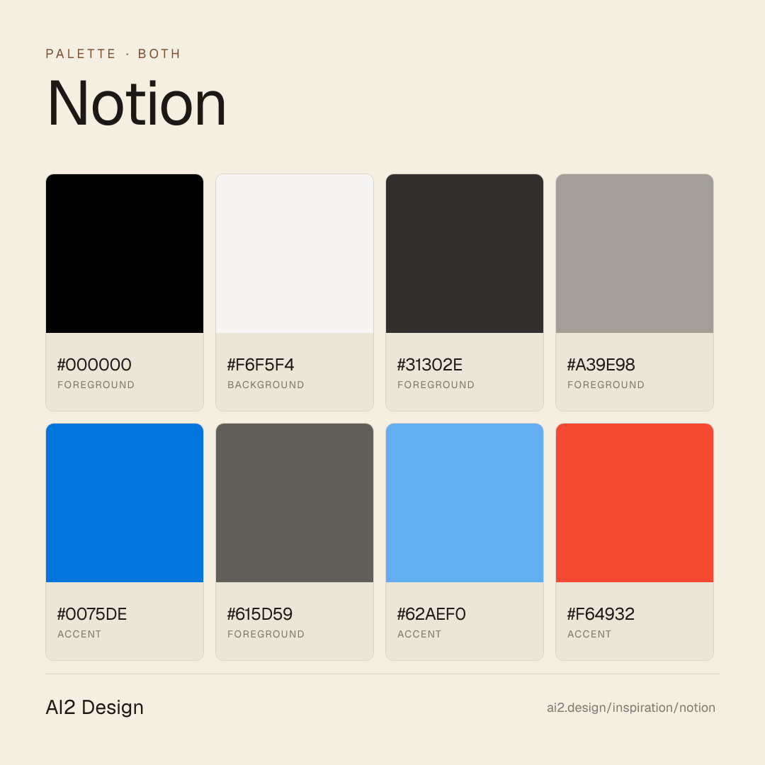
Color philosophy
Warm off-white canvas, dark-ink text at four opacity tiers, and a semantic rainbow of accents where each tone is tied to a specific content role
- bg #f6f5f4 (warm ivory — replaces cold SaaS white everywhere)
- text #000 body (optical black, 1352 occurrences — true ink feel)
- text #31302e emphasis (slightly warmed dark charcoal)
- text #615d59 secondary (warm mid-grey)
- text #a39e98 tertiary (soft grey — metadata, timestamps)
- #0075de link + primary CTA (functional blue)
- #62aef0 info / tip blocks (lighter blue for callouts)
- #f64932 alert / destructive (saturated red-orange — only for error semantics)
- #ff6d00 editorial orange (highlights, annotations, sticker accents)
- #9c7054 citation / warm-brown (book references, longer-form callouts)
Typography rules
- Single workhorse sans: NotionInter (a commissioned optical cut of Inter). Pair it with a serif, a mono, and one sticker font — do not exceed four families
- Preload the four hero weights: NotionInter-Regular / Medium / SemiBold / Bold (local woff2)
- Body paragraph 16px / 24 line-height at weight 400 is the comfortable reading size
- Utility text 14px / 20 at weight 400-500, captions 12px / 16 at weight 500
- Display headlines up to 40px / 60 or 48px / 72 at weight 400-500 — serif or sans acceptable, never bold
- Serif (Lyon Text pattern) appears only for pull quotes and longer-form editorial moments
- Mono (iA Writer Mono pattern) appears only for code, coordinates, API signatures, and citation references
- Sticker font (Permanent Marker pattern) appears only for callout stickers and annotation accents — never in prose
- Letter-spacing stays 'normal' — do not track-open for atmosphere
Spacing rules
- Base unit 2px — scale is 2 / 4 / 6 / 8 / 10 / 12 / 14 / 16 / 20 / 24 / 28 / 32
- 24-32 for section padding, 12-20 for component internal rhythm, 2-8 for inline token micro-spacing
- No value above 32px in a single gap — larger vertical distance comes from section height, not margin
Design tokens
Palette, type, and space — all agent-readable.
20 colors · hex / rgb / hsl / oklch
- foregroundshadow-level-20058%
- HEX
#000000 - RGB
rgb(0, 0, 0) - HSL
hsl(0, 0%, 0%) - OKLCH
oklch(0.00% 0.0000 0.00)
- HEX
- backgroundcolor-gray-20019%
- HEX
#F6F5F4 - RGB
rgb(246, 245, 244) - HSL
hsl(30, 10%, 96%) - OKLCH
oklch(97.06% 0.0017 67.80)
- HEX
- foregroundcolor-gray-8007%
- HEX
#31302E - RGB
rgb(49, 48, 46) - HSL
hsl(40, 3%, 19%) - OKLCH
oklch(30.95% 0.0038 84.58)
- HEX
- foregroundcolor-gray-4006%
- HEX
#A39E98 - RGB
rgb(163, 158, 152) - HSL
hsl(33, 6%, 62%) - OKLCH
oklch(70.17% 0.0104 72.62)
- HEX
- accentcolor-blue-6002%
- HEX
#0075DE - RGB
rgb(0, 117, 222) - HSL
hsl(208, 100%, 44%) - OKLCH
oklch(56.79% 0.1824 254.27)
- HEX
- foregroundcolor-gray-6002%
- HEX
#615D59 - RGB
rgb(97, 93, 89) - HSL
hsl(30, 4%, 36%) - OKLCH
oklch(48.08% 0.0082 67.63)
- HEX
- accentcolor-blue-4001%
- HEX
#62AEF0 - RGB
rgb(98, 174, 240) - HSL
hsl(208, 83%, 66%) - OKLCH
oklch(72.91% 0.1227 246.66)
- HEX
- accentcolor-red-5001%
- HEX
#F64932 - RGB
rgb(246, 73, 50) - HSL
hsl(7, 92%, 58%) - OKLCH
oklch(65.12% 0.2130 30.90)
- HEX
- foregroundcolor-brown-5001%
- HEX
#9C7054 - RGB
rgb(156, 112, 84) - HSL
hsl(23, 30%, 47%) - OKLCH
oklch(58.30% 0.0691 53.40)
- HEX
Inspector
Tab through the captured artifacts.
Six observable layers — page structure, fonts, breakpoints, z-index, gradients, motion — kept paste-ready alongside the tokens above.
Page structure
Semantic hierarchy at a glance.
Depth-first walk of meaningful sections — header, navigation, main regions, articles, footer. 2 nodes captured; depth capped at 6 for readability.
- body
- └─ div (×2)
Accessibility
WCAG contrast matrix.
278 combinations · 78 pass AA · 38 pass AAA · APCA Lc shown alongside WCAG 2.1 ratio for draft WCAG 3 awareness.
| Preview | fg | bg | Ratio | Normal | Large | APCA Lc | Context |
|---|---|---|---|---|---|---|---|
Aa | #000000 | #F6F5F4 | 19.29 | AAA | AAA | +100 | foreground on background |
Aa | #F6F5F4 | #000000 | 19.29 | AAA | AAA | -101 | background on foreground |
Aa | #F6F5F4 | #02093A | 17.49 | AAA | AAA | -101 | background on accent |
Aa | #02093A | #F6F5F4 | 17.49 | AAA | AAA | +99 | accent on background |
Aa | #F6F5F4 | #191918 | 16.16 | AAA | AAA | -100 | background on foreground |
Aa | #191918 | #F6F5F4 | 16.16 | AAA | AAA | +99 | foreground on background |
Aa | #000000 | #FFC95E | 13.77 | AAA | AAA | +80 | foreground on accent |
Aa | #FFC95E | #000000 | 13.77 | AAA | AAA | -79 | accent on foreground |
Aa | #02093A | #FFC95E | 12.49 | AAA | AAA | +79 | accent on accent |
Aa | #FFC95E | #02093A | 12.49 | AAA | AAA | -78 | accent on accent |
Image strategy
Asset loading & format policy.
Observable image posture — total count, lazy-loading ratio, and format mix. Hero image is measured above the fold.
Hero image
https://www.notion.com/_next/image?url=%2Ffront-static%2Fshared%2Fnavigation%2Fai_group.png&w=256&q=75- Format
- UNKNOWN
- Dimensions
- 256×215
- Loading
- lazy
- srcset
- yes
- srcset descriptor
- /_next/image?url=%2Ffront-static%2Fshared%2Fnavigation%2Fai_group.png&w=256&q=75 1x, /_next/image?url=%2Ffront-static%2Fshared%2Fnavigation%2Fai_group.png&w=384&q=75 2x
- Full Page
- productivity
- saas
- both
- 2026-04-24
Frequently asked
Questions people ask about Notion
Answers are pulled from the curator verdict and design brief — the same text your AI agent sees when it paste-reads this page.
What makes Notion's marketing page work as editorial software?
Notion commits to paper-feel identity top to bottom — warm off-white canvas, a custom optical cut of Inter (NotionInter), and a multi-layer soft shadow cascade that reads as ink on real paper. The marketing surface speaks the same visual language as the app itself, so the landing feels like a demo of the product rather than a pitch for it.
What fonts and palette does Notion use?
A quadruple type family: NotionInter (commissioned optical sans) for body, Lyon Text (serif) for pull quotes, iA Writer Mono for code, and Permanent Marker for sticker-style callouts. The palette is warm ivory #f6f5f4 canvas with dark ink at four opacity tiers, plus six semantic accents (#0075de link, #62aef0 info, #f64932 alert, #ff6d00 editorial orange, #9c7054 citation brown).
Can I apply Notion's paper-feel aesthetic to my product?
The transfer is disciplined rather than decorative. Warm the canvas to off-white, commission or adopt an optical-tuned sans, and cascade 4-5 box-shadow declarations at sub-5% opacity for elevation. Zero gradients. Assign semantic roles to accent colors. The AI2 Design brief captures the exact shadow stacks and opacity ladders as paste-ready tokens for any agent workflow.
Editorial credit
Featured Sponsor slot — your brand here
Dedicated logo placement — no rotation, on every export.
COMPARE THIS WITH
Side-by-side reads sharing this design signal.
See also