Raycast · Full Page
Raycast
The productivity-tool landing that treats the web page like a macOS system preference window — and commits to the bit with every shadow, radius, and easing curve. Raycast ports native-app discipline to the browser: skeuomorphic keyboard-key shadows, half-pixel precision radii, a dual-family typography duet, and an open 80-variable token system that reads like a Figma Tokens Studio export.

Editorial disclaimer
Editorial noteThis entry documents observable design-language patterns for educational transfer and AI-agent briefing. Screenshots and trademarks are property of their respective owners. AI2 Design is not affiliated with or endorsed by the featured brand. Inspiration here is about language and rhythm — do not reproduce brand identity, logo, product copy, or proprietary features.
Curator verdict
Why we catalogued it?
Raycast is the rarest kind of productivity-tool landing — one that treats the web page itself as a macOS system preference window, then commits to the bit with every shadow, radius, and easing curve. We catalogued it because it demonstrates what happens when a brand refuses to translate its native-app discipline into standard web vernacular: skeuomorphic keyboard-key shadows, half-pixel precision radii, a typography duet that pairs Inter with SF Pro Text like they were always supposed to share a page, and an open 80-variable token system that reads like a Figma Tokens Studio export. If you are shipping for a developer audience that loves keyboard shortcuts more than they love marketing copy, this is the reference that shows what macOS-fluent looks like on the web.
Design decisions observed
- Native-app discipline on the web — Raycast doesn't translate; it ports. Every visual primitive (key caps, hover states, menu rows) borrows vocabulary from the macOS Human Interface Guidelines, not web marketing.
- Dual-family typography as a statement — Inter and SF Pro sharing a page sounds like a style collision, but Raycast treats them as complementary voices: Inter for editorial text, SF Pro for chrome and controls. That's how they make the page feel Apple-native without breaking web accessibility.
- Open token system as brand transparency — eighty named CSS variables exposed in plain sight, with semantic naming (rounding/spacing/color) that mirrors their internal design tokens. That's how they signal 'we design with engineers at the table'.
- Skeuomorphic shadow grammar — keyboard-key components use inset highlights plus outset depth shadows, a pattern abandoned by most post-2018 interfaces. Raycast revives it because their product is literally about keyboard keys.
- Atmospheric multi-gradient hero language — twelve gradients, mostly radial, arranged like stage lighting rather than hero decoration. Each section gets its own color temperature (purple, cerulean, coral) against the same near-black base.
- Signature ease-out-expo timing — the cubic-bezier curve repeats six times across their transition stack, giving every micro-interaction the same buttery snap. That consistency is invisible individually, decisive in aggregate.
What to study
- How Raycast ports macOS vocabulary to the web without looking like a mid-tier Mac port — most 'Apple-inspired' landings ape the blur and round corners then stop. Steal the mindset: the details Apple cares about (keyboard-focus rings, inset key shadows, menu-row hover states) are where the signal lives.
- How eighty exposed CSS variables read as confidence instead of leakage — most engineering-heavy design systems bury their tokens inside class abstractions. Raycast publishes them in plain view. Steal the mindset: radical token transparency is a recruiting signal.
- How skeuomorphic key-cap shadows survive in 2026 without feeling retro — inset highlight plus outset depth, calibrated at sub-pixel scales (0.5px, 1.5px). Steal the mindset: skeuomorphism is fine when the product is literally the metaphor.
- How a dual-family typography system avoids the 'style conflict' trap — Inter and SF Pro have enough x-height parity that they share line heights gracefully. Steal the mindset: font pairing works when the grids align, not when the moods match.
What to avoid
- Don't port macOS visual language if your product isn't keyboard-native — Raycast earns the discipline because they literally make a keyboard-driven launcher. A SaaS dashboard with key-cap shadows will look like an AI-generated mockup.
- Don't expose eighty design tokens without maintaining them — open variable systems require ruthless discipline. The day a `--spacing-3-5` appears as a hack, the whole system loses credibility.
- Don't copy the skeuomorphic shadow pattern without the native-feeling motion — inset shadows without the matching ease-out-expo micro-timing feel static and dated.
Taste notes
The page reads like a preference pane that escaped into a browser — every surface elevated by a breath of inset light, every corner radius chosen with a millimeter's intentionality, every hover state timed to the same unhurried curve. There's no attempt to prove warmth or humanity; the craft itself is the invitation. You can almost hear the click of keys as you scroll. It's the rare kind of landing that makes you want to close the tab not because it failed to hold attention, but because you want to go use the product.
Lineage & references
- The dark-native productivity cohort's most macOS-loyal member — shoulder-to-shoulder with Arc (browser reimagined), Warp (terminal modernized), and Superhuman (email accelerated). All four refuse the cross-platform compromise; Raycast goes furthest by also shipping the visual vocabulary.
- Part of the 2024+ keyboard-renaissance generation — where Linear taught teams to design for keyboard shortcuts, Raycast builds the infrastructure for keyboard workflows. Sibling taste cohort: Replit, Cursor, Codeium — all tools that treat keystrokes as the primary input modality.
- The quiet elder of open-token marketing landings — Figma's thirty CSS variables felt radical in 2023; Raycast's eighty makes it category-standard. Future tokens-transparent landings (Vercel, Plasmic, Framework X) borrow this posture of radical engineering transparency.
Design language brief
Paste-ready for your agent.
A typed design system transfer brief — philosophy, tokens, rules, techniques, and fitness checks. Your agent reads the whole language, not just the pixels.
Philosophy
Dark-native macOS-fluent productivity landing. Near-black backgrounds (#000000, #1b1c1e) + high-contrast white text (#ffffff) + muted gray secondary ladder (#9c9c9d, #6a6b6c, #434345) + brand-tier accents (#63a1ff sky-blue, #ff6363 coral / `--red-dark`, #2e6fcf navy-link) plus supporting one-off spots (#9ebed7 muted blue, #59d499 mint, #d72a2a scarlet, #452324 cabernet warm, #02193b deep navy panel). Dual-family typography: Inter (editorial body + headings) + SF Pro Text (chrome + controls) + JetBrains Mono + GeistMono (code). Open 80-variable CSS token system (--rounding-none/xs/sm/normal/md/lg/xl/xxl/full · --spacing-none/0-5/1/1-5/2/2-5/3/4/5/6/7). Primary ease-out-expo cubic-bezier(0.23, 1, 0.32, 1) carries most micro-interactions, supported by cubic-bezier(0.215, 0.61, 0.355, 1) and cubic-bezier(0.165, 0.84, 0.44, 1) for slightly different acceleration profiles. Skeuomorphic keyboard-key shadow grammar: inset white highlight (0 1px 0 0 rgba(255,255,255,0.05)) + outset depth (0 1.5px 0.5px 2.5px rgba(0,0,0,0.4)). Twelve gradients (radial-dominant, stage-lighting arrangement).
Main prompt
Build a dark-native productivity-tool marketing landing that feels like a macOS preference pane escaped into a browser. Use near-black grounds (#000000 to #1b1c1e), high-contrast white text, and a muted gray secondary ladder. Pair Inter (editorial) with SF Pro Text (chrome) — treat them as complementary voices, not a style conflict. Expose design tokens as CSS variables with semantic naming (--rounding-*, --spacing-*). Use radial gradients as stage-lighting per section (purple, cerulean, coral against the same base). Time every micro-interaction with cubic-bezier(0.23, 1, 0.32, 1) ease-out-expo. Shadow grammar must be skeuomorphic where the product warrants it (keyboard-key inset + outset depth). Radii small and precision (2-9px, half-pixel 2.5px allowed).
Overview
- Layout
- Section-based dark surfaces with atmospheric gradient backdrops; narrow content columns stacked vertically
- Content width
- Multi-container ladder (320 / 364 / 400 / 456 / 488 / 1204px) — narrow reading content + one wide feature band
- Framing
- Near-black page ground (#000000) + section-level radial gradient overlays; no horizontal rules, atmospheric color shifts mark transitions
- Grid strength
- Low — flex-driven stacks, grid reserved for feature rows + comparison tables
Color philosophy
Dark-native high-contrast palette with atmospheric accent spots — white-on-black editorial with stage-lighting gradient moments. No light mode detected in extract.
- Background dominant: #000000 (near-black) · #1b1c1e (card surface) · #2f3031 (elevated surface)
- Text: #ffffff (primary, 3448 freq) · #9c9c9d (secondary) · #6a6b6c (tertiary) · #434345 (borders/dividers)
- Brand-tier accents (recurring surface): #63a1ff sky-blue (25 measured uses) · #ff6363 coral / `--red-dark` (12 uses) · #2e6fcf navy-link (9 uses)
- Supporting one-off accents (1-5 measured uses each): #9ebed7 muted blue · #59d499 mint · #d72a2a scarlet · #452324 cabernet warm · #02193b deep navy panel
- Gradient-only stops (not in palette colors[] but resolved through atmospheric gradients): rgb(86, 194, 255) cerulean (#56c2ff), rgb(17, 18, 20) → rgb(12, 13, 15) panel ramp, rgb(18, 18, 18) → rgb(13, 13, 13) page atmosphere
- Gradient hero stops use rgba() with alpha — depth through transparency, not solid tones
Gradients (paste-ready)
radial-gradient(75% 75% at 50% 91.9%, rgb(18,18,18) 0px, rgb(13,13,13) 100%) — base page atmosphere
linear-gradient(135deg, rgb(86,194,255) 0%, rgb(19,138,242) 100%) — cerulean CTA / feature highlight
linear-gradient(137deg, rgb(17,18,20) 4.87%, rgb(12,13,15) 75.88%) — card surface gradient
radial-gradient(84.6% 73.49% at 50% 26.51%, rgba(4,63,150,0.7), rgba(6,18,37,0.25)) — hero stage light
radial-gradient(86.88% 75.47% at 50% 24.53%, rgba(82,48,145,0.7), rgba(26,11,51,0.14)) — purple section stage light
radial-gradient(85.77% 49.97% at 51% 5.12%, rgba(255,150,150,0.11), ...) — coral accent section
Total 12 gradients (mostly radial) — stage-lighting arrangement, not hero decoration
Typography rules
- Primary body + editorial: Inter (self-hosted Next.js /static/media/ *.woff2, weights 100-900 variable)
- Chrome + controls: SF Pro Text + SF Pro (macOS-native stack fallback for controls, menus)
- Code: JetBrains Mono + GeistMono (weights 100-900 / 100-800 variable)
- Next.js font optimization active: Inter Fallback + JetBrains Mono Fallback detected (local metric fonts)
- Weight ladder deployed: 400 · 500 · 600 · 700 (full operational range within 100-900)
- Body: 16px / 18.4px line-height / w400 (tight 1.15 ratio — editorial density)
- Display-5: 32px / 36.8px / w400 (large editorial display, not display-jumbo)
- Heading-large: 24px / 27.6px / w500 · SF Pro Text (chrome heading — macOS feel)
- Heading-medium: 23.75px / 27.3125px / w500 · SF Pro Text (half-pixel precision!)
- Small: 13-14px ladder with letterSpacing 0.1-0.3px tight tracking
- Strategy: mixed (self-hosted subset via Next.js /static/media/ + fallback metric-matched locals)
Spacing rules
- Extract-derived scale: 2 · 4 · 6 · 8 · 10 · 12 · 15 · 20 · 22 · 24 · 29 · 32 (multi-base 2+5+7+10 mixed progression)
- CSS var spacing tokens (canonical): --spacing-none (0) · --spacing-0-5 (4) · --spacing-1 (8) · --spacing-1-5 (12) · --spacing-2 (16) · --spacing-2-5 (20) · --spacing-3 (24) · --spacing-4 (32) · --spacing-5 (40) · --spacing-6 (48) · --spacing-7 (56)
- Container ladder: 320 · 364 · 400 · 456 · 488 · 1204px — narrow reading columns + one wide feature band
- Gutters flex-driven, no fixed grid column system
Design tokens
Palette, type, and space — all agent-readable.
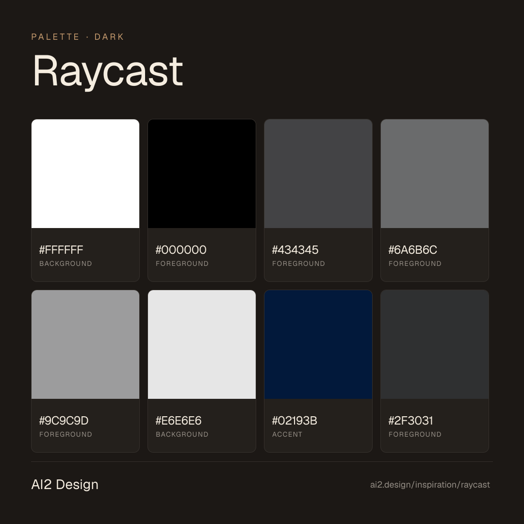
16 colors · hex / rgb / hsl / oklch
- backgroundreverse-background72%
- HEX
#FFFFFF - RGB
rgb(255, 255, 255) - HSL
hsl(0, 0%, 100%) - OKLCH
oklch(100.00% 0.0000 89.76)
- HEX
- foregroundBase-Black10%
- HEX
#000000 - RGB
rgb(0, 0, 0) - HSL
hsl(0, 0%, 0%) - OKLCH
oklch(0.00% 0.0000 0.00)
- HEX
- foregroundgrey-4005%
- HEX
#434345 - RGB
rgb(67, 67, 69) - HSL
hsl(240, 1%, 27%) - OKLCH
oklch(38.36% 0.0033 286.24)
- HEX
- foregroundgrey-3004%
- HEX
#6A6B6C - RGB
rgb(106, 107, 108) - HSL
hsl(210, 1%, 42%) - OKLCH
oklch(52.72% 0.0020 247.86)
- HEX
- foregroundgrey-2003%
- HEX
#9C9C9D - RGB
rgb(156, 156, 157) - HSL
hsl(240, 1%, 61%) - OKLCH
oklch(69.31% 0.0014 286.36)
- HEX
- backgroundgrey-503%
- HEX
#E6E6E6 - RGB
rgb(230, 230, 230) - HSL
hsl(0, 0%, 90%) - OKLCH
oklch(92.49% 0.0000 89.76)
- HEX
- accent1%
- HEX
#02193B - RGB
rgb(2, 25, 59) - HSL
hsl(216, 93%, 12%) - OKLCH
oklch(21.91% 0.0725 257.33)
- HEX
- foregroundgrey-5001%
- HEX
#2F3031 - RGB
rgb(47, 48, 49) - HSL
hsl(210, 2%, 19%) - OKLCH
oklch(30.86% 0.0023 247.90)
- HEX
- accent0%
- HEX
#63A1FF - RGB
rgb(99, 161, 255) - HSL
hsl(216, 100%, 69%) - OKLCH
oklch(70.93% 0.1526 258.49)
- HEX
Inspector
Tab through the captured artifacts.
Six observable layers — page structure, fonts, breakpoints, z-index, gradients, motion — kept paste-ready alongside the tokens above.
Page structure
Semantic hierarchy at a glance.
Depth-first walk of meaningful sections — header, navigation, main regions, articles, footer. 7 nodes captured; depth capped at 6 for readability.
- body
- └─ div
- └─ div
- └─ div
- └─ div
- └─ div
- └─ Form
Accessibility
WCAG contrast matrix.
194 combinations · 84 pass AA · 48 pass AAA · APCA Lc shown alongside WCAG 2.1 ratio for draft WCAG 3 awareness.
| Preview | fg | bg | Ratio | Normal | Large | APCA Lc | Context |
|---|---|---|---|---|---|---|---|
Aa | #FFFFFF | #000000 | 21.00 | AAA | AAA | -108 | background on foreground |
Aa | #000000 | #FFFFFF | 21.00 | AAA | AAA | +106 | foreground on background |
Aa | #FFFFFF | #02193B | 17.43 | AAA | AAA | -106 | background on accent |
Aa | #02193B | #FFFFFF | 17.43 | AAA | AAA | +104 | accent on background |
Aa | #FFFFFF | #1B1C1E | 17.05 | AAA | AAA | -106 | background on foreground |
Aa | #1B1C1E | #FFFFFF | 17.05 | AAA | AAA | +104 | foreground on background |
Aa | #000000 | #E6E6E6 | 16.83 | AAA | AAA | +91 | foreground on background |
Aa | #E6E6E6 | #000000 | 16.83 | AAA | AAA | -92 | background on foreground |
Aa | #E6E6E6 | #02193B | 13.97 | AAA | AAA | -90 | background on accent |
Aa | #02193B | #E6E6E6 | 13.97 | AAA | AAA | +89 | accent on background |
Image strategy
Asset loading & format policy.
Observable image posture — total count, lazy-loading ratio, and format mix. Hero image is measured above the fold.
Hero image
https://www.raycast.com/_next/image?url=%2F_next%2Fstatic%2Fmedia%2Fquick-ai-mobile.a1c4047f.png&w=3840&q=70- Format
- UNKNOWN
- Dimensions
- 0×0
- Loading
- lazy
- srcset
- yes
- srcset descriptor
- /_next/image?url=%2F_next%2Fstatic%2Fmedia%2Fquick-ai-mobile.a1c4047f.png&w=1080&q=70 1x, /_next/image?url=%2F_next%2Fstatic%2Fmedia%2Fquick-ai-mobile.a1c4047f.png&w=3840&q=70 2x
- Full Page
- productivity
- developer-tools
- saas
- dark
- 2026-04-23
Frequently asked
Questions people ask about Raycast
Answers are pulled from the curator verdict and design brief — the same text your AI agent sees when it paste-reads this page.
What makes Raycast's marketing page feel like a system preference window?
Raycast ports native-app discipline to the browser. Skeuomorphic keyboard-key shadows, half-pixel precision radii, a dark-native macOS-fluent palette, an Inter + SF Pro duet, and eighty open CSS variables make the page read like a Figma Tokens Studio export — not a marketing site pretending to be one.
What fonts and palette does Raycast use?
Inter carries body and UI; SF Pro Display handles headlines — a duet rather than a trio. The palette is dark-native: rich blacks, warm greys, and a single vibrant accent. Eighty CSS variables expose the full token system, including the keyboard-key shadow stack that's become Raycast's signature.
Can I apply Raycast's native-app aesthetic to a web product?
The transfer is technical: adopt ease-out-expo easings, skeuomorphic inset shadows for pressable surfaces, half-pixel radii, and the Inter/SF Pro weight cadence. The AI2 Design agent brief contains the exact cubic-bezier values and shadow tokens — paste-ready so your Claude or Cursor session can scaffold surfaces that feel native on the first generation.
Editorial credit
Featured Sponsor slot — your brand here
Dedicated logo placement — no rotation, on every export.
COMPARE THIS WITH
Side-by-side reads sharing this design signal.
See also