Granola · Full Page
Granola
AI meeting notes'un editorial-notebook warmth çalışması — #e3e3e3 warm hairline lattice, custom Melange typeface, editorial blue #1d9bf0 hyperlink semantic. AI surveillance kaygısına karşı 'handmade journalist tool' positioning.

Editorial disclaimer
Editorial noteThis entry documents observable design-language patterns for educational transfer and AI-agent briefing. Screenshots and trademarks are property of their respective owners. AI2 Design is not affiliated with or endorsed by the featured brand. Inspiration here is about language and rhythm — do not reproduce brand identity, logo, product copy, or proprietary features.
Curator verdict
Why we catalogued it?
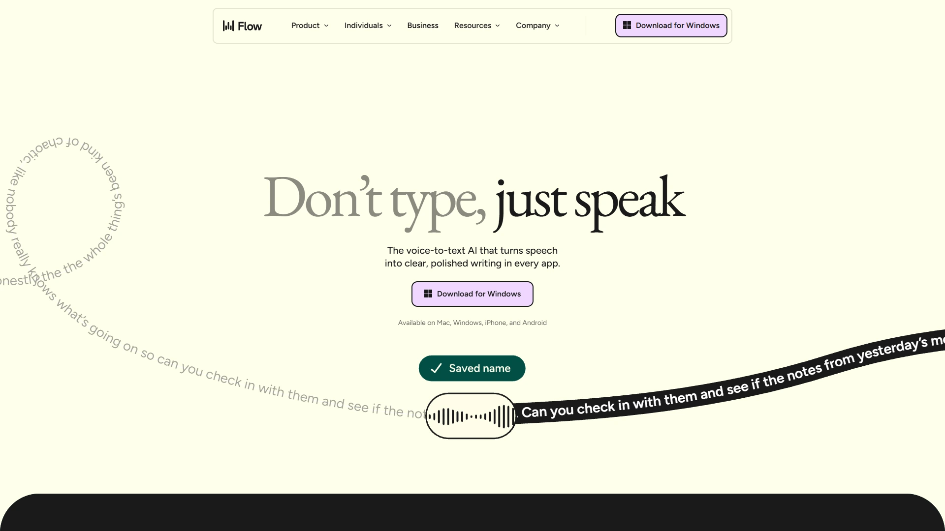
Granola is the rare AI-meeting-notes landing that refused the entire category playbook — no purple gradient, no abstract waveform illustration, no Calendly-style screenshot grid. Instead, the page reads like a journalist's notebook: a warm grey border lattice (~1,425 surface references), Melange custom serif for headlines, system body type, and a single editorial blue accent #1d9bf0 used like a hyperlink. We catalogued it because Granola understood the strategic value of looking like the artifact its product produces — neat, editorial, human, never robotic. If you are shipping AI-assisted tools that need to feel like extensions of human craft rather than replacements for it, this is the lodestar.
Design decisions observed
- Warm grey #e3e3e3 hairline borders (~1,425 surface refs) — Granola's entire layout is a soft border lattice, not a card stack. The page reads as printed page rather than templated screen.
- Custom Melange typeface (loaded as __melange_3929d6) for body and headlines — Melange is a contemporary editorial serif/sans hybrid that gives the page its quietly literary feel.
- System fallback chain (-apple-system, system-ui) layered alongside Melange — the page degrades gracefully to platform-native type if the webfont fails, which is brand-coherent.
- Editorial blue accent #1d9bf0 (~185 refs) used like a hyperlink rather than a CTA paint — the same blue we associate with publication-grade callouts, deployed with editorial restraint.
- Dark elements (#0e0f0c text, #000000 inversion zones) appear sparingly for contrast — the warm light ground is the page's voice; black is punctuation.
- Spacing scale 2/4/6/8/10/12/16/20/24/32 — incremental 4px rhythm with one 32px jump for section breathing.
- Container ladder 552/672/768/896/1280 — multiple reading widths with a magazine-density feel, perfect for note-taking content.
- No motion library detected — pure CSS transitions only (10 catalogued), reinforcing the page's calm, deliberate pacing.
- Custom breakpoints sm=480 (lowered from 640) — Granola optimises for mobile reading earlier than typical Tailwind defaults.
What to study
- How to make an AI tool feel handmade — Granola's warm grey lattice, Melange typography, and editorial blue make the page feel like a journalist's open notebook. Every choice telegraphs craft over automation.
- Custom serif/hybrid type as a positioning signal — Melange isn't a free Google Font. Choosing to license a contemporary editorial typeface tells your audience you take typography seriously, even before they read a word.
- Editorial blue as a hyperlink, not a CTA — Granola uses #1d9bf0 like a footnote callout in a magazine, not like a 'subscribe now' button paint. Steal the discipline of treating accent colour as link semantic, not call-to-action signal.
What to avoid
- Don't lift the system-font fallback discipline without committing to Melange (or equivalent) as the primary — Granola's page is held together by the custom typeface; the fallback is graceful degradation, not the brand.
- Don't paint surfaces in the editorial blue — the colour's power is in its hyperlink-adjacent meaning. Filling a button background in #1d9bf0 collapses the brand into 'AI tool with a blue button'.
- Don't tighten the spacing scale below 2/4/6/8 — Granola's page rhythm depends on breathing room that feels like notebook margins.
Taste notes
The page feels like opening a beautifully kept journal — every section is a notebook page, every accent is a footnote marker, every transition is the deliberateness of someone turning a page rather than swiping a screen. Granola understood that AI-meeting-notes is a category that can easily slip into Big Brother territory (we listen to your meetings, we transcribe everything, we have all your secrets). The warmth of the design is the antidote — it tells you this tool is on your side, an editorial assistant rather than surveillance.
Lineage & references
- Direct heir to the editorial-AI lineage that Anthropic warmth and Are.na minimalism touch on — Granola is the meeting-notes member of that family.
- Standing shoulder-to-shoulder with the modern AI-productivity peer cohort (Otter, Limitless, Rewind) — but Granola's editorial restraint sets it apart from the more chrome-heavy competitors.
- Part of the warm-editorial tech lineage that includes parts of Substack's design, Read.cv, and the broader 2024+ 'humanist software' aesthetic — Granola carries that family into the AI-tools category.
Design language brief
Paste-ready for your agent.
A typed design system transfer brief — philosophy, tokens, rules, techniques, and fitness checks. Your agent reads the whole language, not just the pixels.
Philosophy
Granola's design language is editorial notebook warmth. A warm grey #e3e3e3 hairline lattice carries the entire layout, Melange custom typography provides the editorial voice, system fallbacks ensure graceful degradation, and a single editorial blue #1d9bf0 accent functions as a hyperlink rather than a CTA. The page reads as a journalist's open notebook — neat, warm, handmade, never robotic.
Main prompt
Use this capture as a design language transfer brief for my project. Adopt the palette (warm light surface as primary, #e3e3e3 warm grey hairline border as primary structural element, #0e0f0c near-black text, #000000 inversion zones used sparingly, #536471 muted blue-grey for secondary text, #0f1419 deep ink for primary text variant, #1d9bf0 editorial blue accent used as hyperlink semantic, #ffffff for layered surfaces, #b2c248 olive-yellow for rare highlight callouts, #72726e warm grey for tertiary text, #292929 dark for inversion plate text), typography stack (Melange custom typeface loaded as __melange_3929d6 at 13-16px with letter-spacing 0.13-0.14px on smaller sizes, system-ui and -apple-system as graceful fallback chain), spacing scale 2/4/6/8/10/12/16/20/24/32, container ladder 552/672/768/896/1280 (multiple reading widths with magazine density), custom breakpoints sm=480 (lowered from 640) md=768 lg=992 xl=1280, CSS-only transitions (no motion library required) at cubic-bezier(0.4, 0, 0.2, 1) easing at 150-300ms. Treat #1d9bf0 as a hyperlink semantic, not a CTA paint. Apply the language, not the source brand's copy.
Overview
- Layout
- Hairline lattice editorial flow — warm grey borders organise content into notebook pages stacked vertically; multiple container widths preserve magazine-density reading.
- Content width
- Container ladder 552/672/768/896/1280 — multiple reading widths.
- Framing
- Journalist's notebook — warm grey hairline lattice, Melange typography, editorial blue footnotes.
- Grid strength
- Explicit hairline lattice — borders organise the page as a notebook page system.
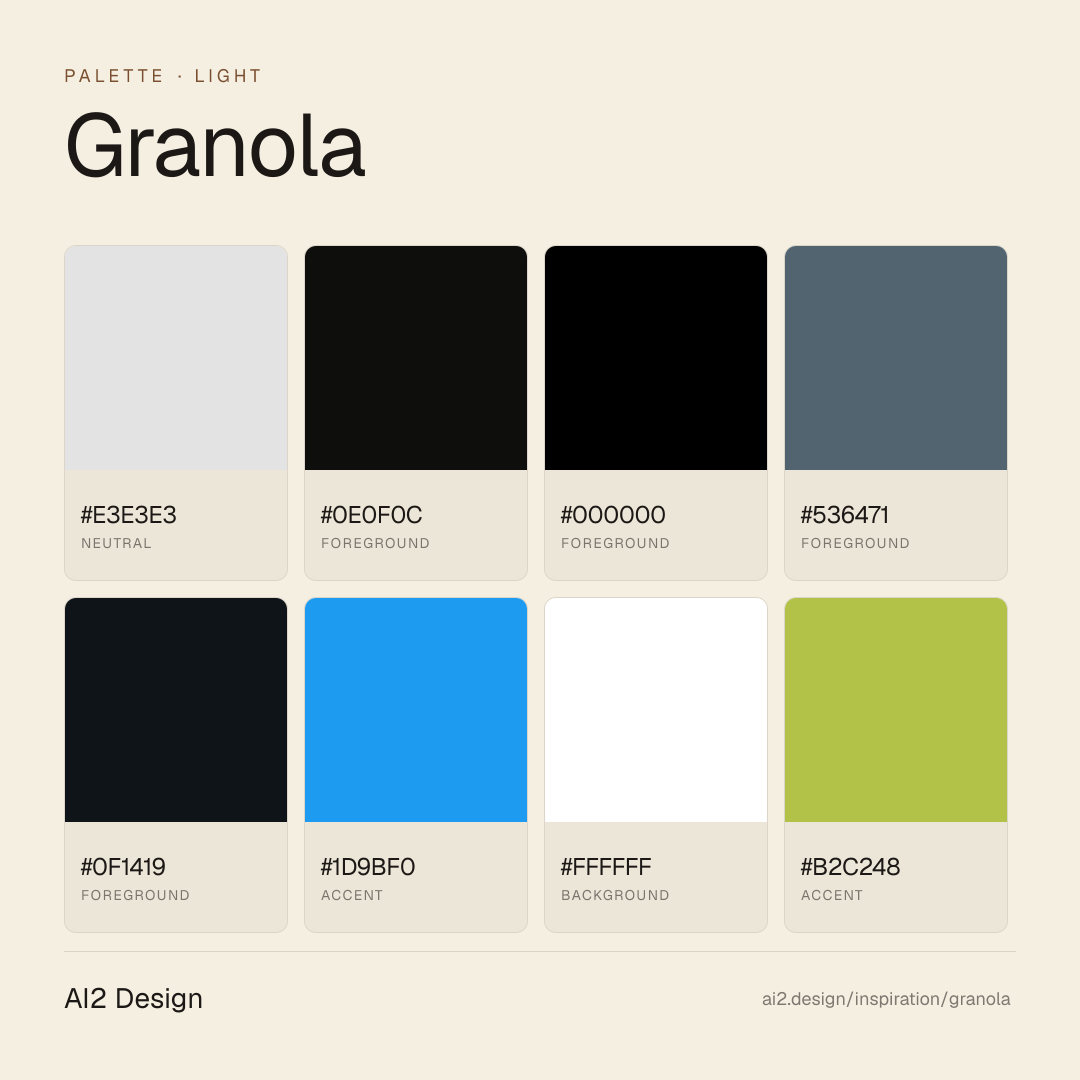
Color philosophy
Warm light primary canvas with #e3e3e3 hairline lattice as structural identity; editorial blue #1d9bf0 as hyperlink semantic; dark elements as scarce punctuation.
- Warm light primary canvas (cream-tinted off-white)
- #e3e3e3 warm grey hairline border — primary structural brand element
- #0e0f0c primary text near-black with warmth
- #000000 used sparingly for inversion zones
- #536471 muted blue-grey for secondary text
- #0f1419 deep ink for emphasis text variant
- #1d9bf0 editorial blue — hyperlink semantic, not CTA paint
- #ffffff for layered surfaces on cream ground
- #b2c248 olive-yellow for rare highlight callouts
- #72726e warm grey for tertiary text
- #292929 dark for inversion plate text
Gradients (paste-ready)
5 gradients catalogued — subtle warm-tone atmospheric depth around hero, never decorative chromatic
Typography rules
- Melange custom typeface (loaded as __melange_3929d6) is the primary identity
- System fallback chain (-apple-system, system-ui) for graceful degradation
- Body 13-16px in Melange; display 32-56px
- Letter-spacing 0.13-0.14px on smaller body sizes (13-14px) — Melange's small-size optical adjustment
- Weight 400 across body and display — Granola trusts the typeface's silhouette
- Line-height 1.5-1.6 body, 1.1-1.2 display
Spacing rules
- 4px base unit, scale 2/4/6/8/10/12/16/20/24/32
- 32px jump between dense and breathing sections
- Section vertical rhythm: 64-128px between major sections
- Card padding (notebook page): 20-32px
- CTA padding: 10-14px vertical, 16-24px horizontal
Design tokens
Palette, type, and space — all agent-readable.
20 colors · hex / rgb / hsl / oklch
- neutral40%
- HEX
#E3E3E3 - RGB
rgb(227, 227, 227) - HSL
hsl(0, 0%, 89%) - OKLCH
oklch(91.58% 0.0000 89.76)
- HEX
- foreground13%
- HEX
#0E0F0C - RGB
rgb(14, 15, 12) - HSL
hsl(80, 11%, 5%) - OKLCH
oklch(16.60% 0.0063 122.11)
- HEX
- foreground11%
- HEX
#000000 - RGB
rgb(0, 0, 0) - HSL
hsl(0, 0%, 0%) - OKLCH
oklch(0.00% 0.0000 0.00)
- HEX
- foreground9%
- HEX
#536471 - RGB
rgb(83, 100, 113) - HSL
hsl(206, 15%, 38%) - OKLCH
oklch(49.39% 0.0294 241.16)
- HEX
- foreground8%
- HEX
#0F1419 - RGB
rgb(15, 20, 25) - HSL
hsl(210, 25%, 8%) - OKLCH
oklch(18.84% 0.0128 248.51)
- HEX
- accent5%
- HEX
#1D9BF0 - RGB
rgb(29, 155, 240) - HSL
hsl(204, 88%, 53%) - OKLCH
oklch(66.71% 0.1615 245.54)
- HEX
- backgroundoats-surface-raised3%
- HEX
#FFFFFF - RGB
rgb(255, 255, 255) - HSL
hsl(0, 0%, 100%) - OKLCH
oklch(100.00% 0.0000 89.76)
- HEX
- accentoats-border-focus2%
- HEX
#B2C248 - RGB
rgb(178, 194, 72) - HSL
hsl(68, 50%, 52%) - OKLCH
oklch(77.82% 0.1463 116.25)
- HEX
- foregroundoats-ink-secondary-static2%
- HEX
#72726E - RGB
rgb(114, 114, 110) - HSL
hsl(60, 2%, 44%) - OKLCH
oklch(55.08% 0.0061 106.60)
- HEX
Inspector
Tab through the captured artifacts.
Six observable layers — page structure, fonts, breakpoints, z-index, gradients, motion — kept paste-ready alongside the tokens above.
Page structure
Semantic hierarchy at a glance.
Depth-first walk of meaningful sections — header, navigation, main regions, articles, footer. 13 nodes captured; depth capped at 6 for readability.
- body
- ├─ Nav
- ├─ Main
- │ └─ div
- │ ├─ Section
- │ └─ div
- │ ├─ Section (×3)
- │ ├─ div
- │ │ └─ Section
- │ └─ Section (×3)
- ├─ Footer
- │ └─ Section
- └─ div
Accessibility
WCAG contrast matrix.
294 combinations · 116 pass AA · 70 pass AAA · APCA Lc shown alongside WCAG 2.1 ratio for draft WCAG 3 awareness.
| Preview | fg | bg | Ratio | Normal | Large | APCA Lc | Context |
|---|---|---|---|---|---|---|---|
Aa | #000000 | #FFFFFF | 21.00 | AAA | AAA | +106 | foreground on background |
Aa | #FFFFFF | #000000 | 21.00 | AAA | AAA | -108 | background on foreground |
Aa | #0E0F0C | #FFFFFF | 19.23 | AAA | AAA | +106 | foreground on background |
Aa | #FFFFFF | #0E0F0C | 19.23 | AAA | AAA | -108 | background on foreground |
Aa | #0F1419 | #FFFFFF | 18.51 | AAA | AAA | +105 | foreground on background |
Aa | #FFFFFF | #0F1419 | 18.51 | AAA | AAA | -107 | background on foreground |
Aa | #000000 | #EAEBE5 | 17.51 | AAA | AAA | +94 | foreground on background |
Aa | #EAEBE5 | #000000 | 17.51 | AAA | AAA | -94 | background on foreground |
Aa | #000000 | #E5EACD | 16.98 | AAA | AAA | +92 | foreground on accent |
Aa | #E5EACD | #000000 | 16.98 | AAA | AAA | -92 | accent on foreground |
Image strategy
Asset loading & format policy.
Observable image posture — total count, lazy-loading ratio, and format mix. Hero image is measured above the fold.
Hero image
https://www.granola.ai/_next/image?url=%2FblogImages%2Fseries-c%2FOG%2520image%2520for%2520blog%2520post.png&w=256&q=75- Format
- UNKNOWN
- Dimensions
- 256×134
- Loading
- lazy
- srcset
- yes
- srcset descriptor
- /_next/image?url=%2FblogImages%2Fseries-c%2FOG%2520image%2520for%2520blog%2520post.png&w=256&q=75 1x, /_next/image?url=%2FblogImages%2Fseries-c%2FOG%2520image%2520for%2520blog%2520post.png&w=640&q=75 2x
- Full Page
- ai
- productivity
- light
- 2026-05-16
Editorial credit
Featured Sponsor slot — your brand here
Dedicated logo placement — no rotation, on every export.
COMPARE THIS WITH
Side-by-side reads sharing this design signal.
See also