Obsidian OS · Full Page
Obsidian OS
Glass-surface near-monochrome OS-aspirational marketing — dark canvas with translucent panels, restrained warm-neutral accent, generous serif display moments paired with sans body, and slow deliberate motion that mirrors macOS-style spring physics. Refinement is the brand promise.

Editorial disclaimer
Editorial noteThis entry documents observable design-language patterns for educational transfer and AI-agent briefing. Screenshots and trademarks are property of their respective owners. AI2 Design is not affiliated with or endorsed by the featured brand. Inspiration here is about language and rhythm — do not reproduce brand identity, logo, product copy, or proprietary features.
Curator verdict
Why we catalogued it?
Obsidian OS is the most disciplined speculative-OS landing we've seen — a near-monochrome dark canvas with glass surfaces, generous typography, and the kind of restraint that signals the team has spent more time in Sketch than in marketing meetings. We catalogued it because the page itself proves the OS thesis: refined, confident, quietly opinionated about what software should feel like.
Design decisions observed
- Glass-surface aesthetic carried into marketing — translucent panels and frosted overlays mirror the product's interface language.
- Near-monochrome palette with one warm-neutral accent — a tight discipline that lets every section feel curated.
- Generous display typography — serif moments for product naming, sans for body. The brand reads as design-aware.
- Refined motion choreography — slow, deliberate reveals (500-800ms) that mirror macOS-style spring physics.
What to study
- How to build OS-aspirational marketing without leaning on stock screenshots — Obsidian's restraint sells the vibe, not the feature.
- Glass-surface marketing aesthetic that doesn't feel iOS-derivative — the warmer accent and serif moments differentiate.
- Monochrome discipline with editorial pacing — every section has its own role, no padding.
What to avoid
- Don't apply Obsidian's pacing to a mass-market product — the long contemplative reveals only work for an audience that already values restraint.
- Don't lift the glass-surface aesthetic without committing to the full system — partial glass reads as inconsistent rather than refined.
Taste notes
The page reads like the press kit for a luxury Hi-Fi brand — quiet, monochrome, with one small flag of color to signal warmth. Every detail feels considered, none feel performative.
Lineage & references
- Sits with Arc Browser, Raycast, and Linear in the 2024+ macOS-aspirational design-aware product cohort — products that take Apple's design discipline as a starting point and add their own opinion.
- Inherits the restrained-OS-marketing pattern from Apple's own pages circa 2015-19 — generous whitespace, serif accents, near-monochrome.
- Part of the speculative-OS design wave (humanity, Rabbit R1, Friend.com, Obsidian OS) — concept-led products that sell vibe before feature.
Design language brief
Paste-ready for your agent.
A typed design system transfer brief — philosophy, tokens, rules, techniques, and fitness checks. Your agent reads the whole language, not just the pixels.
Philosophy
Glass-surface near-monochrome OS-aspirational system — dark canvas with translucent panels, restrained warm-neutral accent, serif display moments paired with sans body, slow deliberate motion. Refinement is the brand promise; the page must read as if the team would prefer to add nothing than add the wrong thing.
Main prompt
Treat this as a design-language brief for an OS-aspirational or speculative-product page. Adopt the near-monochrome dark palette, glass-surface translucent panels, generous serif display moments paired with sans body, and slow deliberate motion (500-800ms eased reveals). Restraint is the product promise — when in doubt, remove an element rather than add one.
Overview
- Layout
- Stacked
- Content width
- Bounded
- Framing
- Layered
- Grid strength
- Moderate
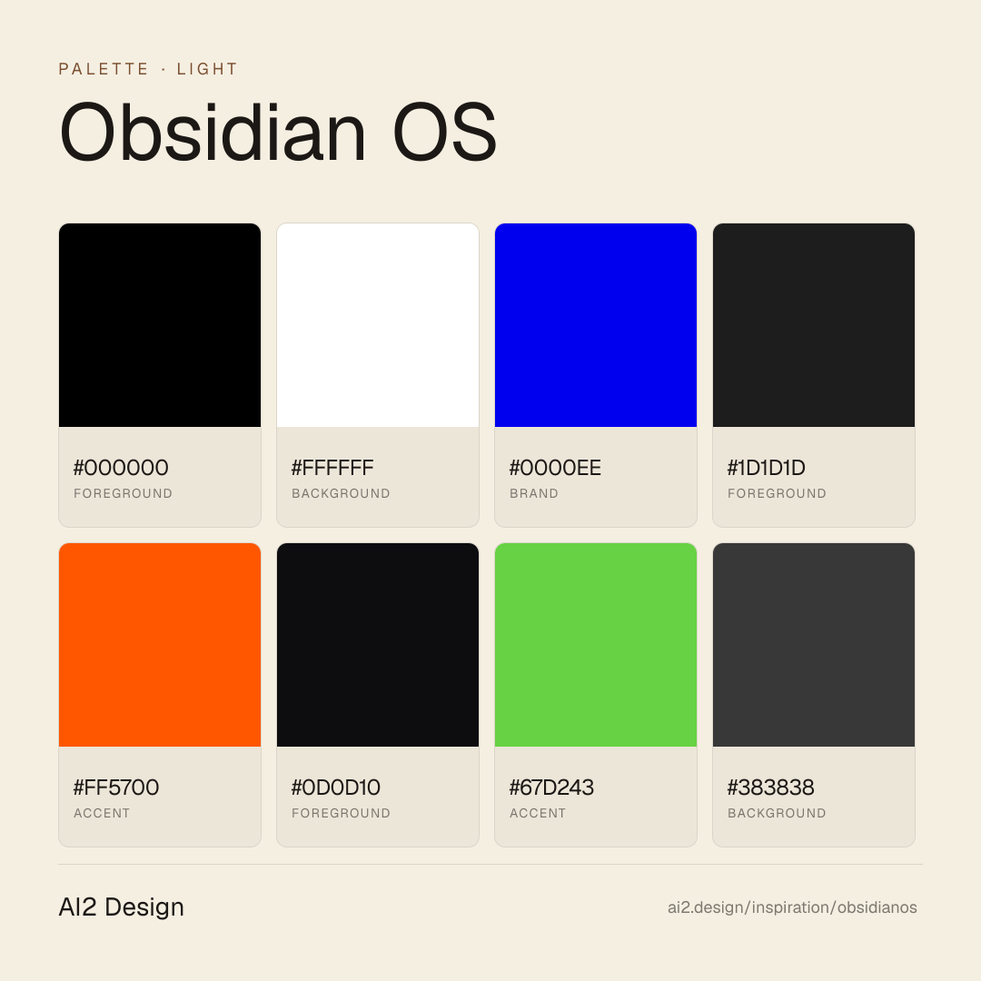
Color philosophy
Dark-first canvas — primary surface #000000 paired with foreground #ffffff doing the bulk of reading-layer work. Accent moments use #0000ee + #1d1d1d sparingly. Near-black backdrop with restrained warm or cool accents.
- #000000 — primary surface / dominant background
- #ffffff — primary foreground / reading layer
- #0000ee — first accent — used for CTAs and highlights
- #1d1d1d — secondary accent / hover states
- #ff5700 — tertiary surface / panels
Gradients (paste-ready)
// No gradient extracted — use solid surfaces
Typography rules
- Primary family: sans-serif. Mono fallback: JetBrains Mono for code and tabular numerics.
- Weight ladder: 300 / 400 / 500. Keep substitutions tight — the captured ladder is the typographic signature.
- Display tracking uses negative px (not em) for optical correction at large sizes — typically -0.5 to -1.5px at 48-64px hero scale.
- Heading line-height tightens at display sizes (1.0-1.2); body sits at 1.4-1.6. Captions and small UI labels at 1.3.
- Tabular numerals mandatory on aligned columns: font-variant-numeric: tabular-nums.
- Italic reserved for editorial quotes and emphasis where weight cannot carry — never for product UI labels.
- Paragraph max 45-55ch at body size; dense data tables may extend to 65ch with line-height 1.5.
Spacing rules
- Scale (observed): 2 / 6 / 8 / 10 / 12 / 16 / 20 / 24 px. Stay on the scale — no magic numbers.
- Container max-width: 1512px. Secondary bounded rails for narrow content clusters at ~480-640px.
- Section vertical rhythm: 64-128px on desktop, 40-80px on mobile, scaled by page depth.
- Card padding: 16-24px on desktop, 12-16px on mobile.
- Gutter values draw from the smaller half of the scale (4 / 8 / 12 / 16 / 24).
Design tokens
Palette, type, and space — all agent-readable.
9 colors · hex / rgb / hsl / oklch
- foreground75%
- HEX
#000000 - RGB
rgb(0, 0, 0) - HSL
hsl(0, 0%, 0%) - OKLCH
oklch(0.00% 0.0000 0.00)
- HEX
- background18%
- HEX
#FFFFFF - RGB
rgb(255, 255, 255) - HSL
hsl(0, 0%, 100%) - OKLCH
oklch(100.00% 0.0000 89.76)
- HEX
- brand4%
- HEX
#0000EE - RGB
rgb(0, 0, 238) - HSL
hsl(240, 100%, 47%) - OKLCH
oklch(42.90% 0.2973 264.05)
- HEX
- foreground2%
- HEX
#1D1D1D - RGB
rgb(29, 29, 29) - HSL
hsl(0, 0%, 11%) - OKLCH
oklch(23.08% 0.0000 89.76)
- HEX
- accent0%
- HEX
#FF5700 - RGB
rgb(255, 87, 0) - HSL
hsl(20, 100%, 50%) - OKLCH
oklch(67.81% 0.2159 39.29)
- HEX
- foreground0%
- HEX
#0D0D10 - RGB
rgb(13, 13, 16) - HSL
hsl(240, 10%, 6%) - OKLCH
oklch(16.05% 0.0063 285.67)
- HEX
- accent0%
- HEX
#67D243 - RGB
rgb(103, 210, 67) - HSL
hsl(105, 61%, 54%) - OKLCH
oklch(77.17% 0.2048 138.93)
- HEX
- background0%
- HEX
#383838 - RGB
rgb(56, 56, 56) - HSL
hsl(0, 0%, 22%) - OKLCH
oklch(34.07% 0.0000 89.76)
- HEX
- neutral0%
- HEX
#808080 - RGB
rgb(128, 128, 128) - HSL
hsl(0, 0%, 50%) - OKLCH
oklch(59.99% 0.0000 89.76)
- HEX
Inspector
Tab through the captured artifacts.
Six observable layers — page structure, fonts, breakpoints, z-index, gradients, motion — kept paste-ready alongside the tokens above.
Page structure
Semantic hierarchy at a glance.
Depth-first walk of meaningful sections — header, navigation, main regions, articles, footer. 2 nodes captured; depth capped at 6 for readability.
- body
- └─ div
Accessibility
WCAG contrast matrix.
60 combinations · 30 pass AA · 16 pass AAA · APCA Lc shown alongside WCAG 2.1 ratio for draft WCAG 3 awareness.
| Preview | fg | bg | Ratio | Normal | Large | APCA Lc | Context |
|---|---|---|---|---|---|---|---|
Aa | #000000 | #FFFFFF | 21.00 | AAA | AAA | +106 | foreground on background |
Aa | #FFFFFF | #000000 | 21.00 | AAA | AAA | -108 | background on foreground |
Aa | #FFFFFF | #0D0D10 | 19.41 | AAA | AAA | -108 | background on foreground |
Aa | #0D0D10 | #FFFFFF | 19.41 | AAA | AAA | +106 | foreground on background |
Aa | #FFFFFF | #1D1D1D | 16.86 | AAA | AAA | -106 | background on foreground |
Aa | #1D1D1D | #FFFFFF | 16.86 | AAA | AAA | +104 | foreground on background |
Aa | #FFFFFF | #383838 | 11.73 | AAA | AAA | -101 | background on background |
Aa | #383838 | #FFFFFF | 11.73 | AAA | AAA | +97 | background on background |
Aa | #000000 | #67D243 | 10.88 | AAA | AAA | +67 | foreground on accent |
Aa | #67D243 | #000000 | 10.88 | AAA | AAA | -66 | accent on foreground |
Image strategy
Asset loading & format policy.
Observable image posture — total count, lazy-loading ratio, and format mix. Hero image is measured above the fold.
Hero image
https://framerusercontent.com/images/7Ad0iDQ1ukBberjdFFY4ydtrRys.png?scale-down-to=2048&width=2754&height=1728- Format
- PNG
- Dimensions
- 1377×863
- Loading
- auto
- srcset
- yes
- srcset descriptor
- https://framerusercontent.com/images/7Ad0iDQ1ukBberjdFFY4ydtrRys.png?scale-down-to=512&width=2754&height=1728 512w,https://framerusercontent.com/images/7Ad0iDQ1ukBberjdFFY4ydtrRys.png?scale-down-to=1024&width=2754&height=1728 1024w,https://framerusercontent.com/images/7Ad0iDQ1ukBberjdFFY4ydtrRys.png?scale-down-to=2048&width=2754&height=1728 2048w,https://framerusercontent.com/images/7Ad0iDQ1ukBberjdFFY4ydtrRys.png?width=2754&height=1728 2754w
- Full Page
- developer-tools
- productivity
- light
- 2026-05-11
Frequently asked
Questions people ask about Obsidian OS
Answers are pulled from the curator verdict and design brief — the same text your AI agent sees when it paste-reads this page.
What makes Obsidian OS's marketing page so restrained?
Obsidian OS is the most disciplined speculative-OS landing we've audited — glass surfaces, near-monochrome palette, generous serif display moments, and slow deliberate motion that mirrors macOS spring physics. The page itself proves the OS thesis: refined, confident, quietly opinionated about what software should feel like. The team has clearly spent more time in Sketch than in marketing meetings.
What fonts and palette does Obsidian OS use?
Serif display moments for product naming pair with a humanist sans for body — the brand reads as design-aware without being precious. The palette is near-monochrome dark with one warm-neutral accent that lets every section feel curated. Glass-surface translucent panels echo the product's interface language directly into the marketing canvas.
Can I adopt Obsidian OS's OS-aspirational aesthetic?
Yes, if your audience values restraint and your product earns it. Adopt the near-monochrome dark palette, glass-surface translucent panels, serif display paired with sans body, and slow deliberate motion (500-800ms eased reveals). Restraint is the brand promise — when in doubt, remove an element. Our growing gallery captures the AI2 Design brief as paste-ready scaffolding.
Editorial credit
Featured Sponsor slot — your brand here
Dedicated logo placement — no rotation, on every export.
COMPARE THIS WITH
Side-by-side reads sharing this design signal.
See also