Resend · Full Page
Resend
The transactional-email API that decided developer-tool marketing deserves the editorial register usually reserved for fashion and finance. Resend pairs a Domaine serif display tier with Inter body and Commit Mono code over a pure-black canvas, then layers atmospheric IMG glow tiles behind a strict typographic grid — a triple-font discipline that reads pragmatic enough to be documentation, refined enough to be a manifesto. A five-voice neon accent palette (signature green #44ffa4 plus pastel yellow, coral, bright blue, amber) acts as printer's marks across an otherwise restrained surface.

Editorial disclaimer
Editorial noteThis entry documents observable design-language patterns for educational transfer and AI-agent briefing. Screenshots and trademarks are property of their respective owners. AI2 Design is not affiliated with or endorsed by the featured brand. Inspiration here is about language and rhythm — do not reproduce brand identity, logo, product copy, or proprietary features.
Curator verdict
Why we catalogued it?
Resend is what happens when a developer-tool brand decides it deserves the editorial register usually reserved for fashion and finance. We catalogued it because it solves a problem most dev-tools never even attempt: how do you sell infrastructure to engineers without sacrificing the typographic and atmospheric authority that makes a brand feel inevitable? The answer here is a triple-font discipline (Domaine serif display, Inter body, Commit Mono code) layered over pure black with neon-green accents — pragmatic enough to read like documentation, refined enough to read like a manifesto.
Design decisions observed
- A serif display where every peer uses sans — Domaine sets the hero in italic editorial register while Inter handles UI and Commit Mono handles code. This is a developer-tool that wants to be quoted, not just used.
- Pure black canvas with neon as a single instrument — the entire surface lives at #000000, and the accent palette behaves like a synthesizer with five voices (#44ffa4, #ffff92, #ff9592, #3b9eff, #ffca16) used sparingly enough that any one of them becomes the punctuation of the section it inhabits.
- Atmospheric backgrounds layered behind type, not over it — every section has decorative IMG tiles at 80-100% opacity providing radial glow and cosmic texture, but they live behind a strict typographic grid so the page never tips into noise.
- Tight Tailwind-native spacing scale (2 / 4 / 6 / 8 / 10 / 12 / 14 / 16 / 20 / 24 / 28 / 30 px) — the math is mainstream, the application is not. Card paddings stay in single-digit increments, vertical rhythm tightens toward the code blocks where attention is highest.
- Code as the vernacular — Commit Mono is loaded ahead of body text, the live integration block is the visual centerpiece, and the typography of the page treats code samples with the same compositional weight as a magazine pull-quote.
What to study
- How Resend gets away with a serif display in a category that defaults to sans — Domaine creates an authority gap between Resend and every Postmark/SendGrid clone. Steal the mindset: pick the typeface your competitors are too cautious to use.
- How a single neon accent becomes a brand fingerprint — #44ffa4 appears in fewer than 40 measured surface occurrences but it is the color anyone remembers from the page. Less is genuinely more when the canvas is pure black.
- How code blocks earn hero treatment — the integration sample is not tucked into a tab or a docs aside; it is sized, lit, and composed like a featured product shot. If your tool ships an SDK, this is the layout discipline to copy.
- How decorative IMG glow tiles ride underneath strict type — the atmospheric layer never crosses into the reading layer. Learn the z-index discipline that lets you have both atmospheric and editorial without one drowning the other.
What to avoid
- Don't reach for Domaine in a B2B SaaS dashboard or transactional UI — the serif works because Resend reserves it for marketing display. In product surfaces, the same choice reads as costume.
- Don't pile on more than two accent colors per section — Resend's palette has five voices precisely because each one stays solo. Mix them and the page collapses into a 2010-era startup deck.
- Don't replicate the IMG-glow background as CSS gradients alone — the atmospheric depth comes from layered raster + mix-blend, not pure CSS. Trying to fake it in pure linear-gradient will produce a flat banded result.
Taste notes
The page reads like a developer publication that happens to sell an API — the editorial-tier serif puts you in a 'this is being briefed to you' posture before you've finished the hero, the Commit Mono code blocks land like footnoted citations, and the neon-green accent works as a printer's mark rather than a CTA. Atmospheric IMG tiles glow underneath the type like cosmic dust on a midnight publication cover, and the entire surface stays disciplined enough that you feel the brand take its own technical content seriously. You are being addressed by a team that wanted email infrastructure to be worth reading about.
Lineage & references
- The post-Stripe/Linear/Vercel cohort of developer-infrastructure marketing — sites that treat documentation typography and brand typography as the same craft, where the homepage and the docs share a single editorial voice rather than splitting into 'marketing' and 'product' dialects.
- Adjacent to the dark-first neon-accent generation (Spline, Linear, Warp, Replit) — pure black canvas with single-digit-percent accent surface area, where one signature color becomes the brand fingerprint. Resend's #44ffa4 sits in this lineage alongside Linear's cyan and Spline's rainbow CSS vars.
- Closest thematic peer is Vercel — both ship developer infrastructure, both run a tight Inter + mono pairing, both treat code blocks as marketing centerpieces. Resend extends this lineage by adding a serif display tier, pulling it half a step toward editorial publications (think Stripe Sessions or Anthropic) without leaving developer-tool register.
Design language brief
Paste-ready for your agent.
A typed design system transfer brief — philosophy, tokens, rules, techniques, and fitness checks. Your agent reads the whole language, not just the pixels.
Philosophy
Dark-first editorial-developer aesthetic on a pure-black canvas (#000000). Triple-font discipline: Domaine serif (display, hero, italic editorial register) + Inter (body, UI, 12-18px scale at weights 400/500) + Commit Mono (code blocks, 12/14/16px). A five-voice neon accent palette (#44ffa4 signature green, #ffff92 pastel yellow, #ff9592 coral, #3b9eff bright blue, #ffca16 amber) used homeopathically — under 5% of total surface. Atmospheric decorative IMG glow tiles layered behind a strict type grid; z-index discipline keeps them under the reading layer. Tailwind-native 2-30px spacing scale, 1280px max container, two-tier motion: snappy interactive feedback at 0.15-0.2s on cubic-bezier(0.4, 0, 0.2, 1) and a slower reveal/ambient tier (0.5 / 1 / 1.5 / 30 s) on cubic-bezier(0.36, 0.66, 0.6, 1), ease-in-out, ease-out, linear.
Main prompt
Use this capture as a design language transfer brief for my project. Adopt the palette (pure black canvas + off-white #f0f0f0 reading text + homeopathic neon accents from the 5-color synthesizer), typographic discipline (Domaine serif for editorial display only, Inter for body/UI in 400/500 weights, Commit Mono for code), Tailwind 2-30px spacing scale, 1280px max-width container, 4-12px radius scale, two-tier motion (snappy 0.15-0.2s interactive on cubic-bezier(0.4, 0, 0.2, 1) plus a slower reveal/ambient tier at 0.5 / 1 / 1.5 / 30 s on cubic-bezier(0.36, 0.66, 0.6, 1) and CSS-keyword easings), and atmospheric-IMG-behind-type composition pattern across every page and component I ship. Treat this as my project's constitution — any new component I author should feel like it ships from the same studio. Apply the language, not the source brand's specific copy or identity. When I ask you to build a page or component, enforce these rules by default, and call out any decision that deviates.
Overview
- Layout
- Grid
- Content width
- Bounded
- Framing
- Flat
- Grid strength
- Medium
Color philosophy
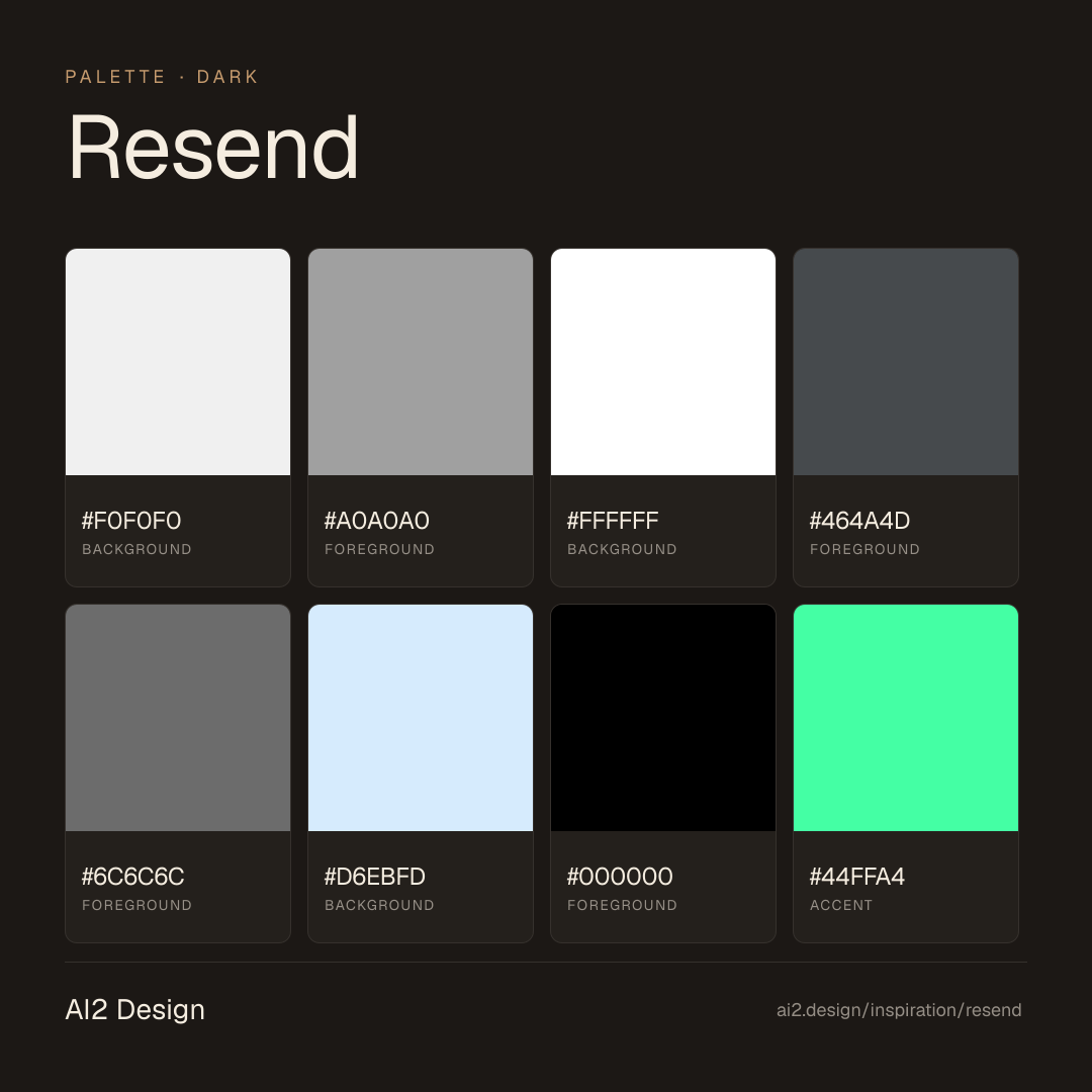
Pure-black canvas (#000000, 55+ measured background occurrences) paired with off-white #f0f0f0 doing the dominant reading layer (2323 occurrences) and pure #ffffff reserved for hero emphasis. Cool slate descender #464a4d / #6c6c6c / #a0a0a0 carries de-emphasis. Accent palette is a five-voice synthesizer: #44ffa4 (signature green, ~36 occurrences), #ffff92 (pastel yellow), #ff9592 (coral), #3b9eff (bright blue), #ffca16 (amber) — together under 5% of total surface area. The atmospheric IMG glow tiles introduce additional warm-cool tones via raster, never via CSS color tokens.
- Off-white #f0f0f0 (weight 400) — primary reading text, ~2323 measured surface occurrences
- Pure #ffffff — hero display headlines and emphasis only, ~176 occurrences
- Cool slate #a0a0a0 / #6c6c6c / #464a4d — secondary text, captions, metadata, de-emphasized labels
- Signature accent #44ffa4 — single-section emphasis (CTA hover, active state, pull-quote highlight); never as a fill background
- Secondary accent voices #ffff92 / #ff9592 / #3b9eff / #ffca16 — used solo per section, never combined; treat as printer's marks
- Pure black #000000 background does ~95% of surface; never gradient the body, let atmospheric IMG layer carry depth
Gradients (paste-ready)
linear-gradient(rgba(0, 0, 0, 0) 0%, rgb(0, 0, 0) 50%, rgb(0, 0, 0) 100%) — section bottom mask blending atmospheric IMG into pure black
Atmospheric IMG glow tiles (1525×1566 absolute decorative layers at op:0.8 + op:1.0) — raster-based, not CSS gradient
Typography rules
- Triple-family discipline: Domaine (serif display) + Inter (sans body/UI) + Commit Mono (code). Self-hosted via Next.js font preloading: domaine_regular/medium/bold + abc_favorit_book/medium + commit_mono_regular/italic + inter_variable.
- Domaine serif: hero display only — italic 'Email for developers'-tier headlines. Never use serif in UI controls, dashboard, or transactional surfaces.
- Inter: body and UI at weight 400 (reading) and 500 (labels, buttons, dense UI). Sizes: 12 / 14 / 16 / 18 px. Line-height 16/20/24/27 — tight body, generous read.
- Commit Mono: code blocks (16/24px), inline code (12-14px / 16-20px line-height). Treat code like editorial pull-quotes — same compositional weight as a section heading.
- No italic in Inter or Commit Mono — italic is reserved exclusively for Domaine display.
- Paragraph max 55-65 ch at 16px Inter; code blocks may run wider but stay inside 1280 max container.
Spacing rules
- Tailwind-native scale: 2 / 4 / 6 / 8 / 10 / 12 / 14 / 16 / 20 / 24 / 28 / 30 px — single-digit micro increments are the rhythm signature.
- Container max-width 1280px (Tailwind 2xl); secondary narrow rails at 344 / 364 / 400 px for mobile content clusters and code-block wrappers.
- Section vertical rhythm: 80-120px on desktop, 48-64px on mobile — atmospheric IMG layer extends past section boundaries to soften transitions.
- Card and code-block padding: 12-24px on desktop, 8-16px on mobile. Always pick from scale; never magic numbers.
- Gutter values for flex/grid: 4 / 8 / 12 / 16 px — tighter than typical Tailwind defaults to support code-block-first compositions.
Design tokens
Palette, type, and space — all agent-readable.
20 colors · hex / rgb / hsl / oklch
- background59%
- HEX
#F0F0F0 - RGB
rgb(240, 240, 240) - HSL
hsl(0, 0%, 94%) - OKLCH
oklch(95.51% 0.0000 89.76)
- HEX
- foreground23%
- HEX
#A0A0A0 - RGB
rgb(160, 160, 160) - HSL
hsl(0, 0%, 63%) - OKLCH
oklch(70.58% 0.0000 89.76)
- HEX
- background4%
- HEX
#FFFFFF - RGB
rgb(255, 255, 255) - HSL
hsl(0, 0%, 100%) - OKLCH
oklch(100.00% 0.0000 89.76)
- HEX
- foreground4%
- HEX
#464A4D - RGB
rgb(70, 74, 77) - HSL
hsl(206, 5%, 29%) - OKLCH
oklch(40.65% 0.0073 239.99)
- HEX
- foreground4%
- HEX
#6C6C6C - RGB
rgb(108, 108, 108) - HSL
hsl(0, 0%, 42%) - OKLCH
oklch(53.13% 0.0000 89.76)
- HEX
- background2%
- HEX
#D6EBFD - RGB
rgb(214, 235, 253) - HSL
hsl(208, 91%, 92%) - OKLCH
oklch(93.01% 0.0332 243.96)
- HEX
- foregroundblack-a121%
- HEX
#000000 - RGB
rgb(0, 0, 0) - HSL
hsl(0, 0%, 0%) - OKLCH
oklch(0.00% 0.0000 0.00)
- HEX
- accent1%
- HEX
#44FFA4 - RGB
rgb(68, 255, 164) - HSL
hsl(151, 100%, 63%) - OKLCH
oklch(88.77% 0.1940 156.70)
- HEX
- accent1%
- HEX
#FFFF92 - RGB
rgb(255, 255, 146) - HSL
hsl(60, 100%, 79%) - OKLCH
oklch(97.73% 0.1317 108.61)
- HEX
Inspector
Tab through the captured artifacts.
Six observable layers — page structure, fonts, breakpoints, z-index, gradients, motion — kept paste-ready alongside the tokens above.
Page structure
Semantic hierarchy at a glance.
Depth-first walk of meaningful sections — header, navigation, main regions, articles, footer. 10 nodes captured; depth capped at 6 for readability.
- body
- ├─ div
- │ └─ div
- │ ├─ Header
- │ ├─ div
- │ │ └─ Section
- │ ├─ Section (×8)
- │ └─ [+3 more]
- ├─ Section
- └─ iframe
Accessibility
WCAG contrast matrix.
290 combinations · 106 pass AA · 72 pass AAA · APCA Lc shown alongside WCAG 2.1 ratio for draft WCAG 3 awareness.
| Preview | fg | bg | Ratio | Normal | Large | APCA Lc | Context |
|---|---|---|---|---|---|---|---|
Aa | #FFFFFF | #000000 | 21.00 | AAA | AAA | -108 | background on foreground |
Aa | #000000 | #FFFFFF | 21.00 | AAA | AAA | +106 | foreground on background |
Aa | #000000 | #FFFF92 | 19.97 | AAA | AAA | +103 | foreground on accent |
Aa | #FFFF92 | #000000 | 19.97 | AAA | AAA | -104 | accent on foreground |
Aa | #FFFFFF | #0B0E14 | 19.32 | AAA | AAA | -108 | background on background |
Aa | #0B0E14 | #FFFFFF | 19.32 | AAA | AAA | +106 | background on background |
Aa | #F0F0F0 | #000000 | 18.43 | AAA | AAA | -98 | background on foreground |
Aa | #000000 | #F0F0F0 | 18.43 | AAA | AAA | +97 | foreground on background |
Aa | #FFFF92 | #0B0E14 | 18.37 | AAA | AAA | -104 | accent on background |
Aa | #0B0E14 | #FFFF92 | 18.37 | AAA | AAA | +102 | background on accent |
Image strategy
Asset loading & format policy.
Observable image posture — total count, lazy-loading ratio, and format mix. Hero image is measured above the fold.
Hero image
https://resend.com/_next/image?url=%2Fstatic%2Flanding-page%2Fbg-hero-1.jpg&w=1920&q=100&dpl=dpl_7eBsybVtkNXiZm2AjideHkrrQxD6- Format
- UNKNOWN
- Dimensions
- 1920×1080
- Loading
- auto
- srcset
- yes
- srcset descriptor
- /_next/image?url=%2Fstatic%2Flanding-page%2Fbg-hero-1.jpg&w=1920&q=100&dpl=dpl_7eBsybVtkNXiZm2AjideHkrrQxD6 1x, /_next/image?url=%2Fstatic%2Flanding-page%2Fbg-hero-1.jpg&w=3840&q=100&dpl=dpl_7eBsybVtkNXiZm2AjideHkrrQxD6 2x
- Full Page
- developer-tools
- saas
- dark
- 2026-04-28
Frequently asked
Questions people ask about Resend
Answers are pulled from the curator verdict and design brief — the same text your AI agent sees when it paste-reads this page.
What makes Resend's marketing page read like a design publication instead of an email API?
Resend pairs a Domaine serif display tier with Inter body and Commit Mono code over a pure-black canvas, then layers atmospheric IMG glow tiles behind a strict typographic grid. The triple-font discipline reads pragmatic enough to be documentation, refined enough to be a manifesto — a register most developer-tool landings still leave on the table.
What fonts and palette does Resend use?
A trio: Domaine (serif display), Inter (body and UI), Commit Mono (code). The canvas is pure black with a five-voice neon accent palette — signature green #44ffa4 plus pastel yellow, coral, bright blue, and amber — used as printer's marks across an otherwise restrained surface. Atmospheric IMG glow tiles replace gradients.
Can I apply Resend's editorial-developer aesthetic to my product?
The transfer is structural: pick a serif display + sans body + mono trio (one voice each), commit to pure-black canvas, and reserve neon accents as punctuation rather than CTA fills. Atmospheric image tiles do the work gradients usually do. The AI2 Design brief in our growing gallery captures the typographic grid and accent rules as paste-ready tokens.
Editorial credit
Featured Sponsor slot — your brand here
Dedicated logo placement — no rotation, on every export.
COMPARE THIS WITH
Side-by-side reads sharing this design signal.
See also