ToDesktop · Full Page
ToDesktop
Web-to-native desktop app platform marketing site that inherits the Geist design system editorial vocabulary and re-tunes it for the web-to-desktop register. ToDesktop pairs Inter and Geist Mono on a hairline-bordered light canvas, uses signature Geist easing for micro-interactions, and reserves a dual orange-and-blue accent for CTAs only — closer to a Vercel docs preview than a runtime product page.

Editorial disclaimer
Editorial noteThis entry documents observable design-language patterns for educational transfer and AI-agent briefing. Screenshots and trademarks are property of their respective owners. AI2 Design is not affiliated with or endorsed by the featured brand. Inspiration here is about language and rhythm — do not reproduce brand identity, logo, product copy, or proprietary features.
Curator verdict
Why we catalogued it?
ToDesktop is the rarest kind of developer-platform marketing page — one that sells a heavy infrastructure product (Electron native app delivery) without ever sounding heavy. We catalogued it because it inherits the Geist design system's editorial vocabulary and re-tunes it for the web-to-desktop register: hairline borders doing structural work, multi-layer stacked shadows pretending to be single elevations, and a dual-accent palette where orange and blue do the entire emotional load with under 2% of the surface. If you are shipping for engineering teams who already trust Vercel-class typography and motion, this is the reference to keep open in the next tab while you work.
Design decisions observed
- Confidence through inheritance — ToDesktop builds atop the Geist design system grammar (semantic body-color tokens, signature easing curve, hairline border discipline) and uses that recognition to anchor a younger product's authority. The aesthetic is borrowed from the people their customers already trust.
- Dual-accent that earns its keep — orange and blue appear only where the page wants you to act or pivot. Less than 2% of the surface, and they're the part you remember.
- Multi-layer shadow stacks pretending to be single shadows — surface elevations are built from three to four overlaid box-shadows (white inset highlight + tinted drop + outer halo), the same technique Vercel uses on its dashboard. It reads as one shadow but feels lit.
- Typographic restraint with a monospace counterpart — Inter alone for prose, Geist Mono for numerics and code-leaning labels. The monospace family is not decorative; it's a signal to the developer audience that this product was built by people who think the same way they do.
- Hairline borders as the structural language — 1px is the dominant spacing unit (188 measured occurrences), more than any other value. The page is held together by lines, not blocks.
What to study
- How ToDesktop carries Geist's signature easing without copying its identity — `cubic-bezier(0.6, 0.6, 0, 1)` is the recognizable curve, but the durations and properties under it belong to ToDesktop's own rhythm. Steal the mindset: borrowing a primitive is fine; cloning a system is not.
- How a semantic CSS variable system replaces hardcoded colors — `--body-light-loud / --body-light-muted / --body-light-ghost` plus `--body-stroke-lighter / --body-stroke-muted` map to a three-tier text + two-tier border vocabulary. Learn how naming tokens by role (loud/muted/ghost) outlives any specific palette.
- How dual-font discipline differs from dual-display — Inter does prose, Geist Mono does numbers and inline tokens. Most landings reach for a serif partner; ToDesktop reaches for the developer's terminal.
- How stacked inset+drop shadows fake elevation cheaply — three to four layered `box-shadow` rules per surface. No filter, no blur tricks, just disciplined layering that feels lit on a flat substrate.
What to avoid
- Don't copy ToDesktop's accent pair for a non-developer audience — orange and blue together signal Vercel-adjacent infra. On a consumer landing, that combination reads as fintech or productivity, and the tone breaks. Match the accents to your audience's prior associations.
- Don't lift the Geist easing curve into a slow-marketing hero animation — `cubic-bezier(0.6, 0.6, 0, 1)` is tuned for dev-tool micro-interactions (75-450ms). Stretching it across 2s scroll choreography flattens the snap that makes it feel right.
- Don't replace the hairline border vocabulary with shadow elevation — ToDesktop's structural authority is the 1px line. Trading lines for cards softens the discipline and dissolves the dev-tool register.
Taste notes
The page reads like a release-notes preview that happens to be marketing — generously spaced, confident in its hairlines, and content to let a single semantic token do the work of three. Atmospheric light leaks drift across the hero at single-digit opacities; orange and blue accents arrive only where the next click matters. You leave the page feeling addressed by engineers, not at engineers, which is the rare register dev-tool marketing keeps trying to find.
Lineage & references
- Direct inheritance from the Geist DS / Vercel design language — semantic body-color tokens (`--body-light-loud`/`muted`/`ghost`), the signature `cubic-bezier(0.6, 0.6, 0, 1)` easing curve, hairline borders as primary elevation. ToDesktop wears the Vercel grammar like a tailored second skin rather than a borrowed coat.
- Shoulder-to-shoulder with the dev-platform editorial cohort (Vercel, Resend, Linear, Plain) — same Inter-plus-mono duet, same dual-accent ground, same conviction that monospace is a developer-trust signal rather than a typographic ornament.
- Part of the 2024+ web-to-native infrastructure generation (Tauri, Electron Forge, Pake, Wails) — but ToDesktop is the only one in that group that has fully internalized Geist's editorial register, which is why its marketing reads more like a product page than a runtime spec.
Design language brief
Paste-ready for your agent.
A typed design system transfer brief — philosophy, tokens, rules, techniques, and fitness checks. Your agent reads the whole language, not just the pixels.
Philosophy
Light-first developer-tool editorial precision at 1px spatial resolution. The canvas is near-white (#ffffff ground + #e5e7eb hairline border + #000000 / #141414 ink); Inter handles prose and Geist Mono handles numerics + inline code labels. A semantic CSS-variable color system (`--body-light-loud #141414 / --body-light-muted #656565 / --body-light-ghost #A4A4A4` with `--body-stroke-lighter #1616160F / --body-stroke-muted #1616161F`) replaces hardcoded values across the surface. Dual-accent palette — `#f79942` warm orange and `#1f6af2` blue — appears at <2% surface area as CTA highlights and pivot signals, never as background fills. Elevation is delivered through 3-4 stacked box-shadows (white inset highlight + tinted drop + outer halo) on hairline-bordered surfaces. Motion is anchored by the Geist signature easing `cubic-bezier(0.6, 0.6, 0, 1)` across 50-450ms durations.
Main prompt
Use this capture as a design language transfer brief for my project. Adopt the palette (light-first #ffffff ground + #e5e7eb hairline border + #000000 / #141414 ink + dual-accent orange #f79942 + blue #1f6af2 reserved for CTA + pivot signals only), typographic rhythm (Inter for prose + Geist Mono for numerics and inline code labels, weight ladder 400/500, size scale 11/12/14/16 px with tight line-heights), 1/4/8/12/16/24 px-base spacing scale with narrow container rails (324-960 px), border-first elevation via 1px hairline + 3-4 stacked box-shadows (white inset highlight + tinted drop + outer halo), 12 atmospheric gradients drifting at 6-12% opacity rather than hero illustration, Geist signature easing `cubic-bezier(0.6, 0.6, 0, 1)` with 50/200/300/400/450/600/1000 ms durations, and a semantic CSS-variable color foundation across every page and component I ship. Treat this as my project's constitution — any new component I author should pass as if crafted in the same studio. Apply the language, not the source brand's specific copy or identity.
Overview
- Layout
- Stack
- Content width
- Bounded
- Framing
- Flat
- Grid strength
- Medium
Color philosophy
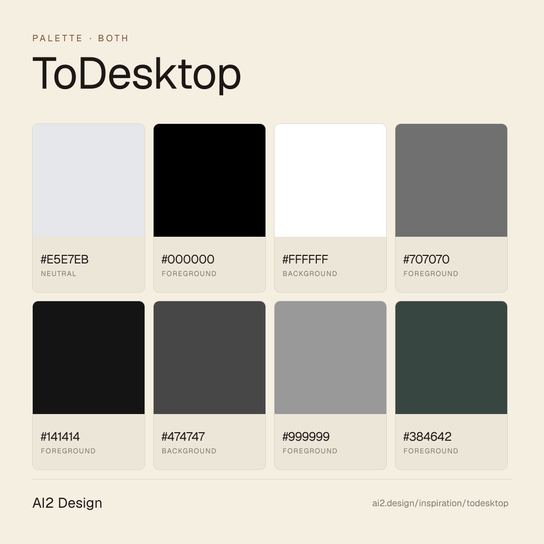
Light-first developer-tool canvas — #ffffff primary background paired with #e5e7eb hairline border (1647 measured occurrences, the structural unit) and #000000 ink (1521 occurrences) doing the dominant work. Mid-tone descender #707070 / #999999 / #c2c2c2 handles captions, dividers, de-emphasized labels. Dual-accent palette is `#f79942` (warm orange) and `#1f6af2` (blue), each appearing only as CTA highlights and pivot signals — surface area < 2% combined. Semantic CSS variables encode the system: `--body-light-loud #141414` (primary text), `--body-light-muted #656565` (secondary), `--body-light-ghost #A4A4A4` (tertiary), `--body-stroke-lighter #1616160F` (hairline), `--body-stroke-muted #1616161F` (border). Dark mode is staged but not the primary register: `--body-dark-loud #FFFFFFCC / --body-dark-muted #FFFFFF99`.
- Hairline border #e5e7eb handling ~1647 measured occurrences — the structural unit that carries elevation and grouping
- Ink #000000 + #141414 (loud) + #707070 (muted) + #999999 (ghost) — three-tier text descender
- Background pair #ffffff (page) + atmospheric gradient panels (rgba 5,6,27 / 0.72) for hero overlays
- Orange #f79942 reserved for primary CTA + recommendation badges — never as fill background
- Blue #1f6af2 reserved for secondary action + link emphasis — never as background block
Gradients (paste-ready)
linear-gradient(rgba(255, 255, 255, 0.06), rgba(255, 255, 255, 0)) — frosted highlight
linear-gradient(0deg, rgba(5, 6, 27, 0.72), rgba(5, 6, 27, 0.72)) — deep blueish overlay (hero)
linear-gradient(rgb(255, 255, 255), rgba(255, 255, 255, 0.8)) — soft fade
linear-gradient(rgb(242, 242, 242), rgb(237, 237, 237)) — subtle off-white panel shift
linear-gradient(0deg, rgba(255, 255, 255, 0), rgba(255, 255, 255, 0.12)) — top edge fade
Typography rules
- Primary family: Inter (prose, headings, UI labels). Counterpart family: Geist Mono (numerics, inline code labels, kbd, version strings). No serif partner.
- Weight ladder: 400 (reading body + most UI) / 500 (emphasis + small labels). Do not introduce 600 — the 500 stops the ladder.
- Size scale: 11 / 12 / 14 / 16 px on body and UI. Display headings extend up the same scale; no magic numbers between steps.
- Line-height pattern: Geist Mono tight (lh 16 on 11-12 px size, lh 32 on 12 px display variant); Inter standard (lh 20 on 14 px, lh 24-26 on 16 px).
- Geist Mono signals developer affinity — use it on numerics, version pills, terminal-adjacent UI. Don't use it for prose paragraphs; that flips the register.
- Numerics in Geist Mono inherit tabular alignment automatically — no `tabular-nums` override needed.
Spacing rules
- Mixed-base rhythm — 1px hairline (188 measured occurrences) + 4px (283) + 8px (281) + 12px (212) + 16px (190) dominate. The 1px is the structural unit, not noise.
- Standard scale beyond hairline: 4 / 6 / 8 / 10 / 12 / 14 / 16 / 18 / 20 / 22 / 24 px. Pick from scale; never invent values between steps.
- Container max-width set: 324 / 516 / 600 / 628 / 936 / 960 px — narrower than typical SaaS landings. Editorial column rhythm.
- Section vertical rhythm: pick from 16-24 px scale × multipliers, never freehand. The narrow container demands the rhythm.
- Card padding: 16-24 px on desktop, 12-16 px on mobile. Hairline border at 1px before reaching for shadow.
Design tokens
Palette, type, and space — all agent-readable.
20 colors · hex / rgb / hsl / oklch
- neutral47%
- HEX
#E5E7EB - RGB
rgb(229, 231, 235) - HSL
hsl(220, 13%, 91%) - OKLCH
oklch(92.76% 0.0058 264.53)
- HEX
- foreground43%
- HEX
#000000 - RGB
rgb(0, 0, 0) - HSL
hsl(0, 0%, 0%) - OKLCH
oklch(0.00% 0.0000 0.00)
- HEX
- backgroundbody-dark-loud5%
- HEX
#FFFFFF - RGB
rgb(255, 255, 255) - HSL
hsl(0, 0%, 100%) - OKLCH
oklch(100.00% 0.0000 89.76)
- HEX
- foreground2%
- HEX
#707070 - RGB
rgb(112, 112, 112) - HSL
hsl(0, 0%, 44%) - OKLCH
oklch(54.52% 0.0000 89.76)
- HEX
- foregroundbody-light-loud1%
- HEX
#141414 - RGB
rgb(20, 20, 20) - HSL
hsl(0, 0%, 8%) - OKLCH
oklch(19.13% 0.0000 89.76)
- HEX
- background0%
- HEX
#474747 - RGB
rgb(71, 71, 71) - HSL
hsl(0, 0%, 28%) - OKLCH
oklch(39.79% 0.0000 89.76)
- HEX
- foreground0%
- HEX
#999999 - RGB
rgb(153, 153, 153) - HSL
hsl(0, 0%, 60%) - OKLCH
oklch(68.30% 0.0000 89.76)
- HEX
- foreground0%
- HEX
#384642 - RGB
rgb(56, 70, 66) - HSL
hsl(163, 11%, 25%) - OKLCH
oklch(38.05% 0.0193 176.01)
- HEX
- accent0%
- HEX
#F79942 - RGB
rgb(247, 153, 66) - HSL
hsl(29, 92%, 61%) - OKLCH
oklch(76.50% 0.1499 59.86)
- HEX
Inspector
Tab through the captured artifacts.
Six observable layers — page structure, fonts, breakpoints, z-index, gradients, motion — kept paste-ready alongside the tokens above.
Page structure
Semantic hierarchy at a glance.
Depth-first walk of meaningful sections — header, navigation, main regions, articles, footer. 6 nodes captured; depth capped at 6 for readability.
- body
- ├─ div (×3)
- ├─ Section (×2)
- ├─ div
- ├─ Section (×4)
- └─ [+12 more]
Accessibility
WCAG contrast matrix.
302 combinations · 144 pass AA · 110 pass AAA · APCA Lc shown alongside WCAG 2.1 ratio for draft WCAG 3 awareness.
| Preview | fg | bg | Ratio | Normal | Large | APCA Lc | Context |
|---|---|---|---|---|---|---|---|
Aa | #000000 | #FFFFFF | 21.00 | AAA | AAA | +106 | foreground on background |
Aa | #FFFFFF | #000000 | 21.00 | AAA | AAA | -108 | background on foreground |
Aa | #FFFFFF | #05061B | 20.03 | AAA | AAA | -108 | background on accent |
Aa | #05061B | #FFFFFF | 20.03 | AAA | AAA | +106 | accent on background |
Aa | #000000 | #E6FFF7 | 20.01 | AAA | AAA | +103 | foreground on background |
Aa | #E6FFF7 | #000000 | 20.01 | AAA | AAA | -104 | background on foreground |
Aa | #000000 | #FFF4F4 | 19.50 | AAA | AAA | +101 | foreground on background |
Aa | #FFF4F4 | #000000 | 19.50 | AAA | AAA | -102 | background on foreground |
Aa | #05061B | #E6FFF7 | 19.09 | AAA | AAA | +102 | accent on background |
Aa | #E6FFF7 | #05061B | 19.09 | AAA | AAA | -104 | background on accent |
Image strategy
Asset loading & format policy.
Observable image posture — total count, lazy-loading ratio, and format mix. Hero image is measured above the fold.
Hero image
https://www.todesktop.com/electron/images/page-background-lights.png- Format
- PNG
- Dimensions
- 1530×1761
- Loading
- auto
- srcset
- no
- Full Page
- developer-tools
- saas
- both
- 2026-04-30
Frequently asked
Questions people ask about ToDesktop
Answers are pulled from the curator verdict and design brief — the same text your AI agent sees when it paste-reads this page.
What makes ToDesktop's marketing page feel like a Vercel docs preview rather than a runtime product?
ToDesktop inherits the Geist design system editorial vocabulary and re-tunes it for the web-to-desktop register. Inter and Geist Mono pair on a hairline-bordered light canvas, signature Geist easing carries micro-interactions, and a dual orange-and-blue accent stays reserved for CTAs only — closer to a docs preview than a marketing landing.
What fonts and palette does ToDesktop use?
A duet: Inter for body and UI, Geist Mono for code and coordinates. The canvas is light-first with hairline borders for elevation rather than drop shadows, and a dual accent — orange and blue — appears only inside CTA surfaces. CSS-var semantic tokens expose the system the same way Vercel does on its own marketing surface.
Can I apply ToDesktop's Vercel-adjacent aesthetic to a Next.js project?
Easily — Inter and Geist Mono are both open. Adopt hairline borders for surface elevation, reserve a two-color accent for CTA only, and tune your easings to Geist's signature curves. The AI2 Design brief in our growing gallery captures the stacked-shadow stack, the easing values, and the CSS-var token naming as paste-ready scaffolding.
Editorial credit
Featured Sponsor slot — your brand here
Dedicated logo placement — no rotation, on every export.
COMPARE THIS WITH
Side-by-side reads sharing this design signal.
See also