Linear · Full Page
Linear
The rarest kind of product marketing page — one that earns trust through restraint rather than spectacle. Linear's landing is the lodestar of the post-Jira developer-tool renaissance; this is the reference to keep open in the next tab while you build.

Editorial disclaimer
Editorial noteThis entry documents observable design-language patterns for educational transfer and AI-agent briefing. Screenshots and trademarks are property of their respective owners. AI2 Design is not affiliated with or endorsed by the featured brand. Inspiration here is about language and rhythm — do not reproduce brand identity, logo, product copy, or proprietary features.
Curator verdict
Why we catalogued it?
Linear is the rarest kind of product marketing page — one that earns your trust through restraint rather than spectacle. We catalogued it because it distills the 2026 technical-minimalism playbook better than any landing we've audited: authority carried by typography alone, density that respects your attention, and a motion vocabulary so disciplined it becomes invisible. If you are shipping for teams who decode design with their engineering brain first, this is the reference to keep open in the next tab while you work.
Design decisions observed
- Confidence through restraint — Linear holds the entire page together with typography alone, no illustration, no rescue mascots, no gradient hero. That's how they sell enterprise.
- A dark canvas that actually earns it — most dark-mode landings feel costumed; Linear's reads like the product itself. The brand and the interface speak the same quiet language.
- Motion so disciplined you forget it exists — a tight ladder of cubic-bezier curves anchors every hover and reveal. The page feels fast because it never interrupts you.
- Density that respects your attention — tight vertical rhythm, short paragraphs, no fluff. Linear trusts that its audience reads fast and doesn't pad the page for length.
- Accent colors used like a laboratory indicator — cyan and pink appear only where emphasis earns its own spotlight. Less than 2% of the surface, and it's the part you remember.
What to study
- How Linear gets away with dark-first in 2026 — most brands still treat it as an afterthought. Steal the mindset: design for the mode your power users actually live in.
- The typographic weight discipline — Linear's type hierarchy is carried by a tiny, stepped weight ladder. You'll never look at default font-weight choices the same way again.
- Motion as an invisible signature — a primary cubic-bezier(0.25, 0.46, 0.45, 0.94) anchors most transitions, with a small set of supporting curves for slower scroll choreography. Learn how a constrained easing palette can become a brand fingerprint more identifiable than a logo.
- Image discipline for product marketing — almost everything lazy-loads; only the hero image pays for its priority. It's the fastest feel-good metric you can steal for your own landing.
What to avoid
- Don't copy-paste Linear's gradient CSS straight into a broad-audience product page — their syntax assumes a modern browser baseline. Adapt it, don't photocopy it.
- Don't mimic Linear's information density on a consumer landing — this level of text-forward design is a signal aimed at engineers and operators. Use the rhythm, match it to your audience.
- Don't add a second display font thinking it'll soften the page — Linear's entire authority comes from a single-family commitment. Mix type here and you dilute the effect you came for.
Taste notes
The page feels like a well-engineered instrument — margins echo Inter's optical sidebearings, borders do almost all of the structural speaking, and the accent palette behaves like a laboratory indicator rather than decoration. You're being briefed, not persuaded. The fact that gradients exist yet barely register (3-4% opacity spotlights) is the thesis: presence without presence.
Lineage & references
- The lodestar of the post-Jira developer-tool renaissance — Linear didn't just rebuild issue tracking, it re-taught the category how to market itself to builders who hate being marketed to.
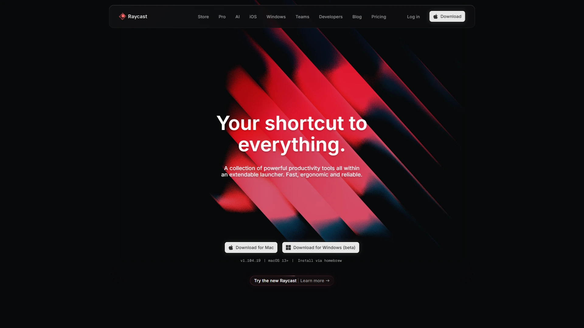
- Sits shoulder-to-shoulder with the product-as-marketing peers (Figma, Notion, Raycast) — landing pages that feel functionally indistinguishable from the product itself, because the brand and the interface are the same piece of work.
- Part of the 2024+ dark-first native-feel generation (Arc, Warp, Raycast, Replit) — tools that treat design decisions with the same engineering rigor they apply to the software they ship.
Design language brief
Paste-ready for your agent.
A typed design system transfer brief — philosophy, tokens, rules, techniques, and fitness checks. Your agent reads the whole language, not just the pixels.
Philosophy
Dark-first typographic precision at 2px spatial resolution. The canvas is near-black; Inter Variable carries voice, weight, and rhythm across a custom 400 / 510 / 590 stepped ladder; large headings pull in with negative px tracking (-1.056 to -1.408px) to feel bound. Elevation is delivered through inset 1px borders, not drop shadows. Accent colors are used homeopathically — cyan and pink as ~3-4% radial glimmers, never as fills. Discipline over decoration, density over display.
Main prompt
Use this capture as a design language transfer brief for my project. Adopt the palette (dark-first near-black background + near-white foreground + homeopathic cyan/pink accents), typographic rhythm (Inter Variable with custom 400/510/590 weight ladder, negative px tracking on display), 2px-base spacing scale, border-first elevation (inset 1px shadows), cubic-bezier(0.25, 0.46, 0.45, 0.94) motion curve, and image-lazy-by-default strategy across every page and component I ship. Treat this as my project's constitution — any new component I author should pass as if crafted in the same studio. Apply the language, not the source brand's specific copy or identity. When I ask you to build a page or component, enforce these rules by default, and call out any decision that deviates.
Overview
- Layout
- Grid
- Content width
- Bounded
- Framing
- Flat
- Grid strength
- Strong
Color philosophy
Dark-first canvas — #0f1011 primary background paired with #23252a panel and #f7f8f8 near-white foreground doing 92% of the surface work. Secondary text descends through cool grays: #62666d → #8a8f98 → #d0d6e0 for progressive de-emphasis. Accent palette is cyan (#55cdff) + pink (#f79ce0) + a thin green (#00ff05), appearing almost exclusively as radial glimmers and 90deg linear highlights at single-digit opacity — not as fills.
- Near-white #f7f8f8 text (weight 400) handling ~2491 measured surface occurrences — dominant reading layer
- Background pair #0f1011 (body) + #23252a (panel), maintaining 4.5+ contrast with #f7f8f8 foreground
- Cool gray descender #62666d / #8a8f98 / #d0d6e0 for captions, metadata, de-emphasized labels
- Cyan #55cdff and pink #f79ce0 used only inside gradients and as focus/highlight accents — surface area < 2%
- Semantic green #00ff05 reserved for critical positive state (a measured 20 occurrences, never decorative)
Gradients (paste-ready)
radial-gradient(50% 50%, rgba(255, 255, 255, 0.04) 0px, rgba(255, 255, 255, 0) 90%)
linear-gradient(90deg, transparent 0px, color(srgb 0.129 0.702 1))
radial-gradient(52.53% 57.5% at 50% 100%, rgba(8, 9, 10, 0) 0px, rgba(8, 9, 10, 1))
Typography rules
- Primary family: Inter Variable (self-hosted, preloaded from /fonts/InterVariable.woff2). Monospace fallback: Berkeley Mono for code, tabular numerics.
- Weight ladder: 400 (reading) / 510 (UI labels + dense controls) / 590 (bold emphasis). Do not substitute 500 or 600 — the 510/590 stepping is the signature.
- Display tracking in px, not em: -0.165px on 15-18px body, -1.056px on 48px headings, -1.408px on 64px hero — constant optical correction at every size.
- Heading line-height is unitless 1.0 at 48-64px (display sits tight); 1.4-1.5 on body 13-16px; 1.3 on small UI labels 12px.
- Tabular numerals mandatory on aligned columns: `font-variant-numeric: tabular-nums`. Berkeley Mono handles code/kbd automatically.
- No italic for emphasis — Inter Variable carries through weight shift. Italic reserved for quoted editorial content.
- Paragraph max 45-55 ch at body 15-16px; dense tables may run to 65 ch at 13px with line-height 1.5.
Spacing rules
- 2px base unit (not 4px). Scale: 2 / 4 / 6 / 8 / 10 / 12 / 14 / 16 / 19 / 22 / 24 / 26 — micro-density is the signature.
- Container max-width 1436px (wider than the Tailwind 1280 default). Secondary bounded rails at 368 / 440 / 480 px for narrow content clusters.
- Section vertical rhythm: 64-96px on desktop, 40-64px on mobile — driven by page depth, not section count.
- Card padding: 16-24px on desktop, 12-16px on mobile. Always pick from scale values; no magic numbers.
- Gutter values for flex/grid: 4 / 8 / 12 / 16 / 24 px — the 19 and 22 variants only appear for optical correction inside dense forms.
Design tokens
Palette, type, and space — all agent-readable.
20 colors · hex / rgb / hsl / oklch
- background60%
- HEX
#F7F8F8 - RGB
rgb(247, 248, 248) - HSL
hsl(180, 7%, 97%) - OKLCH
oklch(97.84% 0.0011 197.14)
- HEX
- foreground16%
- HEX
#62666D - RGB
rgb(98, 102, 109) - HSL
hsl(218, 5%, 41%) - OKLCH
oklch(50.92% 0.0121 261.77)
- HEX
- foreground14%
- HEX
#D0D6E0 - RGB
rgb(208, 214, 224) - HSL
hsl(217, 21%, 85%) - OKLCH
oklch(87.44% 0.0152 260.73)
- HEX
- foreground4%
- HEX
#8A8F98 - RGB
rgb(138, 143, 152) - HSL
hsl(219, 6%, 57%) - OKLCH
oklch(64.88% 0.0146 262.36)
- HEX
- accent2%
- HEX
#F79CE0 - RGB
rgb(247, 156, 224) - HSL
hsl(315, 85%, 79%) - OKLCH
oklch(80.53% 0.1370 336.65)
- HEX
- accent1%
- HEX
#55CDFF - RGB
rgb(85, 205, 255) - HSL
hsl(198, 100%, 67%) - OKLCH
oklch(80.05% 0.1273 229.08)
- HEX
- accent0%
- HEX
#FFC47C - RGB
rgb(255, 196, 124) - HSL
hsl(33, 100%, 74%) - OKLCH
oklch(85.84% 0.1120 70.94)
- HEX
- accent0%
- HEX
#00FF05 - RGB
rgb(0, 255, 5) - HSL
hsl(121, 100%, 50%) - OKLCH
oklch(86.65% 0.2943 142.55)
- HEX
- accent0%
- HEX
#8FA4FF - RGB
rgb(143, 164, 255) - HSL
hsl(229, 100%, 78%) - OKLCH
oklch(74.00% 0.1339 272.88)
- HEX
Inspector
Tab through the captured artifacts.
Six observable layers — page structure, fonts, breakpoints, z-index, gradients, motion — kept paste-ready alongside the tokens above.
Page structure
Semantic hierarchy at a glance.
Depth-first walk of meaningful sections — header, navigation, main regions, articles, footer. 11 nodes captured; depth capped at 6 for readability.
- body
- └─ div (×2)
- ├─ Section
- └─ div
- ├─ div
- │ └─ Header
- │ └─ Nav
- ├─ Main
- │ └─ div
- │ └─ Section (×7)
- └─ Footer
Accessibility
WCAG contrast matrix.
276 combinations · 94 pass AA · 58 pass AAA · APCA Lc shown alongside WCAG 2.1 ratio for draft WCAG 3 awareness.
| Preview | fg | bg | Ratio | Normal | Large | APCA Lc | Context |
|---|---|---|---|---|---|---|---|
Aa | #F7F8F8 | #000000 | 19.74 | AAA | AAA | -103 | background on foreground |
Aa | #000000 | #F7F8F8 | 19.74 | AAA | AAA | +102 | foreground on background |
Aa | #F7F8F8 | #0F1011 | 17.90 | AAA | AAA | -103 | background on foreground |
Aa | #0F1011 | #F7F8F8 | 17.90 | AAA | AAA | +101 | foreground on background |
Aa | #00FF05 | #000000 | 15.31 | AAA | AAA | -86 | accent on foreground |
Aa | #000000 | #00FF05 | 15.31 | AAA | AAA | +87 | foreground on accent |
Aa | #F7F8F8 | #23252A | 14.41 | AAA | AAA | -100 | background on foreground |
Aa | #23252A | #F7F8F8 | 14.41 | AAA | AAA | +98 | foreground on background |
Aa | #D0D6E0 | #000000 | 14.38 | AAA | AAA | -81 | foreground on foreground |
Aa | #000000 | #D0D6E0 | 14.38 | AAA | AAA | +82 | foreground on foreground |
Image strategy
Asset loading & format policy.
Observable image posture — total count, lazy-loading ratio, and format mix. Hero image is measured above the fold.
Hero image
https://linear.app/cdn-cgi/imagedelivery/fO02fVwohEs9s9UHFwon6A/c7fa8f5f-d439-4329-6a65-de549b51e300/f=auto,dpr=2,q=95,fit=scale-down,metadata=none- Format
- UNKNOWN
- Dimensions
- 6304×3520
- Loading
- lazy
- srcset
- no
- Full Page
- saas
- productivity
- dark
- 2026-04-01
Frequently asked
Questions people ask about Linear
Answers are pulled from the curator verdict and design brief — the same text your AI agent sees when it paste-reads this page.
What makes Linear's marketing page work?
Linear earns trust through restraint — dark-first technical minimalism carried by Inter Variable, an inset 1px border shadow system, and a motion vocabulary so disciplined it reads as invisible. Typography alone does the heavy lifting; there's no rescue illustration, no gradient hero, no decorative chrome.
What fonts and palette does Linear's design language use?
A single type family — Inter Variable — handles the entire hierarchy from headline to caption. The palette is charcoal canvas, near-white text, and a single restrained accent. Surface elevation comes from a 1px inset border rather than drop shadows, which keeps the whole page feeling engineered.
Can I apply Linear's design language to my product?
Yes — the patterns are transferable without being a clone. Study the restraint (one font, one accent, inset-only elevation), adopt the density that respects reader attention, and use the AI2 Design brief as paste-ready scaffolding for Claude, Cursor, or any agent you work with. Adapt the mindset, not the logo.
Editorial credit
Featured Sponsor slot — your brand here
Dedicated logo placement — no rotation, on every export.
COMPARE THIS WITH
Side-by-side reads sharing this design signal.
See also