Stripe · Full Page
Stripe
The craft standard that taught an entire category to care about design. Stripe compresses more disciplined ambition into a single scroll than any other fintech landing — a custom type family, a signature gradient trio, and a shadow ritual that makes every card feel lifted off the page.

Editorial disclaimer
Editorial noteThis entry documents observable design-language patterns for educational transfer and AI-agent briefing. Screenshots and trademarks are property of their respective owners. AI2 Design is not affiliated with or endorsed by the featured brand. Inspiration here is about language and rhythm — do not reproduce brand identity, logo, product copy, or proprietary features.
Curator verdict
Why we catalogued it?
Stripe is the craft standard that taught an entire category to care about design. We catalogued it because no other product marketing page compresses as much disciplined ambition into a single scroll: a custom type family, a signature gradient palette that became the industry's idea of 'fintech', and an obsessive shadow-stacking ritual that makes every card feel lifted off the page. If you are shipping payments, billing, or anything trust-dependent, this is the reference you study before you ship anything at all.
Design decisions observed
- A category-defining color signature — Stripe's purple-pink-amber gradient trio became the visual shorthand for 'modern fintech'. Every competitor borrowed; nobody matched the discipline.
- Light-first, confidently — most financial products hide behind navy and slate. Stripe sits on white with a single saturated indigo accent, and looks more trustworthy for it.
- A custom brand typeface as infrastructure — Sohne carries the entire voice. Licensing a type family at this cost only makes sense if the whole system leans on it, and Stripe's does.
- Narrow reading columns instead of sprawl — the page never forgets it's being read by operators, not browsed by window-shoppers. Content rails are tight and intentional.
- Shadow as the brand's quietest tell — not a halo, not a bloom; a meticulously stacked depth that lifts every card a millimeter off the page. Most teams fake it; Stripe engineered it.
What to study
- How a custom typeface gets paid back — Stripe uses one weight heavily, not eight. The investment is in coherence, not showing off range. Steal the mindset before you licence the font.
- Gradient as brand signature instead of decoration — count how few surfaces actually carry one, and notice that the ones that do are the ones that matter most.
- The shadow stacking ritual — most shadows are a single layer; Stripe's best card uses two calibrated offsets to produce a depth you feel before you see. Worth reverse-engineering once.
- Aggressive lazy-loading discipline — almost nothing loads eager. The hero is the exception, and it pays for itself. A checklist your next launch can adopt verbatim.
What to avoid
- Don't copy Stripe's gradient palette into an unrelated category — the purple-pink-amber trio reads 'Stripe-adjacent' instantly, and adjacency is weakness when you're trying to own a brand.
- Don't ship a custom typeface before your system is ready to carry one — Stripe earned it over a decade of consistency. An early-stage product licensing Sohne just looks aspirational.
- Don't borrow the micro-radius discipline without matching it across the whole system — 1–8px precision radii only read 'crafted' when everything else is equally tight. Mixed with default Tailwind rounding, it looks confused.
Taste notes
The page feels like an annual report designed by people who love their product. Margins are quiet, typography carries almost all the weight, gradients appear exactly where you need them to and nowhere else. You leave with the impression of having been briefed by someone who respects your time — which is the whole Stripe thesis compressed into a landing page.
Lineage & references
- The design-rigor benchmark of the modern fintech category — Stripe taught Adyen, Checkout.com, Plaid and a dozen others that payment infrastructure deserves the same craft as consumer software.
- Shares DNA with the craft-first B2B SaaS lineage (Retool, Vercel, Ramp) — products that treat marketing pages as extensions of the engineering culture, not as brochure-ware.
- An anchor for the 'custom typeface as brand capital' movement popularised by Apple and Airbnb — Stripe is the enterprise-adjacent member of that club, the proof that the investment scales down from consumer into B2B.
Design language brief
Paste-ready for your agent.
A typed design system transfer brief — philosophy, tokens, rules, techniques, and fitness checks. Your agent reads the whole language, not just the pixels.
Philosophy
Light-first editorial precision with a signature gradient palette. The page lives on white with near-black text (#000000 dominant, ~1881 observed uses); a single saturated indigo #533afd carries every interactive accent; and a purple-pink-amber radial trio handles atmospheric lift without ever becoming decorative. Sohne variable is the entire typographic voice, weights 300 / 400 only, large headings pull in with negative px tracking (-0.22 to -0.96px). Elevation is delivered through stacked subtle drop shadows; the page's emotional signature is in the calibrated mid-opacity lifts, not in bolder moves.
Main prompt
Use this capture as a design language transfer brief for my project. Adopt the light-first palette (white background + near-black text + single indigo accent), the purple-pink-amber gradient trio used sparingly for atmospheric lift, Sohne-style variable family with a 300 / 400 weight ladder, negative px tracking on display type (-0.22 to -0.96px), a 2px-base spacing scale with narrow reading containers (max 764px), micro-rounded radii (1-8px), and the stacked mid-opacity drop shadow signature across every page and component I ship. Treat this as my project's constitution — any new component I author should pass as if crafted in the same studio. Apply the language, not Stripe's specific copy or identity. When I ask you to build a page or component, enforce these rules by default, and call out any decision that deviates.
Overview
- Layout
- Grid
- Content width
- Bounded
- Framing
- Flat
- Grid strength
- Strong
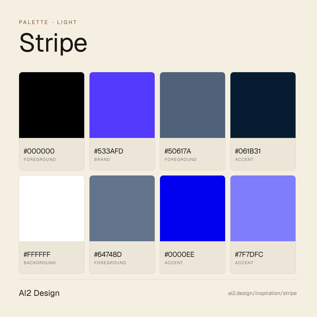
Color philosophy
Light-first canvas — pure white (#ffffff) with near-black (#000000) text handling dominant surface. Indigo #533afd handles every brand-accent moment; a cool slate gray ladder (#50617a → #64748d → #3c4f69 → #273951) carries secondary text. A radial gradient trio (purple → pink → amber) appears sparingly for hero and section atmosphere — never structural, never as fill. Signature warm accent #ff6118 (orange) reserved for small bursts of emphasis. No dark-mode commitment — the brand lives in light.
- Near-black #000000 as dominant text — the most frequent color on the page (~1881 measured uses)
- Indigo #533afd as single brand accent — primary CTA, link hover, active states (~799 observed uses)
- Cool slate gray family #50617a / #64748d / #3c4f69 / #273951 for progressive secondary text de-emphasis
- Deep navy #061b31 as heading surface or footer-dense background (hsl lightness ~11%)
- Warm orange #ff6118 used homeopathically — CTA accent moments, never decorative
- Gradient palette restricted to radial atmospheric lifts; linear gradients only for a few 90deg hero strokes
Gradients (paste-ready)
radial-gradient(circle, rgb(127, 125, 252), rgb(244, 75, 204) 33%, rgb(229, 237, 245) 66%)
linear-gradient(90deg, rgba(0, 0, 0, 0) 0px, rgb(67, 4, 234) 50%, rgba(0, 0, 0, 0) 100%)
radial-gradient(50% 50%, rgba(83, 58, 253, 0.8) 62.5%, rgba(83, 58, 253, 0) 100%)
Typography rules
- Primary family: Sohne variable (self-hosted, preloaded). Mono fallback: Source Code Pro Medium (also preloaded). No third display family — the voice is carried by weight shift inside Sohne.
- Weight ladder: 300 (display + reading) / 400 (dense UI labels). Weights 500+ are not observed — large type stays light, emphasis comes from size and tracking.
- Display tracking in px, not em: -0.22px on 22px headings, -0.26px on 26px, -0.64px on 32px, -0.96px on 48px — the larger the type, the more aggressive the optical tightening.
- Line-height ratios are precise: heading-1 48px/55.2px (1.15), heading-2 32px/35.2px (1.1), text-14 18px/25.2px (1.4), body 14px/14px (1.0 for dense UI rows).
- Tabular numerals mandatory on aligned financial figures: `font-variant-numeric: tabular-nums`. Source Code Pro handles inline code and API reference automatically.
- No italic for emphasis — Sohne 300 → 400 weight shift carries it. Italic is reserved for editorial quotes only.
- Paragraph width 45-55 ch at body 14-16px; editorial runs extend to 60 ch at 18px `text-14`.
Spacing rules
- 2px base unit. Scale: 2 / 4 / 6 / 8 / 10 / 12 / 14 / 16 / 18 / 20 / 22 / 24 — micro-density with no gaps above 24 in the observable range.
- Container max-widths are narrow and stepped: 392 / 400 / 504 / 608 / 752 / 764 px. The page never exceeds 764 px for content — it's a reading column, not a lateral canvas.
- Section vertical rhythm is driven by content density, not a single rule; pad sections generously when type is display-scale, tighten aggressively around dense UI.
- Card padding: 16-24px on desktop, 12-16px on mobile. Always pick from the 2px scale; no magic numbers.
- Gutter values for flex/grid layouts stay within the 2px ladder — no 7, 9, 11, 13 irregulars.
Design tokens
Palette, type, and space — all agent-readable.
20 colors · hex / rgb / hsl / oklch
- foreground47%
- HEX
#000000 - RGB
rgb(0, 0, 0) - HSL
hsl(0, 0%, 0%) - OKLCH
oklch(0.00% 0.0000 0.00)
- HEX
- brand20%
- HEX
#533AFD - RGB
rgb(83, 58, 253) - HSL
hsl(248, 98%, 61%) - OKLCH
oklch(52.11% 0.2679 277.43)
- HEX
- foreground8%
- HEX
#50617A - RGB
rgb(80, 97, 122) - HSL
hsl(216, 21%, 40%) - OKLCH
oklch(48.84% 0.0455 257.92)
- HEX
- accent7%
- HEX
#061B31 - RGB
rgb(6, 27, 49) - HSL
hsl(211, 78%, 11%) - OKLCH
oklch(21.86% 0.0511 251.69)
- HEX
- background5%
- HEX
#FFFFFF - RGB
rgb(255, 255, 255) - HSL
hsl(0, 0%, 100%) - OKLCH
oklch(100.00% 0.0000 89.76)
- HEX
- foreground3%
- HEX
#64748D - RGB
rgb(100, 116, 141) - HSL
hsl(217, 17%, 47%) - OKLCH
oklch(55.52% 0.0435 259.24)
- HEX
- accent2%
- HEX
#0000EE - RGB
rgb(0, 0, 238) - HSL
hsl(240, 100%, 47%) - OKLCH
oklch(42.90% 0.2973 264.05)
- HEX
- accent2%
- HEX
#7F7DFC - RGB
rgb(127, 125, 252) - HSL
hsl(241, 95%, 74%) - OKLCH
oklch(65.33% 0.1839 280.73)
- HEX
- foreground2%
- HEX
#273951 - RGB
rgb(39, 57, 81) - HSL
hsl(214, 35%, 24%) - OKLCH
oklch(34.05% 0.0485 255.87)
- HEX
Inspector
Tab through the captured artifacts.
Six observable layers — page structure, fonts, breakpoints, z-index, gradients, motion — kept paste-ready alongside the tokens above.
Page structure
Semantic hierarchy at a glance.
Depth-first walk of meaningful sections — header, navigation, main regions, articles, footer. 10 nodes captured; depth capped at 6 for readability.
- body
- ├─ div
- │ └─ div
- │ ├─ Header
- │ │ └─ div
- │ │ └─ Nav
- │ ├─ Main
- │ │ └─ Section (×8)
- │ └─ Footer
- └─ iframe (×2)
Accessibility
WCAG contrast matrix.
306 combinations · 104 pass AA · 52 pass AAA · APCA Lc shown alongside WCAG 2.1 ratio for draft WCAG 3 awareness.
| Preview | fg | bg | Ratio | Normal | Large | APCA Lc | Context |
|---|---|---|---|---|---|---|---|
Aa | #000000 | #FFFFFF | 21.00 | AAA | AAA | +106 | foreground on background |
Aa | #FFFFFF | #000000 | 21.00 | AAA | AAA | -108 | background on foreground |
Aa | #FFFFFF | #101010 | 19.03 | AAA | AAA | -107 | background on foreground |
Aa | #101010 | #FFFFFF | 19.03 | AAA | AAA | +105 | foreground on background |
Aa | #000000 | #E5EDF5 | 17.76 | AAA | AAA | +95 | foreground on background |
Aa | #E5EDF5 | #000000 | 17.76 | AAA | AAA | -95 | background on foreground |
Aa | #061B31 | #FFFFFF | 17.37 | AAA | AAA | +104 | accent on background |
Aa | #FFFFFF | #061B31 | 17.37 | AAA | AAA | -106 | background on accent |
Aa | #E5EDF5 | #101010 | 16.10 | AAA | AAA | -95 | background on foreground |
Aa | #101010 | #E5EDF5 | 16.10 | AAA | AAA | +94 | foreground on background |
Image strategy
Asset loading & format policy.
Observable image posture — total count, lazy-loading ratio, and format mix. Hero image is measured above the fold.
Hero image
https://images.stripeassets.com/fzn2n1nzq965/115d4Vd5LVAsqFGDR1ClAv/0ceb2c44a7a7182cd624262420af7544/wave-fallback-desktop.png?w=1392&fm=webp&q=60- Format
- PNG
- Dimensions
- 1392×975
- Loading
- auto
- srcset
- no
- Full Page
- fintech
- saas
- light
- 2026-04-22
Frequently asked
Questions people ask about Stripe
Answers are pulled from the curator verdict and design brief — the same text your AI agent sees when it paste-reads this page.
What makes Stripe's marketing page the craft standard?
Stripe compresses technical credibility and design-as-marketing into the same surface. A narrow 764-pixel container enforces reading discipline, Sohne Variable carries a custom optical scale, and atmospheric gradients sit under a light-first canvas — the whole page reads as the reference implementation of its own design system.
What fonts and palette does Stripe use?
Sohne Variable is the single workhorse family — custom-drawn for Stripe and tuned across weights with optical adjustments. The palette is ivory-light canvas, charcoal body, and narrow accent strokes. Gradients appear as atmosphere, never as decoration; every surface serves comprehension, not spectacle.
Can I transfer Stripe's design language to my product?
The craft is in the choices, not the logo. Narrow your container, pick one optical-tuned sans, keep gradients atmospheric, and let typography handle hierarchy. The AI2 Design brief distils Stripe's decisions into paste-ready tokens and componentRecipes for your agent — adopt the taste, not the trademarks.
Editorial credit
Featured Sponsor slot — your brand here
Dedicated logo placement — no rotation, on every export.
COMPARE THIS WITH
Side-by-side reads sharing this design signal.
See also