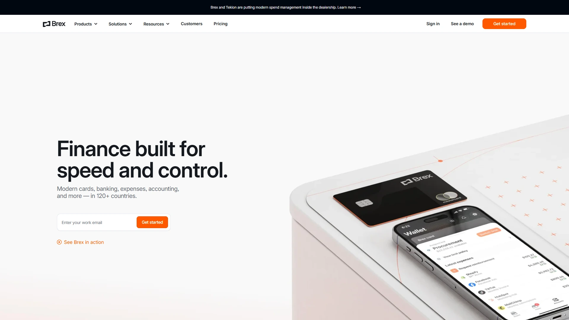
Slash · Full Page
Slash
Premium business-banking marketing site that earns prestige through dark monochrome restraint and a single bronze accent. Slash treats spend management UI as editorial — Inter alone across a 300/400/500/600 weight ladder, atmospheric multi-stop gradients drifting at single-digit opacities in place of hero illustration, and narrow 320-704 px container rails that read like editorial columns. The bronze accent family appears only inside ornamental flourishes and never as a CTA fill, signalling a private-banker register where most fintech competitors settle for chromatic dashboard sprawl.

Editorial disclaimer
Editorial noteThis entry documents observable design-language patterns for educational transfer and AI-agent briefing. Screenshots and trademarks are property of their respective owners. AI2 Design is not affiliated with or endorsed by the featured brand. Inspiration here is about language and rhythm — do not reproduce brand identity, logo, product copy, or proprietary features.
Curator verdict
Why we catalogued it?
Slash is the rarest kind of fintech marketing page — one that earns trust by sounding like a private vault rather than a sales floor. We catalogued it because it operates a discipline most banking competitors keep promising and almost none deliver: a dark monochrome canvas held together by Inter alone, atmospheric gradients drifting at single-digit opacities, and a single bronze accent treated less like a brand color and more like a hallmark stamp on a coin. If you are shipping financial software for operators who measure design by what it refuses to say, this is the reference to keep open in the next tab while you work.
Design decisions observed
- Monochrome confidence — Slash builds the entire surface from a near-black ground (#000000 / #1c1d22) and a grayscale text descender, refusing the chromatic dashboards that crowd this category. The restraint is the brand.
- A single bronze accent that earns its keep — warm tones (#cc9166 family) appear only inside subtle gradient passes and never as a CTA fill. It reads like an editorial flourish, not a button paint job.
- Atmospheric gradients that you barely notice — 11 distinct gradients hover at 2-20% opacity, doing the work of light leaks rather than backgrounds. The page feels lit, not decorated.
- Disciplined narrow containers — the layout breathes inside 320 / 412 / 512 / 544 / 576 / 704 px rails, treating each module as an editorial column rather than a marketing billboard.
- Typography-only authority — Inter alone, weight ladder 300 / 400 / 500 / 600, no display family, no italic. The page sounds confident because the type stays out of its own way.
What to study
- How Slash builds prestige without color — most fintech competitors lean on a chromatic accent system to telegraph trust. Steal the mindset: a single warm accent at <2% surface area can outclass a five-color identity.
- How a shadcn HSL token foundation gets re-tailored for luxury — the underlying CSS variable vocabulary (--background --foreground --card --primary --secondary) is unmistakably shadcn/ui, but the values are calibrated to a near-black register most dev-tool sites would never reach.
- How atmospheric gradients replace illustration — Slash never ships a hero illustration in the traditional sense; instead a stack of low-opacity light leaks does the visual heavy lifting. Learn how subtraction can carry mood.
- How Inter survives without a display partner — most landings reach for a serif or display sans to break Inter's flatness. Slash refuses, leaning on weight discipline and tight tracking instead.
What to avoid
- Don't lift the bronze accent into a CTA fill — that flips the whole composition from editorial to merchandised. Slash's discipline depends on bronze staying ornamental.
- Don't try Slash's narrow container set on a content-heavy SaaS landing — 320-704 px works because the copy is tight and the modules are spaced like editorial columns. Adapt the rhythm to your information density.
- Don't add a second font family thinking it will warm the page — Slash's authority is the single-family commitment. Adding a serif here softens the hallmark and dissolves the prestige.
Taste notes
The page reads like a private banker's office at night — warm leather under a single brass lamp, paperwork already squared on the desk before you arrived. Light beams drift across the canvas at angles you only register subliminally; the bronze ornaments behave like the patina on a heritage instrument rather than a branding flourish. You leave the page feeling briefed by someone who took the appointment seriously.
Lineage & references
- Sits inside the post-Mercury fintech editorial cohort (Mercury, Brex, Ramp circa 2023-25 dark-first banking surfaces) — Slash positions itself in the same prestige register but with tighter monochrome restraint and a single warm accent rather than a full chromatic accent system.
- Shoulder-to-shoulder with Linear's typography-only marketing discipline (and Vercel/Resend's late-2024 dark variants) — same single-family commitment, same refusal of decorative chrome, same conviction that copy is the primary chrome.
- Part of the late-2024 shadcn/ui foundation generation — inherits the HSL semantic token vocabulary (--background --foreground --card --primary --secondary --muted --ring) and a 0.5rem (8px) --radius default, but re-tailors them to a luxury-financial register rather than the dev-tool/monospace register most shadcn sites occupy.
Design language brief
Paste-ready for your agent.
A typed design system transfer brief — philosophy, tokens, rules, techniques, and fitness checks. Your agent reads the whole language, not just the pixels.
Philosophy
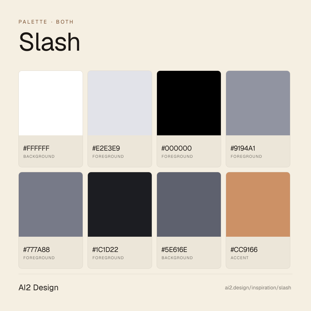
Dark-first monochrome editorial precision at 2px spatial resolution. The canvas is near-black (#000000 ground + #1c1d22 panel + #5e616e divider); Inter alone carries voice across a 300 / 400 / 500 / 600 weight ladder; text descends through a cool gray spectrum (#ffffff → #e2e3e9 → #9194a1 → #777a88) with no chromatic emphasis. A single bronze accent family (#cc9166 / #aa9b8f) appears only inside atmospheric gradients and ornamental flourishes — never as a CTA fill. Elevation is delivered through border-first surfaces at --radius 0.5rem (8px); shadows sit at rgba(0,0,0,0.3) 0 4px 30px 0 and lower. Discipline over decoration; a private-banker register over a SaaS pitch.
Main prompt
Use this capture as a design language transfer brief for my project. Adopt the palette (dark-first #000000 ground + #1c1d22 panel + grayscale text descender + single bronze #cc9166 accent reserved for ornamental layers), typographic rhythm (Inter alone, 300/400/500/600 weight ladder, 13/14/15/16/18/20/24px size scale, no italic, no display partner), 2/6/8 px-base spacing scale with narrow 320-704 px container rails, border-first elevation at 0.5rem (8px) radius, atmospheric multi-stop gradients drifting at 2-20% opacity rather than hero illustration, Tailwind cubic-bezier(0.4, 0, 0.2, 1) easing with 75/150/200/300ms durations powered by Framer Motion runtime, and a shadcn/ui HSL CSS-variable foundation across every page and component I ship. Treat this as my project's constitution — any new component I author should pass as if crafted in the same studio. Apply the language, not the source brand's specific copy or identity. When I ask you to build a page or component, enforce these rules by default, and call out any decision that deviates.
Overview
- Layout
- Stack
- Content width
- Narrow
- Framing
- Flat
- Grid strength
- Medium
Color philosophy
Pure-dark monochrome canvas — #000000 primary background paired with #1c1d22 panel and #ffffff (#e2e3e9 secondary) foreground doing 95%+ of the surface work. Mid-tone descender #9194a1 → #777a88 → #5e616e handles captions, dividers, de-emphasized labels. Accent palette is a single bronze family — #cc9166 (warm copper) and #aa9b8f (muted khaki) — appearing almost exclusively inside multi-stop gradients and ornamental flourishes, never as solid fills. The CSS variable vocabulary is shadcn/ui (--background HSL 240 10% 3.9%, --page-background HSL 240 20% 2%, --foreground HSL 0 0% 98%, --primary HSL 217 91% 60%, --secondary --muted --border --ring) but the visual register is luxury-financial rather than dev-tool.
- Near-white #ffffff text handling ~2079 measured surface occurrences — dominant reading layer
- Background pair #000000 (page) + #1c1d22 (panel), maintaining 16:1+ contrast with #ffffff
- Mid-tone descender #9194a1 / #777a88 / #5e616e for captions, metadata, dividers, de-emphasized labels
- Bronze accent #cc9166 + muted khaki #aa9b8f used only inside gradients and ornamental layers — surface area < 1%
- Border + divider stripe #1c1d22 doubles as panel surface and hairline separator on the same value
Gradients (paste-ready)
linear-gradient(201deg, rgb(18, 19, 23) 13.96%, rgb(11, 12, 14)) — dominant ambient page tilt
linear-gradient(103deg, rgb(174, 147, 87), rgb(255, 240, 204) 40%, rgb(174, 147, 87)) — bronze→cream→bronze ornamental sweep
linear-gradient(rgba(205, 137, 57, 0) 23.5%, rgb(205, 137, 57)) — copper fade-up edge highlight
linear-gradient(135deg, rgba(255, 255, 255, 0.08), rgba(255, 255, 255, 0.02)) — frosted glass card overlay
linear-gradient(to right, rgba(0, 0, 0, 0), rgba(255, 255, 255, 0.2), rgba(0, 0, 0, 0)) — light beam glance highlight
Typography rules
- Primary family: Inter (Next.js next/font/google self-hosted, 3 woff2 variants preloaded). No display partner, no serif, no italic — Inter does the entire job.
- Weight ladder: 300 (display + airy headings) / 400 (reading body) / 500 (UI labels + emphasis) / 600 (bold + small metadata caps). Do not substitute 700 — the 600 stops the ladder.
- Size scale: 13 / 14 / 15 / 16 / 18 / 20 / 24 px on body and UI; display headings extend up the same scale. No magic numbers between steps.
- Line-height pattern: tight on small caps (lh 13-14 = font-size, no leading), 1.375x on body 14-16px (lh 19.25-22), 1.375x on display 18-24px (lh 24.75-33). Constant ratio, not unitless.
- No italic for emphasis — weight shift carries it. Italic reserved for quoted editorial content if required.
- Numerics inherit Inter default — no `tabular-nums` override in the captured surface; tables stay slim, columns stay short.
Spacing rules
- Dual-base rhythm — both 2px and 6px appear with high frequency (267 and 269 measured occurrences respectively). 2px is the hairline border + divider unit; 6px is the dominant tight gap.
- Standard scale beyond hairline: 6 / 8 / 10 / 12 / 14 / 16 / 18 / 20 / 22 / 24 px. Never invent values between steps.
- Container max-width set: 320 / 412 / 512 / 544 / 576 / 704 px — narrower than typical SaaS landings. Treat each module as an editorial column.
- Section vertical rhythm: pick from the same 16-24 px scale × multipliers, never freehand. The narrow container demands the rhythm.
- Card padding: 16-24 px on desktop, 12-16 px on mobile. Hairline border at 1-2 px before reaching for shadow.
Design tokens
Palette, type, and space — all agent-readable.
9 colors · hex / rgb / hsl / oklch
- background66%
- HEX
#FFFFFF - RGB
rgb(255, 255, 255) - HSL
hsl(0, 0%, 100%) - OKLCH
oklch(100.00% 0.0000 89.76)
- HEX
- foreground15%
- HEX
#E2E3E9 - RGB
rgb(226, 227, 233) - HSL
hsl(231, 14%, 90%) - OKLCH
oklch(91.68% 0.0082 278.63)
- HEX
- foreground7%
- HEX
#000000 - RGB
rgb(0, 0, 0) - HSL
hsl(0, 0%, 0%) - OKLCH
oklch(0.00% 0.0000 0.00)
- HEX
- foreground5%
- HEX
#9194A1 - RGB
rgb(145, 148, 161) - HSL
hsl(229, 8%, 60%) - OKLCH
oklch(66.83% 0.0194 275.50)
- HEX
- foreground2%
- HEX
#777A88 - RGB
rgb(119, 122, 136) - HSL
hsl(229, 7%, 50%) - OKLCH
oklch(58.17% 0.0216 276.09)
- HEX
- foreground2%
- HEX
#1C1D22 - RGB
rgb(28, 29, 34) - HSL
hsl(230, 10%, 12%) - OKLCH
oklch(23.18% 0.0097 276.64)
- HEX
- background2%
- HEX
#5E616E - RGB
rgb(94, 97, 110) - HSL
hsl(229, 8%, 40%) - OKLCH
oklch(49.46% 0.0210 275.30)
- HEX
- accent1%
- HEX
#CC9166 - RGB
rgb(204, 145, 102) - HSL
hsl(25, 50%, 60%) - OKLCH
oklch(70.48% 0.0922 56.68)
- HEX
- foreground0%
- HEX
#AA9B8F - RGB
rgb(170, 155, 143) - HSL
hsl(27, 14%, 61%) - OKLCH
oklch(69.91% 0.0247 61.07)
- HEX
Inspector
Tab through the captured artifacts.
Six observable layers — page structure, fonts, breakpoints, z-index, gradients, motion — kept paste-ready alongside the tokens above.
Page structure
Semantic hierarchy at a glance.
Depth-first walk of meaningful sections — header, navigation, main regions, articles, footer. 16 nodes captured; depth capped at 6 for readability.
- body
- ├─ div
- ├─ Header
- │ └─ Nav
- ├─ Main
- │ ├─ Section (×10)
- │ │ └─ div
- │ │ └─ div
- │ │ └─ div
- │ │ └─ Form
- │ └─ [+5 more]
- ├─ Footer
- │ └─ div
- │ └─ div
- │ └─ Nav
- └─ button
Accessibility
WCAG contrast matrix.
58 combinations · 26 pass AA · 12 pass AAA · APCA Lc shown alongside WCAG 2.1 ratio for draft WCAG 3 awareness.
| Preview | fg | bg | Ratio | Normal | Large | APCA Lc | Context |
|---|---|---|---|---|---|---|---|
Aa | #FFFFFF | #000000 | 21.00 | AAA | AAA | -108 | background on foreground |
Aa | #000000 | #FFFFFF | 21.00 | AAA | AAA | +106 | foreground on background |
Aa | #FFFFFF | #1C1D22 | 16.82 | AAA | AAA | -106 | background on foreground |
Aa | #1C1D22 | #FFFFFF | 16.82 | AAA | AAA | +104 | foreground on background |
Aa | #E2E3E9 | #000000 | 16.40 | AAA | AAA | -90 | foreground on foreground |
Aa | #000000 | #E2E3E9 | 16.40 | AAA | AAA | +90 | foreground on foreground |
Aa | #E2E3E9 | #1C1D22 | 13.14 | AAA | AAA | -88 | foreground on foreground |
Aa | #1C1D22 | #E2E3E9 | 13.14 | AAA | AAA | +87 | foreground on foreground |
Aa | #000000 | #CC9166 | 7.81 | AAA | AAA | +52 | foreground on accent |
Aa | #CC9166 | #000000 | 7.81 | AAA | AAA | -50 | accent on foreground |
Image strategy
Asset loading & format policy.
Observable image posture — total count, lazy-loading ratio, and format mix. Hero image is measured above the fold.
Hero image
https://www.slash.com/_next/image?url=%2F_next%2Fstatic%2Fmedia%2Fhero-v2.eb0c8f15.jpg&w=3840&q=75&dpl=dpl_HcBcGJ9LzD1gMXqAZ68HUL1keJVi- Format
- UNKNOWN
- Dimensions
- 2620×1786
- Loading
- auto
- srcset
- yes
- srcset descriptor
- /_next/image?url=%2F_next%2Fstatic%2Fmedia%2Fhero-v2.eb0c8f15.jpg&w=3840&q=75&dpl=dpl_HcBcGJ9LzD1gMXqAZ68HUL1keJVi 1x
- Full Page
- fintech
- saas
- both
- 2026-04-30
Frequently asked
Questions people ask about Slash
Answers are pulled from the curator verdict and design brief — the same text your AI agent sees when it paste-reads this page.
What makes Slash's marketing site feel like a private bank rather than a fintech dashboard?
Slash earns prestige through dark monochrome restraint. Inter alone runs a 300/400/500/600 weight ladder, atmospheric multi-stop gradients drift at single-digit opacities in place of hero illustration, and narrow 320-704 px container rails read like editorial columns. The bronze accent appears only inside ornamental flourishes — never as a CTA fill — signalling a private-banker register.
What fonts and palette does Slash use?
Inter is the entire hierarchy across a 300/400/500/600 weight ladder — one family, four registers. The palette is dark monochrome with a bronze accent family used ornamentally rather than transactionally. Atmospheric multi-stop gradients sit at single-digit opacities, doing the work most fintech sites delegate to chromatic dashboard sprawl.
Can I apply Slash's premium-fintech aesthetic to my product?
Narrow your container rails into editorial columns, commit to one sans family across a tight weight ladder, and treat any accent color as ornament rather than CTA. Replace hero illustration with low-opacity atmospheric gradient. The AI2 Design brief in our growing gallery captures the container widths and gradient stops as paste-ready tokens for any agent workflow.
Editorial credit
Featured Sponsor slot — your brand here
Dedicated logo placement — no rotation, on every export.
COMPARE THIS WITH
Side-by-side reads sharing this design signal.
See also