TradingView · Full Page
TradingView
Financial-charting platform'ın data-density system-font pragmatism'i — -apple-system throughout, classic-web #0000ee blue CTA, market-state semantic colours (red/green/orange). Zero motion library.

Editorial disclaimer
Editorial noteThis entry documents observable design-language patterns for educational transfer and AI-agent briefing. Screenshots and trademarks are property of their respective owners. AI2 Design is not affiliated with or endorsed by the featured brand. Inspiration here is about language and rhythm — do not reproduce brand identity, logo, product copy, or proprietary features.
Curator verdict
Why we catalogued it?
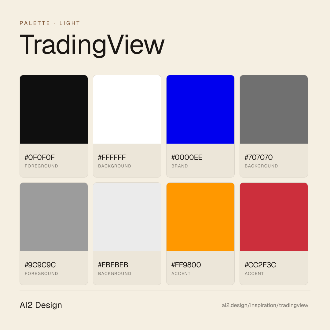
TradingView is the rare financial-charting platform landing that decided system fonts could be the entire typographic identity — yes, the real -apple-system stack, no premium grotesque licensing, no display webfont preload. We catalogued it because most financial platforms reach for either Bloomberg-corporate display fonts or Robinhood-style consumer playfulness. TradingView picked a third path — pure white canvas, dark #0f0f0f text, system font stack for every typographic moment, classic-web hyperlink blue #0000ee for primary CTA, and market-state colours (green #06806b confirm, red #cc2f3c loss, orange #ff9800 warning) deployed only as semantic state signals. The result reads as a brand confident enough to ship system fonts because the product (real-time market data) is the entire value prop. If you are shipping a data-density product that needs to render fast at every screen size, this is the lodestar.
Design decisions observed
- -apple-system + system-ui stack as entire UI typography (~5+ sizes catalogued 11-18px, weights 400/500/600/700) — refuses webfont overhead for performance.
- Pure #ffffff canvas (~623 surface refs) paired with #0f0f0f primary text (~3,145 refs) — extreme contrast spine.
- Classic-web hyperlink blue #0000ee (~554 surface refs) as primary CTA accent — deliberate citation of early-web hyperlink colour, premium signal hiding inside utility.
- Market-state semantic colours: red #cc2f3c (loss/sell), green #06806b (confirm/buy), orange #ff9800 (warning), additional teal #22ab94 — deployed only as state signals, never decoration.
- Container 828/1000 (no wide canvas) — tight reading widths for data-density.
- Custom breakpoints sm=320 md=768 lg=958 xl=1214 2xl=1440 — heavily customised for financial-density layouts.
- Zero motion library — data renders fast, motion lives in chart interactions inside the product.
- 2 catalogued gradients — minimal atmospheric depth.
What to study
- System fonts as entire identity — TradingView ships -apple-system stack and the page reads as premium because the data does the talking. Steal the discipline of letting product surface carry the brand when the product is itself the marketing.
- Classic-web blue #0000ee as primary CTA — most financial platforms reach for safe navy or trust-blue. TradingView's commitment to the original hyperlink colour reads as confident art direction citing computational heritage.
- Market-state colours as semantic state — green/red/orange deployed only as buy/sell/warning signals. Steal the discipline of treating chromatic accents as data-display signals rather than decoration.
What to avoid
- Don't lift the system-font stack without owning a data-density product — system fonts work when product surface carries the brand. For marketing-only sites, custom grotesque earns its license.
- Don't paint button backgrounds in red/green — TradingView treats market-state colours as semantic. The moment you fill a CTA in #06806b green, the brand collapses.
- Don't widen the container beyond 1000px — TradingView's data-density reading rhythm depends on the tight reading width.
Taste notes
The page feels like the inside of a beautifully designed trading terminal that happens to ship marketing copy — every system-font paragraph renders at the optimal screen-density rhythm, every classic-blue CTA earning its semantic frame, every market-state colour signalling exactly what it would inside a real chart. TradingView understood that financial-data products live or die by render speed and semantic clarity, and the brand needs to carry that data-density seriousness through typographic restraint + chromatic semantics.
Lineage & references
- Direct heir to the Bloomberg Terminal / financial-charting aesthetic — data-density over decoration.
- Standing shoulder-to-shoulder with the modern charting peer cohort (TradingView dominates this space) — but the system-font commitment is more disciplined than most.
- Part of the system-font typographic wave that includes parts of Apple's marketing, Wikipedia, and the broader 2024+ system-stack pragmatism aesthetic.
Design language brief
Paste-ready for your agent.
A typed design system transfer brief — philosophy, tokens, rules, techniques, and fitness checks. Your agent reads the whole language, not just the pixels.
Philosophy
TradingView's design language is data-density system-font pragmatism. Pure white canvas; #0f0f0f text; -apple-system + system-ui stack throughout; classic-web blue #0000ee as primary CTA; market-state semantic colours (red/green/orange) only as state signals; zero motion library. Brand reads as a trading terminal that learned how to whisper marketing.
Main prompt
Use this capture as a design language transfer brief for my project. Adopt the palette (#ffffff dominant ground ~623 refs, #0f0f0f primary text dominant ~3,145 refs, #0000ee classic-web blue primary CTA accent ~554 refs, #707070 muted dark grey secondary text, #9c9c9c lighter muted grey tertiary, #ebebeb border, market-state semantic colours: #ff9800 orange warning, #cc2f3c red loss/sell, #06806b green confirm/buy, #22ab94 teal accent), -apple-system + system-ui stack as entire UI typography (sizes 11-18px, weights 400/500/600/700), spacing scale 2/4/6/8/12/16/20/24, container ladder 828/1000 (tight reading widths), custom breakpoints sm=320 md=768 lg=958 xl=1214 2xl=1440, zero motion library, 2 catalogued gradients (atmospheric only). Treat #0000ee as primary CTA accent. Treat market-state colours as semantic state signals never decoration. Apply the language, not the source brand's copy.
Overview
- Layout
- Data-density single-column flow with tight 828-1000px reading rail.
- Content width
- 828px or 1000px (tight density).
- Framing
- Trading terminal that learned marketing — system fonts + semantic colours.
- Grid strength
- Density-focused — content width tight, no wide editorial sprawl.
Color philosophy
Pure white canvas; #0f0f0f text at extreme contrast; classic-web blue #0000ee CTA; market-state semantic colours.
- #ffffff dominant ground
- #0f0f0f primary text
- #0000ee classic-web blue primary CTA
- #707070 muted dark grey secondary
- #9c9c9c lighter muted tertiary
- #ebebeb border
- #ff9800 orange warning state
- #cc2f3c red loss/sell state
- #06806b green confirm/buy state
- #22ab94 teal accent state
Gradients (paste-ready)
2 catalogued — atmospheric depth, restrained
Typography rules
- -apple-system + system-ui stack for entire UI
- Sizes 11/14/16/18px catalogued, weights 400/500/600/700
- Letter-spacing 0
- Line-height 1.5 body, 1.05 display
- Weight ladder: 400 body, 500-600 emphasis, 700 hero display
Spacing rules
- 4px base, scale 2/4/6/8/12/16/20/24
- Section vertical rhythm 64-96px (compressed for data density)
- Card padding 16-24px
Design tokens
Palette, type, and space — all agent-readable.
15 colors · hex / rgb / hsl / oklch
- foregroundcolor-cold-gray-90065%
- HEX
#0F0F0F - RGB
rgb(15, 15, 15) - HSL
hsl(0, 0%, 6%) - OKLCH
oklch(16.84% 0.0000 89.76)
- HEX
- backgroundcolor-white13%
- HEX
#FFFFFF - RGB
rgb(255, 255, 255) - HSL
hsl(0, 0%, 100%) - OKLCH
oklch(100.00% 0.0000 89.76)
- HEX
- brand12%
- HEX
#0000EE - RGB
rgb(0, 0, 238) - HSL
hsl(240, 100%, 47%) - OKLCH
oklch(42.90% 0.2973 264.05)
- HEX
- backgroundcolor-cold-gray-5506%
- HEX
#707070 - RGB
rgb(112, 112, 112) - HSL
hsl(0, 0%, 44%) - OKLCH
oklch(54.52% 0.0000 89.76)
- HEX
- foregroundcolor-cold-gray-4001%
- HEX
#9C9C9C - RGB
rgb(156, 156, 156) - HSL
hsl(0, 0%, 61%) - OKLCH
oklch(69.27% 0.0000 89.76)
- HEX
- backgroundcolor-cold-gray-1501%
- HEX
#EBEBEB - RGB
rgb(235, 235, 235) - HSL
hsl(0, 0%, 92%) - OKLCH
oklch(94.01% 0.0000 89.76)
- HEX
- accentcolor-tan-orange-5000%
- HEX
#FF9800 - RGB
rgb(255, 152, 0) - HSL
hsl(36, 100%, 50%) - OKLCH
oklch(77.03% 0.1741 64.05)
- HEX
- accentcolor-ripe-red-6000%
- HEX
#CC2F3C - RGB
rgb(204, 47, 60) - HSL
hsl(355, 63%, 49%) - OKLCH
oklch(55.73% 0.1923 22.13)
- HEX
- accentcolor-minty-green-6000%
- HEX
#06806B - RGB
rgb(6, 128, 107) - HSL
hsl(170, 91%, 26%) - OKLCH
oklch(53.64% 0.0993 175.65)
- HEX
Inspector
Tab through the captured artifacts.
Six observable layers — page structure, fonts, breakpoints, z-index, gradients, motion — kept paste-ready alongside the tokens above.
Page structure
Semantic hierarchy at a glance.
Depth-first walk of meaningful sections — header, navigation, main regions, articles, footer. 2 nodes captured; depth capped at 6 for readability.
- body
- └─ div (×6)
Accessibility
WCAG contrast matrix.
176 combinations · 64 pass AA · 38 pass AAA · APCA Lc shown alongside WCAG 2.1 ratio for draft WCAG 3 awareness.
| Preview | fg | bg | Ratio | Normal | Large | APCA Lc | Context |
|---|---|---|---|---|---|---|---|
Aa | #0F0F0F | #FFFFFF | 19.17 | AAA | AAA | +106 | foreground on background |
Aa | #FFFFFF | #0F0F0F | 19.17 | AAA | AAA | -108 | background on foreground |
Aa | #FFFFFF | #131722 | 17.90 | AAA | AAA | -107 | background on background |
Aa | #131722 | #FFFFFF | 17.90 | AAA | AAA | +105 | background on background |
Aa | #0F0F0F | #F4F1DB | 16.84 | AAA | AAA | +97 | foreground on accent |
Aa | #F4F1DB | #0F0F0F | 16.84 | AAA | AAA | -98 | accent on foreground |
Aa | #0F0F0F | #EBEBEB | 16.08 | AAA | AAA | +94 | foreground on background |
Aa | #EBEBEB | #0F0F0F | 16.08 | AAA | AAA | -94 | background on foreground |
Aa | #131722 | #F4F1DB | 15.73 | AAA | AAA | +96 | background on accent |
Aa | #F4F1DB | #131722 | 15.73 | AAA | AAA | -97 | accent on background |
Image strategy
Asset loading & format policy.
Observable image posture — total count, lazy-loading ratio, and format mix. Hero image is measured above the fold.
Hero image
https://static.tradingview.com/static/bundles/space-desktop.a262e30221f5eb9925ba.webp- Format
- WEBP
- Dimensions
- 8000×4940
- Loading
- auto
- srcset
- no
- Full Page
- fintech
- saas
- light
- 2026-05-17
Editorial credit
Featured Sponsor slot — your brand here
Dedicated logo placement — no rotation, on every export.
COMPARE THIS WITH
Side-by-side reads sharing this design signal.
See also