Zendesk · Full Page
Zendesk
Warmth-led enterprise customer service marketing — cream canvas with soft sage accents, illustrated trust signals, and editorial scroll pacing that signals heritage without resorting to cold corporate blue. Zendesk pairs a humanist sans with occasional serif moments and lets gentle ease-out motion carry section reveals; every chapter has its own background tonality.

Editorial disclaimer
Editorial noteThis entry documents observable design-language patterns for educational transfer and AI-agent briefing. Screenshots and trademarks are property of their respective owners. AI2 Design is not affiliated with or endorsed by the featured brand. Inspiration here is about language and rhythm — do not reproduce brand identity, logo, product copy, or proprietary features.
Curator verdict
Why we catalogued it?
Zendesk's marketing page is the lesson in how a 17-year-old SaaS rebrands without breaking its enterprise spell. We catalogued it because it walks the tight wire between corporate credibility and 2026 warmth — illustrated icons that feel hand-drawn, a palette that whispers rather than shouts, and a narrative scroll that earns its length. If you're scaling a B2B product past its first redesign, this is the safe house.
Design decisions observed
- Soft authority — Zendesk leans on cream backdrops and stable serif moments to signal heritage, then layers in pastel accent waves to keep it from feeling boardroom.
- Illustrated trust signals — every section earns a small bespoke icon set, never stock imagery. The hand of an illustrator anchors a category usually owned by stock photography.
- Long-scroll narrative — the page is unapologetically tall. Each section is a chapter with its own visual key, paced for executive scanning rather than dev-tool brevity.
- Restrained motion — fades and gentle slide-ins, no spring drama. Enterprise readers don't want their decision interrupted by choreography.
What to study
- How Zendesk earns trust without 80s blue-chip cues — warm neutrals, soft greens, and editorial pacing replace the usual cold corporate stack.
- Section pacing for long marketing pages — every chapter has its own background tone shift so the eye never feels lost.
- Illustrated iconography as a brand-defining asset — bespoke beats stock photography for category authority, even at enterprise scale.
What to avoid
- Don't lift Zendesk's section length into a SaaS targeting bootstrappers — the scroll cost only pays back when your buyer is procurement-led.
- Don't replicate the illustrated icon style without commissioning real illustrators — generic outline icons read as cheap imitation, not warm authority.
Taste notes
The page reads like a glossy magazine spread of a software product — generous breathing room, cream paper, editorial pull quotes. It's the rarest of B2B vibes: enterprise without ceremony.
Lineage & references
- Belongs to the 2023+ warmth-led B2B rebrand cohort (Mailchimp post-2018, Intercom 2022, Hubspot 2024) — companies pulling themselves out of corporate-blue exile.
- Inherits the narrative-marketing playbook pioneered by Slack circa 2017-19 — long scroll, illustration-led, story-first.
- Stands alongside Salesforce Slack and Hubspot in the customer-service trinity but reads softer and more crafted than either.
Design language brief
Paste-ready for your agent.
A typed design system transfer brief — philosophy, tokens, rules, techniques, and fitness checks. Your agent reads the whole language, not just the pixels.
Philosophy
Warm-authority editorial system — cream and soft sage carry enterprise weight without resorting to cold blue. Typography mixes a humanist sans with the occasional serif accent for editorial cadence. Motion is gentle (200-400ms ease-out fades), illustration is bespoke, and section pacing is magazine-grade.
Main prompt
Adopt this capture as a transferable design-language brief for a warmth-led enterprise SaaS marketing page. Use the cream/sage palette, humanist sans typography with serif accents, generous section padding, illustrated iconography (never stock), and gentle ease-out motion as defaults. Build long-scroll pages where each section has its own background tonality. Avoid corporate-blue and aggressive motion — the brand promises a calm conversation, not a sales pitch.
Overview
- Layout
- Stacked
- Content width
- Bounded
- Framing
- Layered
- Grid strength
- Moderate
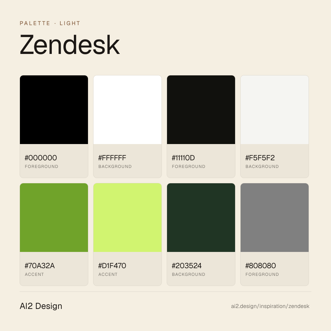
Color philosophy
Light-first canvas — primary surface #000000 paired with foreground #ffffff doing the bulk of reading-layer work. Accent moments use #11110d + #f5f5f2 sparingly. Cream and warm-neutral surfaces with small accent flags.
- #000000 — primary surface / dominant background
- #ffffff — primary foreground / reading layer
- #11110d — first accent — used for CTAs and highlights
- #f5f5f2 — secondary accent / hover states
- #70a32a — tertiary surface / panels
Gradients (paste-ready)
// No gradient extracted — use solid surfaces
Typography rules
- Primary family: Vanilla Sans. Mono fallback: JetBrains Mono for code and tabular numerics.
- Weight ladder: 400 / 500 / 600 / 700. Keep substitutions tight — the captured ladder is the typographic signature.
- Display tracking uses negative px (not em) for optical correction at large sizes — typically -0.5 to -1.5px at 48-64px hero scale.
- Heading line-height tightens at display sizes (1.0-1.2); body sits at 1.4-1.6. Captions and small UI labels at 1.3.
- Tabular numerals mandatory on aligned columns: font-variant-numeric: tabular-nums.
- Italic reserved for editorial quotes and emphasis where weight cannot carry — never for product UI labels.
- Paragraph max 45-55ch at body size; dense data tables may extend to 65ch with line-height 1.5.
Spacing rules
- Scale (observed): 2 / 4 / 6 / 8 / 10 / 12 / 14 / 16 px. Stay on the scale — no magic numbers.
- Container max-width: 1600px. Secondary bounded rails for narrow content clusters at ~480-640px.
- Section vertical rhythm: 64-128px on desktop, 40-80px on mobile, scaled by page depth.
- Card padding: 16-24px on desktop, 12-16px on mobile.
- Gutter values draw from the smaller half of the scale (4 / 8 / 12 / 16 / 24).
Design tokens
Palette, type, and space — all agent-readable.
8 colors · hex / rgb / hsl / oklch
- foreground40%
- HEX
#000000 - RGB
rgb(0, 0, 0) - HSL
hsl(0, 0%, 0%) - OKLCH
oklch(0.00% 0.0000 0.00)
- HEX
- background26%
- HEX
#FFFFFF - RGB
rgb(255, 255, 255) - HSL
hsl(0, 0%, 100%) - OKLCH
oklch(100.00% 0.0000 89.76)
- HEX
- foreground19%
- HEX
#11110D - RGB
rgb(17, 17, 13) - HSL
hsl(60, 13%, 6%) - OKLCH
oklch(17.61% 0.0080 107.19)
- HEX
- background8%
- HEX
#F5F5F2 - RGB
rgb(245, 245, 242) - HSL
hsl(60, 13%, 95%) - OKLCH
oklch(96.93% 0.0040 106.47)
- HEX
- accent6%
- HEX
#70A32A - RGB
rgb(112, 163, 42) - HSL
hsl(85, 59%, 40%) - OKLCH
oklch(65.60% 0.1575 130.02)
- HEX
- accent1%
- HEX
#D1F470 - RGB
rgb(209, 244, 112) - HSL
hsl(76, 86%, 70%) - OKLCH
oklch(91.56% 0.1630 122.05)
- HEX
- background0%
- HEX
#203524 - RGB
rgb(32, 53, 36) - HSL
hsl(131, 25%, 17%) - OKLCH
oklch(30.55% 0.0407 149.49)
- HEX
- foreground0%
- HEX
#808080 - RGB
rgb(128, 128, 128) - HSL
hsl(0, 0%, 50%) - OKLCH
oklch(59.99% 0.0000 89.76)
- HEX
Inspector
Tab through the captured artifacts.
Six observable layers — page structure, fonts, breakpoints, z-index, gradients, motion — kept paste-ready alongside the tokens above.
Page structure
Semantic hierarchy at a glance.
Depth-first walk of meaningful sections — header, navigation, main regions, articles, footer. 11 nodes captured; depth capped at 6 for readability.
- body
- └─ div
- └─ div
- ├─ div
- │ └─ Nav (×2)
- ├─ Main
- │ └─ div
- │ ├─ Section (×10)
- │ └─ [+5 more]
- └─ div
- └─ Footer
Accessibility
WCAG contrast matrix.
44 combinations · 26 pass AA · 18 pass AAA · APCA Lc shown alongside WCAG 2.1 ratio for draft WCAG 3 awareness.
| Preview | fg | bg | Ratio | Normal | Large | APCA Lc | Context |
|---|---|---|---|---|---|---|---|
Aa | #000000 | #FFFFFF | 21.00 | AAA | AAA | +106 | foreground on background |
Aa | #FFFFFF | #000000 | 21.00 | AAA | AAA | -108 | background on foreground |
Aa | #000000 | #F5F5F2 | 19.23 | AAA | AAA | +100 | foreground on background |
Aa | #F5F5F2 | #000000 | 19.23 | AAA | AAA | -101 | background on foreground |
Aa | #FFFFFF | #11110D | 18.92 | AAA | AAA | -107 | background on foreground |
Aa | #11110D | #FFFFFF | 18.92 | AAA | AAA | +105 | foreground on background |
Aa | #11110D | #F5F5F2 | 17.32 | AAA | AAA | +99 | foreground on background |
Aa | #F5F5F2 | #11110D | 17.32 | AAA | AAA | -101 | background on foreground |
Aa | #000000 | #D1F470 | 16.89 | AAA | AAA | +92 | foreground on accent |
Aa | #D1F470 | #000000 | 16.89 | AAA | AAA | -92 | accent on foreground |
Image strategy
Asset loading & format policy.
Observable image posture — total count, lazy-loading ratio, and format mix. Hero image is measured above the fold.
Hero image
https://web-assets.zendesk.com/cdn-cgi/image/width=256,q=45,f=auto/zendesk/pages/campaigns/emea-campaigns/Relate_Logo_Black_EyebrowPromo.svg- Format
- SVG
- Dimensions
- 156×18
- Loading
- auto
- srcset
- yes
- srcset descriptor
- https://web-assets.zendesk.com/cdn-cgi/image/width=256,q=45,f=auto/zendesk/pages/campaigns/emea-campaigns/Relate_Logo_Black_EyebrowPromo.svg 1x, https://web-assets.zendesk.com/cdn-cgi/image/width=384,q=45,f=auto/zendesk/pages/campaigns/emea-campaigns/Relate_Logo_Black_EyebrowPromo.svg 2x
Frequently asked
Questions people ask about Zendesk
Answers are pulled from the curator verdict and design brief — the same text your AI agent sees when it paste-reads this page.
What makes Zendesk's marketing page work?
Zendesk solves the 17-year-old-SaaS rebrand problem by leaning into warmth instead of corporate blue. Cream backdrops, bespoke illustrated icon sets, soft sage accents, and editorial scroll pacing carry enterprise credibility without ceremony. The page reads like a glossy magazine spread of a software product — generous, calm, deliberately paced for executive scanning rather than dev-tool brevity.
What fonts and palette does Zendesk use?
A humanist sans handles body and headlines with occasional serif moments for editorial cadence. The palette is cream-and-soft-sage with judicious pastel accent waves layered through long sections. Each chapter shifts its background tone slightly so the eye never feels lost in a tall page — illustration is bespoke, never stock, and motion stays gentle (200-400ms ease-out fades).
Can I apply Zendesk's warmth-led aesthetic to my product?
Yes, if your buyer is procurement-led and your scroll cost can pay back over a long page. Commission real illustrators (generic vectors read as kitsch), shift section backgrounds chapter-by-chapter, and lean on warm neutrals instead of corporate blue. Our growing gallery captures the AI2 Design brief as paste-ready scaffolding for adapting the warmth without copying the brand.
Editorial credit
Featured Sponsor slot — your brand here
Dedicated logo placement — no rotation, on every export.
COMPARE THIS WITH
Side-by-side reads sharing this design signal.
See also